All Projects → themre → roundy

themre / roundy

Licence: MIT license
Simple react round slider. Supports touch events.

Programming Languages

typescript
32286 projects
javascript
184084 projects - #8 most used programming language
HTML
75241 projects

Projects that are alternatives of or similar to roundy

Hammer Slider
DISCONTINUED - HammerSlider touch is a lightweight infinite carousel plugin.
Stars: ✭ 21 (-27.59%)
Mutual labels:  slider, touch
Vue Gallery
📷 Responsive and customizable image and video gallery, carousel and lightbox, optimized for both mobile and desktop web browsers.
Stars: ✭ 405 (+1296.55%)
Mutual labels:  slider, touch
Swiper
Most modern mobile touch slider with hardware accelerated transitions
Stars: ✭ 29,519 (+101689.66%)
Mutual labels:  slider, touch
Range Slider
The simplest JavaScript custom range slider ever!
Stars: ✭ 41 (+41.38%)
Mutual labels:  slider, touch
Embla Carousel
A lightweight carousel library with fluid motion and great swipe precision.
Stars: ✭ 1,874 (+6362.07%)
Mutual labels:  slider, touch
Slider
Touch swipe image slider/slideshow/gallery/carousel/banner mobile responsive bootstrap
Stars: ✭ 2,046 (+6955.17%)
Mutual labels:  slider, touch
Vuetify Swipeout
👆 A swipe out example built with Vue CLI 3 + Vuetify + Swiper.
Stars: ✭ 117 (+303.45%)
Mutual labels:  slider, touch
Keen Slider
The HTML touch slider carousel with the most native feeling
Stars: ✭ 3,097 (+10579.31%)
Mutual labels:  slider, touch
SimpleSlider
Simple responsive slider created in pure javascript.
Stars: ✭ 21 (-27.59%)
Mutual labels:  slider
pinar
🌲☀️ Customizable, lightweight React Native carousel component with accessibility support.
Stars: ✭ 214 (+637.93%)
Mutual labels:  slider
react-native-slider-intro
A simple and fully customizable React Native component that implements an intro slider for your app
Stars: ✭ 80 (+175.86%)
Mutual labels:  slider
gestures
A library for normalized events and gesture for desktop and mobile.
Stars: ✭ 31 (+6.9%)
Mutual labels:  touch
takahashi.js
Make Takahashi-style slide easily!
Stars: ✭ 30 (+3.45%)
Mutual labels:  slider
vue-barousel
Carousel component mimics NetEase Cloud Music
Stars: ✭ 13 (-55.17%)
Mutual labels:  slider
SHSliderSwitch
SHSliderSwitch is a simple lightweight library to implement an animated slider switch.
Stars: ✭ 18 (-37.93%)
Mutual labels:  slider
embla-carousel-wheel-gestures
wheel interactions for Embla Carousel
Stars: ✭ 30 (+3.45%)
Mutual labels:  slider
emoji-slider
A slider control with emojis
Stars: ✭ 40 (+37.93%)
Mutual labels:  slider
T System
the moving objects tracking system via two axis camera motion (and as optionally n joint robotic arm) for raspberry pi distributions
Stars: ✭ 17 (-41.38%)
Mutual labels:  slider
svelte-slidy
📸 Sliding action script
Stars: ✭ 211 (+627.59%)
Mutual labels:  slider
LiveFader
@IBDesignable Horizontal or vertical UIControl subclass that can start from bottom or middle of the control.
Stars: ✭ 21 (-27.59%)
Mutual labels:  slider

roundy

Roundy

Configurable react round slider. Supports touch events.

Installation

npm i roundy (or yarn add roundy)

Usage

Roundy

You can use Roundy as a single slider:
import Roundy from 'roundy';

const {value} = this.state
<Roundy
   value={value}
   min={10}
   max={30}
   stepSize={5}
   radius={100}
   color='pink'
   onChange={value => this.setState({value})}
   onAfterChange={(value, props) => ... }
   overrideStyle={ ... string template as CSS ...}
/>

You can create pie round chart

<Roundy
   arcSize={270}
   min={10}
   max={30}
   rotationOffset={-45}
/>

Or use roundy as a group of sliders:

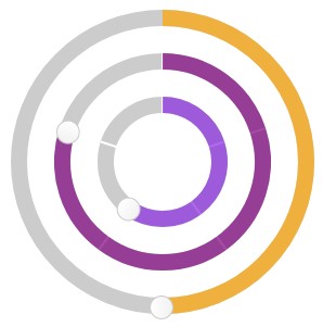
import { RoundyGroup } from 'roundy'

<RoundyGroup sliders={[
    { value: 30, step: 10, id: 'mjaw', max: 50,  radius: 60, color: 'blueviolet', onChange:(val, props) => console.log(props) },
    { value: 30, step: 10, max: 50, radius: 100 },
    { value: 100, step: 20, max: 200, color: 'orange', radius: 140, sliced: false, step: 1 }
]} />

API

Roundy provides the following API:

Prop Description Default
value number: Slider value 50
min number: Minimal value 0
max number: Maximum value 100
stepSize number: Step value to snap value 0
steps number: Number of steps that will be snapable 0
radius number: Slider radius 100
color string: Active slider color 'purple'
bgColor string: Slider arc color '#ccc'
strokeWidth number: Slider arc width 15
thumbSize number: Size (diameter) of thumb 20
sliced boolean: Provide slices based on step value true
onChange function: immediate callback function (value, props) null
onAfterChange function: callback function after release (value, props) null
overrideStyle string: provide additional class style which will be injected into styled-components class null
arcSize number: Size of the arc. Default is 360, can be between 1 and 360 360
rotationOffset number: rotation of the whole circle. Can be between -180 and 180 0
render render prop function that has a signature: ({value, angle}, props) => Node null

Testing

TODO

Contribution

Always happy to take PRs.

Note that the project description data, including the texts, logos, images, and/or trademarks, for each open source project belongs to its rightful owner. If you wish to add or remove any projects, please contact us at [email protected].