transferwise / Sequence Layout
Licence: apache-2.0
A vertical sequence UI component for Android
Stars: ✭ 444
Programming Languages
kotlin
9241 projects
Projects that are alternatives of or similar to Sequence Layout
Handlebars Layouts
Handlebars helpers which implement layout blocks similar to Jinja, Nunjucks (Swig), Pug (Jade), and Twig.
Stars: ✭ 336 (-24.32%)
Mutual labels: layout
Stateviews
Create & Show progress, data or error views, the easy way!
Stars: ✭ 367 (-17.34%)
Mutual labels: progress-bar
Easyswiftlayout
Lightweight Swift framework for Apple's Auto-Layout
Stars: ✭ 345 (-22.3%)
Mutual labels: layout
Ng2 Slim Loading Bar
Angular 2 component shows slim loading bar at the top of the page.
Stars: ✭ 376 (-15.32%)
Mutual labels: progress-bar
Tqdm
A Fast, Extensible Progress Bar for Python and CLI
Stars: ✭ 20,632 (+4546.85%)
Mutual labels: progress-bar
Mylinearlayout
MyLayout is a powerful iOS UI framework implemented by Objective-C. It integrates the functions with Android Layout,iOS AutoLayout,SizeClass, HTML CSS float and flexbox and bootstrap. So you can use LinearLayout,RelativeLayout,FrameLayout,TableLayout,FlowLayout,FloatLayout,PathLayout,GridLayout,LayoutSizeClass to build your App 自动布局 UIView UITab…
Stars: ✭ 4,152 (+835.14%)
Mutual labels: layout
Ngx Ui Loader
Multiple Loaders / spinners and Progress bar for Angular 5, 6, 7 and 8+
Stars: ✭ 368 (-17.12%)
Mutual labels: progress-bar
Theme Ui
Build consistent, themeable React apps based on constraint-based design principles
Stars: ✭ 4,150 (+834.68%)
Mutual labels: layout
Nerdyui
An easy way to create and layout UI components for iOS.
Stars: ✭ 381 (-14.19%)
Mutual labels: layout
Npm Gif
Replace NPM install's progress bar with a GIF!
Stars: ✭ 332 (-25.23%)
Mutual labels: progress-bar
React Native Responsive Grid
Bringing the Web's Responsive Design to React Native
Stars: ✭ 369 (-16.89%)
Mutual labels: layout
Avatarview
A circular Image View with a lot of perks. Including progress animation and highlight state with borders and gradient color.
Stars: ✭ 429 (-3.38%)
Mutual labels: progress-bar
Uicollectionview Layouts Kit
📐 A set of custom layouts for UICollectionView with examples [Swift 5.3, iOS 12].
Stars: ✭ 410 (-7.66%)
Mutual labels: layout
sequence-layout 
 A vertical sequence UI component for Android.
Animates a progress bar to the first active step in the sequence and then periodically runs a pulse animation on that step.
Setup
Add the JitPack maven repository to your root build.gradle:
allprojects {
    repositories {
      maven { url "https://jitpack.io" }
    }
}
And then the actual library dependency to your module's build.gradle:
dependencies {
    implementation 'com.github.transferwise:sequence-layout:... // use latest version'
}
Usage
Take a look at the sample app in this repository.
In XML layout
You can define steps in your XML layout:
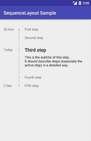
<com.transferwise.sequencelayout.SequenceLayout
    android:layout_width="match_parent"
    android:layout_height="wrap_content">

    <com.transferwise.sequencelayout.SequenceStep
        android:layout_width="match_parent"
        android:layout_height="wrap_content"
        app:anchor="30 Nov"
        app:title="First step"/>

    <com.transferwise.sequencelayout.SequenceStep
        android:layout_width="match_parent"
        android:layout_height="wrap_content"
        app:title="Second step"/>

    <com.transferwise.sequencelayout.SequenceStep
        android:layout_width="match_parent"
        android:layout_height="wrap_content"
        app:active="true"
        app:anchor="Today"
        app:subtitle="Subtitle of this step."
        app:title="Third step"
        app:titleTextAppearance="@style/TextAppearance.AppCompat.Title"/>

    <com.transferwise.sequencelayout.SequenceStep
        android:layout_width="match_parent"
        android:layout_height="wrap_content"
        app:title="Fourth step"/>

    <com.transferwise.sequencelayout.SequenceStep
        android:layout_width="match_parent"
        android:layout_height="wrap_content"
        app:anchor="2 Dec"
        app:title="Fifth step"/>
</com.transferwise.sequencelayout.SequenceLayout>
Custom attributes for SequenceLayout:
| Attribute | Description |
|---|---|
progressForegroundColor |
foreground color of the progress bar |
progressBackgroundColor |
background color of the progress bar |
Custom attributes for SequenceStep:
| Attribute | Description |
|---|---|
active |
boolean to indicate if step is active. There should only be one active step per SequenceLayout. |
anchor |
text for the left side of the step |
anchorMinWidth |
minimum width for the left side of the step |
anchorMaxWidth |
maximum width for the left side of the step |
anchorTextAppearance |
styling for the left side of the step |
title |
title of the step |
titleTextAppearance |
styling for the title of the step |
subtitle |
subtitle of the step |
subtitleTextAppearance |
styling for the subtitle of the step |
Programmatically
Alternatively, define an adapter that extends SequenceAdapter<T>, like this:
class MyAdapter(private val items: List<MyItem>) : SequenceAdapter<MyAdapter.MyItem>() {

    override fun getCount(): Int {
        return items.size
    }

    override fun getItem(position: Int): MyItem {
        return items[position]
    }

    override fun bindView(sequenceStep: SequenceStep, item: MyItem) {
        with(sequenceStep) {
            setActive(item.isActive)
            setAnchor(item.formattedDate)
            setAnchorTextAppearance(...)
            setTitle(item.title)
            setTitleTextAppearance()
            setSubtitle(...)
            setSubtitleTextAppearance(...)
        }
    }

    data class MyItem(val isActive: Boolean,
                      val formattedDate: String,
                      val title: String)
}
... and use it for a SequenceLayout:
val items = listOf(MyItem(...), MyItem(...), MyItem(...))
sequenceLayout.setAdapter(MyAdapter(items))
Note that the project description data, including the texts, logos, images, and/or trademarks,
for each open source project belongs to its rightful owner.
If you wish to add or remove any projects, please contact us at [email protected].