calm / Sexytooltip
Projects that are alternatives of or similar to Sexytooltip
SexyTooltip
The tooltip that has all the right moves.
It handles the gross complexity of view hierarchies and scroll view offsets. You just tell it which view to point at it'll do the rest! It'll even follow that view around the screen as it moves, re-shifting itself and its arrow to stay within the bounds of the window (or another superview you specify). Highly configurable yet super simple out-of-the-box.
It's pretty sexy.

Installation
Add pod 'SexyTooltip' to your Podfile or download the source here
Creation
The default initializer is to give the tooltip a content view which will be contained within the tooltip.
SexyTooltip *errorTooltip = [[SexyTooltip alloc] initWithContentView:self.errorLabel];
SexyTooltip can also be created with an NSAttributedString, which will create a UILabel as the tooltip's content view.
SexyTooltip *greetingsTooltip = [[SexyTooltip alloc] initWithAttributedString:greetingsText
                                                                sizedToView:self.view
                                                                withPadding:UIEdgeInsetsMake(10, 5, 10, 5)
                                                                  andMargin:UIEdgeInsetsMake(20, 20, 20, 20)];
[self.view addSubview:greetingsTooltip];
Presentation
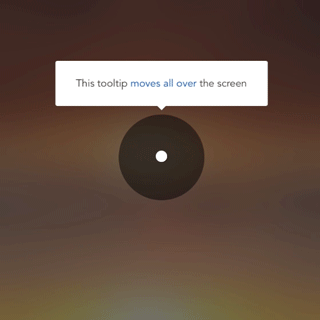
The true beauty of SexyTooltip shines once you present it. No more dealing with nested CGRect logic and UIScrollView offsets. Just pass the view that you want the tooltip to point at, and even as that view moves around the SexyTooltip will continue pointing at the fromView (see the example video above)
[greetingsTooltip presentFromView:self.loginButton
                           inView:self.view
                       withMargin:10
                         animated:YES];
You can also present from a rect or point.
If you use a present method that doesn't explicitly pass inView, the fromView's direct superview will be used as the inView. The inView's bounds.size must be larger (width and height) than the ultimate bounds.size of the tooltip, otherwise there will be no way to place the tooltip.
Dismissal
Dismissal is as easy as calling -(void)dismiss; which defaults to animated dismissal. There's always [self.tooltip dismissAnimated:NO]; if you want to suck all of the joy out of your app ;)
Additionally, you can do [self.tooltip dismissInTimeInterval:10]; if you'd like to keep 'er showing for 10 seconds. Any other dismissals will cancel this timer, or you can do so yourself with [self.tooltip cancelDismissTimer];
Your tooltip will also be dismissed when it is tapped.
Appearance
The default is a nice sexy white with a subtle shadow and curved corners. You can change everything from hasShadow to arrowMargin to borderColor to padding to arrowHeight etc. All of these methods will maintain where your tooltip is currently pointing if they're called while it's showing.
Arrow direction
You can specify an array of permittedArrowDirections which specify the preference order of pointing directions. The tooltip will attempt to fit itself inside the inView you passed while maintaining the arrow pointing at the target view or point. For example, if you're pointing at a view that's moving around the screen, SexyTooltip will continue to be visible as the view moves to the edges by changing its direction in order to stay within the bounds of the inView. This is very powerful for complex tooltip scenarios or cases where you're not sure how the interface might look at the moment of presentation (e.g. variable text sizes)
typedef NS_ENUM(NSUInteger, SexyTooltipArrowDirection) {
    SexyTooltipArrowDirectionUp,
    SexyTooltipArrowDirectionDown,
    SexyTooltipArrowDirectionLeft,
    SexyTooltipArrowDirectionRight
};
Delegate
You can optionally hear about any of the following events as the delegate of your tooltip
@protocol SexyTooltipDelegate <NSObject>

@optional
- (void)tooltipDidPresent:(SexyTooltip *)tooltip;
- (void)tooltipDidDismiss:(SexyTooltip *)tooltip;
- (void)tooltipWillBeTapped:(SexyTooltip *)tooltip;
- (void)tooltipWasTapped:(SexyTooltip *)tooltip;

@end