SheeKit
Customize and resize sheets in SwiftUI with SheeKit. Utilise the power of UISheetPresentationController and other UIKit features.
Overview
SheeKit is a bridge between SwiftUI and UIKit which enriches the modal presentations in SwiftUI with the features available in UIKit.
SheeKit provides two modifiers for presenting the sheet, similar to SwiftUI.sheet(...):
- controlled by
isPresentedboolean flag - controlled by the optional
Identifiableitem
Additionally, SheeKit allows to:
- customize sheet
detentsto present half-screen sheets - define different modal presentation styles for different
Identifiableitems - customize the preferred presented view controller properties via
UIViewControllerProxy - utilise the
UIPopoverPresentationController.adaptiveSheetPresentationControllerand customize adaptive sheet for popover which will be used on iPhone and in compact horizontal size class of the scene on iPad.
Customizing sheet detents to present half-screen sheets
With iOS 15, sheets can be resizable between large() and medium() detents and animate the size transitions.
In order to customize detents, provide SheetProperties to the ModalPresentationStyle/pageSheet(properties:) or ModalPresentationStyle/formSheet(properties:).
struct ShowLicenseAgreement: View {
    @State private var isShowingSheet = false
    @State private var selectedDetentIdentifier = UISheetPresentationController.Detent.Identifier.medium
    var body: some View {
        Button(action: {
            isShowingSheet.toggle()
        }) {
            Text("Show License Agreement")
        }
        .shee(isPresented: $isShowingSheet,
              presentationStyle: .formSheet(properties: .init(detents: [ .medium(), .large() ], selectedDetentIdentifier: $selectedDetentIdentifier, animatesSelectedDetentIdentifierChange: true)),
              onDismiss: didDismiss) {
            VStack {
                Text("License Agreement")
                    .font(.title)
                    .padding(50)
                Text("""
                        Terms and conditions go here.
                    """)
                    .padding(50)
                Button("Dismiss",
                       action: { isShowingSheet.toggle() })
            }
        }
    }

    func didDismiss() {
        // Handle the dismissing action.
    }
}
Define different modal presentation styles for different Identifiable items
In SwiftUI, there are three different modifiers for popover, fullScreenCover and sheet, which don't allow the developer to show different styles of the dialog based on the same source of truth (provided by item).
With SheeKit, it's possible - just provide presentationStyle which corresponds to your item.
struct ShowPartDetail: View {
    @State var sheetDetail: InventoryItem?
    var body: some View {
        Button("Show Part Details") {
            sheetDetail = InventoryItem(
                id: "0123456789",
                partNumber: "Z-1234A",
                quantity: 100,
                name: "Widget")
        }
        .shee(item: $sheetDetail,
              presentationStyle: presentationStyle,
              onDismiss: didDismiss) { detail in
            VStack(alignment: .leading, spacing: 20) {
                Text("Part Number: \(detail.partNumber)")
                Text("Name: \(detail.name)")
                Text("Quantity On-Hand: \(detail.quantity)")
            }
            .onTapGesture {
                sheetDetail = nil
            }
        }
    }

    func didDismiss() {
        // Handle the dismissing action.
    }

    var presentationStyle: ModalPresentationStyle {
        var sheetProperties = SheetProperties()
        sheetProperties.detents = sheetDetail?.quantity ?? 0 > 100500 ? [ .large() ] : [ .medium() ]
        return .formSheet(properties: sheetProperties)
    }
}

struct InventoryItem: Identifiable {
    var id: String
    let partNumber: String
    let quantity: Int
    let name: String
}
Customize the preferred presented view controller properties via UIViewControllerProxy
In UIKit, UIViewController class has many properties which allow to alter the user experience depending on the use case, like forbidding of interactive dismiss of the sheets via isModalInPresentation, customizing status bar appearance, preferred content size, or modal transition style. Unfortunately, this functionality is not exposed in SwiftUI. SheeKit solves this problem by allowing the consumer to provide UIViewControllerProxy which defines preferred parameters of the presented view controller.
struct ShowLicenseAgreement: View {
    @State private var isShowingSheet = false
    @State private var selectedDetentIdentifier = UISheetPresentationController.Detent.Identifier.medium
    var body: some View {
        Button(action: {
            isShowingSheet.toggle()
        }) {
            Text("Show License Agreement")
        }
        .shee(isPresented: $isShowingSheet,
              presentationStyle: .formSheet(properties: .init(detents: [ .medium(), .large() ], selectedDetentIdentifier: $selectedDetentIdentifier, animatesSelectedDetentIdentifierChange: true)),
              presentedViewControllerParameters: presentedViewControllerParameters,
              onDismiss: didDismiss) {
            VStack {
                Text("License Agreement")
                    .font(.title)
                    .padding(50)
                Text("""
                        Terms and conditions go here.
                    """)
                    .padding(50)
                Button("Dismiss",
                       action: { isShowingSheet.toggle() })
            }
        }
    }

    func didDismiss() {
        // Handle the dismissing action.
    }

    var presentedViewControllerParameters: UIViewControllerProxy {
        var parameters = UIViewControllerProxy()
        parameters.preferredStatusBarStyle = .darkContent
        parameters.preferredStatusBarUpdateAnimation = .fade
        parameters.isModalInPresentation = true
        parameters.modalTransitionStyle = .flipHorizontal
        return parameters
    }
}
Utilise the adaptiveSheetPresentationController of UIPopoverPresentationController and customize adaptive sheet for popover
In SwiftUI, when popover is shown as a sheet when the user minimizes the app to the smallest size on top of the other app on iPad, or when the popover is shown on iPhone as a sheet, developer can't get a medium-detent sheet in a compact size class of a scene instead of a popover. The sheet into which popover adapts, is always with .large() detent.
SheeKit allows the developer to customize this behavior and to specify the detents for the sheet in which the popover adapts to, along with the preferred popover arrow direction and the source rect.
struct ShowLicenseAgreement: View {
@State private var isShowingSheet = false
@State private var selectedDetentIdentifier = UISheetPresentationController.Detent.Identifier.medium
var body: some View {
Button(action: {
isShowingSheet.toggle()
}) {
Text("Show License Agreement")
}
.shee(isPresented: $isShowingSheet,
presentationStyle: .popover(permittedArrowDirections: .top,
sourceRectTransform: { $0.offsetBy(dx: 16, dy: 16) },
adaptiveSheetProperties: .init(detents: [ .medium(), .large() ],
selectedDetentIdentifier: $selectedDetentIdentifier,
animatesSelectedDetentIdentifierChange: true)),
onDismiss: didDismiss) {
VStack {
Text("License Agreement")
.font(.title)
.padding(50)
Text("""
Terms and conditions go here.
""")
.padding(50)
Button("Dismiss",
action: { isShowingSheet.toggle() })
}
}
}
func didDismiss() {
// Handle the dismissing action.
}
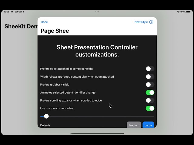
}Demo of the library
Installation
Xcode 13
- Select your project in File Navigator, then select the project again on top of the list of targets. You'll see list of packages.
- Press + button.
- In the appeared window, press + button in the bottom left corner.
- In the appeared menu, select "Add Swift Package Collection"
- In the appeared dialog, enter package collection URL: https://swiftpackageindex.com/edudnyk/collection.json
- Press "Add Collection"
- Select SheeKit package from the collection.
If you want to use SheeKit in any other project that uses SwiftPM, add the package as a dependency in Package.swift:
dependencies: [
  .package(name: "SheeKit", url: "https://github.com/edudnyk/SheeKit.git", from: "2.0.0"),
]
Next, add SheeKit as a dependency of your test target:
targets: [
  .target(name: "MyApp", dependencies: ["SheeKit"], path: "Sources"),
]
Carthage
If you use Carthage, you can add the following dependency to your Cartfile:
github "edudnyk/SheeKit" ~> 2.0.0
CocoaPods
If your project uses CocoaPods, add the pod to any applicable targets in your Podfile:
target 'MyApp' do
  pod 'SheeKit', '~> 2.0.0'
end
Topics
DismissActionModalPresentationStyleModalPresentationStyleCompatSheetPropertiesUIViewControllerProxy