SmartTabLayout
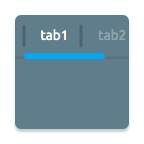
A custom ViewPager title strip which gives continuous feedback to the user when scrolling.
This library has been added some features and utilities based on android-SlidingTabBasic project of Google Samples.


Try out the sample application on the Play Store.
Usage
(For a working implementation of this project see the demo/ folder.)
Add the dependency to your build.gradle.
// For androidx (1.0.0)
dependencies {
    compile 'com.ogaclejapan.smarttablayout:library:2.0.0@aar'

    //Optional: see how to use the utility.
    compile 'com.ogaclejapan.smarttablayout:utils-v4:2.0.0@aar'
}

// For legacy android support library (28.0.0)
dependencies {
    compile 'com.ogaclejapan.smarttablayout:library:1.7.0@aar'

    //Optional: see how to use the utility.
    compile 'com.ogaclejapan.smarttablayout:utils-v4:1.7.0@aar'

    //Deprecated since 1.7.0
    compile 'com.ogaclejapan.smarttablayout:utils-v13:1.7.0@aar'
}
Include the SmartTabLayout widget in your layout. This should usually be placed above the ViewPager it represents.
<com.ogaclejapan.smarttablayout.SmartTabLayout
    android:id="@+id/viewpagertab"
    android:layout_width="match_parent"
    android:layout_height="48dp"
    app:stl_indicatorAlwaysInCenter="false"
    app:stl_indicatorWithoutPadding="false"
    app:stl_indicatorInFront="false"
    app:stl_indicatorInterpolation="smart"
    app:stl_indicatorGravity="bottom"
    app:stl_indicatorColor="#40C4FF"
    app:stl_indicatorThickness="4dp"
    app:stl_indicatorWidth="auto"
    app:stl_indicatorCornerRadius="2dp"
    app:stl_overlineColor="#4D000000"
    app:stl_overlineThickness="0dp"
    app:stl_underlineColor="#4D000000"
    app:stl_underlineThickness="1dp"
    app:stl_dividerColor="#4D000000"
    app:stl_dividerThickness="1dp"
    app:stl_defaultTabBackground="?attr/selectableItemBackground"
    app:stl_defaultTabTextAllCaps="true"
    app:stl_defaultTabTextColor="#FC000000"
    app:stl_defaultTabTextSize="12sp"
    app:stl_defaultTabTextHorizontalPadding="16dp"
    app:stl_defaultTabTextMinWidth="0dp"
    app:stl_distributeEvenly="false"
    app:stl_clickable="true"
    app:stl_titleOffset="24dp"
    app:stl_drawDecorationAfterTab="false"
    />

<androidx.viewpager.widget.ViewPager
    android:id="@+id/viewpager"
    android:layout_width="match_parent"
    android:layout_height="match_parent"
    android:layout_below="@id/viewpagertab"
    />
In your onCreate method (or onCreateView for a fragment), bind the widget to the ViewPager. (If you use a utility together, you can easily add items to PagerAdapter)
e.g. ViewPager of v4.Fragment
FragmentPagerItemAdapter adapter = new FragmentPagerItemAdapter(
        getSupportFragmentManager(), FragmentPagerItems.with(this)
        .add(R.string.titleA, PageFragment.class)
        .add(R.string.titleB, PageFragment.class)
        .create());

ViewPager viewPager = (ViewPager) findViewById(R.id.viewpager);
viewPager.setAdapter(adapter);

SmartTabLayout viewPagerTab = (SmartTabLayout) findViewById(R.id.viewpagertab);
viewPagerTab.setViewPager(viewPager);
(Optional) If you use an OnPageChangeListener with your view pager you should set it in the widget rather than on the pager directly.
viewPagerTab.setOnPageChangeListener(mPageChangeListener);
(Optional) Using the FragmentPagerItemAdapter of utility, you will be able to get a position in the Fragment side.
int position = FragmentPagerItem.getPosition(getArguments());
This position will help to implement the parallax scrolling header that contains the ViewPager :P
Attributes
There are several attributes you can set:
| attr | description |
|---|---|
| stl_indicatorAlwaysInCenter | If set to true, active tab is always displayed in center (Like Newsstand google app), default false |
| stl_indicatorWithoutPadding | If set to true, draw the indicator without padding of tab, default false |
| stl_indicatorInFront | Draw the indicator in front of the underline, default false |
| stl_indicatorInterpolation | Behavior of the indicator: 'linear' or 'smart' |
| stl_indicatorGravity | Drawing position of the indicator: 'bottom' or 'top' or 'center', default 'bottom' |
| stl_indicatorColor | Color of the indicator |
| stl_indicatorColors | Multiple colors of the indicator, can set the color for each tab |
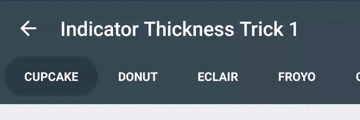
| stl_indicatorThickness | Thickness of the indicator |
| stl_indicatorWidth | Width of the indicator, default 'auto' |
| stl_indicatorCornerRadius | Radius of rounded corner the indicator |
| stl_overlineColor | Color of the top line |
| stl_overlineThickness | Thickness of the top line |
| stl_underlineColor | Color of the bottom line |
| stl_underlineThickness | Thickness of the bottom line |
| stl_dividerColor | Color of the dividers between tabs |
| stl_dividerColors | Multiple colors of the dividers between tabs, can set the color for each tab |
| stl_dividerThickness | Thickness of the divider |
| stl_defaultTabBackground | Background drawable of each tab. In general it set the StateListDrawable |
| stl_defaultTabTextAllCaps | If set to true, all tab titles will be upper case, default true |
| stl_defaultTabTextColor | Text color of the tab that was included by default |
| stl_defaultTabTextSize | Text size of the tab that was included by default |
| stl_defaultTabTextHorizontalPadding | Text layout padding of the tab that was included by default |
| stl_defaultTabTextMinWidth | Minimum width of tab |
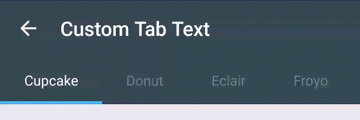
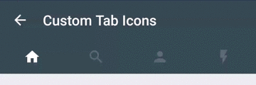
| stl_customTabTextLayoutId | Layout ID defined custom tab. If you do not specify a layout, use the default tab |
| stl_customTabTextViewId | Text view ID in a custom tab layout. If you do not define with customTabTextLayoutId, does not work |
| stl_distributeEvenly | If set to true, each tab is given the same weight, default false |
| stl_clickable | If set to false, disable the selection of a tab click, default true |
| stl_titleOffset | If set to 'auto_center', the slide position of the tab in the middle it will keep to the center. If specify a dimension it will be offset from the left edge, default 24dp |
| stl_drawDecorationAfterTab | Draw the decoration(indicator and lines) after drawing of tab, default false |
Notes: Both 'stl_indicatorAlwaysInCenter' and 'stl_distributeEvenly' if it is set to true, it will throw UnsupportedOperationException.
How to customize the tab
The customization of tab There are three ways.
- Customize the attribute
- SmartTabLayout#setCustomTabView(int layoutResId, int textViewId)
- SmartTabLayout#setCustomTabView(TabProvider provider)
If set the TabProvider, can build a view for each tab.
public class SmartTabLayout extends HorizontalScrollView {

    //...

    /**
     * Create the custom tabs in the tab layout. Set with
     * {@link #setCustomTabView(com.ogaclejapan.smarttablayout.SmartTabLayout.TabProvider)}
     */
    public interface TabProvider {

        /**
         * @return Return the View of {@code position} for the Tabs
         */
        View createTabView(ViewGroup container, int position, PagerAdapter adapter);

    }

    //...
}
How to use the utility
Utility has two types available to suit the Android support library.
- utils-v4 library contains the PagerAdapter implementation class for androidx.fragment.app.Fragment
- (Deprecated) utils-v13 library contains the PagerAdapter implementation class for android.app.Fragment
The two libraries have different Android support libraries that depend, but implemented functionality is the same.
PagerAdapter for View-based Page
ViewPagerItemAdapter adapter = new ViewPagerItemAdapter(ViewPagerItems.with(this)
        .add(R.string.title, R.layout.page)
        .add("title", R.layout.page)
        .create());

viewPager.setAdapter(adapter);

//...

public void onPageSelected(int position) {

  //.instantiateItem() from until .destroyItem() is called it will be able to get the View of page.
  View page = adapter.getPage(position);

}
PagerAdapter for Fragment-based Page
Fragment-based PagerAdapter There are two implementations. Please differences refer to the library documentation for Android.
- FragmentPagerItemAdapter extends FragmentPagerAdapter
- FragmentStatePagerItemAdapter extends FragmentStatePagerAdapter
FragmentPagerItemAdapter adapter = new FragmentPagerItemAdapter(
        getSupportFragmentManager(), FragmentPagerItems.with(this)
        .add(R.string.title, PageFragment.class),
        .add(R.string.title, WithArgumentsPageFragment.class, new Bundler().putString("key", "value").get()),
        .add("title", PageFragment.class)
        .create());

viewPager.setAdapter(adapter);

//...

public void onPageSelected(int position) {

  //.instantiateItem() from until .destoryItem() is called it will be able to get the Fragment of page.
  Fragment page = adapter.getPage(position);

}
Notes: If using fragment inside a ViewPager, Must be use Fragment#getChildFragmentManager().
Looking for iOS ?
Check WormTabStrip out.
LICENSE
Copyright (C) 2015 ogaclejapan
Copyright (C) 2013 The Android Open Source Project

Licensed under the Apache License, Version 2.0 (the "License");
you may not use this file except in compliance with the License.
You may obtain a copy of the License at

http://www.apache.org/licenses/LICENSE-2.0

Unless required by applicable law or agreed to in writing, software
distributed under the License is distributed on an "AS IS" BASIS,
WITHOUT WARRANTIES OR CONDITIONS OF ANY KIND, either express or implied.
See the License for the specific language governing permissions and
limitations under the License.