asotog / Squeezebox
Simple Angular 2 accordion component
Stars: ✭ 18
Programming Languages
typescript
32286 projects
Labels
Projects that are alternatives of or similar to Squeezebox
Ngx Admin
Customizable admin dashboard template based on Angular 10+
Stars: ✭ 23,286 (+129266.67%)
Mutual labels: angular2
Aws Cognito Angular Quickstart
An Angular(v5)-based QuickStart single-page app utilizing Amazon Cognito, S3, and DynamoDB (Serverless architecture)
Stars: ✭ 685 (+3705.56%)
Mutual labels: angular2
Material Dashboard Angular2
Material Dashboard Angular
Stars: ✭ 814 (+4422.22%)
Mutual labels: angular2
Angular2 Mdl
Angular 2, 4, 5, 6, 7, 8, 9, 10, 11 components, directives and styles based on material design lite (npm: @angular-mdl/core)
Stars: ✭ 562 (+3022.22%)
Mutual labels: angular2
Angular Commerce
Angular components for scaffolding online store
Stars: ✭ 526 (+2822.22%)
Mutual labels: angular2
Ngx Restangular
Restangular for Angular 2 and higher versions
Stars: ✭ 787 (+4272.22%)
Mutual labels: angular2
Angular2 Express Starter
Angular 8 and Express 👪 ( Heroku ready )
Stars: ✭ 565 (+3038.89%)
Mutual labels: angular2
Angular2 Notifications
A light and easy to use notifications library for Angular.
Stars: ✭ 735 (+3983.33%)
Mutual labels: angular2
Ngx Echarts
An angular (ver >= 2.x) directive for ECharts (ver >= 3.x)
Stars: ✭ 820 (+4455.56%)
Mutual labels: angular2
Ion2 Calendar
📅 A date picker components for ionic2 /ionic3 / ionic4
Stars: ✭ 537 (+2883.33%)
Mutual labels: angular2
Angular Froala Wysiwyg
Angular 4, 5, 6, 7, 8 and 9 plugin for Froala WYSIWYG HTML Rich Text Editor.
Stars: ✭ 696 (+3766.67%)
Mutual labels: angular2
Ng Select
A select library for Angular, with single and multiple select functionality
Stars: ✭ 16 (-11.11%)
Mutual labels: angular2
Ngx Permissions
Permission and roles based access control for your angular(angular 2,4,5,6,7,9+) applications(AOT, lazy modules compatible
Stars: ✭ 749 (+4061.11%)
Mutual labels: angular2

Squeezebox
Simple Angular 2 accordion component with smooth transitions/animations
Live Sample
Running sample can be seen here , but this is not for real use case, so for real usage take a look at the following references: installation via npm, typescript usage, etc
Installation via npm
npm install squeezebox --save
Typescript Usage
Import the module wherever is going to be used:
import {SqueezeBoxModule} from 'squeezebox/dist';
Import the module also in your app module, like:
@NgModule({
  imports:      [BrowserModule, SqueezeBoxModule], // here
  declarations: [AppComponent],
  bootstrap:    [AppComponent]
})
export class AppModule { }
Start using it in the component template:
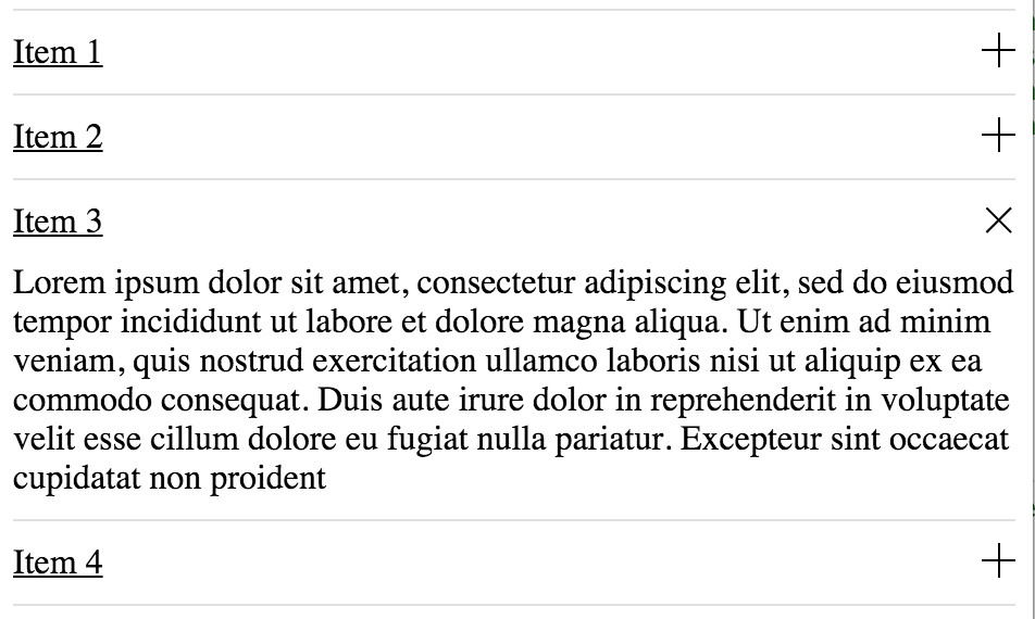
<squeezebox>
    <sb-item>
        <sb-item-head>Title 1</sb-item-head>
        <sb-item-body>Lorem ipsum dolor sit amet</sb-item-body>
    </sb-item>
</squeezebox>
or iterate a data list
<squeezebox>
    <sb-item  *ngFor="let item of itemsList">
        <sb-item-head>{{item.title}}</sb-item-head>
        <sb-item-body>{{item.description}}</sb-item-body>
    </sb-item>
</squeezebox>
Inputs
-
multiple:boolean (default: true) => this attribute enable/disable the multiple item expanded at the same time, for example:
... <squeezebox [multiple]="false"> ... -
collapsed:boolean (default: true) => this attribute enable/disable collapse from the beginning when component is rendered, for example:
... <sb-item [collapsed]="false"> ... -
collapsed:boolean (default: true) => this attribute enable/disable collapse from the beginning when component is rendered, for example:
... <sb-item [collapsed]="false"> ...
Outputs
-
onToggled => this output is triggered everytime item is expanded or collapsed, returns
trueif collapsed orfalseif expanded, for example:
<sb-item  *ngFor="let item of itemsList" (onToggled)="itemWasToggled($event)">
   ...
</sb-item>

...

itemWasToggled(event) {
    console.log('collapsed:', event);
}
...
Methods
-
refresh => This method is useful when accordion is hidden for example when using tabs or panels that go visible and hidden. It can be called from a SqueezeBox reference via
@ViewChildor@ViewChildren, for example following code can refresh all the available squeezeboxes in the current component :
...
@ViewChildren(SqueezeBox) squeezeboxes: QueryList<SqueezeBox>;
...

...
onTabActive(event:Event) {
    event.preventDefault();
    this.squeezeboxes.toArray().forEach(function(s) {
        s.refresh();
    });
}
...
SystemJS configuration
Will need to map the module:
map: {
    "squeezebox": "npm:squeezebox",
    ...
}
And set the package configuration:
packages: {
      ...
      squeezebox: {
        main: './index.ts',
        defaultExtension: 'ts'
      },
      ...
If you are not compiling third party javascript, you can try the following configuration so you can use generated files:
squeezebox: {
    defaultExtension: 'js',
    main: 'index.js'
}
Styles
Styles needs to be included, imported or copied, also feel free to modify the styles:
<link rel="stylesheet" href="/node_modules/squeezebox/styles.css">
Note that the project description data, including the texts, logos, images, and/or trademarks,
for each open source project belongs to its rightful owner.
If you wish to add or remove any projects, please contact us at [email protected].