hsuanxyz / Ion2 Calendar
Licence: mit
📅 A date picker components for ionic2 /ionic3 / ionic4
Stars: ✭ 537
Programming Languages
typescript
32286 projects
Labels
Projects that are alternatives of or similar to Ion2 Calendar
Ionic3 Components
A project full of ionic 3 components and samples - to make life easier :)
Stars: ✭ 1,689 (+214.53%)
Mutual labels: components, ionic, ionic3, ionic2, angular2, angular4
ionic-modal-custom-transitions
Add Custom Transitions to Ionic Modals.
Stars: ✭ 22 (-95.9%)
Mutual labels: ionic, angular2, angular4, ionic2, ionic3
angular-progress-bar
This component allow you to easy incorporate progress-bar to angular/ionic project, providing binding and color options
Stars: ✭ 26 (-95.16%)
Mutual labels: ionic, angular2, angular4, ionic2, ionic3
ionic-uuchat
基于ionic3,angular4的实时聊天app,兼容web端。该项目只是前端部分,所有数据需要请求后端服务器,需要配套express-uuchat-api使用。
Stars: ✭ 14 (-97.39%)
Mutual labels: ionic, angular2, angular4, ionic2, ionic3
Ionic2 Pokedex
🎮 Pokédex sample app developed with Ionic 2, Angular 2 and Apache Cordova. Using Pokéapi as source for data.
Stars: ✭ 143 (-73.37%)
Mutual labels: ionic, ionic3, ionic2, angular2, angular4
Dianoia-app
Mobile (Ionic 3 - Angular 4) app about non-pharmaceutical activities and information for people with dementia.
Stars: ✭ 13 (-97.58%)
Mutual labels: ionic, angular2, angular4, ionic2, ionic3
Chihu2
ionic2-example <吃乎2>混合开发-美食app 🍜 ☕️ 🍦 (This is a support android and apple ionic2 case, a food app)
Stars: ✭ 124 (-76.91%)
Mutual labels: ionic, ionic3, ionic2, angular4
Ionic2 Rating
⭐️ Angular star rating bar. Built for Ionic 2+.
Stars: ✭ 177 (-67.04%)
Mutual labels: ionic, ionic2, angular2, angular4
Wooionic3
An eCommerce App for WooCommerce stores using Ionic 3.
Stars: ✭ 208 (-61.27%)
Mutual labels: ionic, ionic3, ionic2, angular4
React Native Dates
React Native date / daterange picker and calendar
Stars: ✭ 145 (-73%)
Mutual labels: calendar, datepicker, daterangepicker, daterange
Calendarview
A highly customizable calendar library for Android, powered by RecyclerView.
Stars: ✭ 2,862 (+432.96%)
Mutual labels: calendar, datepicker, daterangepicker, daterange
react-native-daterange-picker
A React Native component for picking date ranges or single dates.
Stars: ✭ 86 (-83.99%)
Mutual labels: calendar, datepicker, range, daterange
Drip Ionic3
「水滴打卡」App Open Source Code Base On Ionic V3 Framework
Stars: ✭ 74 (-86.22%)
Mutual labels: ionic3, ionic2, angular2, angular4
ionic3-image-handling
In this ionic tutorial you will learn how to access the image gallery and take pictures from an ionic app. Also we will show you how to add a image cropper. This ionic tutorial includes a working ionic app example you can reuse for your needs.
Stars: ✭ 35 (-93.48%)
Mutual labels: ionic, angular4, ionic2, ionic3
Ng Lottie
Render After Effects animations on Angular based on lottie-web
Stars: ✭ 311 (-42.09%)
Mutual labels: ionic, ionic3, angular2, angular4
Ngx Daterangepicker Material
Pure Angular 2+ date range picker with material design theme, a demo here:
Stars: ✭ 169 (-68.53%)
Mutual labels: daterangepicker, daterange, angular2, angular4
Ionic2 Calendar
A calendar component based on Ionic framework
Stars: ✭ 338 (-37.06%)
Mutual labels: calendar, ionic, ionic3, ionic2
Ionic Audio
An audio player for Ionic 3 and Angular 4. Works with HTML 5 audio or native audio using Cordova Media plugin.
Stars: ✭ 332 (-38.18%)
Mutual labels: ionic3, ionic2, angular2, angular4
Ionic3 Chat
ionic3 chat example
Stars: ✭ 465 (-13.41%)
Mutual labels: components, ionic, ionic3, ionic2
fireblogger
Ionic 2 social media microblogging platform built with firebase 3 as backend
Stars: ✭ 54 (-89.94%)
Mutual labels: ionic, ionic2, ionic3
📅 ion2-calendar


English is not my native language; please excuse typing errors. 中文文档
- Support date range.
- Support multi date.
- Support HTML components.
- Disable weekdays or weekends.
- Setting days event.
- Setting localization.
- Material design.
Support
- ionic-angular
^3.0.02.x - @ionic/angular
4.0.0
Demo
live demo click me.
Usage
Installation
$ npm install ion2-calendar moment --save
Import module
import { NgModule } from '@angular/core';
import { IonicApp, IonicModule } from '@ionic/angular';
import { MyApp } from './app.component';
...
import { CalendarModule } from 'ion2-calendar';

@NgModule({
  declarations: [
    MyApp,
    ...
  ],
  imports: [
    IonicModule.forRoot(),
    CalendarModule
  ],
  bootstrap: [MyApp],
  ...
})
export class AppModule {}
Change Defaults
import { NgModule } from '@angular/core';
import { IonicApp, IonicModule } from 'ionic-angular';
import { MyApp } from './app.component';
...
import { CalendarModule } from "ion2-calendar";

@NgModule({
  declarations: [
    MyApp,
    ...
  ],
  imports: [
    IonicModule.forRoot(MyApp),
    // See CalendarComponentOptions for options
    CalendarModule.forRoot({
      doneLabel: 'Save',
      closeIcon: true
    })
  ],
  bootstrap: [IonicApp],
  entryComponents: [
    MyApp,
    ...
  ]
})
export class AppModule {}
Components Mode
Basic
<ion-calendar [(ngModel)]="date"
              (change)="onChange($event)"
              [type]="type"
              [format]="'YYYY-MM-DD'">
</ion-calendar>
import { Component } from '@angular/core';

@Component({
  selector: 'page-home',
  templateUrl: 'home.html'
})
export class HomePage {
  date: string;
  type: 'string'; // 'string' | 'js-date' | 'moment' | 'time' | 'object'
  constructor() { }

  onChange($event) {
    console.log($event);
  }
  ...
}
Date range
<ion-calendar [(ngModel)]="dateRange"
              [options]="optionsRange"
              [type]="type"
              [format]="'YYYY-MM-DD'">
</ion-calendar>
import { Component } from '@angular/core';
import { CalendarComponentOptions } from 'ion2-calendar';

@Component({
  selector: 'page-home',
  templateUrl: 'home.html'
})
export class HomePage {
  dateRange: { from: string; to: string; };
  type: 'string'; // 'string' | 'js-date' | 'moment' | 'time' | 'object'
  optionsRange: CalendarComponentOptions = {
    pickMode: 'range'
  };

  constructor() { }
  ...
}
Multi Date
<ion-calendar [(ngModel)]="dateMulti"
              [options]="optionsMulti"
              [type]="type"
              [format]="'YYYY-MM-DD'">
</ion-calendar>
import { Component } from '@angular/core';
import { CalendarComponentOptions } from 'ion2-calendar';

@Component({
  selector: 'page-home',
  templateUrl: 'home.html'
})
export class HomePage {
  dateMulti: string[];
  type: 'string'; // 'string' | 'js-date' | 'moment' | 'time' | 'object'
  optionsMulti: CalendarComponentOptions = {
    pickMode: 'multi'
  };

  constructor() { }
  ...
}
Input Properties
| Name | Type | Default | Description |
|---|---|---|---|
| options | CalendarComponentOptions | null | options |
| format | string | 'YYYY-MM-DD' | value format |
| type | string | 'string' | value type |
| readonly | boolean | false | readonly |
Output Properties
| Name | Type | Description |
|---|---|---|
| change | EventEmitter | event for model change |
| monthChange | EventEmitter | event for month change |
| select | EventEmitter | event for click day-button |
| selectStart | EventEmitter | event for click day-button |
| selectEnd | EventEmitter | event for click day-button |
CalendarComponentOptions
| Name | Type | Default | Description |
|---|---|---|---|
| from | Date | new Date() |
start date |
| to | Date | 0 (Infinite) | end date |
| color | string | 'primary' |
'primary', 'secondary', 'danger', 'light', 'dark' |
| pickMode | string | single |
'multi', 'range', 'single' |
| showToggleButtons | boolean | true |
show toggle buttons |
| showMonthPicker | boolean | true |
show month picker |
| monthPickerFormat | Array | ['JAN', 'FEB', 'MAR', 'APR', 'MAY', 'JUN', 'JUL', 'AUG', 'SEP', 'OCT', 'NOV', 'DEC'] |
month picker format |
| defaultTitle | string | '' | default title in days |
| defaultSubtitle | string | '' | default subtitle in days |
| disableWeeks | Array | [] |
week to be disabled (0-6) |
| monthFormat | string | 'MMM YYYY' |
month title format |
| weekdays | Array | ['S', 'M', 'T', 'W', 'T', 'F', 'S'] |
weeks text |
| weekStart | number |
0 (0 or 1) |
set week start day |
| daysConfig | Array<DaysConfig> | [] |
days configuration |
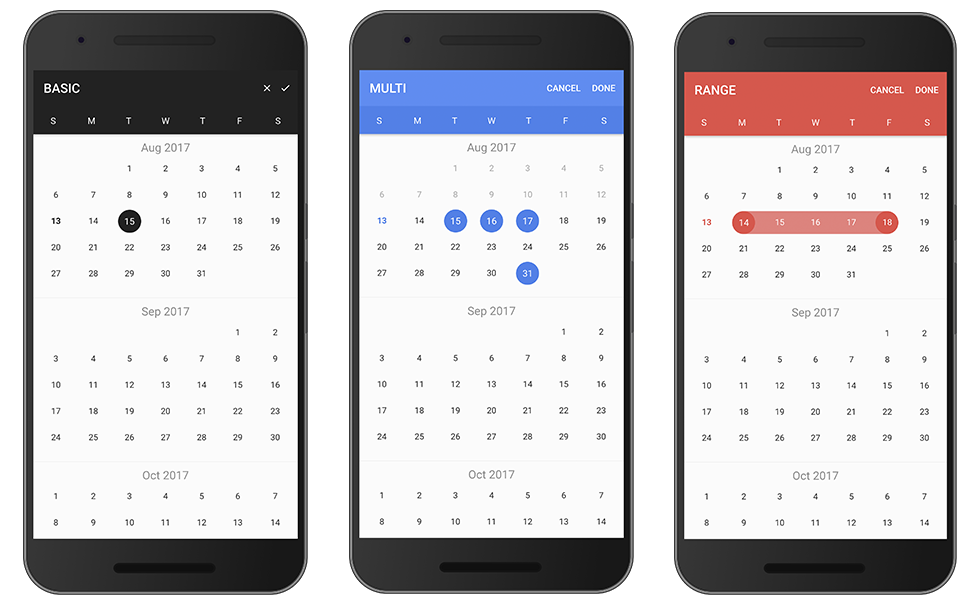
Modal Mode
Basic
Import ion2-calendar in component controller.
import { Component } from '@angular/core';
import { ModalController } from '@ionic/angular';
import {
  CalendarModal,
  CalendarModalOptions,
  DayConfig,
  CalendarResult
} from 'ion2-calendar';

@Component({
  selector: 'page-home',
  templateUrl: 'home.html'
})
export class HomePage {
  constructor(public modalCtrl: ModalController) {}

  openCalendar() {
    const options: CalendarModalOptions = {
      title: 'BASIC'
    };

    const myCalendar = await this.modalCtrl.create({
      component: CalendarModal,
      componentProps: { options }
    });

    myCalendar.present();

    const event: any = await myCalendar.onDidDismiss();
    const date: CalendarResult = event.data;
    console.log(date);
  }
}
Date range
Set pickMode to 'range'.
openCalendar() {
  const options: CalendarModalOptions = {
    pickMode: 'range',
    title: 'RANGE'
  };

  const myCalendar = await this.modalCtrl.create({
    component: CalendarModal,
    componentProps: { options }
  });

  myCalendar.present();

  const event: any = await myCalendar.onDidDismiss();
  const date = event.data;
  const from: CalendarResult = date.from;
  const to: CalendarResult = date.to;

  console.log(date, from, to);
}
Multi Date
Set pickMode to 'multi'.
openCalendar() {
  const options = {
    pickMode: 'multi',
    title: 'MULTI'
  };

  const myCalendar = await this.modalCtrl.create({
    component: CalendarModal,
    componentProps: { options }
  });

  myCalendar.present();

  const event: any = await myCalendar.onDidDismiss();
  const date: CalendarResult = event.data;
  console.log(date);
}
Disable weeks
Use index eg: [0, 6] denote Sunday and Saturday.
openCalendar() {
  const options: CalendarModalOptions = {
    disableWeeks: [0, 6]
  };

  const myCalendar = await this.modalCtrl.create({
    component: CalendarModal,
    componentProps: { options }
  });

  myCalendar.present();

  const event: any = await myCalendar.onDidDismiss();
  const date: CalendarResult = event.data;
  console.log(date);
}
Localization
your root module
import { NgModule, LOCALE_ID } from '@angular/core';
...

@NgModule({
  ...
  providers: [{ provide: LOCALE_ID, useValue: "zh-CN" }]
})

...
openCalendar() {
  const options: CalendarModalOptions = {
    monthFormat: 'YYYY 年 MM 月 ',
    weekdays: ['天', '一', '二', '三', '四', '五', '六'],
    weekStart: 1,
    defaultDate: new Date()
  };

  const myCalendar = await this.modalCtrl.create({
    component: CalendarModal,
    componentProps: { options }
  });

  myCalendar.present();

  const event: any = await myCalendar.onDidDismiss();
  const date: CalendarResult = event.data;
  console.log(date);
}
Days config
Configure one day.
openCalendar() {
  let _daysConfig: DayConfig[] = [];
  for (let i = 0; i < 31; i++) {
    _daysConfig.push({
      date: new Date(2017, 0, i + 1),
      subTitle: `$${i + 1}`
    })
  }

  const options: CalendarModalOptions = {
    from: new Date(2017, 0, 1),
    to: new Date(2017, 11.1),
    daysConfig: _daysConfig
  };

  const myCalendar = await this.modalCtrl.create({
    component: CalendarModal,
    componentProps: { options }
  });

  myCalendar.present();

  const event: any = await myCalendar.onDidDismiss();
  const date: CalendarResult = event.data;
  console.log(date);
}
API
Modal Options
| Name | Type | Default | Description |
|---|---|---|---|
| from | Date | new Date() |
start date |
| to | Date | 0 (Infinite) | end date |
| title | string | 'CALENDAR' |
title |
| color | string | 'primary' |
'primary', 'secondary', 'danger', 'light', 'dark' |
| defaultScrollTo | Date | none | let the view scroll to the default date |
| defaultDate | Date | none | default date data, apply to single |
| defaultDates | Array | none | default dates data, apply to multi |
| defaultDateRange | { from: Date, to: Date } | none | default date-range data, apply to range |
| defaultTitle | string | '' | default title in days |
| defaultSubtitle | string | '' | default subtitle in days |
| cssClass | string | '' |
Additional classes for custom styles, separated by spaces. |
| canBackwardsSelected | boolean | false |
can backwards selected |
| pickMode | string | single |
'multi', 'range', 'single' |
| disableWeeks | Array | [] |
week to be disabled (0-6) |
| closeLabel | string | CANCEL |
cancel button label |
| doneLabel | string | DONE |
done button label |
| clearLabel | string | null | clear button label |
| closeIcon | boolean | false |
show cancel button icon |
| doneIcon | boolean | false |
show done button icon |
| monthFormat | string | 'MMM YYYY' |
month title format |
| weekdays | Array | ['S', 'M', 'T', 'W', 'T', 'F', 'S'] |
weeks text |
| weekStart | number |
0 (0 or 1) |
set week start day |
| daysConfig | Array<DaysConfig> | [] |
days configuration |
| step | number | 12 |
month load stepping interval to when scroll |
| defaultEndDateToStartDate | boolean | false |
makes the end date optional, will default it to the start |
onDidDismiss Output { data } = event
| pickMode | Type |
|---|---|
| single | { date: CalendarResult } |
| range | { from: CalendarResult, to: CalendarResult } |
| multi | Array<CalendarResult> |
onDidDismiss Output { role } = event
| Value | Description |
|---|---|
| 'cancel' | dismissed by click the cancel button |
| 'done' | dismissed by click the done button |
| 'backdrop' | dismissed by click the backdrop |
DaysConfig
| Name | Type | Default | Description |
|---|---|---|---|
| cssClass | string | '' |
separated by spaces |
| date | Date | required | configured days |
| marked | boolean | false | highlight color |
| disable | boolean | false | disable |
| title | string | none | displayed title eg: 'today'
|
| subTitle | string | none | subTitle subTitle eg: 'New Year\'s'
|
CalendarResult
| Name | Type |
|---|---|
| time | number |
| unix | number |
| dateObj | Date |
| string | string |
| years | number |
| months | number |
| date | number |
Thanks for reading
Note that the project description data, including the texts, logos, images, and/or trademarks,
for each open source project belongs to its rightful owner.
If you wish to add or remove any projects, please contact us at [email protected].