storybook-eol / Storybook Addon A11y
REPO/PACKAGE MOVED - Storybook addon to help, improving accessibility within you're react components.
Stars: ✭ 37
Programming Languages
javascript
184084 projects - #8 most used programming language
Projects that are alternatives of or similar to Storybook Addon A11y
Storybook Addon Jest
REPO/PACKAGE MOVED - React storybook addon that show component jest report
Stars: ✭ 177 (+378.38%)
Mutual labels: addon, storybook
storybook-addon-next
A no config Storybook addon that makes Next.js features just work in Storybook
Stars: ✭ 184 (+397.3%)
Mutual labels: addon, storybook
Addon Jsx
This Storybook addon show you the JSX / template of the story
Stars: ✭ 209 (+464.86%)
Mutual labels: addon, storybook
Storybook Addon
Develop themable components with Emotion/Styled Components/Material-UI with help of Storybook & React Theming
Stars: ✭ 122 (+229.73%)
Mutual labels: addon, storybook
storybook-styled-components
No description or website provided.
Stars: ✭ 76 (+105.41%)
Mutual labels: addon, storybook
Storybook Addon Styled Component Theme
storybook addon
Stars: ✭ 168 (+354.05%)
Mutual labels: addon, storybook
storybook-xstate-addon
A storybook addon to assist with writing stories that rely on xstate
Stars: ✭ 48 (+29.73%)
Mutual labels: addon, storybook
React Storybook Addon Props Combinations
Given possible values for each prop, renders your component with all combinations of prop values.
Stars: ✭ 130 (+251.35%)
Mutual labels: addon, storybook
storybook-addon-headless
A Storybook addon to preview content from a headless CMS in components
Stars: ✭ 23 (-37.84%)
Mutual labels: addon, storybook
create-material-ui-app
create-react-app + storybook + storybook-addon-material-ui
Stars: ✭ 55 (+48.65%)
Mutual labels: addon, storybook
Storybook Addon Preview
Storybook Addon Preview can show user selected knobs in various framework code in Storybook
Stars: ✭ 43 (+16.22%)
Mutual labels: addon, storybook
Storycap
A Storybook Addon, Save the screenshot image of your stories 📷 via puppeteer.
Stars: ✭ 451 (+1118.92%)
Mutual labels: addon, storybook
Addon Smart Knobs
🧠 This Storybook plugin uses @storybook/addon-knobs but creates the knobs automatically based on PropTypes.
Stars: ✭ 215 (+481.08%)
Mutual labels: addon, storybook
storybook-addon-mock
This addon allows you to mock fetch or XMLHttpRequest in the storybook.
Stars: ✭ 67 (+81.08%)
Mutual labels: addon, storybook
msw-storybook-addon
Mock API requests in Storybook with Mock Service Worker.
Stars: ✭ 168 (+354.05%)
Mutual labels: addon, storybook
Storybook Addon Material Ui
Addon for storybook wich wrap material-ui components into MuiThemeProvider. 📃 This helps and simplifies development of material-ui based components.
Stars: ✭ 513 (+1286.49%)
Mutual labels: addon, storybook
Axegrinder
Crawl websites for accessibility issues from the command line.
Stars: ✭ 12 (-67.57%)
Mutual labels: accessibility
Ember Cli Updater
ember-cli addon to help you update your ember-cli application or addon.
Stars: ✭ 32 (-13.51%)
Mutual labels: addon
React Redux Saga Starter
Basic, Opinionated starter kit for React+Redux+Redux Saga with support for SCSS CSS Modules, Storybook, JEST testing, and ESLint
Stars: ✭ 12 (-67.57%)
Mutual labels: storybook
Osmnx Examples
Usage examples, demos, and tutorials for OSMnx.
Stars: ✭ 863 (+2232.43%)
Mutual labels: accessibility
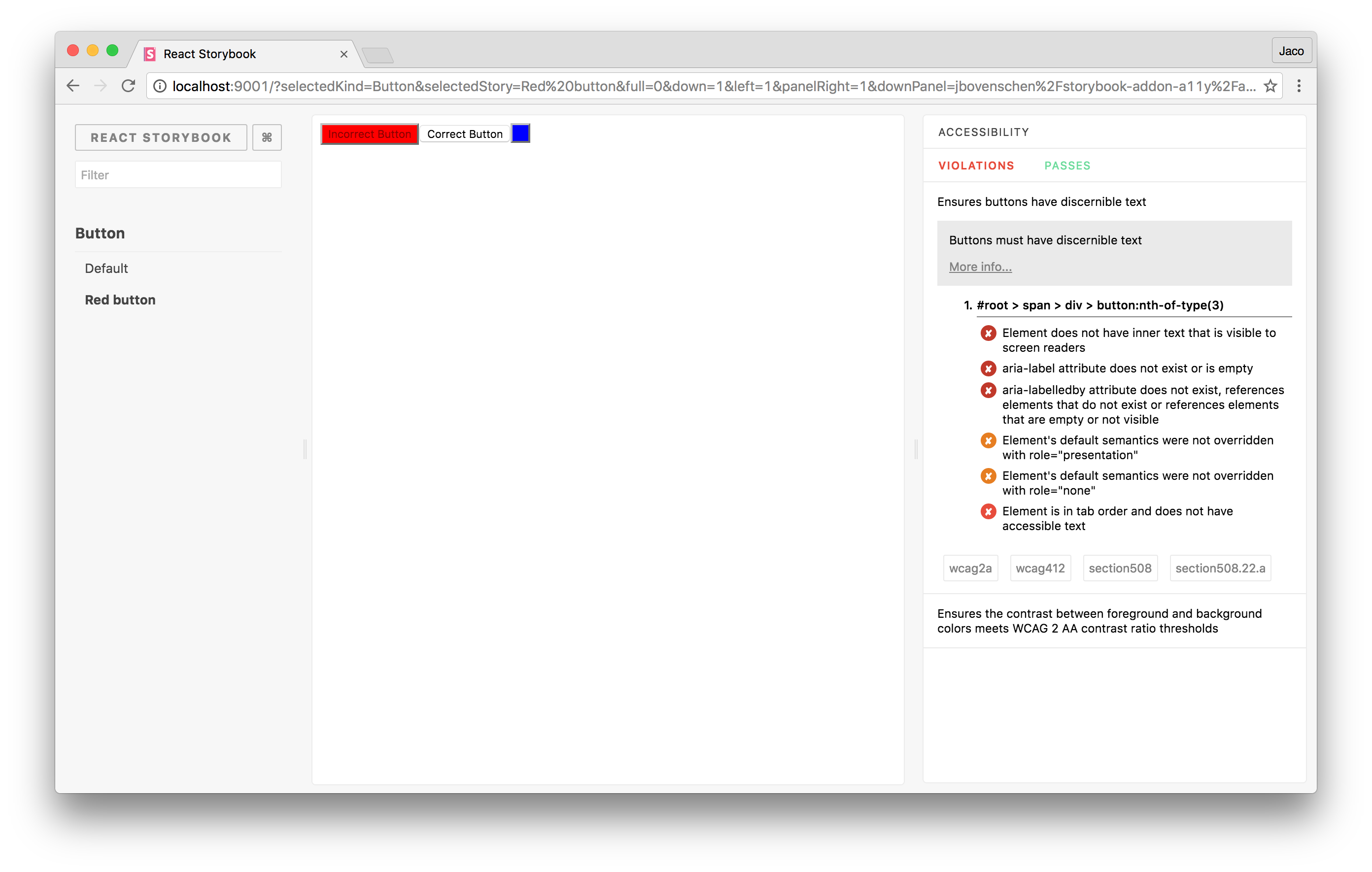
storybook-addon-a11y
This storybook addon can be helpfull to make your UI components more accessibile.
Getting started
First, install the addon.
$ npm install -D storybook-addon-a11y
Add this line to your addons.js file (create this file inside your storybook config directory if needed).
import 'storybook-addon-a11y/register';
import the 'checkA11y' decorator to check your stories for violations within your components.
import React from 'react';
import { storiesOf } from '@storybook/react';

import { checkA11y } from 'storybook-addon-a11y';

storiesOf('button', module)
  .addDecorator(checkA11y)
  .add('Accessible', () => (
    <button>
      Accessible button
    </button>
  ))
  .add('Inaccessible', () => (
    <button style={{ backgroundColor: 'red', color: 'darkRed', }}>
      Inaccessible button
    </button>
  ));
Note that the project description data, including the texts, logos, images, and/or trademarks,
for each open source project belongs to its rightful owner.
If you wish to add or remove any projects, please contact us at [email protected].

