All Projects β†’ gazpachu β†’ Sugui Design System

gazpachu / Sugui Design System

Licence: mit
A design system template for the SugUI components library based on styleguidist

Programming Languages

javascript
184084 projects - #8 most used programming language

Projects that are alternatives of or similar to Sugui Design System

Vitamin Web
Decathlon Design System libraries for web applications
Stars: ✭ 70 (+311.76%)
Mutual labels:  styleguide, design-system, ui-kit, ui-components
React95
πŸŒˆπŸ•Ή Refreshed Windows 95 style UI components for your React app
Stars: ✭ 4,877 (+28588.24%)
Mutual labels:  design-system, ui-kit, styled-components
sugui
UI Components library based on React, Styled Components and React Testing Library
Stars: ✭ 17 (+0%)
Mutual labels:  styled-components, ui-kit, design-system
Daisyui
⭐️ ⭐️ ⭐️ ⭐️ ⭐️  Tailwind Components
Stars: ✭ 382 (+2147.06%)
Mutual labels:  design-system, ui-kit, ui-components
Styled Bootstrap
πŸ’…πŸ» A styled-component implementation of Bootstrap
Stars: ✭ 154 (+805.88%)
Mutual labels:  styleguide, ui-components, styled-components
Css
The CSS design system that powers GitHub
Stars: ✭ 10,670 (+62664.71%)
Mutual labels:  styleguide, design-system, ui-components
Axiom React
Axiom - Brandwatch design system and React pattern library
Stars: ✭ 41 (+141.18%)
Mutual labels:  styleguide, design-system, ui-components
design-system
Nulogy Design System
Stars: ✭ 61 (+258.82%)
Mutual labels:  styleguide, styled-components, design-system
visage
Visage design system
Stars: ✭ 12 (-29.41%)
Mutual labels:  ui-kit, ui-components, design-system
Community Platform
A series of tools for the Precious Plastic community to collaborate around the world and tackle plastic waste.
Stars: ✭ 343 (+1917.65%)
Mutual labels:  design-system, styled-components
Uiengine
Workbench for UI-driven development
Stars: ✭ 349 (+1952.94%)
Mutual labels:  styleguide, design-system
Svelte Materialify
A Material UI Design Component library for Svelte heavily inspired by vuetify.
Stars: ✭ 351 (+1964.71%)
Mutual labels:  ui-kit, ui-components
Blocks.css
Add some dimension to your page with blocks πŸš€
Stars: ✭ 330 (+1841.18%)
Mutual labels:  design-system, ui-components
Windows 95 Ui Kit
πŸ’Ύ Windows 95 UI Kit made with Bootstrap 4 components
Stars: ✭ 294 (+1629.41%)
Mutual labels:  ui-kit, ui-components
Rimble Ui
React components that implement Rimble's Design System.
Stars: ✭ 357 (+2000%)
Mutual labels:  ui-components, styled-components
Welcome Ui
Customizable design system of @wttj with react β€’ styled-components β€’ styled-system β€’ reakit
Stars: ✭ 256 (+1405.88%)
Mutual labels:  design-system, styled-components
megafon-ui
MegaFon React UI
Stars: ✭ 16 (-5.88%)
Mutual labels:  ui-kit, ui-components
Cosmos
πŸ”­ Auth0 Design System
Stars: ✭ 512 (+2911.76%)
Mutual labels:  styleguide, design-system
Uiw
βš›οΈ @uiwjs A high quality UI Toolkit, A Component Library for React 16+.
Stars: ✭ 531 (+3023.53%)
Mutual labels:  ui-kit, ui-components
Primitives
An open-source UI component library for building high-quality, accessible design systems and web apps. Maintained by @modulz.
Stars: ✭ 644 (+3688.24%)
Mutual labels:  ui-kit, ui-components

PRs Welcome Build Status

sugUI Design System

This package works together with the sugUI components library.

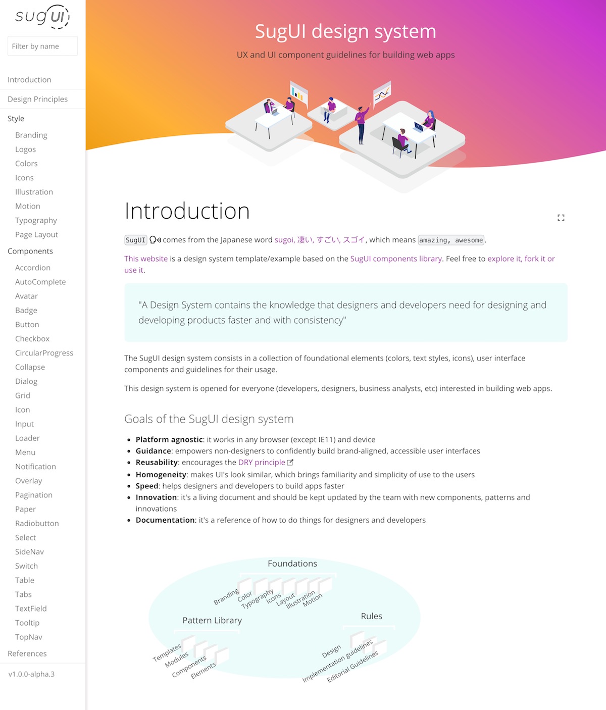
What can I do with this package?

Most users would fork this repo to create their custom design system based on the sugUI components library. If that's the case, you might want to setup your local environment to have both packages working together with hot reloading.

Local environment setup

First of all, clone this repository in your computer and install the dependencies using yarn or npm i.

Then clone the sugUI package into your computer. Keep the name of the folder as sugui. It should look something like this:

  • /users/your-user/dev/sugui
  • /users/your-user/dev/sugui-design-system

Now you need to create a symbolic link to the sugUI library.

Go to the /sugui folder and type:

yarn link

Then go to /sugui-design-system/node_modules folder and type:

yarn link sugui

Done!, now your sugui folder in node_modules will reference your cloned sugui folder, rather than the one downloaded from npm.

Now you can run the styleguide with yarn run styleguide and it will trigger the Hot Reload every time you change anything in sugui or in sugui-design-system.

Production build

Type:

yarn run styleguide:build

Deploy to Github pages

yarn run deploy
Note that the project description data, including the texts, logos, images, and/or trademarks, for each open source project belongs to its rightful owner. If you wish to add or remove any projects, please contact us at [email protected].