ViHtarb / Tooltip
Simple to use customizable Android Tooltips library based on PopupWindow
Stars: ✭ 236
Programming Languages
java
68154 projects - #9 most used programming language
Projects that are alternatives of or similar to Tooltip
Balloon
🎈 Modernized and sophisticated tooltips, fully customizable with an arrow and animations on Android.
Stars: ✭ 2,242 (+850%)
Mutual labels: tooltips
Ngx Popper
An angular wrapper for popper.js, great for tooltips and positioning popping elements
Stars: ✭ 183 (-22.46%)
Mutual labels: tooltips
Aws Secure Environment Accelerator
The AWS Secure Environment Accelerator is a tool designed to help deploy and operate secure multi-account, multi-region AWS environments on an ongoing basis. The power of the solution is the configuration file which enables the completely automated deployment of customizable architectures within AWS without changing a single line of code.
Stars: ✭ 203 (-13.98%)
Mutual labels: customizable
Discord Giveaways
🎉 Complete framework to facilitate the creation of giveaways using discord.js
Stars: ✭ 153 (-35.17%)
Mutual labels: customizable
Startup Landing
Collection of free top of the line startup landing templates built using react/nextjs/gatsby. Free to download, simply edit and deploy! Updated weekly!
Stars: ✭ 176 (-25.42%)
Mutual labels: customizable
Pull To Refresh.rentals Ios
This project aims to provide a simple and customizable pull to refresh implementation. Made in Yalantis
Stars: ✭ 2,171 (+819.92%)
Mutual labels: customizable
Strapi Plugin Comments
A plugin for Strapi Headless CMS that provides end to end comments feature with their moderation panel, bad words filtering, abuse reporting and more.
Stars: ✭ 138 (-41.53%)
Mutual labels: customizable
Ragtextfield
Subclass of UITextField that adds an animated placeholder and an optional hint label below the text.
Stars: ✭ 227 (-3.81%)
Mutual labels: customizable
Sublime Da Ui
Adaptive, Customizable, Elegant UI Theme and Color Schemes for Sublime Text 3
Stars: ✭ 180 (-23.73%)
Mutual labels: customizable
The Plain Contract
The Plain Contract is a crowsourced, open source freelance contract template, written in plain language.
Stars: ✭ 210 (-11.02%)
Mutual labels: customizable
Animatedgraph
Animated Graph which you can include in your application to show information in more attractive way
Stars: ✭ 162 (-31.36%)
Mutual labels: customizable
Frameless Titlebar
Customizable Electron Titlebar for frameless windows
Stars: ✭ 167 (-29.24%)
Mutual labels: customizable
Bitglitter
⚡ Embed data payloads inside of ordinary images or video with high-performance animated 2-D barcodes. (Python library)
Stars: ✭ 193 (-18.22%)
Mutual labels: customizable
Niui
Lightweight, feature-rich, accessible front-end library
Stars: ✭ 152 (-35.59%)
Mutual labels: tooltips
Customasm
💻 An assembler for custom, user-defined instruction sets! https://hlorenzi.github.io/customasm/web/
Stars: ✭ 211 (-10.59%)
Mutual labels: customizable
Flutter Timeline
⌚️ A general flutter timeline widget based on real-world application references
Stars: ✭ 142 (-39.83%)
Mutual labels: customizable
React Native Render Html
iOS/Android pure javascript react-native component that renders your HTML into 100% native views
Stars: ✭ 2,617 (+1008.9%)
Mutual labels: customizable
Swiftpagemenu
Customizable Page Tab Menu Controller 👍
Stars: ✭ 233 (-1.27%)
Mutual labels: customizable
Customizablecalendar
CustomizableCalendar is a library that allows you to create your calendar, customizing UI and behaviour
Stars: ✭ 214 (-9.32%)
Mutual labels: customizable
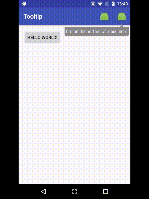
Android Tooltips

Simple to use customizable Android Tooltips library based on PopupWindow. This Tooltips does not require any custom layout. It works as PopupWindow.
Getting started
SNAPSHOTS
For using snapshots of development versions you need include the snapshots repo by adding the snapshot build to a dependent project. To do this add the following to your build.gradle project(not module) file
maven {
    url "https://oss.sonatype.org/content/repositories/snapshots"
}
Gradle
dependencies {
    compile 'com.github.vihtarb:tooltip:1.0.0-alpha05-SNAPSHOT'
}
Maven
<dependency>
    <groupId>com.github.vihtarb</groupId>
    <artifactId>tooltip</artifactId>
    <version>1.0.0-alpha05-SNAPSHOT</version>
</dependency>
Changelog-SNAPSHOTS
1.0.0-alpha05-SNAPSHOT
- Fixed #58 issue
- Removed
android:fontFamilyandandroid:typefaceattributes support for simple Tooltip. UsetextAppearanceinstead - Removed deprecated classes from simple
Tooltipmodule - Implemented
tooltipStyleattribute
1.0.0-alpha04-SNAPSHOT
- Fixed #57 issue
1.0.0-alpha03-SNAPSHOT
- Migrated to androidx
1.0.0-alpha02-SNAPSHOT
- Migrated to Java 1.8
- Fixed simple Tooltip
Builder.setText(int)method - Implemented sets Tooltip
setFocusable(isCancelable)issue #55
1.0.0-alpha01-SNAPSHOT
- Library splitted to
coreanddefault Tooltipmodules. - First version with a primitive implementation of customization. From this version you can customize tooltip as you need. To do this you need extends from
core.Tooltipandcore.Tooltip.Builderclasses and implementcore.Tooltip.createContentViewmethod. For example look todetault Tooltipimplementation.
USAGE
Tooltip tooltip = new Tooltip.Builder(anchorView)
        .setText("Hello tooltip")
        .show();
Useful methods
Builder:
Builder(MenuItem anchorMenuItem)Builder(MenuItem anchorMenuItem, @StyleRes int resId)Builder(View anchorView)Builder(View anchorView, @StyleRes int resId)-
setCancelable(boolean cancelable)- dismiss on outside touch. Default isfalse -
setDismissOnClick(boolean isDissmissOnClick)- dismiss on inside touch. Default isfalse setArrowEnabled(boolean isArrowEnabled)-
setBackgroundColor(@ColorInt int color)- background color. Default isColor.GRAY -
setCornerRadius(@DimenRes int resId)- background drawable corner radius from resources -
setCornerRadius(float radius)- background drawable corner radius setArrowHeight(@DimenRes int resId)setArrowHeight(float height)setArrowWidth(@DimenRes int resId)setArrowWidth(float width)-
setArrow(@DrawableRes int resId)- custom arrow drawable from resources -
setArrow(Drawable arrowDrawable)- custom arrow drawable -
setMargin(@DimenRes int resId)- margin between arrow and anchor view from resources -
setMargin(float margin)- margin between arrow and anchor view -
setPadding(int padding)- content padding -
setPadding(float padding)- deprecated, usesetPadding(int padding)instead -
setGravity(int gravity)- Tooltip gravity. Default isGravity.BOTTOM setMaxWidth(int gravity)setDrawablePadding(int gravity)setDrawableBottom(@DrawableRes int resId)setDrawableBottom(Drawable drawable)setDrawableEnd(@DrawableRes int resId)setDrawableEnd(Drawable drawable)setDrawableStart(@DrawableRes int resId)setDrawableStart(Drawable drawable)setDrawableTop(@DrawableRes int resId)setDrawableTop(Drawable drawable)setTextAppearance(@StyleRes int resId)setText(@StringRes int resId)setText(String text)setTextSize(@DimenRes int resId)setTextSize(float size)setTextColor(@ColorInt int color)setTextStyle(int style)setLineSpacing(@DimenRes int addResId, float mult)setLineSpacing(float add, float mult)setTypeface(Typeface typeface)setOnClickListener(OnClickListener listener)setOnLongClickListener(OnLongClickListener listener)setOnDismissListener(OnDismissListener listener)-
build()- creates and returns new Tooltip -
show()- creates, shows and returns new Tooltip
Tooltip:
-
isShowing()- retruns is Tooltip showing -
show()- show Tooltip if not showing -
dismiss()- dismissing Tooltip setOnClickListener(OnClickListener listener)setOnLongClickListener(OnLongClickListener listener)setOnDismissListener(OnDismissListener listener)
Styleable
You can create Tooltip with custom style
Tooltip tooltip = new Tooltip.Builder(anchorView, R.style.tooltip)
        .setText("Hello tooltip")
        .show();
Attributes
-
<attr name="cancelable" format="boolean"/>- dismiss on outside touch. Default isfalse -
<attr name="dismissOnClick" format="boolean"/>- dismiss on inside touch. Default isfalse <attr name="arrowEnabled" format="boolean"/>-
<attr name="backgroundColor" format="color"/>- background color. Default isColor.GRAY -
<attr name="cornerRadius" format="dimension"/>- background drawable corner radius <attr name="arrowHeight" format="dimension"/><attr name="arrowWidth" format="dimension"/><attr name="arrowDrawable" format="reference"/>-
<attr name="margin" format="dimension"/>- margin between arrow and anchor view <attr name="textAppearance" format="reference"/>-
<attr name="android:padding"/>- content padding -
<attr name="android:gravity"/>- Tooltip gravity <attr name="android:maxWidth"/><attr name="android:drawablePadding"/><attr name="android:drawableBottom"/><attr name="android:drawableEnd"/><attr name="android:drawableStart"/><attr name="android:drawableTop"/><attr name="android:text"/><attr name="android:textSize"/><attr name="android:textColor"/><attr name="android:textStyle"/><attr name="android:fontFamily"/><attr name="android:typeface"/><attr name="android:lineSpacingExtra"/><attr name="android:lineSpacingMultiplier"/>
RELEASES
Gradle
dependencies {
    compile 'com.github.vihtarb:tooltip:0.2.0'
}
Maven
<dependency>
    <groupId>com.github.vihtarb</groupId>
    <artifactId>tooltip</artifactId>
    <version>0.2.0</version>
</dependency>
Changelog
0.2.0
- Implemented setting compound drawables(and drawables padding) by
BuildermethodssetDrawableStart,setDrawableEnd,setDrawableBottom,setDrawableTopand for paddingsetDrawablePadding(int)or styleable attributesandroid:drawableStart,android:drawableEnd,android:drawableBottom,android:drawableTopand for paddingandroid:drawablePadding(@antoninovitale) - Implemented setting max
Tooltipwidth byBuildermethodsetMaxWidth(int)or styleable attributeandroid:maxWidth(@CapnSpellcheck) - Implemented RTL layout direction supporting
- Implemented use
Gravity.LEFTandGravity.RIGHTasTooltipgravity, but it strongly not recommended - Implemented smooth
Tooltiparrow - Fixed
Tooltipcontent view padding -
BuildermethodsetPadding(float)marked as deprecated usesetPadding(int)instead -
BuildermethodsetPadding(int)now sets padding from argument not from resources - Implemented arrow disabling by
BuildermethodsetArrowEnabled(boolean)or styleable attributearrowEnabled -
#26 Fixed issue with
Exception android.view.WindowManager$BadTokenException:... -
#19 Fixed issue with
Tooltipmoving on scrolling/updating list views -
#13 Implemented supporting
CharSequencefor text instead ofString(@gkravas)
0.1.9
- Min SDK changed from 11 to 14
- Implemented
OnClickListenerandOnLongClickListenerlisteners - Implemented
setOnClickListenerandsetOnLongClickListenermethods inBuilderandTooltip - Implemented
setOnDismissListenerinTooltip - Implemented customizing arrow drawable by
BuildermethodsetArrow(Drawable)and styleable attributearrowDrawable - Reimplemented
TooltipActionViewclass - Removed
Context contextargument inBuilderconstructors with second argumentMenuItem anchorMenuItem - Fixed
Activity has leaked window
Future Work
- Animations
- Elevation(Shadow)
Known issues
-
#17 As temporary fix use it:
compile ('com.github.vihtarb:tooltip:version') { exclude module: "support-compat" }
License(MIT License)
The MIT License (MIT)

Copyright (c) 2016. Viн[email protected]ь

Permission is hereby granted, free of charge, to any person obtaining a copy
of this software and associated documentation files (the "Software"), to deal
in the Software without restriction, including without limitation the rights
to use, copy, modify, merge, publish, distribute, sublicense, and/or sell
copies of the Software, and to permit persons to whom the Software is
furnished to do so, subject to the following conditions:

The above copyright notice and this permission notice shall be included in
all copies or substantial portions of the Software.

THE SOFTWARE IS PROVIDED "AS IS", WITHOUT WARRANTY OF ANY KIND, EXPRESS OR
IMPLIED, INCLUDING BUT NOT LIMITED TO THE WARRANTIES OF MERCHANTABILITY,
FITNESS FOR A PARTICULAR PURPOSE AND NONINFRINGEMENT. IN NO EVENT SHALL THE
AUTHORS OR COPYRIGHT HOLDERS BE LIABLE FOR ANY CLAIM, DAMAGES OR OTHER
LIABILITY, WHETHER IN AN ACTION OF CONTRACT, TORT OR OTHERWISE, ARISING FROM,
OUT OF OR IN CONNECTION WITH THE SOFTWARE OR THE USE OR OTHER DEALINGS IN
THE SOFTWARE.
Note that the project description data, including the texts, logos, images, and/or trademarks,
for each open source project belongs to its rightful owner.
If you wish to add or remove any projects, please contact us at [email protected].