twig-bulma-form-theme
A Twig 3.x Form Theme for Bulma 0.9.x for use with Symfony 5/6 framework
Twig (3.x) Bulma (v0.9.x) Form theme
Bulma is a modern CSS framework based on Flexbox. This form theme was created for use with the Twig Template engine. Twig is a modern template engine for PHP.
This form theme was built to work with Twig in combination with the Symfony Framework for websites built on top of the Bulma CSS framework.
Index
How to use the form theme:
The easiest way to make use of the form theme in Symfony is to set this form theme in the configuration file. Have a look at the Symfony documentation. Also example files are provided in this repository.
Icon support:
The theme also supports the use of icons. Bulma comes with support for the Font Awesome icon toolkit. It's realy easy to make a form widget support these themes with Symfony Form Type Extensions. An example Form Type Extension is provided within the examples directory in this repository.
Examples
widget sizes:
Widget size can be set by just using a classname. The following example is for use with the Symfony Form Type.
$builder->add('firstname', TextType::class, [
    'attr' => [
        'class' => 'is-large'
    ],
    ...
]);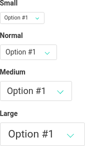
NOTE
The default size needs no extra class. Suppoted sizes are is-small, is-medium and is-large.
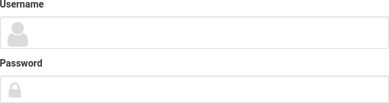
Icons:
The following example is for use with the Symfony Form Type. This example is based on the Form Type Extension provided in the documentation examples directory.
$builder
    // Username widget with user icon
    ->add('username', TextType::class, [
	    'bulma_icon' => [
            'icon' => 'user',
            'position' => 'left',
        ],
        ...
    ])
    // Password widget with lock icon
    ->add('password', PasswordType::class, [
        'bulma_icon' => [
            'icon' => 'lock',
            'position' => 'left',
        ],
        ...
    ])
;
Need more icons?
Have a look at the bulma.io and fontawesome.io website to find out which icons are available and how to implement them.
Dropdown with ChoiceType:
The following example is for use with the Symfony Form Type 'ChoiceType'
->add('checkbox_dropdown', Type\ChoiceType::class, [
    'choices' => [
        // choice groups are supported (including 'group_by' method)
        'Group header 1' => [
            'Checkbox 1' => 1,
            'Checkbox 2' => 2,
        ],
        'Group header 2' => [
            'Checkbox 3' => 3,
            'Checkbox 4' => 4,
        ],
    ],
    'label' => false, // = don't render top label (trigger button label is always rendered)
    'expanded' => true, // required to use dropdown
    'multiple' => true, // true = checkboxes, false = radio buttons
    'attr' => [
        'dropdown' => true, // required to use dropdown
        'dropdown_arrow_icon' => false, // default to true
        'class' => 'is-rounded is-outlined', // added to dropdown trigger button
    ],
])
Render it inside a form:
<!-- easiest way to render -->
{{ form_row(form.checkbox_dropdown) }}

<!-- if you need to customize a little bit -->
<div class="field">
    <!-- remove form_label() if you don't want the top label -->
    <!-- but still a customizable label inside dropdown trigger button -->
    {{ form_label(form.checkbox_dropdown) }}
    <div class="dropdown">
        {{ form_widget(form.checkbox_dropdown) }}
    </div>
</div>
Sources
Have a look at the following websites and their documentation for more information about this subject.
- The Bulma CSS framework website;
- The Font Awesome font and CSS toolkit;
- The Twig Template engine for PHP website;
- The Symfony PHP framework website.