red-data-tools / Unicode_plot.rb
Licence: mit
Plot your data by Unicode characters
Stars: ✭ 127
Programming Languages
ruby
36898 projects - #4 most used programming language
Projects that are alternatives of or similar to Unicode plot.rb
Superset
Apache Superset is a Data Visualization and Data Exploration Platform
Stars: ✭ 42,634 (+33470.08%)
Mutual labels: data-science, data-visualization
Aethos
Automated Data Science and Machine Learning library to optimize workflow.
Stars: ✭ 94 (-25.98%)
Mutual labels: data-science, data-visualization
My Journey In The Data Science World
📢 Ready to learn or review your knowledge!
Stars: ✭ 1,175 (+825.2%)
Mutual labels: data-science, data-visualization
Pythondata
repo for code published on pythondata.com
Stars: ✭ 113 (-11.02%)
Mutual labels: data-science, data-visualization
Livechart
Android library to draw beautiful and rich line charts.
Stars: ✭ 78 (-38.58%)
Mutual labels: data-science, data-visualization
Awesome Bigdata
A curated list of awesome big data frameworks, ressources and other awesomeness.
Stars: ✭ 10,478 (+8150.39%)
Mutual labels: data-science, data-visualization
Graphia
A visualisation tool for the creation and analysis of graphs
Stars: ✭ 67 (-47.24%)
Mutual labels: data-science, data-visualization
Sweetviz
Visualize and compare datasets, target values and associations, with one line of code.
Stars: ✭ 1,851 (+1357.48%)
Mutual labels: data-science, data-visualization
Krisk
Statistical Interactive Visualization with pandas+Jupyter integration on top of Echarts.
Stars: ✭ 111 (-12.6%)
Mutual labels: data-science, data-visualization
Datasist
A Python library for easy data analysis, visualization, exploration and modeling
Stars: ✭ 123 (-3.15%)
Mutual labels: data-science, data-visualization
Just Dashboard
📊 📋 Dashboards using YAML or JSON files
Stars: ✭ 1,511 (+1089.76%)
Mutual labels: data-science, data-visualization
Awesome Business Intelligence
Actively curated list of awesome BI tools. PRs welcome!
Stars: ✭ 1,157 (+811.02%)
Mutual labels: data-science, data-visualization
Dex
Dex : The Data Explorer -- A data visualization tool written in Java/Groovy/JavaFX capable of powerful ETL and publishing web visualizations.
Stars: ✭ 1,238 (+874.8%)
Mutual labels: data-science, data-visualization
Linkedingiveaway
👨🏽🏫You can learn about anything over here. What Giveaways I do and why it's important in today's modern world. Are you interested in Giveaway's?🔋
Stars: ✭ 67 (-47.24%)
Mutual labels: data-science, data-visualization
Vizuka
Explore high-dimensional datasets and how your algo handles specific regions.
Stars: ✭ 100 (-21.26%)
Mutual labels: data-science, data-visualization
Verticapy
VerticaPy is a Python library that exposes sci-kit like functionality to conduct data science projects on data stored in Vertica, thus taking advantage Vertica’s speed and built-in analytics and machine learning capabilities.
Stars: ✭ 59 (-53.54%)
Mutual labels: data-science, data-visualization
Seaborn
Statistical data visualization in Python
Stars: ✭ 9,007 (+6992.13%)
Mutual labels: data-science, data-visualization
Dash Stock Tickers Demo App
Dash Demo App - Stock Tickers
Stars: ✭ 108 (-14.96%)
Mutual labels: data-science, data-visualization
Seaborn Tutorial
This repository is my attempt to help Data Science aspirants gain necessary Data Visualization skills required to progress in their career. It includes all the types of plot offered by Seaborn, applied on random datasets.
Stars: ✭ 114 (-10.24%)
Mutual labels: data-science, data-visualization
UnicodePlot - Plot your data by Unicode characters
UnicodePlot provides the feature to make charts with Unicode characters.
Install
$ gem install unicode_plot
Usage
require 'unicode_plot'

x = 0.step(3*Math::PI, by: 3*Math::PI / 30)
y_sin = x.map {|xi| Math.sin(xi) }
y_cos = x.map {|xi| Math.cos(xi) }
plot = UnicodePlot.lineplot(x, y_sin, name: "sin(x)", width: 40, height: 10)
UnicodePlot.lineplot!(plot, x, y_cos, name: "cos(x)")
plot.render
You can get the results below by running the above script:

Supported charts
barplot
UnicodePlot.barplot(data: {'foo': 20, 'bar': 50}, title: "Bar").render

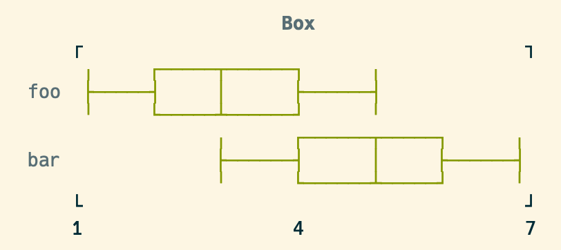
boxplot
UnicodePlot.boxplot(data: {foo: [1, 3, 5], bar: [3, 5, 7]}, title: "Box").render

densityplot
x = Array.new(500) { 20*rand - 10 } + Array.new(500) { 6*rand - 3 }
y = Array.new(1000) { 30*rand - 10 }
UnicodePlot.densityplot(x, y, title: "Density").render

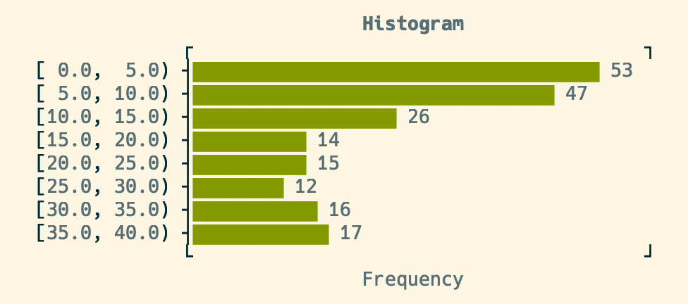
histogram
x = Array.new(100) { rand(10) } + Array.new(100) { rand(30) + 10 }
UnicodePlot.histogram(x, title: "Histogram").render

lineplot
See Usage section above.
scatterplot
x = Array.new(50) { rand(20) - 10 }
y = x.map {|xx| xx*rand(30) - 10 }
UnicodePlot.scatterplot(x, y, title: "Scatter").render

Acknowledgement
This library is strongly inspired by UnicodePlot.jl.
License
MIT License
Author
Note that the project description data, including the texts, logos, images, and/or trademarks,
for each open source project belongs to its rightful owner.
If you wish to add or remove any projects, please contact us at [email protected].
