BalestraPatrick / Valuestepper
Programming Languages
Labels
Projects that are alternatives of or similar to Valuestepper
ValueStepper
Description
ValueStepper is an improved replication of Apple's UIStepper object. The problem with UIStepper is that it doesn't display the value to the user. I was tired of creating a simple UILabel just to show the value in the UI. ValueStepper integrates the value in a UILabel between the increase and decrease buttons. It's as easy as that.
Usage
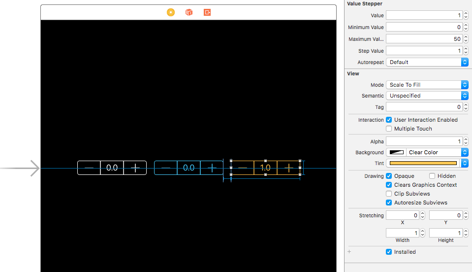
To see it in action, run the example project, clone the repo, and run pod install from the Example directory first. The example project shows how to set up ValueStepper in Storyboard.
Storyboard
Drag a UIView object and set the class to ValueStepper (if needed set the module to ValueStepper too). You can now customize all the properties in IB such as the minimumValue, tintColor and so on. Make sure to set the width to 149 and the height to 29 which are the default values. Create an @IBAction on the ValueChanged control event to be notified when the value changes.

Programmatically
import ValueStepper

let valueStepper: ValueStepper = {
    let stepper = ValueStepper()
    stepper.tintColor = .whiteColor()
    stepper.minimumValue = 0
    stepper.maximumValue = 1000
    stepper.stepValue = 100
    return stepper
}()

override func viewDidLoad() {
    super.viewDidLoad()
    valueStepper.addTarget(self, action: "valueChanged:", forControlEvents: .ValueChanged)
}

@IBAction func valueChanged1(sender: ValueStepper) {
    // Use sender.value to do whatever you want
}
Customizations
These are the available properties with the relative documentation.
/// Current value and sends UIControlEventValueChanged when modified.
@IBInspectable public var value: Double = 0.0

/// Minimum value that must be less than the maximum value.
@IBInspectable public var minimumValue: Double = 0.0

/// Maximum value that must be greater than the minimum value.
@IBInspectable public var maximumValue: Double = 1.0

/// When set to true, the user can tap the label and manually enter a value.
@IBInspectable public var enableManualEditing: Bool = false

/// The value added/subtracted when one of the two buttons is pressed.
@IBInspectable public var stepValue: Double = 0.1

/// When set to true, keeping a button pressed will continuously increase/decrease the value every 0.1s.
@IBInspectable public var autorepeat: Bool = true

/// The background color of the stepper buttons while pressed.
@IBInspectable public var highlightedBackgroundColor: UIColor = UIColor(white: 1.0, alpha: 0.1)

/// The color of the +/- icons when in disabled state.
@IBInspectable public var disabledIconButtonColor: UIColor = UIColor.gray

/// The color of the +/- buttons background when in disabled state.
@IBInspectable public var disabledBackgroundButtonColor: UIColor = UIColor.clear

/// The background color of the plus and minus buttons.
@IBInspectable public var backgroundButtonColor: UIColor = UIColor.clear

/// The background color of the center view that contains the value label.
@IBInspectable public var backgroundLabelColor: UIColor = UIColor.clear

/// The text color of the value label in positioned in the center.
@IBInspectable public var labelTextColor: UIColor = UIColor.white

/// Describes the format of the value.
public var numberFormatter: NumberFormatter

// Default width of the stepper. Taken from the official UIStepper object.
public let defaultWidth = 141.0

// Default height of the stepper. Taken from the official UIStepper object.
public let defaultHeight = 29.0

/// Value label that displays the current value displayed at the center of the stepper.
public let valueLabel: UILabel
Installation
ValueStepper is available through CocoaPods. To install
it, simply add the following line to your Podfile:
pod 'ValueStepper'
You can also use Carthage if you prefer. Add this line to your Cartfile.
github "BalestraPatrick/ValueStepper"
Requirements
iOS 8.3 and Swift 4.0 are required.
- If you are using Swift 5, use the master branch.
- If you are using Swift 4.2, use the swift-4.2 branch.
- If you are using Swift 3.2, use the swift-3.2 branch.
- If you are using Swift 2.3, use the swift-2.3 branch.
Author
I'm Patrick Balestra. Email: [email protected] Twitter: @BalestraPatrick.
License
ValueStepper is available under the MIT license. See the LICENSE file for more info.
Inspired by GMStepper. Thanks to Gmertk for the interesting and useful related blog post.


