All Projects → daveliepmann → Vdquil

daveliepmann / Vdquil

Licence: mit
Visualizing Data (in Quil!)

Programming Languages

clojure
4091 projects
clj
17 projects

Projects that are alternatives of or similar to Vdquil

Leaflet Swoopy
⤵️ Swoopy Arrow Plugin for Leaflet
Stars: ✭ 52 (-20%)
Mutual labels:  data-visualization
Chart
Create the most popular types of charts by real or random data
Stars: ✭ 1,101 (+1593.85%)
Mutual labels:  data-visualization
Tsne Cuda
GPU Accelerated t-SNE for CUDA with Python bindings
Stars: ✭ 1,120 (+1623.08%)
Mutual labels:  data-visualization
Running page
Make your own running home page
Stars: ✭ 1,078 (+1558.46%)
Mutual labels:  data-visualization
Openrefine
OpenRefine is a free, open source power tool for working with messy data and improving it
Stars: ✭ 8,531 (+13024.62%)
Mutual labels:  data-visualization
Verticapy
VerticaPy is a Python library that exposes sci-kit like functionality to conduct data science projects on data stored in Vertica, thus taking advantage Vertica’s speed and built-in analytics and machine learning capabilities.
Stars: ✭ 59 (-9.23%)
Mutual labels:  data-visualization
Helix Toolkit
Helix Toolkit is a collection of 3D components for .NET.
Stars: ✭ 1,050 (+1515.38%)
Mutual labels:  data-visualization
Daru View
daru-view is for easy and interactive plotting in web application & IRuby notebook. daru-view is a plugin gem to the existing daru gem.
Stars: ✭ 65 (+0%)
Mutual labels:  data-visualization
Github Patterns
📈 What languages got the most GitHub stars in 2016?
Stars: ✭ 58 (-10.77%)
Mutual labels:  data-visualization
Victory Pie
D3 pie & donut chart component for React
Stars: ✭ 61 (-6.15%)
Mutual labels:  data-visualization
Deep Viz
A React component library, providing concise and beautiful diversity charts with Canvas, SVG, E-map, WebGL, Dom, based on data visualization experience and commercial data display practice.
Stars: ✭ 55 (-15.38%)
Mutual labels:  data-visualization
Unity Ugui Xcharts
A charting and data visualization library for Unity. 一款基于UGUI的数据可视化图表插件。
Stars: ✭ 1,086 (+1570.77%)
Mutual labels:  data-visualization
Gr.rb
Ruby wrapper for the GR framework
Stars: ✭ 60 (-7.69%)
Mutual labels:  data-visualization
Tuicalendr
📆 R htmlwidget for tui-calendar
Stars: ✭ 53 (-18.46%)
Mutual labels:  data-visualization
Facebook Archive
Just some fun you can have with facebook's archive data
Stars: ✭ 63 (-3.08%)
Mutual labels:  data-visualization
Metrotwitter
What Twitter reveals about the differences between cities and the monoculture of the Bay Area
Stars: ✭ 52 (-20%)
Mutual labels:  data-visualization
Esquisse
RStudio add-in to make plots with ggplot2
Stars: ✭ 1,097 (+1587.69%)
Mutual labels:  data-visualization
Reaviz
📊 Data visualization library for React based on D3
Stars: ✭ 1,141 (+1655.38%)
Mutual labels:  data-visualization
D3
This is the repository for my course, Learning Data Visualization with D3.js on LinkedIn Learning and Lynda.com.
Stars: ✭ 64 (-1.54%)
Mutual labels:  data-visualization
Aframe Forcegraph Component
Force-directed graph component for A-Frame
Stars: ✭ 60 (-7.69%)
Mutual labels:  data-visualization

vdquil - Visualizing Data (in Quil!)

Ben Fry's Visualizing Data has been a lot of fun to work through. However, as an experienced programmer familiar with Java syntax and concepts, and having already played with Processing on my own before reading the book, I found that doing the exercises as-is wasn't challenging enough. I decided to have some fun by doing the Processing exercises in Clojure using the most excellent Quil library.

Similar work has been done with Matt Pearson's Generative Art.

My goals are to exactly match the Processing code's output and to write idiomatic Clojure. If you find an error (or just something non-idiomatic to Clojure) please contact me via github or via email (first name, period, last name, gmail). Pull requests welcome too.

Running the exercises

To see these sketches in action, first walk through the preprocessing, then data, then figures. For example, for Chapter 5:

  1. Evaluate the expressions in ch5preprocessing.clj first. (The team images and figure 8 data are already included in the git repository, so you can skip this step if you cloned the `/resources folder of this repo.) Change sample data (e.g. dates) as desired. Note that the second section (grabbing data across a date range) is not needed until figure 8.
  2. Evaluate the expressions in ch5data.clj.
  3. Evaluate the expressions in figure5-6.clj. If you want to compare different versions of the sketch, comment out the marked code blocks.

Compare my code output to that of the original by downloading the Processing source and running the examples on your machine. If you have any questions drop me a line.

Screenshots!

That's all well and good, but what if you just want to see what this stuff looks like without the hassle of running the code yourself? Well, that's too bad, because you're missing out on a lot of cool interactivity. But here are some screenshots to hold you over.

Chapter 3 - Plotting (arbitrary) data spatially:

Screenshot of Chapter 3, figure 7

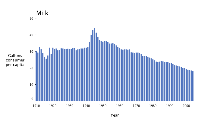
Chapter 4 - Graphing milk, tea, and coffee prices as a time series:

Screenshot of Chapter 4, figure 14

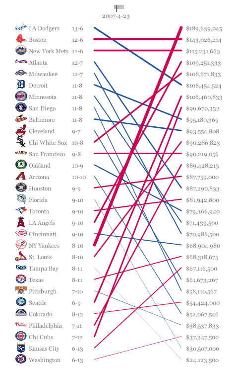
Chapter 5 - Correlating separate win/loss and salary datasets for Major League Baseball teams:

Screenshot of Chapter 5, figure 8

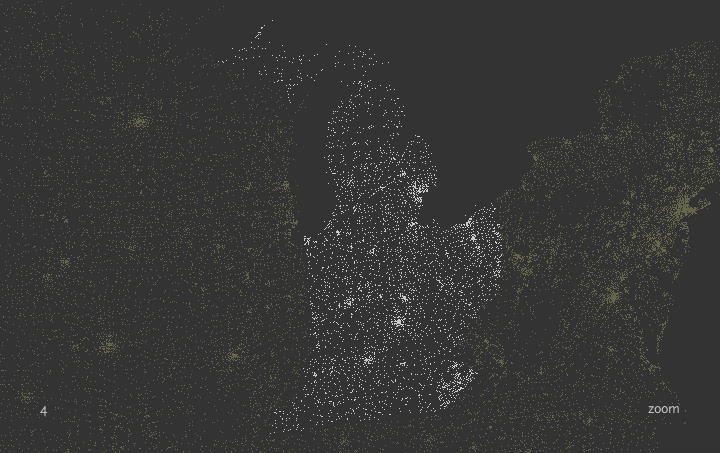
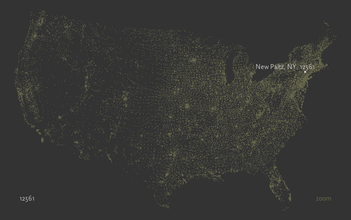
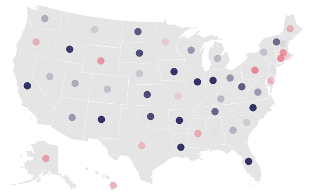
Chapter 6: Mapping zipcodes as a scatterplot: Screenshot of Chapter 6, whole map
Screenshot of Chapter 6, zoomed in

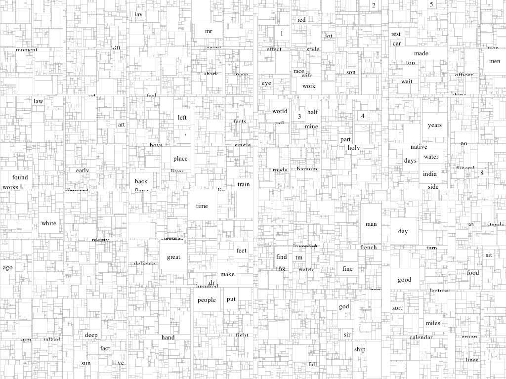
Chapter 7: Treemapping word usage in Mark Twain's Following the Equator: Screenshot of Chapter 7, figure 2
Attribution

This project is based on code and examples in Visualizing Data, First Edition by Ben Fry, copyright 2008 Ben Fry, 9780596514556.

Note that the project description data, including the texts, logos, images, and/or trademarks, for each open source project belongs to its rightful owner. If you wish to add or remove any projects, please contact us at [email protected].