nrlnishan / Viewpager Swift
Programming Languages
Projects that are alternatives of or similar to Viewpager Swift
ViewPager-Swift
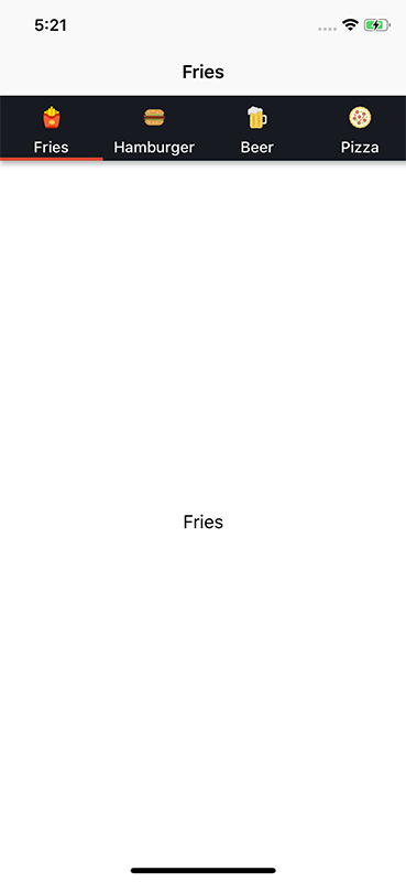
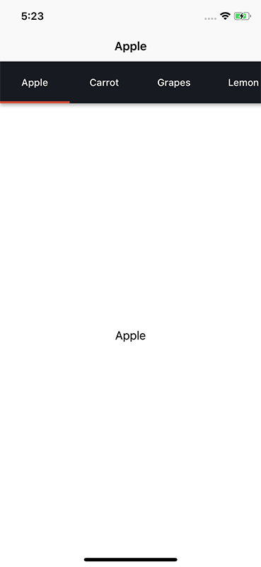
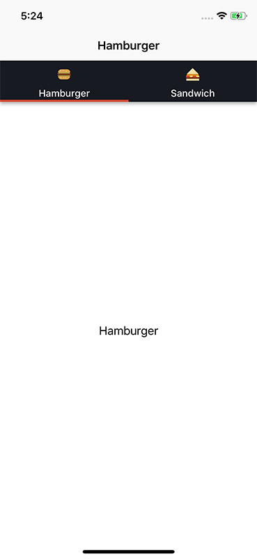
An easy to use view pager library for iOS in Swift based on UIPageViewController and Scroll View along with multiple customization options and tap as well as swipe gesture for changing between pages.
What's New
This release 2.0.1 provides support for swift 4.2 & onwards. Use previous releases if you want to support older versions of swift.
This release contains changes which are not compatible with previous releases. I have tried to minimize the changes as much as possible to support backward compatibility.
Changelog:
- Renamed ViewPagerControllerDataSource to ViewPagerDataSource
- Renamed ViewPagerControllerDelegate to ViewPagerDelegate
- Simplified the way to create ViewPager & its Options. See How to use section
- Introduced property to show shadow below tab bar
Installation
NOTE: Release 2.0.1 provides support for Swift 4.2 & onwards . If you are using older versions of Swift, use previous releases.
This documentation is for Release 2.0.1. It slightly differs from previous releases. If you are looking for previous documentation, refer to swift4.0 branch.
Using Cocoapods
- Add following in your podfile
pod 'ViewPager-Swift'
- Type
pod installin your terminal - After installation, add
import ViewPager_Swiftmodule in your UIViewController, wherever you want to use ViewPager.
Manual Installation
Add
- ViewPager.swift
- ViewPagerOptions.swift
- ViewPagerTab.swift
- ViewPagerTabView.swift
files in your project.All files are present inside ViewPager-Swift/Core directory.
Screenshots
Contribution
You can always contribute to the project by creating a PR to development branch.
How to use
- Customize your View Pager with the help of ViewPagerOptions class
- Create ViewPager instance and set its options, datasource & delegates. That's it
You can find the implementation example on MainViewController.swift & TestViewController.swift files.
Step 1: During its initialization, default options are set for view pager. So just this single line is enough if you want to use default configuration.
let myOptions= ViewPagerOptions()
For further customization,
// Let's show image with text
myOptions.tabType = ViewPagerTabType.imageWithText

// If I want all my tabs to be of equal width
myOptions.distribution = ViewPagerOptions.Distribution.equal

// If I don't want my tab to get highlighted for page
myOptions.isTabHighlightAvailable = false

// If I want indicator bar to show below current page tab
myOptions.isTabIndicatorAvailable= true

// Oh! and let's change color of tab to red
myOptions.tabViewBackgroundDefaultColor = UIColor.redColor()

// and many more...
Step 2:
let viewPager = ViewPager(viewController: self)
viewPager.setOptions(options: options)
viewPager.setDataSource(dataSource: self)
viewPager.setDelegate(delegate: self)
viewPager.build()
That's it. You need to conform to ViewPagerDataSource protocol to provide necessary data such as number of tabs, ViewController to display etc. If you want , you can conform to ViewPagerDelegate protocol to receive additional feedbacks.
ViewPagerDataSource:
// Provide number of pages required
func numberOfPages() -> Int

// Provide ViewController for each page
func viewControllerAtPosition(position:Int) -> UIViewController

// Provide info for each tab
func tabsForPages() -> [ViewPagerTab]

// Yayy! I can start from any page
optional func startViewPagerAtIndex()->Int
ViewPagerDelegate:
Called when transition to another view controller starts but is not completed
func willMoveToControllerAtIndex(index:Int)
Called when transiton to another view controller is completed
func didMoveToControllerAtIndex(index:Int)
Additional
You can also change the page programatically. Suppose you want to display 3rd page.
viewpager.displayViewController(atIndex: 2) // Since index starts from 0
Note: If you want the viewpager to show specific page when it loads, use func startViewPagerAtIndex()->Int method from datasource.
Also, you can update any of the viewpager tab. Just update the ViewPagerTab array which you are providing through the datasource. and then call
viewpager.invalidateCurrentTabs()
Customization
You can perform lots of customization. If you want to look under the hoods, all the public variables inside ViewPagerOptions.swift file is customizable.
Notes:
Tab Indicator: Horizontal bar of small thickness which is displayed under tab for current page
TabView: Horizontal bar shown above viewpager which displays image or name of page.
Distribution: Enum which defines how the tabs should be laid out
Enums:
tabType:ViewPagerTabType
Determines which type of tab should be displayed.
basic: Tab containing only name of the page
image: Tab containing only image for the page
imageWithText: Tab showing image and name (below image) for the page
distribution: ViewPagerOptions.Distribution
Determines how the tabs should be laid out
normal: Tabs are laid out from Left to Right and is scrollable Width of each tab is equal to its content width + paddings set in options.
equal: Tabs are laid out from Left to Right and is scrollable. Width of all the tabs are equal. The width of all the tabs is equal to that of the largest ones.
segmented: Tabs are laid out from Left to Right in such a way that it doesnot exceeds the width of its container. So its not scrollable. i.e All the tabs fits within a view. Paddings are ignored.
Tab View and Tab Indicator:
Whether to highlight tab for current page or not, Default is false
isTabHighlightAvailable:Bool
Whether to display tab indicator or not, Default is true
isTabIndicatorAvailable:Bool
Height for tab, Default is 60
tabViewHeight:CGFloat
Background Color for whole tab View
tabViewBackgroundDefaultColor:UIColor
Background Color for current tab. Only displays if isTabViewHighlightAvailable is set to true
tabViewBackgroundHighlightColor:UIColor
Color for each page title
tabViewTextDefaultColor:UIColor
Color for text for current tab
tabViewTextHighlightColor:UIColor
Padding for each tab, Default is 10
tabViewPaddingLeft:CGFloat
tabViewPaddingRight:CGFloat
Height of tab indicator, Default is 3
tabIndicatorViewHeight:CGFloat
Background Color for tab Indicator
tabIndicatorViewBackgroundColor:UIColor
Font for the text inside tab
tabViewTextFont: UIFont
Size of the image inside tab. Used incase tabtype is image or imageWithText.
tabViewImageSize: CGSize
Top and Bottom margin for the image inside tab. Used incase tabtype is imageWithText. Else image is automatically centered inside tab.
tabViewImageMarginTop: CGFloat
tabViewImageMarginBottom: CGFloat
Displays shadow below the tab bar.
isTabBarShadowAvailable: Bool
Shadow Customization. Works only if isTabBarShadowAvailable is set to true.
shadowColor: UIColor
shadowOpacity: Float
shadowOffset: CGSize
shadowRadius: CGFloat
View Pager
Transition style for each page, Default is scroll
viewPagerTransitionStyle:UIPageViewControllerTransitionStyle
License
The MIT License (MIT)
Copyright (c) 2016 nrlnishan
Permission is hereby granted, free of charge, to any person obtaining a copy of this software and associated documentation files (the "Software"), to deal in the Software without restriction, including without limitation the rights to use, copy, modify, merge, publish, distribute, sublicense, and/or sell copies of the Software, and to permit persons to whom the Software is furnished to do so, subject to the following conditions:
The above copyright notice and this permission notice shall be included in all copies or substantial portions of the Software.
THE SOFTWARE IS PROVIDED "AS IS", WITHOUT WARRANTY OF ANY KIND, EXPRESS OR IMPLIED, INCLUDING BUT NOT LIMITED TO THE WARRANTIES OF MERCHANTABILITY, FITNESS FOR A PARTICULAR PURPOSE AND NONINFRINGEMENT. IN NO EVENT SHALL THE AUTHORS OR COPYRIGHT HOLDERS BE LIABLE FOR ANY CLAIM, DAMAGES OR OTHER LIABILITY, WHETHER IN AN ACTION OF CONTRACT, TORT OR OTHERWISE, ARISING FROM, OUT OF OR IN CONNECTION WITH THE SOFTWARE OR THE USE OR OTHER DEALINGS IN THE SOFTWARE.


