afollestad / Viewpagerdots
Licence: apache-2.0
👀 Simple, compact Kotlin library for ViewPager page indicators.
Stars: ✭ 168
Programming Languages
kotlin
9241 projects
Projects that are alternatives of or similar to Viewpagerdots
Loopviewpagerlayout
☺无限轮播ViewPagerLayout 广告栏 banner 多种滑动的样式 使用API简单明了
Stars: ✭ 100 (-40.48%)
Mutual labels: viewpager
Shviewpager
A simple view pager for iOS. Compatible with iOS 8.0 or later.
Stars: ✭ 127 (-24.4%)
Mutual labels: viewpager
Producttour
ProductTour is android sample project implementing a parallax effect welcome page using ViewPager and PageTransformer, similar to the one found in Google's app like Sheet, Drive, Docs...
Stars: ✭ 1,839 (+994.64%)
Mutual labels: viewpager
Whatsappviewpager
Swipeable tabs like WhatsApp in Android
Stars: ✭ 115 (-31.55%)
Mutual labels: viewpager
Xbanner
🔥【图片轮播】支持图片无限轮播,支持AndroidX、自定义指示点、显示提示文字、切换动画、自定义布局,一屏显示多个等功能
Stars: ✭ 1,734 (+932.14%)
Mutual labels: viewpager
Banner
🔥🔥🔥Banner 2.0 来了!Android广告图片轮播控件,内部基于ViewPager2实现,Indicator和UI都可以自定义。
Stars: ✭ 11,682 (+6853.57%)
Mutual labels: viewpager
Autonotifyviewpager
Automatically notifies viewpager's adapter, when content is changed.
Stars: ✭ 96 (-42.86%)
Mutual labels: viewpager
Bubblepagerindicator
A view pager indicator view to deal with a large amount of pages.
Stars: ✭ 127 (-24.4%)
Mutual labels: viewpager
Imageviewer
A simple and customizable Android full-screen image viewer 一个简单且可自定义的Android全屏图像浏览器
Stars: ✭ 1,889 (+1024.4%)
Mutual labels: viewpager
Nested Fragments
Samples of nested fragments in various widgets (TabHost, ViewPager)
Stars: ✭ 115 (-31.55%)
Mutual labels: viewpager
Zjywidget
🎨 一组实用炫酷自定义View的集合(包括源码及demo)包括常见的支付、扫描、解锁动画、炫酷转盘式菜单等效果。A collection of Android cool custom views
Stars: ✭ 121 (-27.98%)
Mutual labels: viewpager
Viewpager Swift
Simple View Pager library for swift using UIPageViewController and Scroll View
Stars: ✭ 136 (-19.05%)
Mutual labels: viewpager
Parallaxviewpager
a simple ViewPager with parallax effect
Stars: ✭ 103 (-38.69%)
Mutual labels: viewpager
Flipviewpager.draco
This project aims to provide a working page flip implementation for usage in ListView.
Stars: ✭ 1,849 (+1000.6%)
Mutual labels: viewpager
Rvpindicator
ViewPager指示器 实现联动,自身滚动,支持类型 : 下滑线,三角形,全背景,图片
Stars: ✭ 99 (-41.07%)
Mutual labels: viewpager
Widgetlayout
自定义ViewGroup的集合(有 kotlin 实现分支):提高编写效率和 UI 绘制性能,少嵌套,易用易扩展。
Stars: ✭ 130 (-22.62%)
Mutual labels: viewpager
Expandingpager
ExpandingPager is a card peek/pop controller
Stars: ✭ 1,906 (+1034.52%)
Mutual labels: viewpager
Cardslider
Card Slider is an android component allows you to implement carousel effect with infinite indicators and more features
Stars: ✭ 160 (-4.76%)
Mutual labels: viewpager
Wormtabstrip
🐛 WormTabStrip ViewPager for iOS written in Swift, which gives continuous feedback to the user when scrolling
Stars: ✭ 145 (-13.69%)
Mutual labels: viewpager
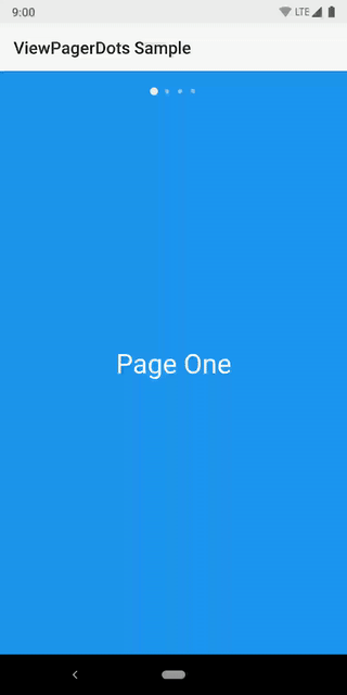
ViewPager Dots
This library provides a very small, compact, Kotlin-based implementation for ViewPager dots. The dots can of course be switched out for whatever type of Drawable you wish. The animation can be customized as well.

Dependency
dependencies {

  implementation 'com.afollestad:viewpagerdots:1.0.0'
}
Usage
Your layout would look something like this:
<LinearLayout
    xmlns:android="http://schemas.android.com/apk/res/android"
    android:layout_width="match_parent"
    android:layout_height="match_parent"
    android:orientation="vertical"
    >

  <com.afollestad.viewpagerdots.DotsIndicator
      android:id="@+id/dots"
      android:layout_width="match_parent"
      android:layout_height="48dp"
      />

  <androidx.viewpager.widget.ViewPager
      android:id="@+id/pager"
      android:layout_width="match_parent"
      android:layout_height="match_parent"
      />

</LinearLayout>
You attach the view pager to the dots indicator in your code:
val viewPager: ViewPager = // ...
val dots: DotsIndicator = // ...

viewPager.adapter = // ... This must be set before attaching
dots.attachViewPager(viewPager)
Customization
Lots of things can be visually customized about the DotsIndicator.
From your layout, here's a list of XML attributes:
-
app:dot_width(the width of each individual dot) -
app:dot_height(the height of each individual dot) -
app:dot_margin(spacing between each dot) -
app:dot_drawable(the default icon for each dot) -
app:dot_drawable_unselected(defaults todot_drawable) -
app:dot_tint(lets you apply a color tint to the above drawables) -
app:dots_animator(the animator when a dot becomes selected) -
app:dots_animator_reverse(defaults to reversed version of the above) -
app:dots_orientation(orientation of the whole strip; defaults tohorizontal) -
app:dots_gravity(gravity of the whole strip; defaults tocenter)
You can also apply some basic changes dynamically in your code:
val dots: DotsIndicator = // ...

// This lets you switch out the indicator drawables at runtime.
dots.setDotDrawable(
  indicatorRes = R.drawable.some_drawable,
  unselectedIndicatorRes = R.drawable.other_drawable // optional, defaults to above
)

// These two let you dynamically tint your indicators at runtime.
dots.setDotTint(Color.BLACK)
dots.setDotTintRes(R.color.black)
Note that the project description data, including the texts, logos, images, and/or trademarks,
for each open source project belongs to its rightful owner.
If you wish to add or remove any projects, please contact us at [email protected].