PygmySlowLoris / Vue Fab
Licence: mit
Vue Floating Action Button
Stars: ✭ 233
Projects that are alternatives of or similar to Vue Fab
Vue Element Starter
Vue starter with Element-UI [READY, unmaintained now]
Stars: ✭ 216 (-7.3%)
Mutual labels: vuejs2
Customfloatingactionbutton
This view is for replacement of standard Floating Action Button from Google Support Library. It is easy to use, customizable and you can also add text to button
Stars: ✭ 222 (-4.72%)
Mutual labels: floatingactionbutton
Vue Marquee Text Component
[CSS GPU Animation] Marquee Text for vuejs
Stars: ✭ 226 (-3%)
Mutual labels: vuejs2
Vuejs Logger
Provides customizable logging functionality for Vue.js. Compatible with Vue2.
Stars: ✭ 215 (-7.73%)
Mutual labels: vuejs2
Vuex Feature Scoped Structure
📈 Feature scoped Vuex modules to have a better organization of business logic code inside Vuex modules based on Large-scale Vuex application structures @3yourmind
Stars: ✭ 218 (-6.44%)
Mutual labels: vuejs2
Shop Vue
It's just a shopping cart experiment using VueJS.
Stars: ✭ 225 (-3.43%)
Mutual labels: vuejs2
Vue Material Kit
Vue Material Kit - Open Source Material Design UI Kit
Stars: ✭ 231 (-0.86%)
Mutual labels: vuejs2
Vue2 Perfect Scrollbar
Vue.js wrapper for perfect scrollbar
Stars: ✭ 225 (-3.43%)
Mutual labels: vuejs2
Fabulousfilter
Android library to animate Floating Action Button to Bottom Sheet Dialog and vice-versa
Stars: ✭ 2,477 (+963.09%)
Mutual labels: floatingactionbutton
Vue Emoji Picker
Very simple, yet powerful, vue emoji picker 🎉🔥🚀
Stars: ✭ 218 (-6.44%)
Mutual labels: vuejs2
Vue Easy Gantt
A simple Vue.js gantt chart plugin for presenting weekly tasks
Stars: ✭ 226 (-3%)
Mutual labels: vuejs2
V Uploader
A Vue2 plugin make files upload simple and easier, single file upload with image preview, multiple upload with drag and drop
Stars: ✭ 216 (-7.3%)
Mutual labels: vuejs2
V Bar
The virtual responsive crossbrowser scrollbar component for VueJS 2x
Stars: ✭ 216 (-7.3%)
Mutual labels: vuejs2
Vuemmerce
👉 Responsive ecommerce template 🛒 built with Vue.js and Nuxt.js
Stars: ✭ 223 (-4.29%)
Mutual labels: vuejs2
Vue Element Loading
⏳ Loading inside a container or full screen for Vue.js
Stars: ✭ 234 (+0.43%)
Mutual labels: vuejs2
Vue2 Scrollbar
The Simplest Pretty Scroll Area Component with custom scrollbar for Vue 2. https://bosnaufal.github.io/vue2-scrollbar
Stars: ✭ 233 (+0%)
Mutual labels: vuejs2
FAB
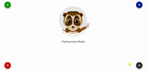
Floating Action Button for Vue.
The component supports multiple action buttons so you can add as many actions as you need. It will fire an event to the parent when clicking on each one.
Installation
npm install vue-fab --save
Dependencies
Include the following stylesheets on your document's head
<link rel="stylesheet" href="https://fonts.googleapis.com/icon?family=Material+Icons">
And
<link rel="stylesheet" href="https://cdnjs.cloudflare.com/ajax/libs/animate.css/3.5.2/animate.min.css">
Properties
| Properties | Type | Values |
|---|---|---|
bg-color |
String |
Default '#333333' Accepts all color formats: HEX, RGB & RGBA |
position |
String |
Default 'bottom-left' Options: 'bottom-left', 'bottom-right', 'top-left','top-right' |
position-type |
String |
Default 'fixed' Options: 'fixed' or 'absolute' |
z-index |
String |
Default '999' Set any value that suits your needs. |
ripple-show |
Boolean |
Default true Options: true or false. |
ripple-color |
String |
Default 'light' Options: 'light' or 'dark'. |
icon-size |
String |
Default 'medium' Options: 'small', 'medium' or 'large'. |
main-icon |
String |
Default 'add' Use icons from the material icon library. |
main-tooltip |
String | Default null |
actions |
Array | Details bellow |
fixed-tooltip |
Boolean |
Default 'false' if true, it shows the tooltip beside the actions |
enable-rotation |
Boolean |
Default 'true' if true, the fab will rotate to indicate that it has been opened. Will not rotate if there are no actions specified. |
start-opened |
Boolean |
Default 'false' if true, the fab will start opened. |
toggle-when-away |
Boolean |
Default 'true' if false, the fab will not be closed when clicking outside from the fab component. |
actions
| Properties | Type | Values |
|---|---|---|
name |
String | Name of the event |
icon |
String | Icon name (Please refer to Material icons) |
tooltip |
String | If not used, tooltip won't appear. |
color |
String |
Default bg-color valueAccepts all color formats: HEX, RGB & RGBA |
Examples
Include the component in your .vue file, actions prop is required for the component to work. The @event has to match the name given in the actions prop.
<template>
  <fab :actions="fabActions"
       @cache="cache"
       @alertMe="alert"
  ></fab>
</template>
Either color and position are set by default but they can be changed.
<fab
   :position="position"
   :bg-color="bgColor"
   :actions="fabActions"
   @cache="cache"
   @alertMe="alert"
></fab>
Match your data with your components props. The bgColor accepts either HEX, RBG or RGBA format.
Remember: Only material icons are accepted.
<script>
import fab from 'vue-fab'

export default {
  components: {
    fab
  },
   data(){
      return {
          bgColor: '#778899',
          position: 'top-right',
          fabActions: [
              {
                  name: 'cache',
                  icon: 'cached'
              },
              {
                  name: 'alertMe',
                  icon: 'add_alert'
              }
          ]
      }
  },
  methods:{
      cache(){
          console.log('Cache Cleared');
      },
      alert(){
          alert('Clicked on alert icon');
      }
  }
}
</script>
Note that the project description data, including the texts, logos, images, and/or trademarks,
for each open source project belongs to its rightful owner.
If you wish to add or remove any projects, please contact us at [email protected].