All Projects → dreambo8563 → vue-piece-slider

dreambo8563 / vue-piece-slider

Licence: MIT license
animated slides in a fragmented look 🐞🌳✡️📐

Programming Languages

javascript
184084 projects - #8 most used programming language
Vue
7211 projects
CSS
56736 projects
HTML
75241 projects
Makefile
30231 projects

Projects that are alternatives of or similar to vue-piece-slider

MediaSliderView
Pure java based, highly customizable media slider gallery supporting both images and videos for android.
Stars: ✭ 85 (-10.53%)
Mutual labels:  slider, images, carousel
Vue Gallery
📷 Responsive and customizable image and video gallery, carousel and lightbox, optimized for both mobile and desktop web browsers.
Stars: ✭ 405 (+326.32%)
Mutual labels:  slider, images, carousel
React Native Swiper Flatlist
👆 Swiper component implemented with FlatList using Hooks & Typescript + strict automation tests with Detox
Stars: ✭ 217 (+128.42%)
Mutual labels:  slider, images, carousel
React Flickity Component
A React.js component for using @desandro's Flickity
Stars: ✭ 232 (+144.21%)
Mutual labels:  slider, carousel
Vue Infinite Slide Bar
∞ Infinite slide bar component (no dependency and light weight 1.48 KB)
Stars: ✭ 190 (+100%)
Mutual labels:  slider, slides
Vue Glide
A slider and carousel as vue component on top of the Glide.js
Stars: ✭ 225 (+136.84%)
Mutual labels:  slider, carousel
Keen Slider
The HTML touch slider carousel with the most native feeling
Stars: ✭ 3,097 (+3160%)
Mutual labels:  slider, carousel
vue-splide
The Splide component for Vue.
Stars: ✭ 257 (+170.53%)
Mutual labels:  slider, carousel
takahashi.js
Make Takahashi-style slide easily!
Stars: ✭ 30 (-68.42%)
Mutual labels:  slider, slides
angular-simple-slider
An AngularJS directive providing a simple slider functionality
Stars: ✭ 15 (-84.21%)
Mutual labels:  slider, carousel
vue3-carousel
Vue 3 carousel component
Stars: ✭ 379 (+298.95%)
Mutual labels:  slider, carousel
vue-barousel
Carousel component mimics NetEase Cloud Music
Stars: ✭ 13 (-86.32%)
Mutual labels:  slider, carousel
svelte-slidy
📸 Sliding action script
Stars: ✭ 211 (+122.11%)
Mutual labels:  slider, carousel
Slider
Touch swipe image slider/slideshow/gallery/carousel/banner mobile responsive bootstrap
Stars: ✭ 2,046 (+2053.68%)
Mutual labels:  slider, carousel
Vue Awesome Swiper
🏆 Swiper component for @vuejs
Stars: ✭ 12,072 (+12607.37%)
Mutual labels:  slider, slides
Svelte Carousel
A super lightweight, super simple Carousel for Svelte 3
Stars: ✭ 144 (+51.58%)
Mutual labels:  slider, carousel
pinar
🌲☀️ Customizable, lightweight React Native carousel component with accessibility support.
Stars: ✭ 214 (+125.26%)
Mutual labels:  slider, carousel
Carousel View
CarouselView for android with showing horizontal and vertical, auto scrolling (with pause/resume), slider mode/ carousel mode options
Stars: ✭ 131 (+37.89%)
Mutual labels:  slider, carousel
Xam.plugin.simpleappintro
Just a nice and simple AppIntro for your Xamarin Forms project
Stars: ✭ 139 (+46.32%)
Mutual labels:  slider, carousel
react-instagram-zoom-slider
🌄↔️ A slider component with pinch to zoom capabilities inspired by Instagram
Stars: ✭ 67 (-29.47%)
Mutual labels:  slider, carousel

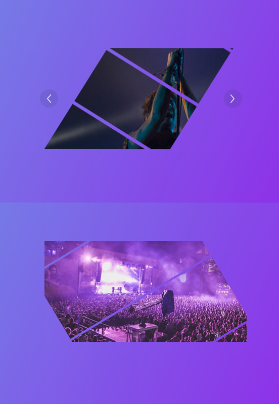
vue-piece-slider (Demo)

Codacy Badge All Contributors Greenkeeper badge Build Status Known Vulnerabilities License: MIT npm

This library is a simplified Vue portal of an awesome Codrops Article by Luis Manuel (original source).

In this version, just support image type.

Install

npm install --save animejs vue-piece-slider

Usage

Check out the Demo to see it in action.

<template>
  <div class="content" id="app">
    <Slider
      :arrow="true"
      :options="options"
      @click="click"
      class="slider"
      :list="list"
      v-model="activeIndex"
    ></Slider>
  </div>
</template>

<script>
import Slider from "vue-piece-slider"

export default {
  name: "app",
  data() {
    return {
      activeIndex: 0,
      list: [
        "./img/1.jpg",
        "./img/2.jpg",
        "./img/3.jpg",
        "./img/4.jpg",
        "./img/5.jpg"
      ],
      options: {
        angle: 30,
        extraSpacing: { extraX: 1, extraY: -20 },
        piecesWidth: 100,
        ty: 200,
        piecesSpacing: 1,
        animation: {
          duration: 2000,
          easing: "easeOutQuint"
        }
      }
    }
  },
  components: {
    Slider
  },
  methods: {
    click() {
      // eslint-disable-next-line no-console
      console.info("object")
    }
  }
}
</script>

<style lang="scss">
#app {
  font-family: "Avenir", Helvetica, Arial, sans-serif;
  -webkit-font-smoothing: antialiased;
  -moz-osx-font-smoothing: grayscale;
  text-align: center;
  color: #2c3e50;
  margin-top: 60px;
  .slider {
    width: 400px;
    height: 200px;
  }
}
</style>

Props

Property Type Default Description
list Array [] The image list
value Number |String 0 The activeIndex
arrow Booleans true if to show the action arrow when hover

Options

Property Type Default Description
angle Number 45 Rotation angle for pieces. All pieces in the same item will have the same rotation angle.
extraSpacing Object { extraX: 500, extraY: 200 } Extra space that should be covered by the pieces. You can set a different value for each axis using an Object like: {extraX: 0, extraY: 0}. This is useful if angle != 0.
piecesWidth Func |Number random(50, 200) Pieces width.
piecesSpacing Func |Number 5 Separation among pieces.

more params please follow the package of Piece

Credits

Contributors

Thanks goes to these wonderful people (emoji key):

Vincent Guo
Vincent Guo

💻 📖 🚇

This project follows the all-contributors specification. Contributions of any kind welcome!

Note that the project description data, including the texts, logos, images, and/or trademarks, for each open source project belongs to its rightful owner. If you wish to add or remove any projects, please contact us at [email protected].