All Projects → Abdulqudus001 → vue-skeleton-loader

Abdulqudus001 / vue-skeleton-loader

Licence: Apache-2.0 license
A simple and easily customizable skeleton loader plugin for you Vue application.

Programming Languages

Vue
7211 projects
javascript
184084 projects - #8 most used programming language

Projects that are alternatives of or similar to vue-skeleton-loader

Vue Content Placeholders
Composable components for rendering fake (progressive) content like facebook in vue
Stars: ✭ 1,547 (+1990.54%)
Mutual labels:  loader, vue-components, progressive-rendering
Vue Loaders
Vue + loaders.css
Stars: ✭ 127 (+71.62%)
Mutual labels:  loader, vue-components
vue-load-image
A Vue component for showing loader during image loading https://john015.github.io/vue-load-image/
Stars: ✭ 60 (-18.92%)
Mutual labels:  loader, vue-components
Vue Spinners
💫 A collection of loading spinner components for Vuejs
Stars: ✭ 255 (+244.59%)
Mutual labels:  loader, vue-components
Vue Wait
Complex Loader and Progress Management for Vue/Vuex and Nuxt Applications
Stars: ✭ 1,869 (+2425.68%)
Mutual labels:  loader, vue-components
vm-markdown
Example
Stars: ✭ 96 (+29.73%)
Mutual labels:  vue-components
fastify-loader
The route loader for the cool kids!
Stars: ✭ 17 (-77.03%)
Mutual labels:  loader
vexip-ui
A Vue 3 UI library, Highly customizable property values, Full TypeScript, Performance should be good.
Stars: ✭ 488 (+559.46%)
Mutual labels:  vue-components
react-native-modal-loader
Customizable animated modal progress hud for react apps.
Stars: ✭ 36 (-51.35%)
Mutual labels:  loader
shadow
Shadow dom support for Vue
Stars: ✭ 46 (-37.84%)
Mutual labels:  vue-components
shell-loader
A Webpack loader that runs an arbitrary script on matching files
Stars: ✭ 18 (-75.68%)
Mutual labels:  loader
vue-scroll-snap
A super simple Vue component that allows fullscreen and horizontal scroll snapping.
Stars: ✭ 25 (-66.22%)
Mutual labels:  vue-components
nautilus.js
[separated fork] Async JavaScript loader & dependency manager in ~600B [gziped]
Stars: ✭ 59 (-20.27%)
Mutual labels:  loader
sw-loader
Yet another service worker loader
Stars: ✭ 19 (-74.32%)
Mutual labels:  loader
requirex
A different kind of module loader 📦🦖
Stars: ✭ 20 (-72.97%)
Mutual labels:  loader
ots
A widget that can show loaders, notifications, internet connectivity changes as Overlay.
Stars: ✭ 20 (-72.97%)
Mutual labels:  loader
bee-ui
VUE组件库
Stars: ✭ 16 (-78.38%)
Mutual labels:  vue-components
void-ui
A UI toolkit for Vue.js.
Stars: ✭ 20 (-72.97%)
Mutual labels:  vue-components
vue-mobiledoc-editor
A lightweight and customizable editor that allows you to embed rich content using Vuejs components.
Stars: ✭ 73 (-1.35%)
Mutual labels:  vue-components
chusho
A library of bare & accessible components and tools for Vue.js 3
Stars: ✭ 47 (-36.49%)
Mutual labels:  vue-components

skeleton-loader-vue

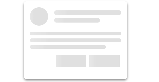
Loader showing skeleton view while data is being loaded to improve UX.

Sample loader


💿 Installation

  • npm: npm install skeleton-loader-vue --save
  • yarn: yarn add skeleton-loader-vue

🚀 Usage

You can import and register the component globally in your main.js, or import and use it in a particular component.

To register in your main.js

import Vue from 'vue';
// Import the component
import VueSkeletonLoader from 'skeleton-loader-vue';

// Register the component globally
Vue.component('vue-skeleton-loader', VueSkeletonLoader);

To register in your component

<script>
import VueSkeletonLoader from 'skeleton-loader-vue';
export default {
  components: { VueSkeletonLoader },
};
</script>

Using loader in your .vue file

<template>
  <div class="facebook-card">
    <vue-skeleton-loader
      type="circle"
      :width="200"
      :height="200"
      animation="fade"
    />
  </div>
</template>

This would give create a circle having a width and heigth of 200px and an animation of fade.

API

Props

Prop Type Default Options Description
width number, string 200 The is the width of the loader, and can be either a number or string. This property would be overridden if the size props is set
height number, string 100 The is the height of the loader, and can be either a number or string. This property would be overridden if the size props is set
size number,string This is used to give the loader the same width and height. The property would override the width and height previously set
type string 'rect' rect, circle This is the type of the loader. It could be circle or rectangle shaped
animation string 'wave' fade, wave, pulse, pulse-x, pulse-y The animation to be applied to the loader
color string rgba(0,0,0,0.12) The sets the color of the loader. It accepts all valid CSS colors (rgb, hsl, hex included)
wave-color string rgba(255, 255, 255, 0.5) The sets the color of the wave. It accepts all valid CSS colors (rgb, hsl, hex included)
rounded boolean false Add this prop to give a non-circle loader a border-radius 0f 8px
radius number,string 8 This is used to determine the border radius of the loader

Project setup

Install dependencies

  • npm: npm install
  • yarn: yarn

Start Dev Server

  • npm: npm run serve
  • yarn: yarn serve

Compiles and minifies for production

  • npm: npm run build
  • yarn: yarn build

Customize configuration

See Configuration Reference.

Note that the project description data, including the texts, logos, images, and/or trademarks, for each open source project belongs to its rightful owner. If you wish to add or remove any projects, please contact us at [email protected].