vue3-context-menu
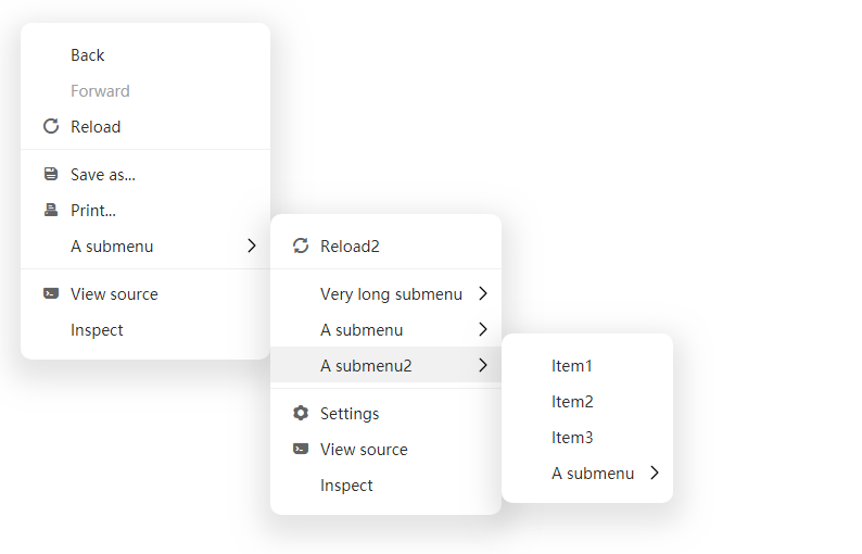
A context menu component for Vue3
features
- Simple and easy to use, small size
- Provide component mode and function mode
- Customizable
❗ Upgrade Note
Version 1.1.0 has been greatly upgraded and may be incompatible with the previous version. If there is a problem, please install version 1.0.9.
Install
npm install -save @imengyu/vue3-context-menu
Useage
It is recommended that you check the examples source code before use. It provides a variety of detailed usage methods, which may be very helpful to you.
Import
import '@imengyu/vue3-context-menu/lib/vue3-context-menu.css'
import ContextMenu from '@imengyu/vue3-context-menu'

createApp(App).use(ContextMenu)
Show menu
There are two ways to display menus:
The first is the function mode. You can use this.$contextmenu or showContextMenu global function displays a menu through menu data:
import ContextMenu from '@imengyu/vue3-context-menu'

onContextMenu(e : MouseEvent) {
  //prevent the browser's default menu
  e.preventDefault();
  //shou your menu
  this.$contextmenu({
    x: e.x,
    y: e.y,
    items: [
      {
        label: "A menu item",
        onClick: () => {
          alert("You click a menu item");
        }
      },
      {
        label: "A submenu",
        children: [
          { label: "Item1" },
          { label: "Item2" },
          { label: "Item3" },
        ]
      },
    ]
  });

  //Same as this.$contextmenu
  ContextMenu.showContextMenu({ ... });
}
The second is the component mode. You can use the component and template to display the menu:
<context-menu
  v-model:show="show"
  :options="optionsComopnent"
>
  <context-menu-item label="Simple item" @click="onMenuClick(1)" />
  <context-menu-sperator /><!--use this to add sperator-->
  <context-menu-group label="Menu with child">
    <context-menu-item label="Item1" @click="onMenuClick(2)" />
    <context-menu-item label="Item2" @click="onMenuClick(3)" />
    <context-menu-group label="Child with v-for 50">
      <context-menu-item v-for="index of 50" :key="index" :label="'Item3-'+index" @click="onLoopMenuClick(index)" />
    </context-menu-group>
  </context-menu-group>
</context-menu>data() {
return {
show: false,
optionsComopnent: {
zIndex: 3,
minWidth: 230,
x: 500,
y: 200
},
}
},
methods: {
onButtonClick(e : MouseEvent) {
//显示组件菜单
this.show = true;
this.options.x = e.x;
this.options.y = e.y;
},
}Menu icon
The menu component does not provide any icons. If you want to add an icon, it is recommended to use iconfont Icon library.
Font icon
Use iconfont library: After importing, fill in the icon attribute of MenuItem to display the icon in front of the menu item.
- If the font names are different, you can specify other fonts by writing the
iconFontClassattribute ofMenuItemorMenuOptions. - By default, the
<i>element is used to display icons
SVG Icon
Support the use of svg <symbol> to display icons:
<svg viewBox="0 0 80 20" xmlns="http://www.w3.org/2000/svg">
  <!-- Your icon -->
  <symbol id="icon-multiply" viewBox="0 0 1024 1024">
    <path d="M512 64C264.608 64 64 264.608 64 512c0 247.36 200.608 448 448 448 247.36 0 448-200.64 448-448 0-247.392-200.64-448-448-448z m158.4 651.552L512 557.312l-158.4 158.24-45.312-45.248L466.688 512l-158.304-158.4 45.312-45.312L512 466.688l158.4-158.4 45.28 45.312L557.312 512l158.368 158.4-45.28 45.152z" fill="#F74A21"></path>
  </symbol>
</svg>
//Function mode
this.$contextmenu({
items: [
{
label: "Item with svg icon",
svgIcon: "#icon-multiply",
svgProps: {
fill: '#f60',
},
},
],
//...
} as MenuOptions);//Component mode
<context-menu-item label="Item with svg icon" svgIcon="#icon-multiply" :svgProps="{ fill: '#f60' }" />Customize icon
You can also completely customize the rendering icon through the slot of the menu, such as:
<context-menu-item label="Item with custom icon slot">
  <template #icon>
    <img src="https://imengyu.top/assets/images/test/icon.png" style="width:20px;height:20px" />
  </template>
</context-menu-item>
Customize the icon of the entire menu:
<context-menu
  v-model:show="show"
  :options="options"
>
  <template #itemIconRender={ icon }>
    <!--icon is the icon attribute passed in the menu-item. You can use your own icon component here-->
    <img :src="icon" style="width:20px;height:20px" />
  </template>
  ... menu items ...
</context-menu>
Customize icon in function mode:
import { h } from 'vue';

{
  label: "Item with custom icon render",
  icon: h('img', {
    src: 'https://imengyu.top/assets/images/test/icon.png',
    style: {
      width: '20px',
      height: '20px',
    }
  }),
},
Custom style
If you think the menu style is not good-looking, you can rewrite the CSS style. All CSS style definitions are in /src/ContextSubMenu.vue. You can copy all the styles, modify them as needed, and store them in your file. Then overwrite the default style where you import:
import '@imengyu/vue3-context-menu/lib/vue3-context-menu.css'
import 'your-style-file-path.css'
Customize
The menu provides some slots that allow you to customize some parts of the rendering. For details, please refer to the example source code examples/views/BasicCustomize.vue examples/views/ComponentCustomize.vue。
API reference
Component mode: component properties and description
ContextMenu
Menu component.
Props
| Attribute | Description | Type | Default |
|---|---|---|---|
| show(v-model) | Controls whether the menu is displayed | boolean |
— |
| options | Menu options, See MenuOptions | MenuOptions |
— |
Events
| Event name | Description | Arguments |
|---|---|---|
| close | This event is triggered when the menu is closed | - |
Slots
| Slot name | Description | Arguments |
|---|---|---|
| itemRender | Global menu item render slot | MenuItemRenderData |
| itemIconRender | Global menu item icon render slot | MenuItemRenderData |
| itemLabelRender | Global menu item label render slot | MenuItemRenderData |
| itemRightArrowRender | Global menu item right arrow render slot | MenuItemRenderData |
| speratorRender | Global menu sperator render slot | - |
MenuItemRenderData
| Property | Description | Type |
|---|---|---|
| theme | Menu theme | 'light' 'dark' |
| isOpen | This value indicates whether the current menu submenu is open | boolean |
| hasChildren | This value indicates whether the current menu has submenus | boolean |
| onClick | Define the click event callback of the element, which is used for the internal event processing of the menu. When rendering item with slot, please call this function back, otherwise the menu cannot respond to the event normally | - |
| onMouseEnter | Mouse in event callback of custom element. When rendering item with slot, please call this function back, otherwise the menu cannot respond to the event normally | - |
| ... | Other arguments are same with MenuItem |
- |
ContextMenuItem
Menu item component.
Props
| Property | Description | Type | Default |
|---|---|---|---|
| label | The label of menu. | string |
— |
| icon | The icon for menu item. | string |
— |
| iconFontClass | Custom icon library font class name. | string |
— |
| svgIcon | Display icons use svg symbol (<use xlink:href="...">) , only valid when icon attribute is empty. |
string |
— |
| svgProps | The user-defined attribute of the svg tag, which is valid when using svgIcon. |
SVGAttributes |
— |
| disabled | Disable menu item? | boolean |
false |
| clickableWhenHasChildren | When there are subitems in this item, is it allowed to trigger its own click event? | boolean |
false |
| clickClose | Should close menu when Click this menu item ? | boolean |
true |
| customClass | Custom submenu class. | string |
— |
| onClick | Menu item click event handler. | Function() |
— |
Slots
| Slot name | Description | Arguments |
|---|---|---|
| default | Rendering slot for the current menu | - |
| icon | Icon rendering slot | - |
| label | Label rendering slot | - |
| rightArrow | Right Arrow rendering slot | - |
Click
| Event name | Description | Arguments |
|---|---|---|
| click | This event is triggered when the click this menu item | - |
ContextMenuGroup
Submenu component.
Props
| Property | Description | Type | Default |
|---|---|---|---|
| label | The label of menu. | string |
— |
| icon | The icon for menu item. | string |
— |
| iconFontClass | Custom icon library font class name. | string |
— |
| svgIcon | Display icons use svg symbol (<use xlink:href="...">) , only valid when icon attribute is empty. |
string |
— |
| svgProps | The user-defined attribute of the svg tag, which is valid when using svgIcon. |
SVGAttributes |
— |
| disabled | Disable menu item? | boolean |
false |
| clickableWhenHasChildren | When there are subitems in this item, is it allowed to trigger its own click event? | boolean |
false |
| adjustSubMenuPosition | Specifies should submenu adjust it position when the menu exceeds the screen. | boolean |
true |
| clickClose | Should close menu when Click this menu item ? | boolean |
true |
| customClass | Custom submenu class. | string |
— |
| minWidth | Submenu minimum width (in pixels). | number |
100 |
| maxWidth | Submenu maximum width (in pixels). | number |
600 |
| onClick | Menu item click event handler. | Function() |
— |
Slots
| Slot name | Description | Arguments |
|---|---|---|
| default | Submenu render slot | - |
ContextMenuSperator
Menu separator component.
Function mode
Global Function
-
ContextMenu.showContextMenu(options: MenuOptions, customSlots?: Record<string, Slot>)Show context menu.
Param Description options The options of menu. customSlots These slots to allow you to customize the style of the current menu, the names of these slots are the same as those in the component mode. -
ContextMenu.closeContextMenu()Manually close the currently open context menu.
-
this.$contextmenuSame as
ContextMenu.showContextMenubut this function is registered to vue global property.
MenuOptions
| Property | Description | Type | Optional value | Default |
|---|---|---|---|---|
| items | The items for this menu. | MenuItem[] |
— | — |
| x | Menu display x position. | number |
— | 0 |
| y | Menu display y position. | number |
— | 0 |
| xOffset | X-coordinate offset of submenu and parent menu. | number |
— | 0 |
| yOffset | Y-coordinate offset of submenu and parent menu. | number |
— | 0 |
| iconFontClass | Custom icon library font class name. | string |
— | iconfont |
| zIndex | The z-index of this menu. | number |
— | 2 |
| customClass | Custom menu class. | string |
— | — |
| minWidth | Minimum width of main menu (in pixels) | number |
— | 100 |
| maxWidth | Maximum width of main menu (in pixels) | number |
— | 600 |
| theme | Menu theme | string |
'light' or 'dark' |
light |
| closeWhenScroll | Close when user scroll mouse ? | boolean |
- | true |
MenuItem
| Property | Description | Type | Optional value | Default |
|---|---|---|---|---|
| label | The label of menu. | string or VNode or ((label: string) => VNode) |
— | — |
| icon | The icon for menu item. | string or VNode or ((icon: string) => VNode) |
— | — |
| iconFontClass | Custom icon library font class name. | string |
— | iconfont |
| svgIcon | Display icons use svg symbol (<use xlink:href="...">) , only valid when icon attribute is empty. |
string |
— | — |
| svgProps | The user-defined attribute of the svg tag, which is valid when using svgIcon. |
SVGAttributes |
— | — |
| disabled | Disable menu item? | boolean |
— | false |
| adjustSubMenuPosition | Specifies should submenu adjust it position when the menu exceeds the screen. | boolean |
— | true |
| clickableWhenHasChildren | When there are subitems in this item, is it allowed to trigger its own click event? | boolean |
— | false |
| clickClose | Should close menu when Click this menu item ? | boolean |
— | true |
| divided | Is this menu item separated from the menu item below? | boolean |
— | false |
| customClass | Custom submenu class. | string |
— | — |
| minWidth | Submenu minimum width (in pixels). | number |
— | 100 |
| maxWidth | Submenu maximum width (in pixels). | number |
— | 600 |
| onClick | Menu item click event handler. | Function() |
— | — |
| customRender | A custom render callback that allows you to customize the rendering of the current item. | VNode or ((item: MenuItemRenderData) => VNode) |
— | — |
| children | Submenu items. | MenuItem[] |
— | — |