scalia / Vuejs Tree
Projects that are alternatives of or similar to Vuejs Tree
VueJS Tree

A highly customizable vuejs tree viewer
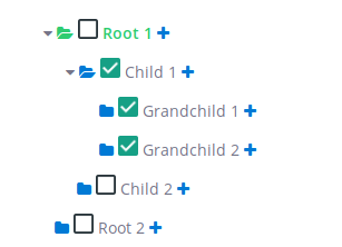
Example
Getting Started
Install
You can install using yarn:
$ yarn add vuejs-tree
or with npm:
$ npm install vuejs-tree
Usage
Add the following lines at the top of your .js file which contains your Vue instance.
  import Tree from 'vuejs-tree'


  // in your vue instance
  components: {
    'Tree': Tree
  },
Then add the following line in your html file to generate a tree. You can have as many trees per page as you want.
<Tree id="my-tree-id" ref="my-tree-ref" :custom-options="myCustomOptions" :custom-styles="myCustomStyles" :nodes="treeDisplayData"></Tree>
Data Structure
You need to define data to display which is a nested array of hash.
Example:
data: {
  treeDisplayData: [
    {
      text: 'Root 1',
      nodes: [
        {
          text: 'Child 1',
          nodes: [
            {
              text: 'Grandchild 1'
            },
            {
              text: 'Grandchild 2'
            }
          ]
        },
        {
          text: 'Child 2'
        }
      ]
    },
    {
      text: 'Root 2'
    }
  ]
}
Node properties
Here is a fully customized node:
{
  id: 1,
  text: 'Root 1',
  definition: 'First node',
  depth: 1,
  checkable: false,
  selectable: false,
  expandable: true,
  tags: [42],
  state: {
    checked: false,
    expanded: false,
    selected: false
  },
  nodes: [
    {},
    ...
  ]
}
The Following properties define a node level css and behavior.
| key | type | Detail |
|---|---|---|
| id | String or Integer --> Mandatory | Used in the tree to differentiate each node |
| text | String --> Mandatory | The text value displayed at the right of the node icons |
| definition | String --> Optional | If some text is given, then it will show as a tooltip |
| depth | Integer --> Optional | It corresponds to the node depth, starting from 0, 1 or anything. It's advisable to fill these fields if some of your nodes have the same id |
| tags | [Integer] --> Optional | The tag is displayed at the right end of the line |
| checkable | Boolean --> Optional, default: true | Used to enable or disable the node's check event |
| selectable | Boolean --> Optional, default: true | Used to enable or disable the node's select event |
| expandable | Boolean --> Optional, default: true | Used to enable or disable the node's expand event |
| state | nodes's state | |
| state.checked | Boolean --> Optional, default: false | Change the node's default state (at initialize) |
| state.selected | Boolean --> Optional, default: false | Change the node's default state (at initialize) |
| state.expanded | Boolean --> Optional, default: false | Change the node's default state (at initialize) |
| nodes | Object --> Optional | Used to display the node's children. Look above for a structure example |
Options / Styles
Here is an example of a customOptions hash the tree can take. I suggest you to use a vuejs computed function if you want to use a function pointer.
computed: {
  myCustomStyles() {
    return {
      tree: {
        height: 'auto',
        maxHeight: '300px',
        overflowY: 'visible',
        display: 'inline-block'
      },
      row: {
        width: '500px',
        cursor: 'pointer',
        child: {
          height: '35px'
        }
      },
      addNode: {
        class: 'custom_class',
        style: {
          color: '#007AD5'
        }
      },
      editNode: {
        class: 'custom_class',
        style: {
          color: '#007AD5'
        }
      },
      deleteNode: {
        class: 'custom_class',
        style: {
          color: '#EE5F5B'
        }
      },
      selectIcon: {
        class: 'custom_class',
        style: {
          color: '#007AD5'
        },
        active: {
          class: 'custom_class',
          style: {
            color: '#2ECC71'
          }
        }
      },
      text: {
        style: {},
        active: {
          style: {
            'font-weight': 'bold',
            color: '#2ECC71'
          }
        }
      }
    };
  },
  myCustomOptions() {
    return {
      treeEvents: {
        expanded: {
          state: true,
          fn: null,
        },
        collapsed: {
          state: false,
          fn: null,
        },
        selected: {
          state: false,
          fn: null,
        },
        checked: {
          state: true,
          fn: this.myCheckedFunction,
        }
      },
      events: {
        expanded: {
          state: true,
          fn: null,
        },
        selected: {
          state: false,
          fn: null,
        },
        checked: {
          state: false,
          fn: null,
        },
        editableName: {
          state: false,
          fn: null,
          calledEvent: null,
        }
      },
      addNode: { state: false, fn: null, appearOnHover: false },
      editNode: { state: true, fn: null, appearOnHover: true },
      deleteNode: { state: true, fn: null, appearOnHover: true },
      showTags: true,
    };
  }
},
Styles
| Option name | Detail |
|---|---|
| tree | Object - override default tree css |
| row | Object - override default tree node css |
| row.child | Object - override style of <div> into the <li> row (e.g. you can manage the height of the row) |
| expanded | Object - contains the class of the expanded icon |
| addNode | Object - contains the class and the style of the addNode button |
| editNode | Object - contains the class and the style of the editNode button |
| deleteNode | Object - contains the class and the style of the deleteNode button |
| selectIcon | Object - contains the class and the style for the select node icon |
| text | Object - contains the class and the style for the node's text |
Options
Tree options
| Option name | Detail |
|---|---|
| treeEvents | Object - contains the callback tree events, called after the tree row events |
| treeEvents.expanded | Object - enable or disable the callback when a node is expanded. If enabled, fn (function pointer) must be present. |
| treeEvents.collapsed | Object - enable or disable the callback when a node is collasped. If enabled, fn (function pointer) must be present. |
| treeEvents.selected | Object - enable or disable the callback when a node is selected. If enabled, fn (function pointer) must be present. |
| treeEvents.checked | Object - enable or disable the callback when a node is checked. If enabled, fn (function pointer) must be present. |
Row Options
| Option name | Detail |
|---|---|
| showTags | Boolean - Show the node's tag if given |
| addNode | Object - enable or disable the add node button. If enabled, fn must be present. If appearOnHover is true, the button will appear only if the row is hovered |
| editNode | Object - enable or disable the edit node button. If enabled, fn must be present. If appearOnHover is true, the button will appear only if the row is hovered |
| deleteNode | Object - enable or disable the delete node button. If enabled, fn must be present. If appearOnHover is true, the button will appear only if the row is hovered |
| events | Object - contains the node events, override the tree row events behavior |
| events.expanded | Object - enable or disable the expanded node event. The fn key is optional, if present, it will replace the native behavior |
| events.selected | Object - enable or disable the selected node event. The fn key is optional, if present, it will replace the native behavior |
| events.checked | Object - enable or disable the checked node event. The fn key is optional, if present, it will replace the native behavior |
| events.editableName | Object - enable or disable the event when the node's name is clicked. If enabled, the key fn or calledEvent must be present. calledEvent is a string and it value must be an existing event (e.g. 'selected') |
Events
Tree
You can call your own function here by assigning a function pointer in the tree options and changing its state to true. These functions are called after all tree modifications.
onNodeSelected
Called when a node is selected.
myCustomOptions.treeEvents.selected.fn
onNodeExpanded
Called when a node is expanded.
myCustomOptions.treeEvents.expanded.fn
Or called when a node is collapsed.
myCustomOptions.treeEvents.collapsed.fn
onNodeChecked
Called when a node is collapsed.
myCustomOptions.treeEvents.checked.fn
Tree row
You can call your own function here by assigning a function pointer in the tree options. It will replace the existing behavior of the tree for this event. You can also disabled an event by changing it's state to false.
toggleSelected
Called when a node is selected. myCustomOptions.events.selected.fn
toggleExpanded
Called when a node is expanded or collapsed. myCustomOptions.events.expanded.fn
toggleChecked
Called when a node is checked. myCustomOptions.events.checked.fn
editableName
You can call a special function if you assign it's pointer in myCustomOptions.events.editableName.fn
Or you can call an existing event by assigining it's name in myCustomOptions.events.editableName.calledEvent
example : myCustomOptions.events.editableName.calledEvent = 'selected'
Methods
Methods Params:
depth --> Optional but help distinguish nodes with the same id.
argWanted --> It can either be a node attribute name (string) or a array of node attribute name (like ['id', 'name']).
format --> If you want the function to return an plain array (false) or a hash tree (true).
maxDepth --> The function will only access nodes within the maxDepth.
fullNode --> Return only node ids or node objects.
conditions --> It's used to affect only the nodes which match it. For example if the condition is {checked: true}, the function will affect only the nodes which are checked. You can use all nodes attribute that are present in the node object.
| Function | Detail |
|---|---|
| checkNode(nodeId, depth) | Check a node |
| uncheckNode(nodeId, depth) | Uncheck a node |
| getSelectedNode() | Return the selected node if you have selected a node |
| getCheckedNodes(argWanted, format = false) | Return all checked nodes |
| getExpandedNodes(argWanted, format = false) | Return all expanded nodes |
| checkAllNodes() | Check all nodes |
| uncheckAllNodes() | Uncheck all nodes |
| expandNode(nodeId, depth) | Expand a node |
| collapseNode(nodeId, depth) | Collapse a node |
| selectNode(nodeId, depth) | Select a node and deselect the previously selected node if it exists |
| expandAllNodes() | Expand all nodes |
| collapseAllNodes() | Collapse all nodes |
| deselectAllNodes() | Deselect all nodes |
| findNode(nodeId, maxDepth = 9999) | Find and return a node |
| getVisibleNodes(fullNode = false) | Get all visible nodes |
| getNodesData(argWanted, conditions = {}, format = false) | Customizable function that returns nodes |
Get the tree instance
If you want to call any tree method, you need to get the instance.
To get the tree instance you just need to be in the vue instance and use this.$refs['my-tree-ref']
Then you can use a method like that: this.$refs['my-tree-ref'].myMethod()