All Projects → Intelliabb → Xamcustomlayouts

Intelliabb / Xamcustomlayouts

Licence: apache-2.0
Xamarin.Forms Custom Layouts - Cards

Projects that are alternatives of or similar to Xamcustomlayouts

Xamarincontrols
Cross-platform controls for Xamarin and Xamarin.Forms.
Stars: ✭ 104 (+593.33%)
Mutual labels:  xamarin, forms, card
Toast
To use it in PCL or .NetStandard projects write this line of code : CrossToastPopUp.Current.ShowToastMessage("Message");
Stars: ✭ 51 (+240%)
Mutual labels:  xamarin, custom, forms
ButtonCirclePlugin
Circle Buttons with icon for your Xamarin.Forms Applications
Stars: ✭ 96 (+540%)
Mutual labels:  xaml, xamarin
MyTasks
Xamarin.Forms goodlooking UI sample.
Stars: ✭ 74 (+393.33%)
Mutual labels:  xaml, xamarin
Formswpflive
Live XAML development for Xamarin Forms Apps using WPF Backend.
Stars: ✭ 14 (-6.67%)
Mutual labels:  xamarin, xaml
Fields
Good, solid base to build custom forms in iOS apps, using self-sizing compositional layout.
Stars: ✭ 80 (+433.33%)
Mutual labels:  custom, forms
Uno.Themes
This library is designed to help you use the material design system with the Uno Platform
Stars: ✭ 112 (+646.67%)
Mutual labels:  xaml, xamarin
Xam.Plugin.AutoUpdate
Xamarin Forms plugin that auto updates your Android or UWP sideloaded application.
Stars: ✭ 22 (+46.67%)
Mutual labels:  xamarin, forms
XamarinHorizontalList
This sample is built with a few xamarin horizontal lists different implementations.
Stars: ✭ 36 (+140%)
Mutual labels:  xaml, xamarin
Ammyui
Ammy language repository
Stars: ✭ 356 (+2273.33%)
Mutual labels:  xamarin, xaml
Arcgis Runtime Samples Dotnet
Sample code for ArcGIS Runtime SDK for .NET – UWP, WPF, Xamarin.Android, Xamarin.iOS, and Xamarin.Forms
Stars: ✭ 274 (+1726.67%)
Mutual labels:  xamarin, xaml
Xamanimation
Xamarin Forms Animation Library
Stars: ✭ 389 (+2493.33%)
Mutual labels:  xamarin, xaml
uptime-card
Minimalistic uptime card for Home Assistant Lovelace UI
Stars: ✭ 152 (+913.33%)
Mutual labels:  custom, card
ListViewWithSubListView
Xamarin.Forms Expandable ListView With Sub-ListView MVVM Pattern
Stars: ✭ 40 (+166.67%)
Mutual labels:  xamarin, forms
FavFighters
Xamarin.Forms goodlooking UI sample using the new SwipeView.
Stars: ✭ 32 (+113.33%)
Mutual labels:  xaml, xamarin
arcgis-runtime-demos-dotnet
Demo applications provided by the ArcGIS Runtime SDK for .NET Team
Stars: ✭ 51 (+240%)
Mutual labels:  xaml, xamarin
Reactiveproperty
ReactiveProperty provides MVVM and asynchronous support features under Reactive Extensions. Target framework is .NET Standard 2.0.
Stars: ✭ 603 (+3920%)
Mutual labels:  xamarin, xaml
Mobile
The mobile app vault (iOS and Android).
Stars: ✭ 3,149 (+20893.33%)
Mutual labels:  xamarin, xaml
Xamarin.Forms.TabView
The TabView is a Xamarin.Forms control to display a set of tabs and their respective content.
Stars: ✭ 56 (+273.33%)
Mutual labels:  xaml, xamarin
Templateui
A set of Xamarin.Forms templated controls.
Stars: ✭ 273 (+1720%)
Mutual labels:  xamarin, xaml

Card View Using Custom Layouts In Xamarin.Forms

This sample shows how to create a custom layout (container) that can be reused in the app and can take any View as child.

Download NuGet Package: https://www.nuget.org/packages/IntelliAbb.Xamarin.Controls

Blog post: https://intelliabb.com/2018/03/21/card-view-for-xamarin-forms-using-custom-layouts/

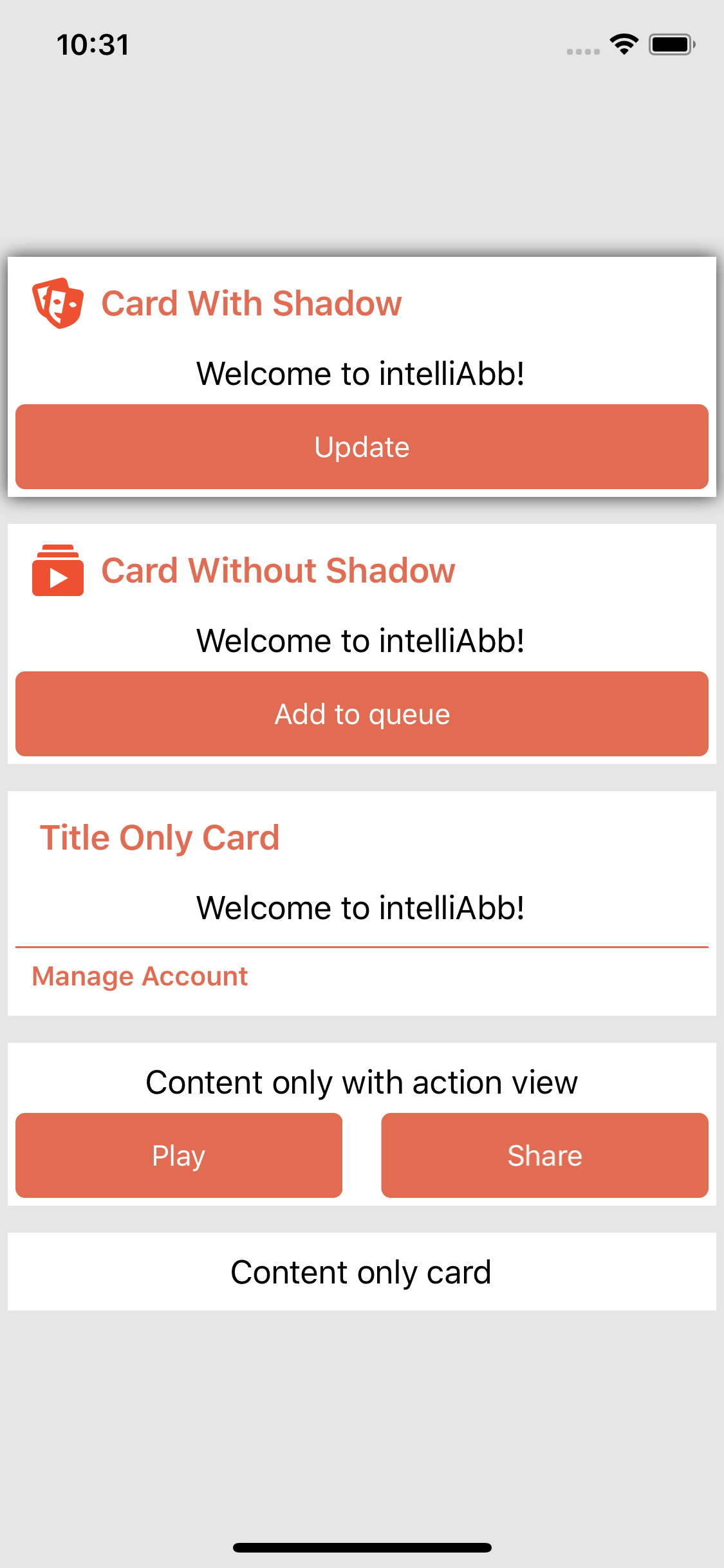
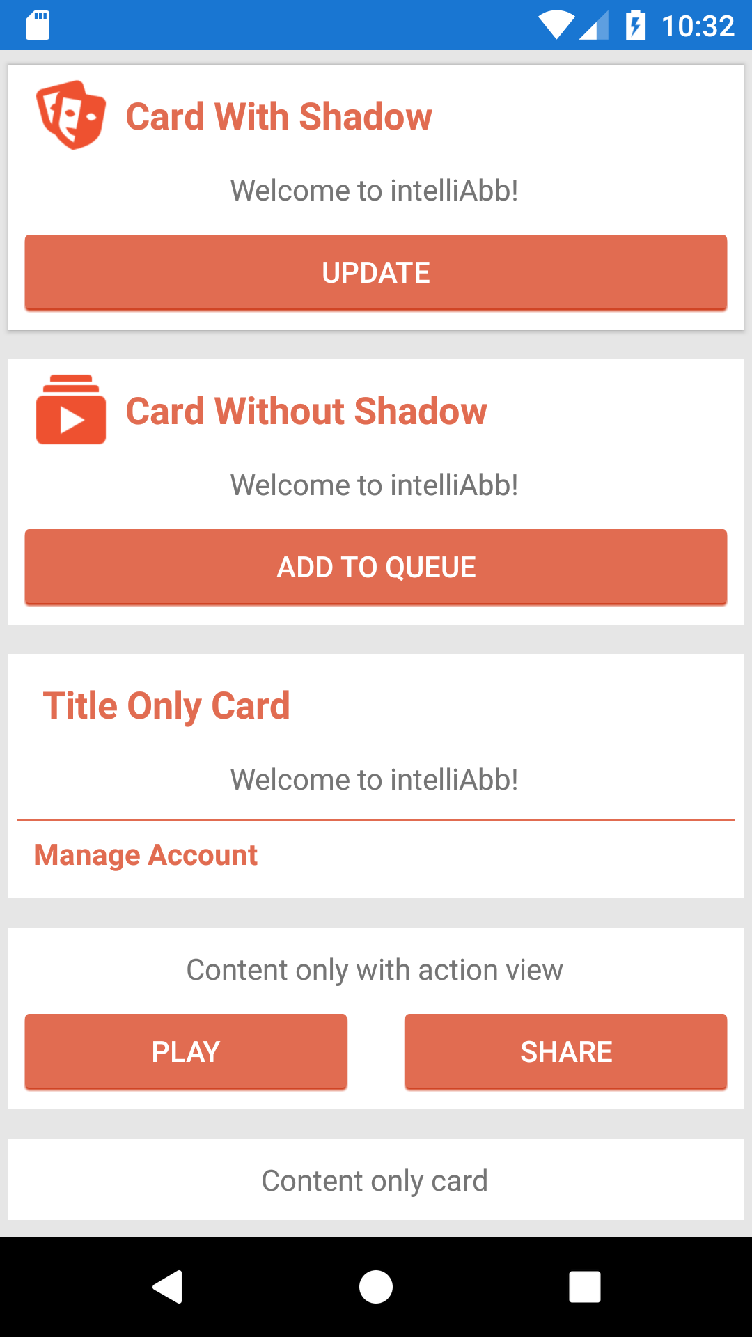
Card View

iOS

iOS

Android

Android

Parts

  1. Icon
  2. Title
  3. Content View (ContentPresenter)
  4. Action View (ContentPresenter)

All parts are optional. You can mix and match to your needs.

Usage

In XAML

Depending on where you place your custom layout/control, bring in the namespace, if needed.

xmlns:controls="clr-namespace:XamCustomLayouts.Controls;assembly=XamCustomLayouts.Controls"

then,

<controls:ShadedCard Icon="profile.png" Title="Card With Shadow" CornerRadius="0" HasShadow="true" TitleStyle="{StaticResource SectionTitleText}">
  <controls:ShadedCard.CardContent>
      <Label Text="Welcome to intelliAbb!" VerticalOptions="Center" HorizontalOptions="Center" />
  </controls:ShadedCard.CardContent>
  <controls:ShadedCard.ActionView>
      <Button Text="Update"/>
  </controls:ShadedCard.ActionView>
</controls:ShadedCard>

In C#

var card = new ShadedCard {
  Icon = "icon.png",
  Title = "My Card",
  ContentView = new StackLayout {
    . . .
  },
  ActionView = new StackLayout {
    . . .
  },
};

// assuming you have a child-bearing container as parent,
Parent.Children.Add(card);

MVVM Data Binding

If you are using MVVM in your Xamarin.Forms app (as you should :)), you will find that binding to a control inside a view that is child of this card view, the implicit bindings will not work as the child control does not know about the grandparent control (page) and it's binding context. So, you will have to explicitly bind to the page's binding context by simply doing the following,

  1. Name your page. i.e. <... x:Name="MyPage"/>
  2. Bind explicitly. i.e. <Label Text="{Binding BindingContext.PropertyName, Source={x:Reference MyPage}}"/>

That is it. You just told your grand child control/view to bind to MyPage's BindingContext, which is your ViewModel.

Enjoy!

Note that the project description data, including the texts, logos, images, and/or trademarks, for each open source project belongs to its rightful owner. If you wish to add or remove any projects, please contact us at [email protected].