Zebra Tooltips 

A lightweight, accessible, and highly configurable jQuery plugin for creating beautiful tooltips


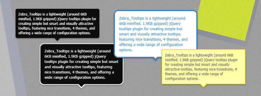
Zebra Tooltips is a lightweight (around 5KB minified, 1.7KB gzipped) and accessible jQuery tooltips plugin for creating smart and visually attractive tooltips, featuring nice transitions, 4 themes, and offering a wide range of configuration options.
Besides the default behavior of tooltips showing when user hovers the element, tooltips may also be shown and hidden programmatically. When shown programmatically, the tooltips feature a "close" button and clicking it will be the only way of closing tooltips opened this way. This is useful for drawing users' attention to specific areas of a page (like error messages after validating a form).
Tooltips can be aligned left, center or right, relative to the parent element, as well as above or below the parent element. The library detects the browser window's edges and will make sure that the tooltips are always in the viewport.
The tooltips are created using NO IMAGES and falls back gracefully for browsers that don't support all the fancy stuff.
Works in pretty much any browser - Firefox, Chrome, Safari, Edge, Opera and Internet Explorer 6+
Features
- lightweight - it weights around 5KB minified and 1.7KB gzipped
- includes 4 themes
- features nice transitions
- detects the edges of the browser window and makes sure that the tooltips always stay in the viewport
- tooltips may be shown and hidden programatically
- tooltips can be aligned left, center or right, relative to the parent element, as well as above or below the parent element
- uses NO IMAGES and falls back gracefully for browsers that don't support all the fancy stuff
- works in pretty much any browser - Firefox, Chrome, Safari, Edge, Opera and Internet Explorer 6+
🎂 Support the development of this project
Your support means a lot and it keeps me motivated to keep working on open source projects.
If you like this project please
If you are feeling generous, you can buy me a coffee by donating through PayPal, or you can become a sponsor.
Either way - Thank you!
Demo
See the demos
Requirements
Zebra Tooltips has no dependencies other than jQuery 1.7+
Installation
Zebra Tooltips is available as a npm package. To install it use:
# the "--save" argument adds the plugin as a dependency in packages.json
npm install zebra_tooltips --save
Zebra Tooltips is also available as a Bower package. To install it use:
# the "--save" argument adds the plugin as a dependency in bower.json
bower install zebra_tooltips --save
How to use
First, load jQuery from a CDN and provide a fallback to a local source like:
<script src="https://code.jquery.com/jquery-3.5.0.min.js"></script>
<script>window.jQuery || document.write('<script src="path/to/jquery-3.5.0.js"><\/script>')</script>
Load the Zebra Tooltips jQuery plugin
<script src="path/to/zebra_tooltips.min.js"></script>Alternatively, you can load Zebra Tooltips from JSDelivr CDN like this:
<!-- for the most recent version, not recommended in production -->
<script
  src="https://cdn.jsdelivr.net/npm/zebra_tooltips@latest/dist/zebra_tooltips.min.js"></script>

<!-- for a specific version -->
<script
  src="https://cdn.jsdelivr.net/npm/[email protected]/dist/zebra_tooltips.min.js"></script>

<!-- replacing "min" with "src" will serve you the non-compressed version -->
Load one the plugin's theme
<link rel="stylesheet" href="path/to/zebra_tooltips.min.css">...or from JSDelivr CDN
<link
  rel="stylesheet"
  href="https://cdn.jsdelivr.net/npm/[email protected]/dist/css/default/zebra_tooltips.min.css">

<!-- replacing "min" with "src" will serve you the non-compressed version -->
Now, within the DOM-ready event do
$(document).ready(function() {

    // show tooltips for any element that has a class named "tooltips"
    // the content of the tooltip will be taken from the element's "title" attribute
    new $.Zebra_Tooltips($('.tooltips'));

});
Configuration options
Properties
All parameters are optional.
Note that any of the properties below may also be set via data attributes. To do this you have prefix the name of the property you want to set with data-ztt_.
| Property | Type | Default | Description |
|---|---|---|---|
animation_speed |
integer | 250 | The speed (in milliseconds) of the animation used to show/hide tooltips. |
animation_offset |
integer | 20 |
The number of pixels the tooltips should use to slide into position. Set to 0 for no sliding.
|
close_on_click |
boolean | TRUE |
By default, if the users clicks when over a tooltip, the tooltip will close (if the tooltip was not open programatically, that is). Set this property to FALSE to prevent this behavior.
|
content |
string | "" |
The content of the tooltip. By default, the content of the tooltip is taken from the title attribute of the element the tooltip is attached to and has priority over the content property (meaning that if the title attribute is set, the value of this property is ignored).Use this property to set the content of the tooltip when you can't or don't want to use the title attribute.
|
hide_delay |
integer | 100 | The delay (in milliseconds) after which to hide the tooltip once the mouse moves away from the trigger element or the tooltip. |
keep_visible |
boolean | TRUE | Should tooltips remain visible also when the mouse cursor is over the tooltips or should the tooltips be visible strictly when the mouse cursor is over the parent elements? |
max_width |
integer | 250 | Maximum width of the tooltip's content |
opacity |
float | 0.85 |
The tooltip's opacity. Must be a value between 0 (completely transparent) and 1 (completely opaque)
|
position |
string | center |
The tooltip's position, relative to the trigger element. Can be center, left or right
|
prerender |
boolean | FALSE |
If set to TRUE, tooltips will be created on document load, rather than only when needed.
|
show_delay |
integer | 100 | The delay (in milliseconds) after which to show the tooltip once the mouse is over the trigger element. |
vertical_alignment |
string | above |
By default, tooltips are shown above the elements they are attached to and are shown below only if there isn't enough space above. Set the value of this property to below if you want to reverse the default behavior so that tooltips will be shown below the elements they are attached to and will be shown above only there isn't enough space below.Possible values are above and below.
|
vertical_offset |
integer | 0 | How close (in pixels) should the tip of the tooltip be relative to the parent element. |
Events
| Event | Description |
|---|---|
onBeforeHide |
Event fired before a tooltip is hidden. The callback function receives as argument the element the tooltip is attached to, and the tooltip element. If the callback function returns boolean FALSE, the tooltip will not be hidden.
|
onHide |
Event fired after a tooltip is hidden. The callback function receives as argument the element the tooltip is attached to, and the tooltip element. |
onBeforeShow |
Event fired before a tooltip is shown. The callback function receives as argument the element the tooltip is attached to, and the tooltip element. If the callback function returns boolean FALSE, the tooltip will not be shown.
|
onShow |
Event fired after a tooltip is shown. The callback function receives as argument the element the tooltip is attached to, and the tooltip element. |
Methods
show(element, [destroy = FALSE])
Shows the tooltip attached to the element or the elements given as argument.
When showing a tooltip using this method, the tooltip can only be closed by the user clicking on the "close" icon on the tooltip (which is automatically added when using this method) or by calling the hide() method.
Arguments
element - an element or a collection of elements for which to show the attached tooltips.
destroy - (optional) - if set to TRUE, once the user clicks the close button, the tooltip will be muted and will not be shown anymore when the user hovers the parent element with the mouse.
In this case, the tooltip can be shown again only by calling this method.
If set to FALSE, the tooltip will be shown whenever the user hovers the parent element with the mouse, only it will not have the close button anymore.
Default is FALSE
var element = $('#tooltip'),
    tooltip = new $.Zebra_Tooltips(element);

tooltip.show(element);
hide(element, [destroy = FALSE])
Hides the tooltip attached to the element or the elements given as argument.
When showing a tooltip using this method, the tooltip can only be closed by the user clicking on the "close" icon on the tooltip (which is automatically added when using this method) or by calling the hide() method.
Arguments
element - an element or a collection of elements for which to hide the attached tooltips.
destroy - (optional) - if set to TRUE, once hidden, the tooltip will be muted and will not be shown anymore when the user hovers the parent element with the mouse.
In this case, the tooltip can be shown again only by calling the show() method.
Default is FALSE
var element = $('#tooltip'),
    tooltip = new $.Zebra_Tooltips(element);

tooltip.hide(element);
Sponsors
Cross browser/device testing is done with
