Highly-modular React Todo application built of reusable Bit components 

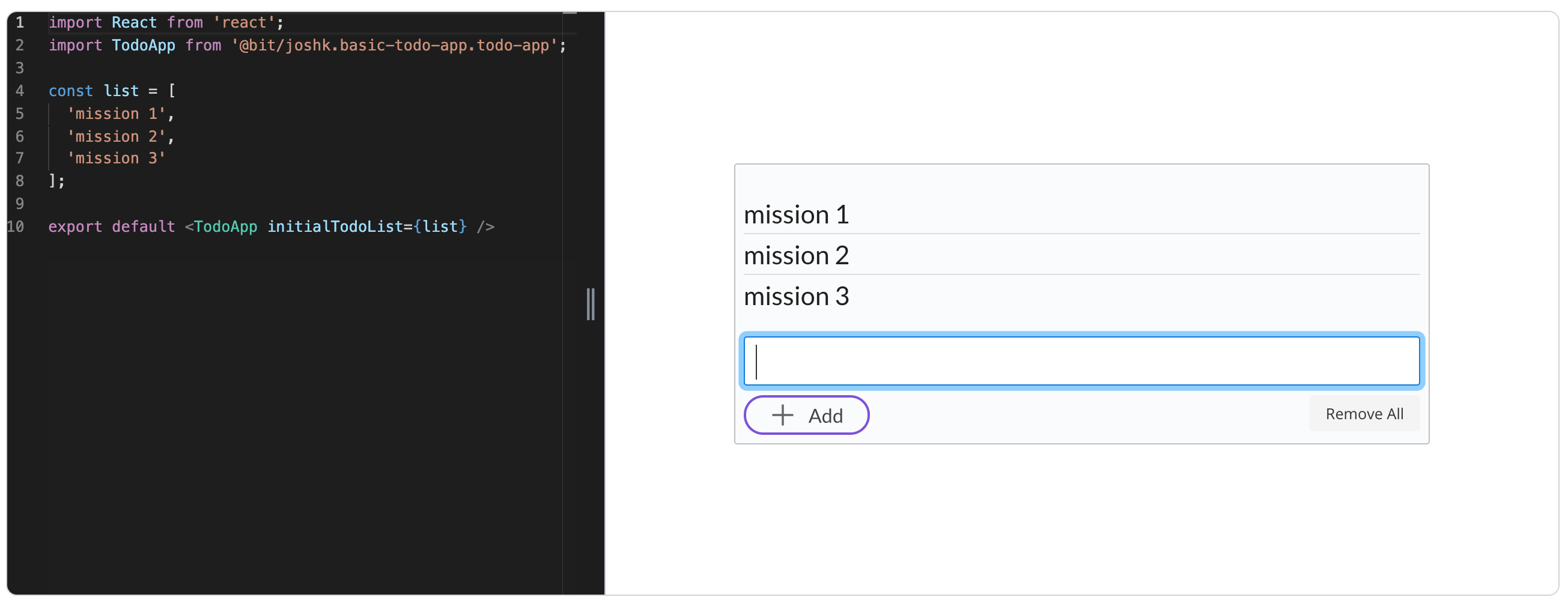
A basic React todo aplication composed of bit componnets shared from 5 different popular React UI libraries inlcuding Grommet, Semantic-UI React, Primereact and Lodash.
All the reusable components used to build this app are availabe in this collection. The final todo application is also available as a reusbale bit component, which can be extended and composed with other components to build larger applications.
Motivation
Demonstrating software modularity in the age of components with React and Bit.
Tutorial
See the full tutorial- build your own modular application with reusable components.
Build a Super Modular Todo App with React and Bit Components.
Wich components I used?
Semantic UI React
semantic-ui-react list component
semantic-ui-react icon component
semantic-ui-react css link component
PrimeReact
primereact inputtextarea component
primereact button component
primereact css link component
Grommet
grommet-icons
lodash
to install them in your project
yarn add @bit/semantic-org.semantic-ui-react.list
yarn add @bit/semantic-org.semantic-ui-react.icon
yarn add @bit/semantic-org.semantic-ui-react.internal.style-links

yarn add @bit/primefaces.primereact.inputtextarea
yarn add @bit/primefaces.primereact.button
yarn add @bit/primefaces.primereact.internal.stylelinks

yarn add @bit/grommet.grommet.button
yarn add @bit/grommet.grommet-icons.add

yarn add @bit/lodash.lodash.unique-id
Contributing
Pull requests are welcome. For major changes, please open an issue first to discuss what you would like to change.
Please make sure to update tests as appropriate.