Bubble Navigation


Demos
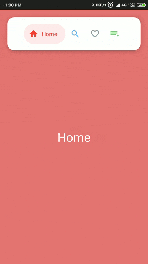
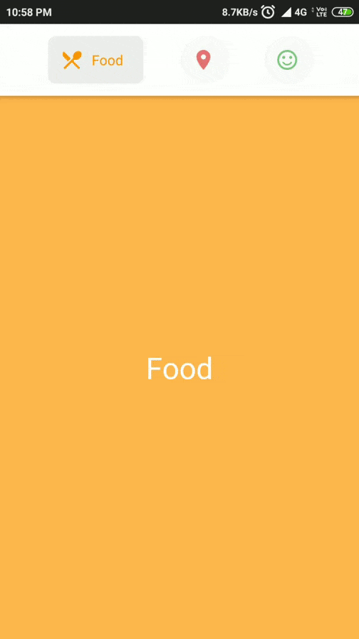
| FloatingTopBarActivity | TopBarActivity |
|---|---|
 |
 |
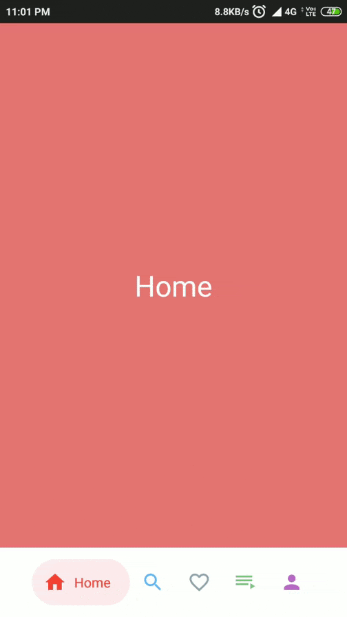
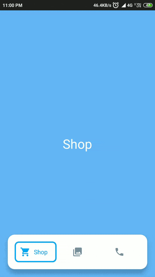
| BottomBarActivity | EqualBottomBarActivity |
|---|---|
 |
 |
Features:
- Support for API Level 16+
- Highly customizable
- Light weight and easy-to-use
- Supports TransitionDrawable for cool state changes
- 2 types of NavigationView for different use cases
- BubbleNavigationConstraintView: supports
spread,insideandpackedmode - BubbleNavigationLinearView: allows equal distribution using weight or packed mode
- BubbleNavigationConstraintView: supports
- Bonus BubbleToggleView to create new UI components, other than navigation
- Add Badges
Usage
Check out the Sample app, to see how its implemented.
Gradle
- This library is available on JCenter. To use it, add the following to
build.gradle
dependencies {
    implementation 'com.gauravk.bubblenavigation:bubblenavigation:1.0.7'
}
XML
<com.gauravk.bubblenavigation.BubbleNavigationConstraintView
        android:id="@+id/top_navigation_constraint"
        android:layout_width="match_parent"
        android:layout_height="wrap_content"
        android:layout_marginBottom="380dp"
        android:background="@color/white"
        android:elevation="4dp"
        android:padding="12dp"
        app:bnc_mode="spread">

        <com.gauravk.bubblenavigation.BubbleToggleView
            android:id="@+id/c_item_rest"
            android:layout_width="wrap_content"
            android:layout_height="wrap_content"
            app:bt_active="true"
            app:bt_colorActive="@color/search_active"
            app:bt_colorInactive="@color/search_inactive"
            app:bt_icon="@drawable/ic_restaurant"
            app:bt_shape="@drawable/transition_background_drawable_restaurant"
            app:bt_title="@string/restaurant"
            app:bt_padding="@dimen/internal_padding"
            app:bt_titlePadding="@dimen/title_padding" />

         <!-- Add more child items here - max upto 5 -->

</com.gauravk.bubblenavigation.BubbleNavigationConstraintView>| attr | Description |
|---|---|
| bnc_mode | Changes the display mode the child elements |
| - spread : equally distributes the child elements | |
| - packed : elements are packed with center gravity | |
| - inside : inside elements are equally distributed |
OR
<com.gauravk.bubblenavigation.BubbleNavigationLinearView
        android:id="@+id/bottom_navigation_view_linear"
        android:layout_width="match_parent"
        android:layout_height="wrap_content"
        android:background="@color/white"
        android:elevation="8dp"
        android:orientation="horizontal"
        android:padding="12dp">

        <com.gauravk.bubblenavigation.BubbleToggleView
            android:id="@+id/l_item_home"
            android:layout_width="wrap_content"
            android:layout_height="wrap_content"
            app:bt_active="true"
            app:bt_colorActive="@color/home_active"
            app:bt_colorInactive="@color/home_inactive"
            app:bt_icon="@drawable/ic_home"
            app:bt_shape="@drawable/transition_background_drawable_home"
            app:bt_title="@string/home"
            app:bt_padding="@dimen/internal_padding"
            app:bt_titlePadding="@dimen/title_padding" />

    <!-- Add more child items here - max upto 5 -->

    </com.gauravk.bubblenavigation.BubbleNavigationLinearView>
Using BubbleToggleView
BubbleToggleView is designed to work as a child component for the BubbleNavigationLinearView and BubbleNavigationConstraintView.
This view can be used independently for:
- Custom implementation of NavigationBar
- Creation of new UI components
- ToggleView
| attr | Description |
|---|---|
| bt_active | Sets to Active State |
| bt_colorActive | When in Active State, uses this color for the Icon and Title |
| bt_colorInctive | When in Inactive State, uses this color for the Icon and Title |
| bt_icon | Sets the Icon Drawable |
| bt_iconWidth | Updates the Icon Width |
| bt_iconHeigth | Updates the Icon Height |
| bt_title | Sets the Title Text |
| bt_titleSize | Updates the Tilte Text Size in sp |
| bt_shape | Sets the Background Drawable. Use TransitionDrawable to get fade in-out effect when toggling |
| bt_showShapeAlways | If true and using Normal drawable, background shape remains visible always |
| bt_shapeColor | Changes the tint color of the shape. N/A when using TransitionDrawable or showShapeAlways is true. |
| bt_duration | Sets time duration for toggle animation to complete in ms |
| bt_padding | Sets the internal padding in dp |
| bt_titlePadding | Sets the title padding in dp |
| bt_badgeText | Sets the text for the badge |
| bt_badgeTextSize | Sets the font size of the badge text |
| bt_badgeTextColor | Sets the text color of the badge |
| bt_badgeBackgroundColor | Sets the background color of the badge |
Note: Normal drawables may retain the shape of each Navigation item. Setting the same drawable for each item with different bt_shapeColor properties produces a similar effect while lowering memory usage and improving performance.
Activity/Fragment
In Java
  bubbleNavigation.setNavigationChangeListener(new BubbleNavigationChangeListener() {
            @Override
            public void onNavigationChanged(View view, int position) {
                //navigation changed, do something
            }
        });
Or in Kotlin
  navigation_view.setNavigationChangeListener { view , position ->
            //navigation changed, do something here
}| Method | Description |
|---|---|
void setCurrentActiveItem(int position) |
Changes the current active state for the navigation view |
void setTypeface(Typeface typeface) |
Updates the typeface of the text |
void setNavigationChangeListener(BubbleNavigationChangeListener listener) |
Sets the navigation change listener |
int getCurrentActiveItemPosition() |
Returns the current active position |
void setBadgeValue(int position, String value) |
Updates the corresponding badge text value |
Contribute
Users are welcome to suggest ideas or feature requests, or report bugs and issues here
I am always open to new suggestions and good contributions.
Contact
Feel free to reach out to me at [email protected]
License:
    Copyright 2019 Gaurav Kumar

    Licensed under the Apache License, Version 2.0 (the "License");
    you may not use this file except in compliance with the License.
    You may obtain a copy of the License at

    http://www.apache.org/licenses/LICENSE-2.0

    Unless required by applicable law or agreed to in writing, software
    distributed under the License is distributed on an "AS IS" BASIS,
    WITHOUT WARRANTIES OR CONDITIONS OF ANY KIND, either express or implied.
    See the License for the specific language governing permissions and
    limitations under the License.