dooboolab / Flutter_calendar_carousel
Licence: mit
Calendar widget for flutter that is swipeable horizontally. This widget can help you build your own calendar widget highly customizable.
Stars: ✭ 621
Programming Languages
dart
5743 projects
Projects that are alternatives of or similar to Flutter calendar carousel
Angular Moment Picker
Angular Moment Picker is an AngularJS directive for date and time picker using Moment.js.
Stars: ✭ 536 (-13.69%)
Mutual labels: calendar
Crunchycalendar
A beautiful material calendar with endless scroll, range selection and a lot more!
Stars: ✭ 465 (-25.12%)
Mutual labels: calendar
Calendar Links
Generate add to calendar links for Google, iCal and other calendar systems
Stars: ✭ 544 (-12.4%)
Mutual labels: calendar
React Infinite Calendar
✨ Infinite scrolling date-picker built with React, with localization, range selection, themes, keyboard support, and more.
Stars: ✭ 3,828 (+516.43%)
Mutual labels: calendar
Outlookcaldavsynchronizer
Sync Outlook with Google, SOGo, Nextcloud or any other CalDAV/CardDAV server
Stars: ✭ 560 (-9.82%)
Mutual labels: calendar
Calendarview
An Easy to Use Calendar for iOS (Swift 5.0)
Stars: ✭ 429 (-30.92%)
Mutual labels: calendar
Sppermissions
Ask permissions with ready-use interface. You can check status permission and if it has been requested before. Support SwiftUI.
Stars: ✭ 4,701 (+657%)
Mutual labels: calendar
Workalendar
Worldwide holidays and workdays computational toolkit.
Stars: ✭ 549 (-11.59%)
Mutual labels: calendar
Mbcalendarkit
An open source calendar framework for iOS, with support for customization, IBDesignable, Autolayout, and more.
Stars: ✭ 561 (-9.66%)
Mutual labels: calendar
Ion2 Calendar
📅 A date picker components for ionic2 /ionic3 / ionic4
Stars: ✭ 537 (-13.53%)
Mutual labels: calendar
Calendarpicker
CalendarPicker Component for React Native
Stars: ✭ 568 (-8.53%)
Mutual labels: calendar
React Modern Calendar Datepicker
A modern, beautiful, customizable date picker for React
Stars: ✭ 555 (-10.63%)
Mutual labels: calendar
flutter_calendar_carousel


Calendar widget for flutter that is swipeable horizontally. This widget can help you build your own calendar widget highly customizable. Now you can even add your icon for each event.
New Feature
- Check out great feature
customDayBuilderwork done by maxgmer 🎉.
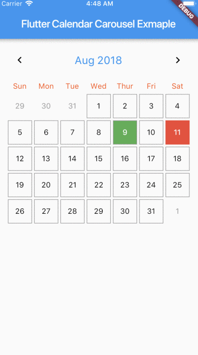
Rectangular style
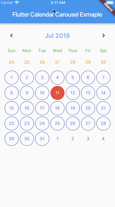
Circular style
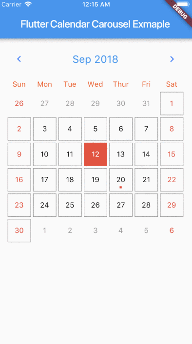
No border

Marked Dates
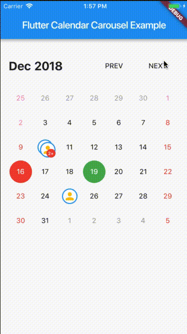
Custom Icon Events
Getting Started
For help getting started with Flutter, view our online documentation.
Props
| props | types | defaultValues |
|---|---|---|
| viewPortFraction | double |
1.0 |
| prevDaysTextStyle | TextStyle |
|
| daysTextStyle | TextStyle |
|
| nextDaysTextStyle | TextStyle |
|
| prevMonthDayBorderColor | Color |
Colors.transparent |
| thisMonthDayBorderColor | Color |
Colors.transparent |
| nextMonthDayBorderColor | Color |
Colors.transparent |
| dayPadding | double |
2.0 |
| height | double |
double.infinity |
| width | double |
double.infinity |
| todayTextStyle | TextStyle |
fontSize: 14.0, color: Colors.white |
| dayButtonColor | Color |
Colors.red |
| todayBorderColor | Color |
Colors.red |
| todayButtonColor | Colors |
Colors.red |
| selectedDateTime | DateTime |
|
| selectedDayTextStyle | TextStyle |
fontSize: 14.0, color: Colors.white |
| selectedDayBorderColor | Color |
Colors.green |
| selectedDayButtonColor | Color |
Colors.green |
| daysHaveCircularBorder | bool |
|
| onDayPressed | Func |
|
| weekdayTextStyle | TextStyle |
fontSize: 14.0, color: Colors.deepOrange |
| iconColor | Color |
Colors.blueAccent |
| headerTextStyle | TextStyle |
fontSize: 20.0, color: Colors.blue |
| headerText | Text |
Text('${DateFormat.yMMM().format(this._dates[1])}') |
| weekendTextStyle | TextStyle |
fontSize: 14.0, color: Colors.pinkAccent |
| markedDatesMap | Events |
null |
| markedDateWidget | Widget |
Positioned(child: Container(color: Colors.blueAccent, height: 4.0, width: 4.0), bottom: 4.0, left: 18.0); |
| markedDateShowIcon | bool |
false |
| markedDateIconBorderColor | Color |
|
| markedDateIconMaxShown | int |
2 |
| markedDateIconMargin | double |
5.0 |
| markedDateIconBuilder | MarkedDateIconBuilder<T> |
|
| markedDateIconOffset | double |
5.0 |
| markedDateCustomShapeBorder | ShapeBorder |
null |
| markedDateCustomTextStyle | TextStyle |
null |
| markedDateMoreCustomDecoration | Decoration |
|
| markedDateMoreCustomTextStyle | TextStyle |
|
| headerMargin | EdgetInsets |
const EdgeInsets.symmetric(vertical: 16.0) |
| headerTitleTouchable | bool |
false |
| onHeaderTitlePressed | Function |
() => _selectDateFromPicker() |
| showHeader | bool |
|
| showHeaderButton | bool |
|
| childAspectRatio | double |
1.0 |
| weekDayMargin | EdgeInsets |
const EdgeInsets.only(bottom: 4.0) |
| weekFormat | bool |
false |
| locale | String |
en |
| firstDayOfWeek | int |
null |
| onCalendarChanged | Function(DateTime) |
|
| minSelectedDate | DateTime |
|
| maxSelectedDate | DateTime |
|
| inactiveDaysTextStyle | TextStyle |
|
| inactiveWeekendTextStyle | TextStyle |
|
| weekDayFormat | WeekdayFormat |
short |
| staticSixWeekFormat | bool |
false |
| showOnlyCurrentMonthDate | bool |
false |
| dayCrossAxisAlignment | CrossAxisAlignment |
CrossAxisAlignment.center |
| dayMainAxisAlignment | MainAxisAlignment |
CrossAlignment.center |
| showIconBehindDayText | bool |
false |
| pageScrollPhysics | ScrollPhysics |
ScrollPhysics |
With CalendarCarousel<YourEventClass> and EventList<YourEventClass> you can specifiy a custom Event class.
Install
Add flutter_calendar_carousel as a dependency in pubspec.yaml
For help on adding as a dependency, view the documentation.
Usage
import 'package:flutter_calendar_carousel/flutter_calendar_carousel.dart' show CalendarCarousel;
Widget widget() {
  return Container(
    margin: EdgeInsets.symmetric(horizontal: 16.0),
    child: CalendarCarousel<Event>(
      onDayPressed: (DateTime date, List<Event> events) {
        this.setState(() => _currentDate = date);
      },
      weekendTextStyle: TextStyle(
        color: Colors.red,
      ),
      thisMonthDayBorderColor: Colors.grey,
//      weekDays: null, /// for pass null when you do not want to render weekDays
//      headerText: Container( /// Example for rendering custom header
//        child: Text('Custom Header'),
//      ),
      customDayBuilder: (   /// you can provide your own build function to make custom day containers
        bool isSelectable,
        int index,
        bool isSelectedDay,
        bool isToday,
        bool isPrevMonthDay,
        TextStyle textStyle,
        bool isNextMonthDay,
        bool isThisMonthDay,
        DateTime day,
      ) {
          /// If you return null, [CalendarCarousel] will build container for current [day] with default function.
          /// This way you can build custom containers for specific days only, leaving rest as default.

          // Example: every 15th of month, we have a flight, we can place an icon in the container like that:
          if (day.day == 15) {
            return Center(
              child: Icon(Icons.local_airport),
            );
          } else {
            return null;
          }
      },
      weekFormat: false,
      markedDatesMap: _markedDateMap,
      height: 420.0,
      selectedDateTime: _currentDate,
      daysHaveCircularBorder: false, /// null for not rendering any border, true for circular border, false for rectangular border
    ),
  );
}
TODO
- [x] Render weekdays.
- [x] Customizable headerWidget.
- [x] Set weekdays visibility.
- [x] Customizable textStyles for days in weekend.
- [x] Marked Dates.
- [x] Multiple Marked Dates.
- [x] Customizable weekend days.
- [x] Week Calendar.
- [x] Carousel Week Calendar.
- [ ] Multiple days selections.
- [x] Widget test.
Help Maintenance
I've been maintaining quite many repos these days and burning out slowly. If you could help me cheer up, buying me a cup of coffee will make my life really happy and get much energy out of it.

Note that the project description data, including the texts, logos, images, and/or trademarks,
for each open source project belongs to its rightful owner.
If you wish to add or remove any projects, please contact us at [email protected].