All Projects → dylan-profiler → heatmaps

dylan-profiler / heatmaps

Licence: BSD-3-Clause license
Better heatmaps in Python

Programming Languages

Jupyter Notebook
11667 projects
python
139335 projects - #7 most used programming language

Projects that are alternatives of or similar to heatmaps

catheat
Plot categorical heatmaps with seaborn
Stars: ✭ 17 (-85.47%)
Mutual labels:  heatmap, seaborn
publib
Produce publication-level quality images on top of Matplotlib
Stars: ✭ 34 (-70.94%)
Mutual labels:  plot, matplotlib
monthly-returns-heatmap
Python Monthly Returns Heatmap (DEPRECATED! Use QuantStats instead)
Stars: ✭ 23 (-80.34%)
Mutual labels:  heatmap, seaborn
Itermplot
An awesome iTerm2 backend for Matplotlib, so you can plot directly in your terminal.
Stars: ✭ 1,267 (+982.91%)
Mutual labels:  plot, matplotlib
sarviewer
Generate graphs with gnuplot or matplotlib (Python) from sar data
Stars: ✭ 60 (-48.72%)
Mutual labels:  plot, matplotlib
Matplotlib4j
Matplotlib for java: A simple graph plot library for java with powerful python matplotlib
Stars: ✭ 107 (-8.55%)
Mutual labels:  plot, matplotlib
Calendar Heatmap
Calendar heatmap with matplotlib and random data
Stars: ✭ 76 (-35.04%)
Mutual labels:  heatmap, matplotlib
Tensorflow Plot
📈 TensorFlow + Matplotlib as TF ops
Stars: ✭ 285 (+143.59%)
Mutual labels:  plot, matplotlib
Github-Stars-Predictor
It's a github repo star predictor that tries to predict the stars of any github repository having greater than 100 stars.
Stars: ✭ 34 (-70.94%)
Mutual labels:  seaborn, matplotlib
Goodreads visualization
A Jupyter notebook where I play with my Goodreads data
Stars: ✭ 51 (-56.41%)
Mutual labels:  plot, seaborn
Rustplotlib
A Rust's binding of matplotlib
Stars: ✭ 31 (-73.5%)
Mutual labels:  plot, matplotlib
11 Python Matplotlib Module
Matplotlib is an amazing visualization library in Python for 2D plots of arrays. Matplotlib is a multi-platform data visualization library built on NumPy arrays and designed to work with the broader SciPy stack. It was introduced by John Hunter in the year 2002. One of the greatest benefits of visualization is that it allows us visual access to …
Stars: ✭ 206 (+76.07%)
Mutual labels:  matplotlib, matplotlib-heatmap
Adjusttext
A small library for automatically adjustment of text position in matplotlib plots to minimize overlaps.
Stars: ✭ 731 (+524.79%)
Mutual labels:  plot, matplotlib
tapmap
Command line keyboard heatmap generator.
Stars: ✭ 19 (-83.76%)
Mutual labels:  heatmap, matplotlib
Vapeplot
matplotlib extension for vaporwave aesthetics
Stars: ✭ 483 (+312.82%)
Mutual labels:  plot, matplotlib
Pyheat
pprofile + matplotlib = Python program profiled as an awesome heatmap!
Stars: ✭ 491 (+319.66%)
Mutual labels:  heatmap, matplotlib
bitrate-plotter
Plots a graph showing the bitrate every second or the bitrate of every GOP, for a video or audio file.
Stars: ✭ 15 (-87.18%)
Mutual labels:  plot, matplotlib
nodeplotlib
NodeJS plotting library for JavaScript and TypeScript. On top of plotly.js. Inspired by matplotlib.
Stars: ✭ 115 (-1.71%)
Mutual labels:  plot, matplotlib
Python-Course
Python Basics, Machine Learning and Deep Learning
Stars: ✭ 50 (-57.26%)
Mutual labels:  seaborn, matplotlib
Data-Analytics-Projects
This repository contains the projects related to data collecting, assessing,cleaning,visualizations and analyzing
Stars: ✭ 167 (+42.74%)
Mutual labels:  seaborn, matplotlib

heatmapz - Better heatmaps in Python

Python code and Jupyter notebook for an improved heatmap implementation using Matplotlib and Seaborn.

Similar to what you can easily get in Tableau using a Size parameter, here you can have square size as parameter depending on the field value.

Described in detail in this blog post: https://towardsdatascience.com/better-heatmaps-and-correlation-matrix-plots-in-python-41445d0f2bec

See below for installation details, reference and examples.

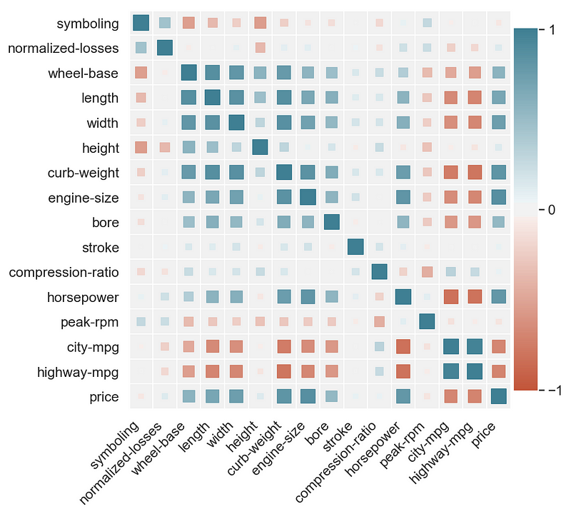
Example of a correlation matrix

drawing

Example of a discrete joint distribution

drawing

Installation

To get the pip package run:

pip install heatmapz

Then you can use the following imports:

from heatmap import heatmap, corrplot

Reference


heatmap(x, y, **kwargs)

Parameters:

x : A list, np.array or pandas.Series containing the values for the horizontal dimension

y : A list, np.array or pandas.Series containing the values for the vertical dimension

Optional parameters:

color : A list, np.array or pandas.Series containing values based on which to apply the heatmap color. Should have the same length as x and y.

palette : A list of colors to use as the heatmap palette. The values from color are mapped onto the palette so that min(color) -> palette[0] and max(color) -> palette[len(palette)-1], and the values in between are linearly interpolated. A good way to choose or create a palette is to simply use Seaborn palettes (https://seaborn.pydata.org/tutorial/color_palettes.html).

color_range : A tuple (color_min, color_max) that enables capping the values of color being mapped to palette. All color values less than color_min are capped to color_min, and all color values larger than color_max are capped to color_max. Then those values are mapped to palette as described under color.

size : A list, np.array or pandas.Series containing values based on which to apply the size to the shapes in the plot. Should have the same length as x and y.

size_range : A tuple (size_min, size_max) that enables capping the values of size being applied to the shapes in the plot. Essentially controls min and max size of the shapes.

size_scale : Used to scale the size of the shapes in the plot to make them fit the size of the fields in the matrix. Default value is 500. You will likely need to fiddle with this parameter in order to find the right value for your figure size and the size range applied.

x_order : Should contain all distinct values of x ordered in the way you want them shown on the x-axis from left to right.

y_order : Should contain all distinct values of y ordered in the way you want them shown on the y-axis from bottom to top.

marker : Specify the shape to use in the plot. It can be any of the matplotlib marker shapes (https://matplotlib.org/api/markers_api.html). The default is 's' for square.

xlabel : Label for the x-axis. Default is none.

ylabel : Label for the y-axis. Default is none.


corrplot(data, size_scale=500, marker='s')

A shorthand function for making correlation plots from pandas dataframes.

Parameters:

data : You should pass the result of calling df.corr() on a dataframe.

size_scale : Used to scale the size of the shapes in the plot to make them fit the size of the fields in the matrix. Default value is 500. You will likely need to fiddle with this parameter in order to find the right value for your figure size and the size range applied.

marker : Specify the shape to use in the plot. It can be any of the matplotlib marker shapes (https://matplotlib.org/api/markers_api.html). The default is 's' for square.

Examples

You can find a walktrough with examples in this Colab notebook https://colab.research.google.com/drive/1YSvER-U3cwGplSHyXwaCXYhOWfWO53Iy

Note that the project description data, including the texts, logos, images, and/or trademarks, for each open source project belongs to its rightful owner. If you wish to add or remove any projects, please contact us at [email protected].