florent37 / Singledateandtimepicker
Licence: apache-2.0
You can now select a date and a time with only one widget !
Stars: ✭ 921
Programming Languages
java
68154 projects - #9 most used programming language
Projects that are alternatives of or similar to Singledateandtimepicker
Md Date Time Picker
An implementation of Material Design Picker components in vanilla CSS, JS, and HTML
Stars: ✭ 272 (-70.47%)
Mutual labels: time, date, material, design, dialog, picker
Vue Ctk Date Time Picker
VueJS component to select dates & time, including a range mode
Stars: ✭ 707 (-23.24%)
Mutual labels: time, date, dialog, picker, range
Vuetify Daterange Picker
The missing date range picker for Vuetify JS you have been looking for.
Stars: ✭ 192 (-79.15%)
Mutual labels: date, material, picker, range
Date Picker
📅 Custom responsive date picker widget for Android, written in Kotlin.
Stars: ✭ 146 (-84.15%)
Mutual labels: time, date, picker
Lightpick
(deprecated) Check out the new date picker Litepicker
Stars: ✭ 204 (-77.85%)
Mutual labels: date, picker, range
React Picky Date Time
A react component for date time picker. Online demo examples
Stars: ✭ 31 (-96.63%)
Mutual labels: time, date, picker
Persianrangedatepicker
Persian range date picker for android.
Stars: ✭ 48 (-94.79%)
Mutual labels: date, picker, range
Linear Time Picker
Gorgeous Android Time and Date picker library inspired by the Timely app
Stars: ✭ 613 (-33.44%)
Mutual labels: time, date, picker
Brpickerview
BRPickerView 封装的是iOS中常用的选择器组件,主要包括:日期选择器(支持年月日、年月等15种日期样式选择,支持设置星期、至今等)、地址选择器(支持省市区、省市、省三种地区选择)、自定义字符串选择器(支持单列、多列、二级联动、三级联动选择)。支持自定义主题样式,适配深色模式,支持将选择器组件添加到指定容器视图。
Stars: ✭ 2,149 (+133.33%)
Mutual labels: time, date, picker
popoPicker
popoPicker是一个移动端3D滚轮日期时间和单项的选择器,支持无限循环滚动,不依赖第三方库
Stars: ✭ 26 (-97.18%)
Mutual labels: time, date, picker
HijriDatePicker
Material (Gregorian - Hijri) Date & Time Picker
Stars: ✭ 128 (-86.1%)
Mutual labels: time, dialog, picker
Angular Moment Picker
Angular Moment Picker is an AngularJS directive for date and time picker using Moment.js.
Stars: ✭ 536 (-41.8%)
Mutual labels: time, date, picker
Pickadate.js
The mobile-friendly, responsive, and lightweight jQuery date & time input picker.
Stars: ✭ 7,753 (+741.8%)
Mutual labels: time, date, picker
Things Calendar
Simple but elegant datepicker for the web — inspired by Things for mac
Stars: ✭ 165 (-82.08%)
Mutual labels: date, design, picker
React Native Modal Datetime Picker
A React-Native datetime-picker for Android and iOS
Stars: ✭ 2,412 (+161.89%)
Mutual labels: time, date, picker
Dialogsheet
An Android library to create fully material designed bottom dialogs similar to the Android Pay app.
Stars: ✭ 236 (-74.38%)
Mutual labels: material, design, dialog
Chocobo-Date-Range-Picker
🗓️ Component - The Date Range Picker easier to use in AngularJS.
Stars: ✭ 23 (-97.5%)
Mutual labels: date, range, picker
react-picky-date-time
A react component for date time picker. Online demo examples
Stars: ✭ 41 (-95.55%)
Mutual labels: time, date, picker
vue-timeselector
🕒 Simply customizable powerful time picker for Vue.js
Stars: ✭ 41 (-95.55%)
Mutual labels: time, date, picker
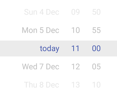
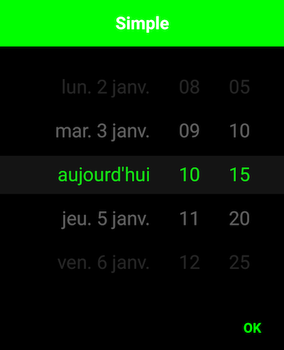
SingleDateAndTimePicker
You can now select a date and a time with only one widget !


Usage
new SingleDateAndTimePickerDialog.Builder(context)
            //.bottomSheet()
            //.curved()
            //.stepSizeMinutes(15)
            //.displayHours(false)
            //.displayMinutes(false)
            //.todayText("aujourd'hui")
            .displayListener(new SingleDateAndTimePickerDialog.DisplayListener() {
                @Override
                public void onDisplayed(SingleDateAndTimePicker picker) {
                    // Retrieve the SingleDateAndTimePicker
                }

                @Override
                public void onClosed(SingleDateAndTimePicker picker) {
                    // On dialog closed
                }
            })
            .title("Simple")
            .listener(new SingleDateAndTimePickerDialog.Listener() {
                @Override
                public void onDateSelected(Date date) {

                }
            }).display();
Select 2 dates
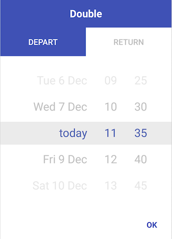
new DoubleDateAndTimePickerDialog.Builder(context)
            //.bottomSheet()
            //.curved()
            //.stepSizeMinutes(15)
            .title("Double")
            .tab0Text("Depart")
            .tab1Text("Return")
            .listener(new DoubleDateAndTimePickerDialog.Listener() {
                @Override
                public void onDateSelected(List<Date> dates) {

                }
        }).display();
Display days, months and years

new SingleDateAndTimePickerDialog.Builder(this)
            .bottomSheet()
            .curved()
            .displayMinutes(false)
            .displayHours(false)
            .displayDays(false)
            .displayMonth(true)
            .displayYears(true)
            .displayDaysOfMonth(true)
            .display();
Include in a layout
<com.github.florent37.singledateandtimepicker.SingleDateAndTimePicker
        android:layout_width="wrap_content"
        android:layout_height="230dp"
        app:picker_curved="true"
        app:picker_cyclic="true"
        app:picker_visibleItemCount="7"
        />
iOS like :P
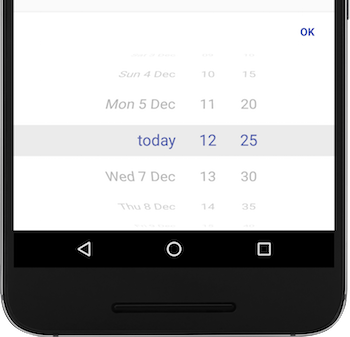
new SingleDateAndTimePickerDialog.Builder(context)
                                    .bottomSheet()
                                    .curved()
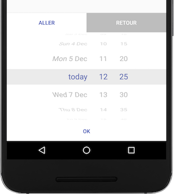
new DoubleDateAndTimePickerDialog.Builder(context)
                                    .bottomSheet()
                                    .curved()
Customisation
You can change the minutes steps (default : 5min)
new SingleDateAndTimePickerDialog.Builder(context)
            .stepSizeMinutes(15)
            .display();
And change some colors
new SingleDateAndTimePickerDialog.Builder(context)
            .backgroundColor(Color.BLACK)
            .mainColor(Color.GREEN)
            .titleColor(Color.WHITE)
            .display();
Date range
Require user to select a date between a range
new SingleDateAndTimePickerDialog.Builder(context)
            .defaultDate(defaultDate)
            .minDateRange(minDate)
            .maxDateRange(maxDate)
            .display();
Or simply require user to select a future date
new SingleDateAndTimePickerDialog.Builder(context)
            .mustBeOnFuture()
            .display();
Changing typeface
final SingleDateAndTimePicker singleDateAndTimePicker2 = findViewById(R.id.single_day_picker2);
singleDateAndTimePicker2.setTypeface(ResourcesCompat.getFont(this, R.font.dinot_regular));
Or pass it as an attribute in the XML layout. (See XML section on how to use it.)
XML
Some/most options are also available via XML:
    <com.github.florent37.singledateandtimepicker.SingleDateAndTimePicker
        android:id="@+id/single_day_picker"
        android:layout_width="wrap_content"
        android:layout_height="wrap_content"
        app:picker_itemSpacing="6dp"
        app:picker_curvedMaxAngle="45"
        app:picker_curved="true"
        app:picker_selectorColor="@android:color/transparent"
        app:picker_stepSizeHours="2"
        app:picker_stepSizeMinutes="5"
        app:picker_cyclic="false"
        app:picker_dayCount="31"
        app:picker_mustBeOnFuture="true"
        app:picker_visibleItemCount="7"
        app:fontFamily="@font/dinot_bold"
        />
- picker_itemSpacing: Margin between items. Only has effect with height=wrap-content
- picker_curvedMaxAngle sets the max angle of top/bottom items. If 45 then the visible 'window' of the wheel is a 'quarter' of the circle. If 90 (default) its rolling on a half-circle
-
app:fontFamilyorandroid:fontFamilysets the typeface/font to be used with the date picker. Note - For api below v-16 useapp:fontFamily
Get divider lines around selected by overwriting one or more of
    <color name="picker_default_divider_color">@android:color/transparent</color>
    <dimen name="picker_default_divider_height">1dp</dimen>
    <drawable name="picker_default_divider">@drawable/picker_divider</drawable>
Use in conjuction with
app:picker_selectorColor="@android:color/transparent" on layout.
Download
In your module 
implementation 'com.github.florent37:singledateandtimepicker:2.2.7'
//compatible with androidX
Credits
Author: Florent Champigny
Blog : http://www.tutos-android-france.com/
Fiches Plateau Moto : https://www.fiches-plateau-moto.fr/


License
Copyright 2016 florent37, Inc.

Licensed under the Apache License, Version 2.0 (the "License");
you may not use this file except in compliance with the License.
You may obtain a copy of the License at

   http://www.apache.org/licenses/LICENSE-2.0

Unless required by applicable law or agreed to in writing, software
distributed under the License is distributed on an "AS IS" BASIS,
WITHOUT WARRANTIES OR CONDITIONS OF ANY KIND, either express or implied.
See the License for the specific language governing permissions and
limitations under the License.
Note that the project description data, including the texts, logos, images, and/or trademarks,
for each open source project belongs to its rightful owner.
If you wish to add or remove any projects, please contact us at [email protected].