daniel-stoneuk / Material About Library
Programming Languages
Projects that are alternatives of or similar to Material About Library
material-about-library
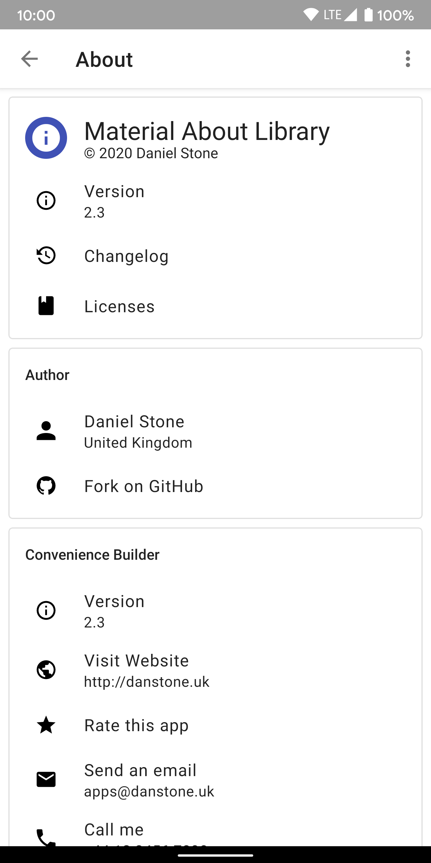
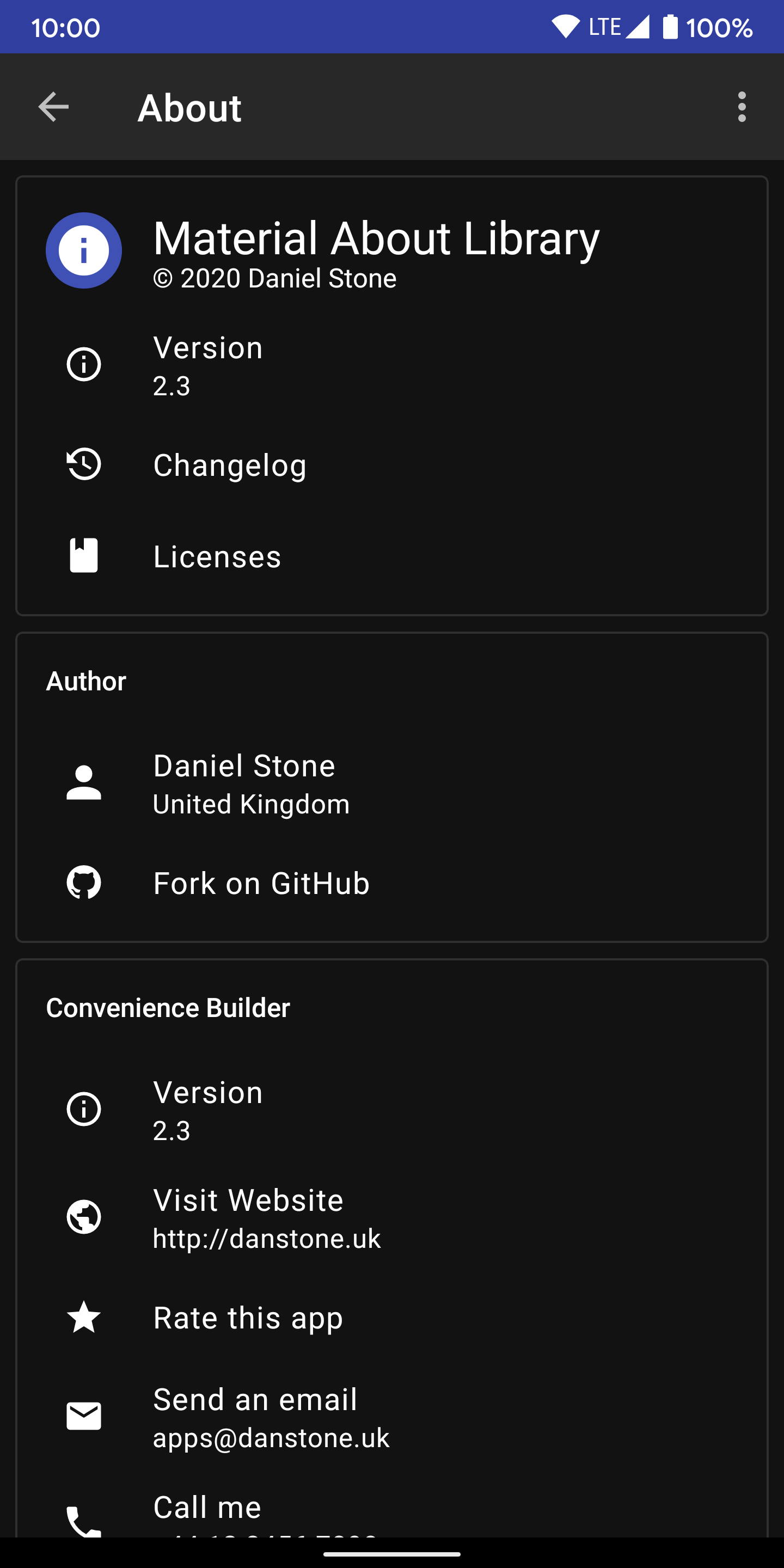
Makes it easy to create a beautiful about screen for your app. Generates an Activity or Fragment.
Idea from here: Heinrich Reimer's open-source-library-request-manager
Design inspired by Phonograph
If you use this library in your app, please let me know and I'll add it to the list.
Demo
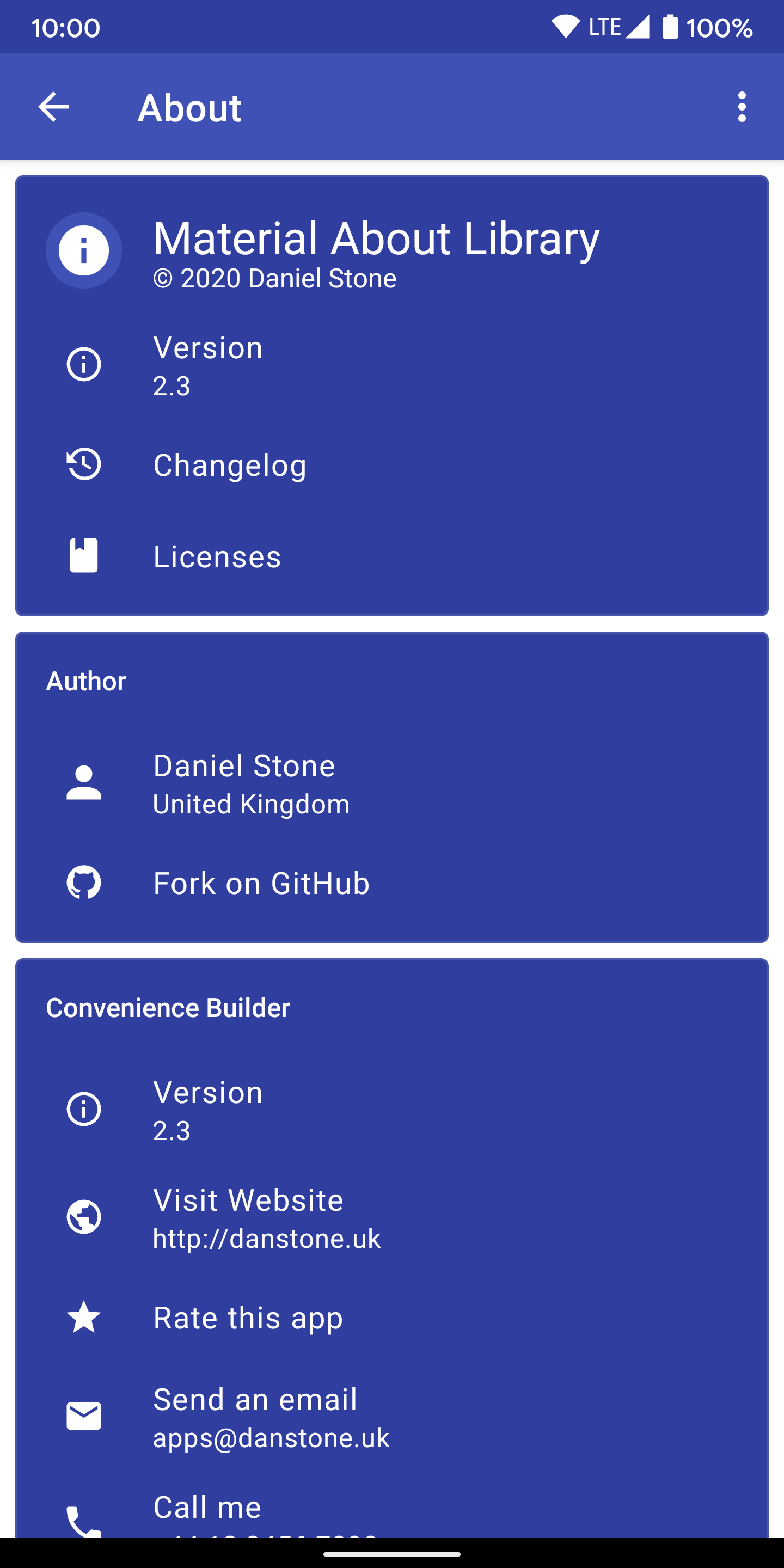
Screenshots
| Light | Dark | Custom Cardview Background |
|---|---|---|
 |
 |
 |
Features
- Material design
- Modular backend
- Easy to implement
- Simple but intuitive API
- Dynamic item support
Dependency
material-about-library is available on jitpack.io.
Gradle dependency:
allprojects {
    repositories {
        maven { url 'https://jitpack.io' }
    }
}
dependencies {
    implementation 'com.github.daniel-stoneuk:material-about-library:3.1.2'
}
Help test 3.2.0 with shared views between adapters (may cause crashes):
dependencies {
    implementation 'com.github.daniel-stoneuk:material-about-library:3.2.0-rc01'
}
Migration
View the migration guide here
Setup
Activity
Your Activity must extend MaterialAboutActivity and be in your AndroidManifest.xml:
public class ExampleMaterialAboutActivity extends MaterialAboutActivity {

    @Override
    @NonNull
    protected MaterialAboutList getMaterialAboutList(@NonNull Context context) {
        return new MaterialAboutList.Builder()
                .build(); // This creates an empty screen, add cards with .addCard()
    }

    @Override
    protected CharSequence getActivityTitle() {
        return getString(R.string.mal_title_about);
    }

}
Ensure that the theme extends a MaterialComponents theme, and apply primary & secondary colours:
<manifest ...>
    <application ...>
        <activity android:name=".ExampleMaterialAboutActivity"
            android:theme="@style/AppTheme.MaterialAboutActivity"/>
    </application>
</manifest>
<style name="AppTheme.MaterialAboutActivity" parent="Theme.MaterialComponents.DayNight.DarkActionBar">
    <item name="colorPrimary">@color/colorPrimary</item>
    <item name="colorPrimaryDark">@color/colorPrimaryDark</item>
</style>
Fragment
Your Fragment must extend MaterialAboutFragment.
public class ExampleMaterialAboutFragment extends MaterialAboutFragment {

    @Override
    protected MaterialAboutList getMaterialAboutList(final Context activityContext) {
        return new MaterialAboutList.Builder()
                .build(); // This creates an empty screen, add cards with .addCard()
    }

}
Theming will follow the activity theme.
Add Cards:
Start building a "card" using MaterialAboutCard.Builder()
public class ExampleMaterialAboutActivity extends MaterialAboutActivity {

    @Override
    @NonNull
    protected MaterialAboutList getMaterialAboutList(@NonNull Context context) {
        MaterialAboutCard card = new MaterialAboutCard.Builder()
                // Configure card here
                .build();

        return new MaterialAboutList.Builder()
                    .addCard(card)
                    .build();
    }
}
Give the card a title by calling .title() on the MaterialAboutCard.Builder
MaterialAboutCard card = new MaterialAboutCard.Builder()
    .title("Author")
    .build();
Enable elevation and disable the outline to get a more classic design by calling .outline(false) on the MaterialAboutCard.Builder
MaterialAboutCard card = new MaterialAboutCard.Builder()
    .outline(false)
    .build();
Add Items to a card:
There are currently two types of items you can add to a card - MaterialAboutTitleItem and MaterialAboutActionItem. Other types of items are planned, for example "person" items which feature buttons to showcase a single person. Feel free to submit a PR or Issue for more item ideas.
-
MaterialAboutActionItem: Standard item with text, icon and optional subtext. -
MaterialAboutTitleItem: Larger item with large icon (e.g. app icon) and larger text.
MaterialAboutTitleItem is created with MaterialAboutTitleItem.Builder() and lets you specify text and an icon.
MaterialAboutCard.Builder cardBuilder = new MaterialAboutCard.Builder();
cardBuilder.addItem(new MaterialAboutTitleItem.Builder()
        .text("Material About Library")
        .icon(R.mipmap.ic_launcher)
        .build());
MaterialAboutActionItem is created with MaterialAboutActionItem.Builder() and lets you specify text, sub-text, an icon and an OnClickAction.
cardBuilder.addItem(new MaterialAboutActionItem.Builder()
        .text("Version")
        .subText("1.0.0")
        .icon(R.drawable.ic_about_info)
        .setOnClickAction(new MaterialAboutActionItem.OnClickAction() {
            @Override
            public void onClick() {
                Toast.makeText(ExampleMaterialAboutActivity.this, "Version Tapped", Toast.LENGTH_SHORT)
                        .show();
            }
        })
        .build());
Return the list:
Create a MaterialAboutList using MaterialAboutList.Builder(), passing in the cards you would like to display.
MaterialAboutCard card = new MaterialAboutCard.Builder()
        .title("Hey! I'm a card")
        .build();

return new MaterialAboutList.Builder()
        .addCard(card)
        .build();
Check out a working example in Demo.java.
Tip: You can either use Strings / Drawables or Resources when creating MaterialAboutItem's
Tip: Use Android-Iconics for icons. "Android-Iconics - Use any icon font, or vector (.svg) as drawable in your application."
Tip: Use ConvenienceBuilder to easily create items or OnClickActions.
Tip: Customise text colour and card colour in your styles. Example below:
<style name="AppTheme.MaterialAboutActivity.Light.DarkActionBar.CustomCardView" parent="Theme.MaterialComponents.Light.DarkActionBar">
        <!-- Customize your theme here. -->
        <item name="colorPrimary">@color/colorPrimary</item>
        <item name="colorPrimaryDark">@color/colorPrimaryDark</item>
        <item name="android:textColorPrimary">#ffffff</item>
        <item name="android:textColorSecondary">#ffffff</item>
        <item name="colorSurface">@color/colorPrimaryDark</item>
        <item name="colorOnSurface">#ffffff</item>
    </style>
Custom Adapters:
It is possible to replace the contents of a card with a custom adapter. If you do this, then none of the items associated with the card will be displayed. Check out the demo app, in which use LicenseAdapter (hence the INTERNET permission).
MaterialAboutCard.Builder customAdapterCardBuilder = new MaterialAboutCard.Builder();
// Create list of libraries
List<Library> libraries = new ArrayList<>();

// Add libraries that are hosted on GitHub with an Apache v2 license.
libraries.add(Licenses.fromGitHubApacheV2("yshrsmz/LicenseAdapter"));
libraries.add(Licenses.fromGitHubApacheV2("daniel-stoneuk/material-about-library"));

customAdapterCardBuilder.title("Custom Adapter (License Adapter)");
customAdapterCardBuilder.customAdapter(new LicenseAdapter(libraries));
});
Dynamic items:
It's possible to create dynamic items that either change on tap (or when any other event occurs). There are two examples in the sample application. Simply change the items in the list variable and then call refreshMaterialAboutList(). DiffUtil calculates the changes to animate in the RecyclerView.
final MaterialAboutActionItem item = new MaterialAboutActionItem.Builder()
            .text("Dynamic UI")
            .subText(subText)
            .icon(new IconicsDrawable(c)
                    .icon(CommunityMaterial.Icon.cmd_refresh)
                    .color(ContextCompat.getColor(c, R.color.mal_color_icon_dark_theme)
                    ).sizeDp(18))
            .build();
    item.setOnClickAction(new MaterialAboutItemOnClickAction() {
        @Override
        public void onClick() {
            item.setSubText("Random number: " + ((int) (Math.random() * 10)));
            refreshMaterialAboutList();
        }
    });
Custom card and Action layout
To get a layout that is similar to the 6th screenshot above simply override the files mal_material_about_action_item and mal_material_about_list_card by creating new layout resources with the same filename. See here.
Contributors
- Daniel Stone (@daniel-stoneuk)
- Robert Pösel (@Robyer)
- Jonas Uekötter (@ueman)
- Rainer Lang (@Rainer-Lang)
- Sebastian Guillen (@code-schreiber)
- and others
Apps using this library
- Monitor for EnergyHive & Engage
- Crafting Assistant NMS
- ComicsDB Client, code available on GitHub
- Android About Box (library) - an opinionated About Box for Android
- Skin Widget for Minecraft
- FastHub for GitHub
License
Copyright 2016-2020 Daniel Stone

Licensed under the Apache License, Version 2.0 (the "License");
you may not use this file except in compliance with the License.
You may obtain a copy of the License at

   http://www.apache.org/licenses/LICENSE-2.0

Unless required by applicable law or agreed to in writing, software
distributed under the License is distributed on an "AS IS" BASIS,
WITHOUT WARRANTIES OR CONDITIONS OF ANY KIND, either express or implied.
See the License for the specific language governing permissions and
limitations under the License.


