javiersantos / Materialstyleddialogs
Programming Languages
Projects that are alternatives of or similar to Materialstyleddialogs
MaterialStyledDialogs 
Android Library

Android Library that shows a beautiful and customizable Material designed dialog with header. Based on material-dialogs and inspired by this dribbble.
How to include
Add the repository to your project build.gradle:
repositories {
    jcenter()
    maven {
        url "https://jitpack.io"
    }
}
And add the library to your module build.gradle:
AndroidX
dependencies {
    implementation 'com.github.javiersantos:MaterialStyledDialogs:3.0.1'
}
Pre AndroidX (no longer supported)
dependencies {
    implementation 'com.github.javiersantos:MaterialStyledDialogs:2.2'
}
Usage
Basic Dialog
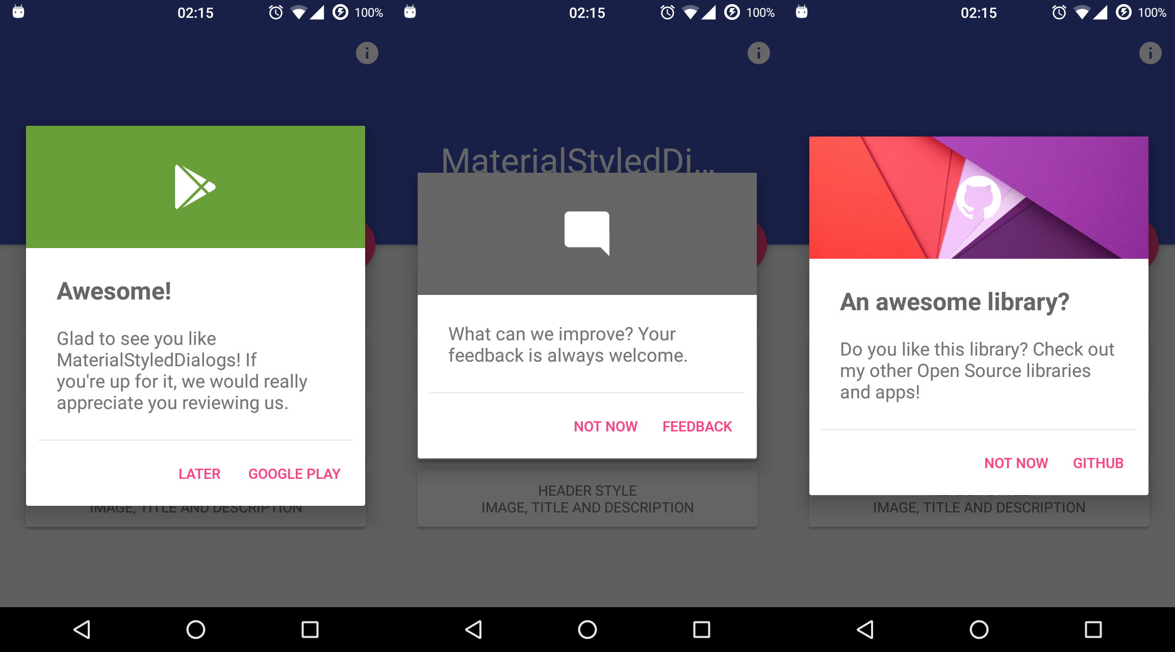
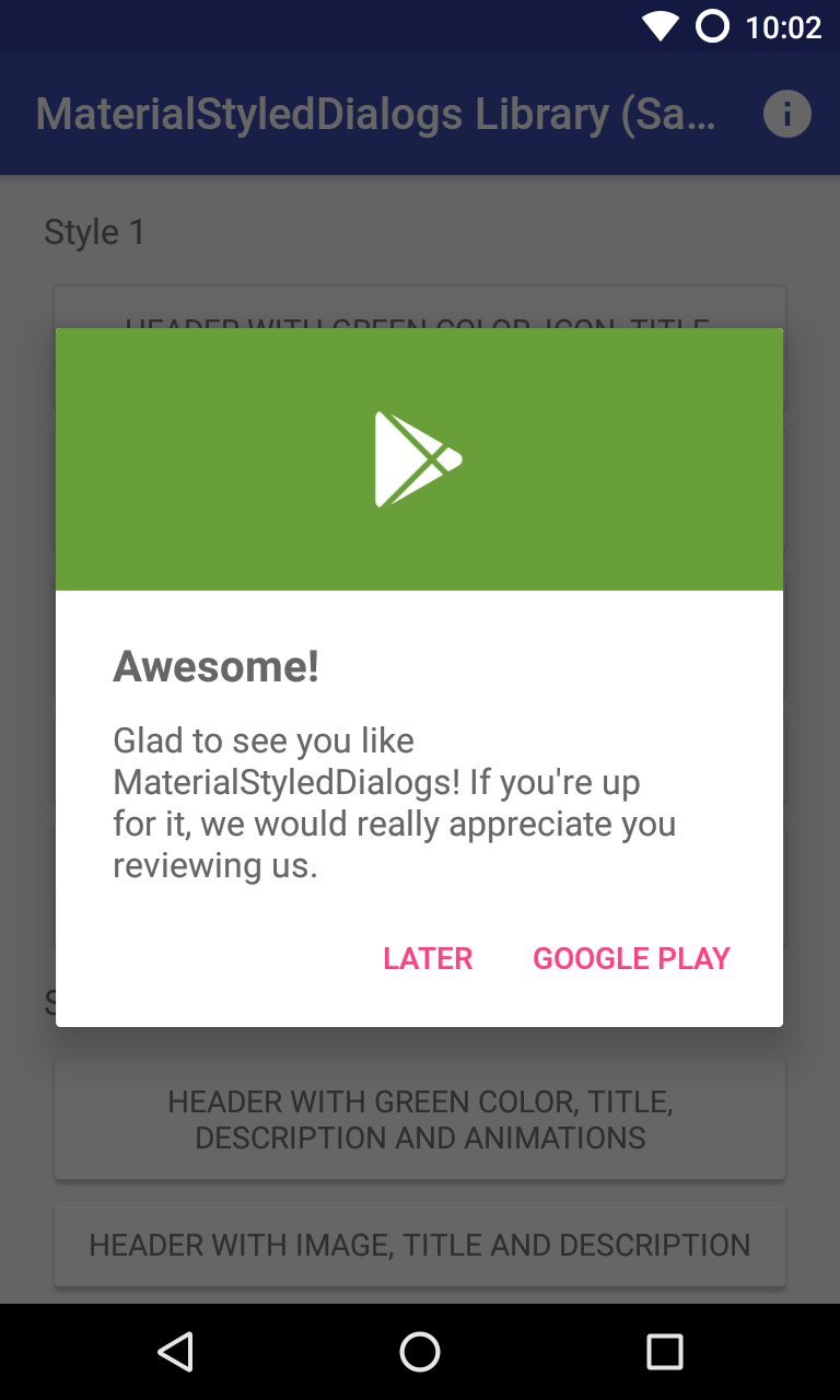
A basic dialog will show the provided title (optional) and description, using your primary color as the header background. You have access to methods such as setTitle(), setContent(), setIcon(), setCancelable(), dismiss(), etc. Customizations are explained below.
MaterialStyledDialog.Builder(this)
	.setTitle("Awesome!")
	.setDescription("What can we improve? Your feedback is always welcome.")
	.show()
Java Sample
new MaterialStyledDialog.Builder(this)
	.setTitle("Awesome!")
	.setDescription("What can we improve? Your feedback is always welcome.")
	.show();
or using the builder...
val dialog = MaterialStyledDialog.Builder(this)
	.setTitle("Awesome!")
	.setDescription("What can we improve? Your feedback is always welcome.")
	.build()
dialog.show()
Java Sample
MaterialStyledDialog dialog = new MaterialStyledDialog.Builder(this)
	.setTitle("Awesome!")
	.setDescription("What can we improve? Your feedback is always welcome.")
	.build();
...
dialog.show();
Customizations (Wiki)
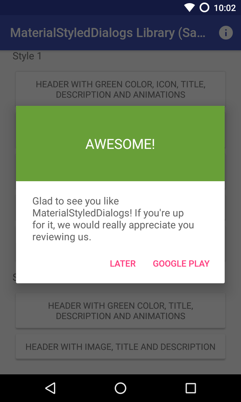
Setting a style
|
|
|---|---|
| Header with Icon (default): .setStyle(Style.HEADER_WITH_ICON) | Header with Title: .setStyle(Style.HEADER_WITH_TITLE) |
MaterialStyledDialog.Builder(this)
	.setTitle("Awesome!")
	.setDescription("What can we improve? Your feedback is always welcome.")
	.setStyle(Style.HEADER_WITH_ICON)
	.show()
Java Sample
new MaterialStyledDialog.Builder(this)
	.setTitle("Awesome!")
	.setDescription("What can we improve? Your feedback is always welcome.")
	.setStyle(Style.HEADER_WITH_ICON)
	//.setStyle(Style.HEADER_WITH_TITLE)
	.show();
Displaying an icon
The dialog icon is displayed in the center of the dialog (as seen it the screenshots).
MaterialStyledDialog.Builder(this)
	.setTitle("Awesome!")
	.setDescription("What can we improve? Your feedback is always welcome.")
	.setIcon(R.drawable.ic_launcher)
	.show()
Java Sample
new MaterialStyledDialog.Builder(this)
	.setTitle("Awesome!")
	.setDescription("What can we improve? Your feedback is always welcome.")
	.setIcon(R.drawable.ic_launcher)
	//.setIcon(ContextCompat.getDrawable(this, R.drawable.ic_launcher))
	.show();
Using a custom header color
By default, your primary color will be used for the header background. However you can customize this by adding:
MaterialStyledDialog.Builder(this)
	.setTitle("Awesome!")
	.setDescription("What can we improve? Your feedback is always welcome.")
	.setHeaderColor(R.color.dialog_header)
	.show()
Java Sample
new MaterialStyledDialog.Builder(this)
	.setTitle("Awesome!")
	.setDescription("What can we improve? Your feedback is always welcome.")
	.setHeaderColor(R.color.dialog_header)
	.show();
Using an image as the header background
Customize your dialog by adding a drawable instead of a color.
MaterialStyledDialog.Builder(this)
	.setTitle("Awesome!")
	.setDescription("What can we improve? Your feedback is always welcome.")
	.setHeaderDrawable(R.drawable.header)
	.show()
Java Sample
new MaterialStyledDialog.Builder(this)
	.setTitle("Awesome!")
	.setDescription("What can we improve? Your feedback is always welcome.")
	.setHeaderDrawable(R.drawable.header)
	//.setHeaderDrawable(ContextCompat.getDrawable(this, R.drawable.heaer))
	.show();
Adding a darker/grey overlay to the header background
Some icons or drawables may fit better when using a darker/grey overlay. Using the .withDarkerOverlay() method the library will apply a color filter to the header background. false by default.
MaterialStyledDialog.Builder(this)
	.setTitle("Awesome!")
	.setDescription("What can we improve? Your feedback is always welcome.")
	.setHeaderDrawable(R.drawable.header)
	.withDarkerOverlay(true)
	.show()
Java Sample
new MaterialStyledDialog.Builder(this)
	.setTitle("Awesome!")
	.setDescription("What can we improve? Your feedback is always welcome.")
	.setHeaderDrawable(R.drawable.header)
	.withDarkerOverlay(true)
	.show();
Adding icon and dialog animations
An animation to the icon will be displayed when the dialog is opened (true by default).
You can also add a custom animation using .setIconAnimation(R.anim.your_animation). A zoom in-out animation will be used by default.
MaterialStyledDialog.Builder(this)
	.setTitle("Awesome!")
	.setDescription("What can we improve? Your feedback is always welcome.")
	.withIconAnimation(true)
	.setIconAnimation(R.anim.your_animation)
	.show()
Java Sample
new MaterialStyledDialog.Builder(this)
	.setTitle("Awesome!")
	.setDescription("What can we improve? Your feedback is always welcome.")
	.withIconAnimation(true)
	.setIconAnimation(R.anim.your_animation)
	.show();
The dialog will be displayed with an animation when it is opened and closed. false by default.
MaterialStyledDialog.Builder(this)
	.setTitle("Awesome!")
	.setDescription("What can we improve? Your feedback is always welcome.")
	.withDialogAnimation(true)
	.show()
Java Sample
new MaterialStyledDialog.Builder(this)
	.setTitle("Awesome!")
	.setDescription("What can we improve? Your feedback is always welcome.")
	.withDialogAnimation(true)
	//.withDialogAnimation(true, Duration.SLOW)
	.show();
Adding buttons and callbacks
Buttons are showed at the end of the bottom dialog. You can add your own text and actions/callbacks.
MaterialStyledDialog.Builder(this)
	.setTitle("Awesome!")
	.setDescription("What can we improve? Your feedback is always welcome.")
	.setPositiveText(R.string.button)
	.onPositive { Log.d("MaterialStyledDialogs", "Do something!"); }
	.show()
Java Sample
new MaterialStyledDialog.Builder(this)
	.setTitle("Awesome!")
	.setDescription("What can we improve? Your feedback is always welcome.")
	.setPositiveText(R.string.button)
	.onPositive(new MaterialDialog.SingleButtonCallback() {
		@Override
		public void onClick(@NonNull MaterialDialog dialog, @NonNull DialogAction which) {
			Log.d("MaterialStyledDialogs", "Do something!");
	})
	//.setNegativeText(...)
	//.onNegative(...)
	//.setNeutralText(...)
	//.onNeutral(...)
	.show();
If no onPositive(...), onNegative(...) or onNeutral(...) callbacks are provided, then the bottom dialog will be dismissed when tapping on the button.
If autoDismiss() is turned false, then you must manually dismiss the dialog in these callbacks. Auto dismiss is true by default.
A divider before the buttons can be added using the .withDivider(true) method (false by default).
Get the buttons of the dialog
If you need to access the buttons of your dialog, you can achieve it like this:
val dialog = MaterialStyledDialog.Builder(this)
	.setTitle("Awesome!")
	.setDescription("This is a sample description.")
	.show()

dialog.positiveButton().text = "Positive"
dialog.negativeButton().text = "Negative"
Dismissing when touching outside
The setCancelable() method lets you disable dismissing the bottom dialog when you tap outside the dialog window. true by default.
MaterialStyledDialog.Builder(this)
	.setTitle("Awesome!")
	.setDescription("What can we improve? Your feedback is always welcome.")
	.setCancelable(true)
	.show()
Java Sample
new MaterialStyledDialog.Builder(this)
	.setTitle("Awesome!")
	.setDescription("What can we improve? Your feedback is always welcome.")
	.setCancelable(true)
	.show();
Adding a custom view
You can add custom view to your bottom dialog just by adding the layout to the setCustomView() method.
MaterialStyledDialog.Builder(this)
	.setTitle("Awesome!")
	.setDescription("What can we improve? Your feedback is always welcome.")
	.setCustomView(your_custom_view)
	.show()
Java Sample
new MaterialStyledDialog.Builder(this)
	.setTitle("Awesome!")
	.setDescription("What can we improve? Your feedback is always welcome.")
	.setCustomView(your_custom_view) // Old standard padding: .setCustomView(your_custom_view, 20, 20, 20, 0)
	//.setCustomView(your_custom_view, 10, 20, 10, 20) // int left, int top, int right, int bottom
	.show();
A detailed description is available at: https://github.com/javiersantos/MaterialStyledDialogs/wiki/Adding-a-custom-view
Making the content scrollable
If your dialog content is too long you may prefer to make it scrollable. By using the next method you can specify the minimum number of lines to show the scroll bar (5 lines by default).
MaterialStyledDialog.Builder(this)
	.setTitle("Awesome!")
	.setDescription("A loooooooooong looooooooooong really loooooooooong content. Lorem ipsum dolor sit amet, consectetur adipiscing elit. Aliquam pulvinar sem nibh, et efficitur massa mattis eget. Phasellus condimentum ligula.")
	.setScrollable(true)
	.show()
Java Sample
new MaterialStyledDialog.Builder(this)
	.setTitle("Awesome!")
	.setDescription("A loooooooooong looooooooooong really loooooooooong content. Lorem ipsum dolor sit amet, consectetur adipiscing elit. Aliquam pulvinar sem nibh, et efficitur massa mattis eget. Phasellus condimentum ligula.")
	.setScrollable(true)
	//.setScrollable(true, 10)
	.show();
Get the buttons of the dialog
If you need to access the buttons of your dialog, you can achieve it like this:
val dialog = MaterialStyledDialog.Builder(this)
	.setTitle("Awesome!")
	.setDescription("This is a sample description.")
	.show()

dialog.positiveButton().text = "Positive"
dialog.negativeButton().text = "Negative"
License
Copyright 2016-2020 Javier Santos

Licensed under the Apache License, Version 2.0 (the "License");
you may not use this file except in compliance with the License.
You may obtain a copy of the License at

   http://www.apache.org/licenses/LICENSE-2.0

Unless required by applicable law or agreed to in writing, software
distributed under the License is distributed on an "AS IS" BASIS,
WITHOUT WARRANTIES OR CONDITIONS OF ANY KIND, either express or implied.
See the License for the specific language governing permissions and
limitations under the License.

MaterialStyledDialogs includes code from material-dialogs, which is
licensed under the MIT license. You may obtain a copy at

   https://github.com/afollestad/material-dialogs/blob/master/LICENSE.txt