MatplotLibBridge
A bridge to provide the ability to Pharo user to use Python's Matplotlib.
Install
This project has been tested on Linux and Mac OS. If someone manage to use it on Windows, please let me know.
Python side
Obviously, you need to have Python 3 installed on your machine. Furthermore, you need matplotlib package installed as well. The following link explains how to do it install matplotlib.
Pharo side
To install this project in your image, open a playground and execute the following code snippet:
Metacello new
    baseline: 'MatplotLibBridge';
    repository: 'github://juliendelplanque/MatplotLibBridge/src';
    load
This will install version 0.1 of the project. You should only depend on released versions for your projects. The master branch of this repository contains latest commits and might not be stable.
Once MatplotLibBridge is installed in your image, you need to configure Python3Generator to use the Python interpreter you prefer. My advise is to use the FFI interpreter using: P3GInterpreter useFFIInterpreter. If your python3 binary is located in a standard path in your file system, it should be fine, else you can manually set the path to python3 binary using for example: P3GInterpreter current pathToPython: '/usr/bin/python3'.
How to use MatplotLibBridge?
This page provides some examples to illustrate how to use MatplotLibBridge. For each example, the method #show is called when the plot is built. This method open an interactive window showing a preview of the plot. If you want to export the plot in a file, you can use #generateIn: which takes a FileReference as argument. This method creates an image file with a format corresponding to the extension of the file reference. The available formats are .png, .svg and .pdf. For example: plot generateIn: '/tmp/foo.png' will generate the plot in the file /tmp/foo.png in png format.
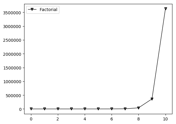
Creating a line plot
The following code snippet creates a line plot for the factorial function between 0 and 10. It also illustrates that it is possible to use LaTeX code as marker for the points. Using #label: message allows to give name to the line that will be displayed in a corner of the plot.
MLBLinePlot new
	addPointsLine: [ :line |
		line
			points: ((0 to: 10) collect: [ :i | i @ i factorial ]);
			marker: '$\triangledown$';
			label: 'Factorial' ];
	show
Creating a line plot using Y-Block line
The following code snippet creates a line plot for the factorial function between 0 and 10 using MLBYBlockLine. It is totally equivalent to the preceding example (in the result) but this is another way to express the plot using MatplotLibBridge.
MLBLinePlot new
	addYBlockLine: [ :line |
		line
			x: (0 to: 10);
			yBlock: #factorial;
			marker: '$\triangledown$';
			label: 'Factorial' ];
	show

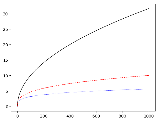
Creating multi-lines plot
The following code snippet creates a multi-lines plot for the square root function, the third-root function and the fourth-root function between 0 and 1000. It also shows how to change the color of a line (using #color:) and how to change its style (using #style:). Available styles for a line can be accessed using MLBLine>>#lineStyles
MLBLinePlot new
	addPointsLine: [ :line | line points: ((0 to: 1000) collect: [ :i | i @ i sqrt ]) ];
	addPointsLine: [ :line |
		line
			points: ((0 to: 1000) collect: [ :i | i @ (i nthRoot: 3) ]);
			color: Color red;
			style: '--' ];
	addPointsLine: [ :line |
		line
			points: ((0 to: 1000) collect: [ :i | i @ (i nthRoot: 4) ]);
			color: Color blue;
			style: 'dotted' ];
	show
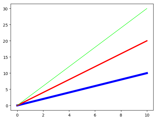
Changing line width in line plot or multi-lines plot
It is possible to configure the width of each line in a line plot using #width:.
MLBLinePlot new
	addPointsLine: [ :line |
		line
			points: ((0 to: 10) collect: [ :i | i @ i ]);
			width: 5;
			color: Color blue ];
	addPointsLine: [ :line |
		line
			points: ((0 to: 10) collect: [ :i | i @ (i * 2) ]);
			width: 3;
			color: Color red ];
	addPointsLine: [ :line |
		"#width = 1 if not specified."
		line
			points: ((0 to: 10) collect: [ :i | i @ (i * 3) ]);
			color: Color green ];
	show
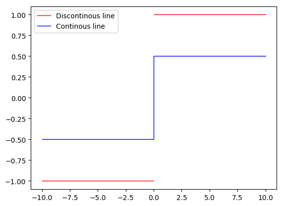
Discontinuous lines in line plot or multi-lines plot
If you create points having Float nan as x or y, it allows to create discontinuous lines.
MLBLinePlot new
	addPointsLine: [ :line |
		line
			points:
				((-10 to: -0) collect: [ :i | i @ 1 negated ]) , {(0 @ Float nan)}
					, ((0 to: 10) collect: [ :i | i @ 1 ]);
			label: 'Discontinous line';
			color: Color red ];
	addPointsLine: [ :line |
		line
			points:
				((-10 to: -0) collect: [ :i | i @ 0.5 negated ])
					, ((0 to: 10) collect: [ :i | i @ 0.5 ]);
			label: 'Continous line';
			color: Color blue ];
	show
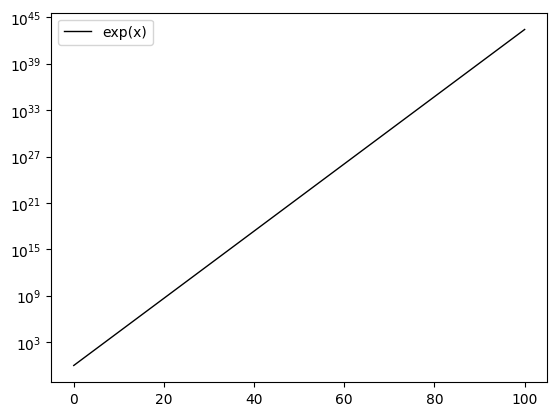
Set an axis to be in logarithmic scale
Calling the method #logScale in #configYAxis block makes the scale of the concerned axis logarithmic. Other scales are available, see MLBAbstractAxis>>validScales.
MLBLinePlot new
	addPointsLine: [ :line |
		line
			points: ((0 to: 100) collect: [ :i | i @ i exp ]);
			label: 'exp(x)' ];
	configYAxis: [ :yAxis |
		yAxis logScale ];
	show
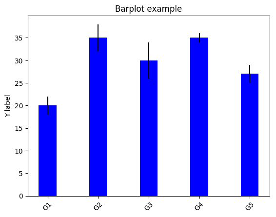
Creating a bar plot
The following code snippet creates a bar plot for some data and to display their standard deviation. This example also illustrates how to do some basic configuration of x and y axes (#configXAxis: and #configYAxis:).
|data std |
data := #(20 35 30 35 27).
std := #(2 3 4 1 2).

MLBBarPlot new
	data: data;
	labels: #('G1' 'G2' 'G3' 'G4' 'G5');
	color: Color blue;
	configXAxis: [ :xAxis |
		xAxis
			labelsRotation: 45 ];
	configYAxis: [ :yAxis |
		yAxis
			title: 'Y label' ];
	title: 'Barplot example';
	errorBars: std;
	errorBarsColor: Color black;
	alignLabelCenter;
	show.
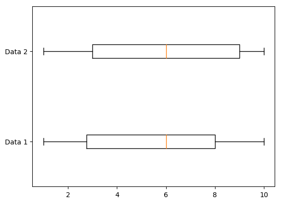
Creating an horizontal box plot
The following code snippet creates an horizontal box plot for some random data.
MLBBoxPlot new
	dataList: {((1 to: 100) collect: [ :i | (1 to: 10) atRandom ]) . ((1 to: 100) collect: [ :i | (1 to: 10) atRandom ])};
	beHorizontal;
	configYAxis: [ :axis|
		axis
			labels: #('Data 1' 'Data 2') ];
	show
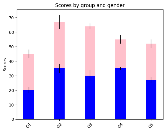
Creating a stacked bar plot
The following code snippet creates a stacked bar plot for some data and to display their standard deviation. The #dataList of a MLBStackedBarPlot should be a collection of collections of the same arity. It also shows how to rotate the labels of an axis.
| menMeans womenMeans menStd womenStd data std |
menMeans := #(20 35 30 35 27).
womenMeans := #(25 32 34 20 25).
menStd := #(2 3 4 1 2).
womenStd := #(3 5 2 3 3).

data := (1 to: menMeans size) collect: [ :i |
			{ menMeans at: i. womenMeans at: i } ].
std := (1 to: menStd size) collect: [ :i |
			{ menStd at: i. womenStd at: i } ].

MLBStackedBarPlot new
	dataList: data;
	colorList: {Color blue. Color pink};
	title: 'Scores by group and gender';
	configXAxis: [ :xAxis |
		xAxis
			labelsRotation: 45;
			labels: #('G1' 'G2' 'G3' 'G4' 'G5') ];
	configYAxis: [ :yAxis |
		yAxis
			title: 'Scores' ];
	errorBarsList: std;
	errorBarsColorList: { Color black . Color black };
	alignLabelCenter;
	show.
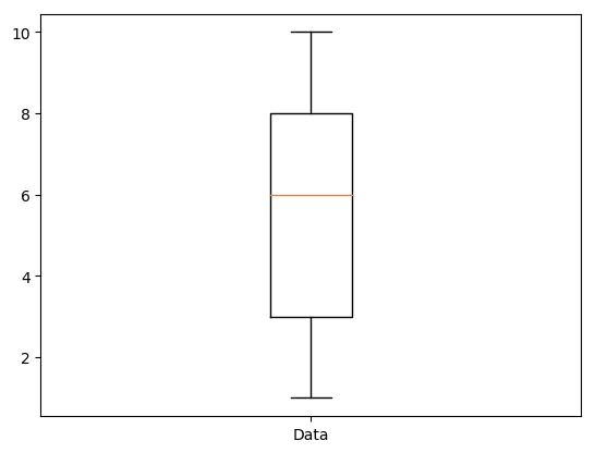
Creating a vertical box plot
The following code snippet creates a vertical box plot for some random data. No need to call #beVertical since this is the default orientation of the plot.
MLBBoxPlot new
	dataList: {((1 to: 100) collect: [ :i | (1 to: 10) atRandom ])};
	configXAxis: [ :xAxis|
		xAxis
			labels: #('Data') ];
	show
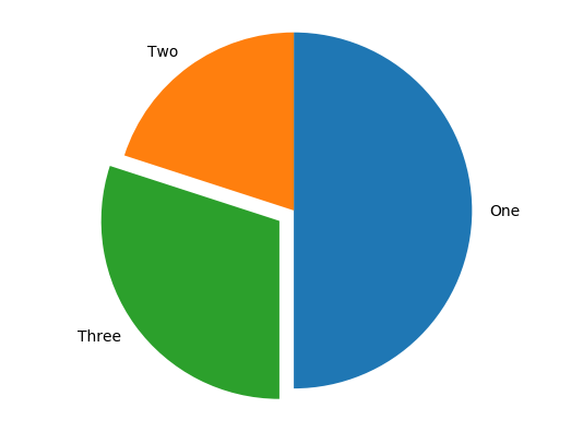
Creating a pie plot
The following code snippet creates a pie box plot for some data that sum to 100. You can optionally add labels:, set the a shadow or not (hasShadow:), configure the axis: (here we want to have a round pie, so we set it to 'equal'), explode each part of the pie at different degrees (here only the part concerning 30 data is exploded) and choose the start angle.
MLBPiePlot new
	data: #(50 20 30);
	labels: #(One Two Three);
	hasShadow: false;
	axis: 'equal';
	explode: #(0 0 0.1);
	startAngle: -90;
	show
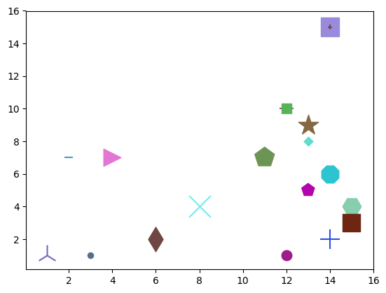
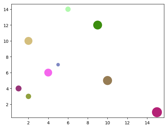
Creating a scatter plot (new API)
The following code snippet creates a scatter plot for some random data. The principle is to create MLBScatterData, to set them a position, a color, a size and a shape
MLBScatterPlot2 new
	data: ((1 to: 20) collect: [ :i |
		(MLBScatterData position: (1 to: 15) atRandom @ (1 to: 15) atRandom size: (20 to: 500) atRandom)
			color: Color random;
			marker: MLBConstants markers atRandom;
			yourself ]);
	show
Creating a scatter plot (old API)
The following code snippet creates a scatter plot for some random data. Here we create MLBCircles with a random position, a random diameter and a random color and provide them to the MLBScatterPlot instance.
MLBScatterPlot new
	circles: ((1 to: 10) collect: [ :i |
		(MLBCircle position: (1 to: 15) atRandom @ (1 to: 15) atRandom size: (20 to: 500) atRandom)
			color: Color random;
			yourself ]);
	show
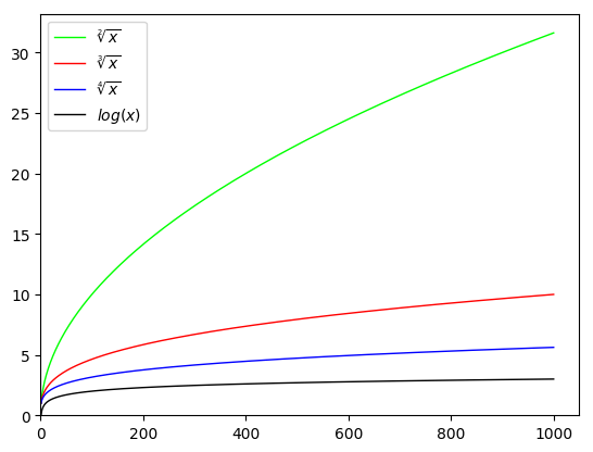
Using LaTeX in legend
The following code snippet shows you how to create a line plot with LaTeX code for lines' labels. In fact, with MatplotLibBridge, you can use LaTeX in any String you provide.
| interval |
interval := 1 to: 1000.
MLBLinePlot new
	addPointsLine: [ :line |
		line
			points: (interval collect: [ :i | i @ i sqrt ]);
			color: Color green;
			label: '$\sqrt[2]{x}$' ];
	addPointsLine: [ :line |
		line
			points: (interval collect: [ :i | i @ (i nthRoot: 3) ]);
			color: Color red;
			label: '$\sqrt[3]{x}$' ];
	addPointsLine: [ :line |
		line
			points: (interval collect: [ :i | i @ (i nthRoot: 4) ]);
			color: Color blue;
			label: '$\sqrt[4]{x}$' ];
	addPointsLine: [ :line |
		line
			points: (interval collect: [ :i | i @ i log ]);
			label: '$log(x)$' ];
	configXAxis: [ :axis | axis min: 0 ];
	configYAxis: [ :axis | axis min: 0 ];
	addLegend;
	show
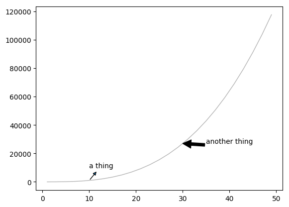
Annotations
On any plot, you can add annotations. An annotation is an extra graphical element you add on your plot such as for example an arrow pointing to a certain interesting location on the plot.
MLBLinePlot new
	addPointsLine: [ :line |
		line
			points: ((1 to: 50 by: 2) collect: [ :i | i @ (i ** 3) ]);
			style: 'solid';
			marker: 'None';
			color:
				(Color
					r: 0
					g: 0
					b: 0
					alpha: 0.3) ];
	addAnnotation: [ :annotation |
		annotation
			content: 'a thing';
			position: 10 @ (10 ** 3);
			textPosition: 10 @ (10 ** 4);
			arrowProperties: {('arrowstyle' -> '<|-')} asDictionary ];
	addAnnotation: [ :annotation |
		annotation
			content: 'another thing';
			position: 30 @ (30 ** 3);
			textPosition: 35 @ (30 ** 3 + 10);
			arrowProperties:
				{('facecolor' -> 'black').
				('shrink' -> 4)} asDictionary ];
	show
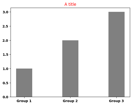
Style sheet
MatplotLib allows to use stylesheet to reuse/change easily plot styles. The bridge actually expose this API with the MLBStyleSheet object. The name of properties are the same as in the python version. For more information see the official documentation of matplotlib: https://matplotlib.org/users/customizing.html.
| style |
style := MLBStyleSheet new
				setProperty: 'color' ofGroup: 'text' to: 'red';
				setProperty: 'weight' ofGroup: 'font' to: 'bold';
				yourself.

MLBBarPlot new
	data: #(1 2 3);
	labels: #('Group 1' 'Group 2' 'Group 3');
	title: 'A title';
	style: style;
	show