react-component / Progress
Licence: mit
React Progress Bar
Stars: ✭ 568
Programming Languages
typescript
32286 projects
Projects that are alternatives of or similar to Progress
Stepprogressview
Step-by-step progress view with labels and shapes. A good replacement for UIActivityIndicatorView and UIProgressView.
Stars: ✭ 272 (-52.11%)
Mutual labels: progress
Tqdm
A Fast, Extensible Progress Bar for Python and CLI
Stars: ✭ 20,632 (+3532.39%)
Mutual labels: progress
Lemniscate
An easy way to make your progress view nice and sleek.
Stars: ✭ 420 (-26.06%)
Mutual labels: progress
Gradient Widgets
Flutter widgets wrapped with gradients
Stars: ✭ 290 (-48.94%)
Mutual labels: progress
Qier Progress
💃 Look at me, I am a slim progress bar and very colorful / 支持彩色或单色的顶部进度条
Stars: ✭ 307 (-45.95%)
Mutual labels: progress
Ng2 Slim Loading Bar
Angular 2 component shows slim loading bar at the top of the page.
Stars: ✭ 376 (-33.8%)
Mutual labels: progress
Coreprogress
OkHttp upload and download progress support
Stars: ✭ 498 (-12.32%)
Mutual labels: progress
Circleprogressview
🎡 CircleProgressView是一个圆形渐变的进度动画控件(支持外环显示刻度,内环随之变化,配置参数完全可配),动画效果纵享丝滑。
Stars: ✭ 314 (-44.72%)
Mutual labels: progress
Rsloadingview
Awesome loading animations using 3D engine written with Swift
Stars: ✭ 388 (-31.69%)
Mutual labels: progress
Ftindicator
A light wight UI package contains local notification, progress HUD, toast, with blur effect, elegant API and themes support.
Stars: ✭ 292 (-48.59%)
Mutual labels: progress
Waitme
jquery plugin for easy creating loading css3/images animations
Stars: ✭ 302 (-46.83%)
Mutual labels: progress
Theglowingloader
TheGlowingLoader is the highly configurable library to indicate progress and is natively created for Android Platform. It is an implementation of a design composed by Shashank Sahay.
Stars: ✭ 379 (-33.27%)
Mutual labels: progress
Progressstatusbar
Another way to show progress. A progress View over the system StatusBar.
Stars: ✭ 283 (-50.18%)
Mutual labels: progress
Arslineprogress
iOS progress bar, replacement for the default activity indicator.
Stars: ✭ 434 (-23.59%)
Mutual labels: progress
React Progress Button
🌀 Simple react.js component for an inline progress indicator
Stars: ✭ 516 (-9.15%)
Mutual labels: progress
Buttonprogressbar Ios
A small and flexible (well documented) UIButton subclass with animated loading progress, and completion animation.
Stars: ✭ 479 (-15.67%)
Mutual labels: progress
Vue Simple Spinner
A simple, flexible spinner for Vue.js
Stars: ✭ 385 (-32.22%)
Mutual labels: progress
rc-progress
Progress Bar.


Example
https://progress.react-component.vercel.app/
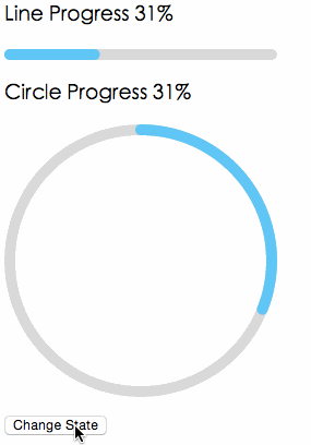
Screenshots
Browsers
- support IE9+, Chrome, Firefox, Safari
Install

Usage
import { Line, Circle } from 'rc-progress';

export default () => (
  <>
     <Line percent="10" strokeWidth="4" strokeColor="#D3D3D3" />
     <Circle percent="10" strokeWidth="4" strokeColor="#D3D3D3" />
  </>
);
Compatibility
 IE / Edge |
 Firefox |
 Chrome |
 Safari |
 Electron |
|---|---|---|---|---|
| IE11, Edge | last 2 versions | last 2 versions | last 2 versions | last 2 versions |
API
props
| name | type | default | description |
|---|---|---|---|
| strokeWidth | Number | 1 | Width of the stroke. Unit is percentage of SVG canvas size. |
| strokeColor | String | #2db7f5 | Stroke color. |
| trailWidth | Number | 1 | Width of the trail stroke. Unit is percentage of SVG canvas size. Trail is always centered relative to actual progress path. If trailWidth are not defined, it same as strokeWidth. |
| trailColor | String | #D9D9D9 | Color for lighter trail stroke underneath the actual progress path. |
| strokeLinecap | String | 'round' | The shape to be used at the end of the progress bar, can be `butt`, `square` or `round`. |
| prefixCls | String | rc-progress | prefix className for component |
| className | String | customized className | |
| style | Object | style object will be added to svg element | |
| percent | Number | 0 | the percent of the progress |
| gapDegree | Number | 0 | the gap degree of half circle, 0 - 360 |
| gapPosition | String | top | the gap position, value: top, bottom, left, right. |
Installation
npm install --save rc-progress
Development
npm install
npm start
License
rc-progress is released under the MIT license.
Note that the project description data, including the texts, logos, images, and/or trademarks,
for each open source project belongs to its rightful owner.
If you wish to add or remove any projects, please contact us at [email protected].