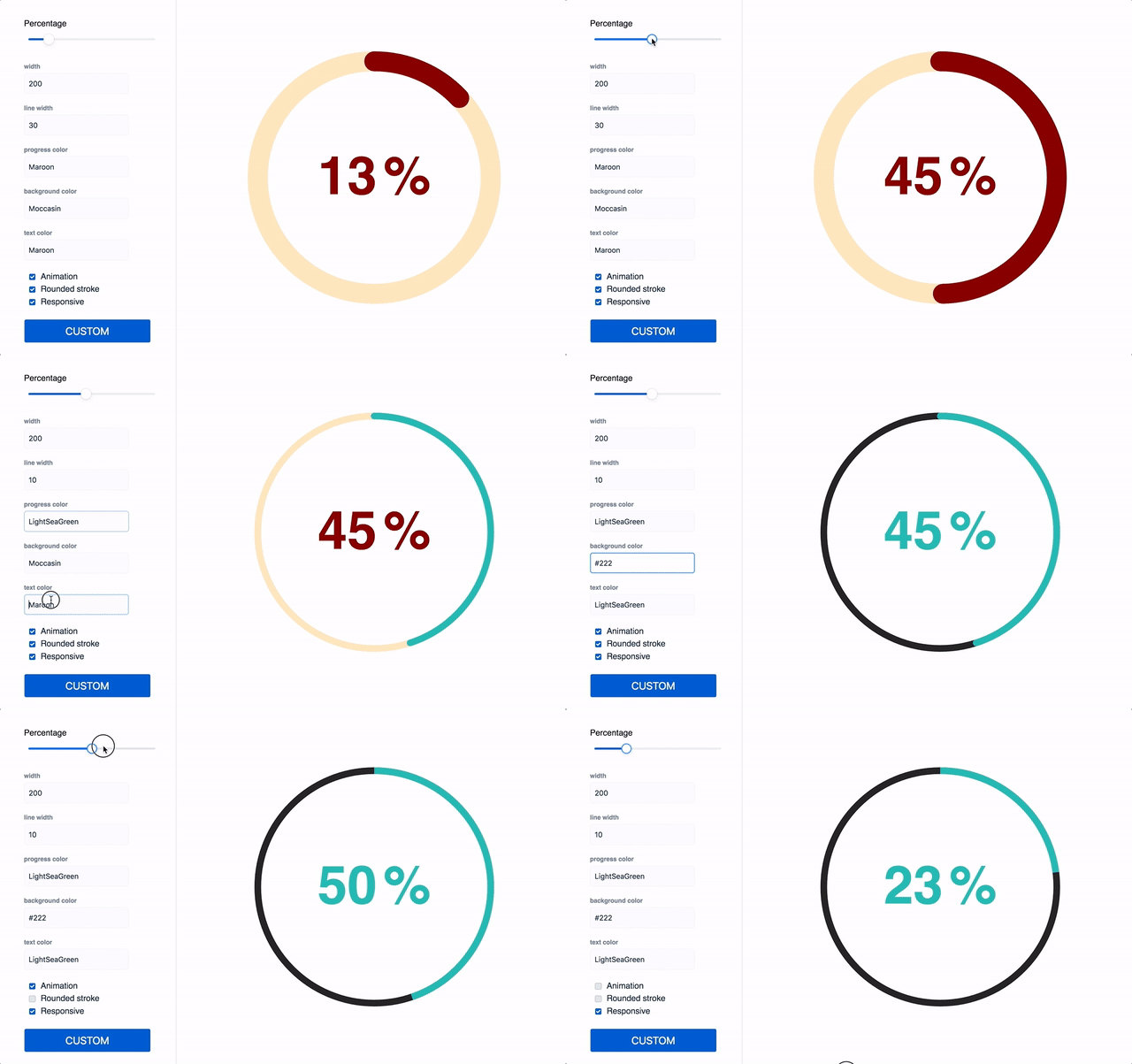
zzarcon / React Circle
Licence: mit
Renders a svg circle + progress, it just works 💘
Stars: ✭ 925
Programming Languages
typescript
32286 projects
Projects that are alternatives of or similar to React Circle
Spinners React
Lightweight SVG/CSS spinners for React
Stars: ✭ 254 (-72.54%)
Mutual labels: svg, loading, progress, spinner
Vue Wait
Complex Loader and Progress Management for Vue/Vuex and Nuxt Applications
Stars: ✭ 1,869 (+102.05%)
Mutual labels: loading, progress, spinner
Circleprogressview
🎡 CircleProgressView是一个圆形渐变的进度动画控件(支持外环显示刻度,内环随之变化,配置参数完全可配),动画效果纵享丝滑。
Stars: ✭ 314 (-66.05%)
Mutual labels: loading, progress, circle
Whirl
CSS loading animations with minimal effort!
Stars: ✭ 774 (-16.32%)
Mutual labels: loading, progress, spinner
React Nprogress
⌛️ A React primitive for building slim progress bars.
Stars: ✭ 173 (-81.3%)
Mutual labels: loading, progress, spinner
spinners-angular
Lightweight SVG/CSS spinners for Angular
Stars: ✭ 21 (-97.73%)
Mutual labels: progress, spinner, loading
spinnies
Node.js module to create and manage multiple spinners in command-line interface programs
Stars: ✭ 111 (-88%)
Mutual labels: progress, spinner, loading
progress-image-view-android
Simple progress with ImageView android
Stars: ✭ 64 (-93.08%)
Mutual labels: progress, loading
plain-overlay
The simple library for customizable overlay which covers a page, elements or iframe-windows.
Stars: ✭ 28 (-96.97%)
Mutual labels: progress, loading
Waitme
jquery plugin for easy creating loading css3/images animations
Stars: ✭ 302 (-67.35%)
Mutual labels: loading, progress
react-awesome-loaders
🚀 High quality, super responsive and completely customisable Loading Animations to insert into your website with single line of code.
Stars: ✭ 146 (-84.22%)
Mutual labels: progress, spinner
Loading Bar
Flexible, light weighted and super fast Progress Bar Library
Stars: ✭ 300 (-67.57%)
Mutual labels: loading, progress
awesome-web-styling
Awesome Web Styling with CSS Animation Effects ⭐️
Stars: ✭ 109 (-88.22%)
Mutual labels: spinner, loading
Ngx Ui Loader
Multiple Loaders / spinners and Progress bar for Angular 5, 6, 7 and 8+
Stars: ✭ 368 (-60.22%)
Mutual labels: loading, spinner
Ng2 Slim Loading Bar
Angular 2 component shows slim loading bar at the top of the page.
Stars: ✭ 376 (-59.35%)
Mutual labels: loading, progress
Buttonprogressbar Ios
A small and flexible (well documented) UIButton subclass with animated loading progress, and completion animation.
Stars: ✭ 479 (-48.22%)
Mutual labels: loading, progress
react-circle 
Renders a svg circle + percentage. It just works
Demo
https://zzarcon.github.io/react-circle
Install 🚀
$ yarn add react-circle
Usage ⛏
Basic 🙃
ReactCircle is opinionated and comes with default size and colors, just pass the progress prop to get them:
import Circle from 'react-circle';

<Circle
  progress={35}
/>
Custom 💅
Optionally, you can pass the following props and customize it as your will
import Circle from 'react-circle';

// All avaliable props for customization(illustrated by default values):
// Details are ordered as: `<Type>: <Description>`
<Circle
  animate={true} // Boolean: Animated/Static progress
  animationDuration="1s" // String: Length of animation
  responsive={false} // Boolean: Make SVG adapt to parent size
  size="100" // String: Defines the size of the circle.
  lineWidth="25" // String: Defines the thickness of the circle's stroke.
  progress="0" // String: Update to change the progress and percentage.
  progressColor="rgb(76, 154, 255)" // String: Color of "progress" portion of circle.
  bgColor="#ecedf0" // String: Color of "empty" portion of circle.
  textColor="#6b778c" // String: Color of percentage text color.
  textStyle={{
    font: 'bold 4rem Helvetica, Arial, sans-serif' // CSSProperties: Custom styling for percentage.
  }}
  percentSpacing={10} // Number: Adjust spacing of "%" symbol and number.
  roundedStroke={false} // Boolean: Rounded/Flat line ends
  showPercentage={true} // Boolean: Show/hide percentage.
  showPercentageSymbol={true} // Boolean: Show/hide only the "%" symbol.
/>
Features
- No external dependencies
- No external styles
- 2KB size => https://bundlephobia.com/result?p=react-circle
Note that the project description data, including the texts, logos, images, and/or trademarks,
for each open source project belongs to its rightful owner.
If you wish to add or remove any projects, please contact us at [email protected].

