martyan / React Customizable Progressbar
Licence: mit
Customizable circular progress bar component for React 🍩
Stars: ✭ 37
Programming Languages
typescript
32286 projects
Projects that are alternatives of or similar to React Customizable Progressbar
Mkmagneticprogress
A circular progress bar for iOS written in Swift
Stars: ✭ 214 (+478.38%)
Mutual labels: progressbar, circular
React Nprogress
⌛️ A React primitive for building slim progress bars.
Stars: ✭ 173 (+367.57%)
Mutual labels: component, progressbar
Vue Step Progress
A simple Vue component that displays a Progress Bar with labels for each step
Stars: ✭ 26 (-29.73%)
Mutual labels: component, progressbar
Respin
React SVG loading spinner based on jxnblk.com/loading
Stars: ✭ 21 (-43.24%)
Mutual labels: component
React Awesome Button
React button component. Awesome button is a 3D UI, progress, social and share enabled, animated at 60fps, light weight, performant, production ready react UI button component. 🖥️ 📱
Stars: ✭ 943 (+2448.65%)
Mutual labels: component
Vue Direction
👋 Declarative, direction-aware hover in Vuejs
Stars: ✭ 35 (-5.41%)
Mutual labels: component
Dotnet Assembly Grapher
Reverse engineering and software quality assurance tool for .NET assemblies
Stars: ✭ 21 (-43.24%)
Mutual labels: component
Progressbar.js
Responsive and slick progress bars
Stars: ✭ 7,499 (+20167.57%)
Mutual labels: progressbar
Jcnavigator
A decoupled navigator framework of jumping between modules or apps for iOS development.
Stars: ✭ 33 (-10.81%)
Mutual labels: component
Android Holocircularprogressbar
Holo Circular ProgressBar
Stars: ✭ 966 (+2510.81%)
Mutual labels: progressbar
Telegram Notifier
Provides Telegram integration for Symfony Notifier.
Stars: ✭ 30 (-18.92%)
Mutual labels: component
React Calendar
A React Native inspired date list renderer
Stars: ✭ 34 (-8.11%)
Mutual labels: component
Vue Lazy Component
🐌 Vue.js 2.x 组件级懒加载方案-Vue.js 2.x component level lazy loading solution
Stars: ✭ 915 (+2372.97%)
Mutual labels: component
Finder
The Finder component finds files and directories via an intuitive fluent interface.
Stars: ✭ 7,840 (+21089.19%)
Mutual labels: component
React Pricing Table
💶 Fast, flexible, simple pricing tables in React.
Stars: ✭ 21 (-43.24%)
Mutual labels: component
React Password Mask
Show/hide the contents of a password field.
Stars: ✭ 34 (-8.11%)
Mutual labels: component
React Iron Image
Image lazy loading React component inspired by Polymer's iron-image component.
Stars: ✭ 32 (-13.51%)
Mutual labels: component
React Base Table
A react table component to display large datasets with high performance and flexibility
Stars: ✭ 966 (+2510.81%)
Mutual labels: component
react-customizable-progressbar
Customizable circular SVG progress bar component for React
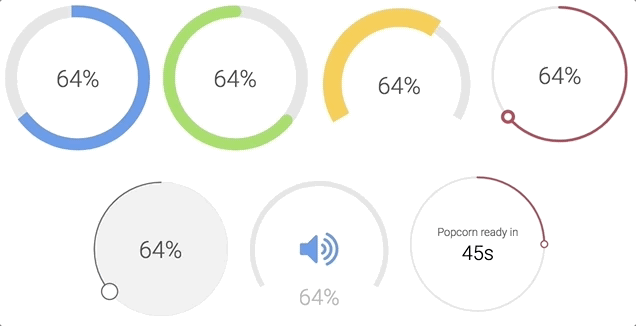
Check examples or generator to play around with all props
Installation
npm install --save react-customizable-progressbar
or
yarn add react-customizable-progressbar
Usage
import ProgressBar from 'react-customizable-progressbar'

<ProgressBar
    progress={60}
    radius={100}
/>
Props
| Name | Type | Default | Description |
|---|---|---|---|
radius (required) |
number |
100 |
Progress bar radius |
progress (required) |
number |
0 |
Progress value (out of steps) |
steps |
number |
100 |
Total steps |
cut |
number |
0 |
Angle of the circle sector |
rotate |
number |
-90 |
Progress rotation |
strokeWidth |
number |
20 |
Stroke width |
strokeColor |
string |
'indianred' |
Stroke color |
strokeLinecap |
string |
'round' |
Stroke line cap |
transition |
string |
'0.3s ease' |
Transition |
trackStrokeWidth |
number |
20 |
Track stroke width |
trackStrokeColor |
string |
'#e6e6e6' |
Track stroke color |
trackStrokeLinecap |
string |
'round' |
Track stroke line cap |
trackTransition |
string |
'1s ease' |
Track transition |
pointerRadius |
number |
0 |
Pointer radius |
pointerStrokeWidth |
number |
20 |
Pointer stroke width |
pointerStrokeColor |
string |
'indianred' |
Pointer stroke color |
pointerFillColor |
string |
'white' |
Pointer fill color |
initialAnimation |
bool |
false |
Initial animation |
initialAnimationDelay |
number |
0 |
Initial animation delay |
inverse |
bool |
false |
Inverse |
counterClockwise |
bool |
false |
Counter-clockwise |
children |
node |
null |
Children - pass anything to show inside progress bar |
className |
string |
'' |
Progress bar class name |
Styles
.RCP {}
.RCP__track {}
.RCP__progress {}
.RCP__pointer {}
You can use these default indicator styles to center it both horizontally and vertically:
.your-indicator {
    display: flex;
    justify-content: center;
    text-align: center;
    position: absolute;
    top: 0;
    width: 100%;
    height: 100%;
    margin: 0 auto;
    user-select: none;
}
Run examples locally
npm install
npm run dev
Note that the project description data, including the texts, logos, images, and/or trademarks,
for each open source project belongs to its rightful owner.
If you wish to add or remove any projects, please contact us at [email protected].