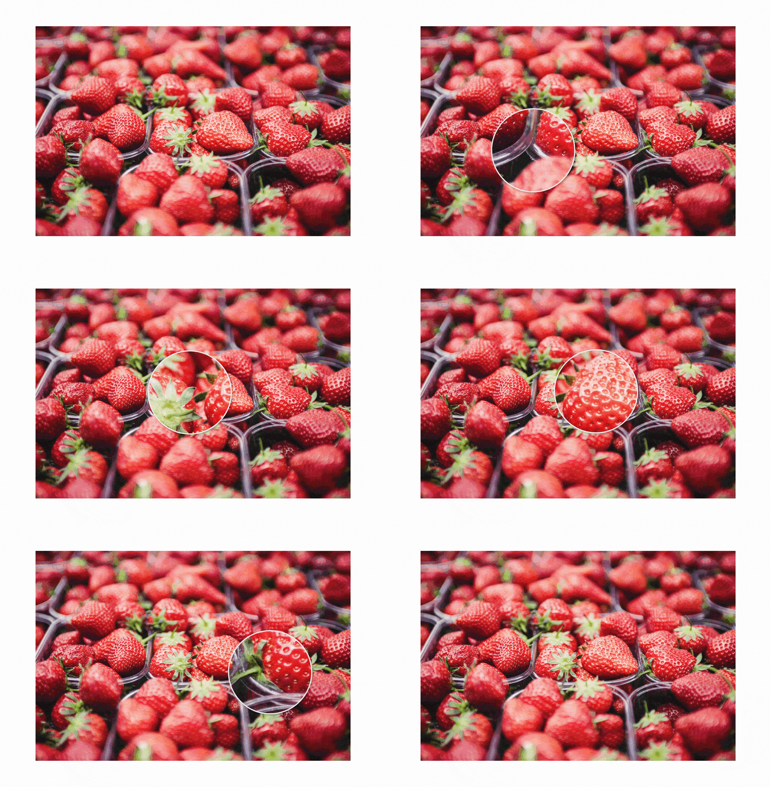
samuelmeuli / React Magnifier
Licence: mit
🔍 React image zoom component
Stars: ✭ 116
Programming Languages
typescript
32286 projects
Projects that are alternatives of or similar to React Magnifier
React Grid Carousel
React responsive carousel component w/ grid layout
Stars: ✭ 29 (-75%)
Mutual labels: image, react-component
Vue Picture Input
Mobile-friendly picture file input Vue.js component with image preview, drag and drop, EXIF orientation, and more
Stars: ✭ 862 (+643.1%)
Mutual labels: image, component
Sparkline
Lightweight React sparklines ✨ 📈
Stars: ✭ 19 (-83.62%)
Mutual labels: component, react-component
React Responsive Picture
A future-proof responsive image component that supports latest Picture specification
Stars: ✭ 91 (-21.55%)
Mutual labels: image, react-component
Ui Box
Blazing Fast React UI Primitive
Stars: ✭ 847 (+630.17%)
Mutual labels: component, react-component
Mediumlightbox
Nice and elegant way to add zooming functionality for images, inspired by medium.com
Stars: ✭ 671 (+478.45%)
Mutual labels: image, zoom
Reactjs Popup
React Popup Component - Modals,Tooltips and Menus — All in one
Stars: ✭ 1,211 (+943.97%)
Mutual labels: component, react-component
Uskin
A front-end framework aims at developing web projects based on CSS3 and provides common components.
Stars: ✭ 74 (-36.21%)
Mutual labels: component, react-component
React Background Slideshow
Sexy tiled background slideshow for React 🔥
Stars: ✭ 98 (-15.52%)
Mutual labels: image, component
Reactprimer
React component prototyping tool that generates fully connected class component code.
Stars: ✭ 743 (+540.52%)
Mutual labels: component, react-component
React Planner
✏️ A React Component for plans design. Draw a 2D floorplan and navigate it in 3D mode.
Stars: ✭ 846 (+629.31%)
Mutual labels: component, react-component
React Zmage
一个基于 React 的可缩放图片控件 | A scalable image wrapper power by react
Stars: ✭ 713 (+514.66%)
Mutual labels: image, zoom
React Prismazoom
A pan and zoom component for React, using CSS transformations.
Stars: ✭ 29 (-75%)
Mutual labels: react-component, zoom
React Native Fit Image
Responsive image component to fit perfectly itself.
Stars: ✭ 539 (+364.66%)
Mutual labels: image, component
React Scrollbars Custom
The best React custom scrollbars component
Stars: ✭ 576 (+396.55%)
Mutual labels: component, react-component
Extended image
A powerful official extension library of image, which support placeholder(loading)/ failed state, cache network, zoom pan image, photo view, slide out page, editor(crop,rotate,flip), paint custom etc.
Stars: ✭ 1,021 (+780.17%)
Mutual labels: image, zoom
React Image Zoom
React component for desktop browsers for image zoom on mouse hover
Stars: ✭ 97 (-16.38%)
Mutual labels: image, zoom
react-magnifier
React image zoom component
- Simple and customizable
- Supports touch screens
- Allows different files for large image and magnifying glass (e.g. thumbnail and high-resolution image)
→ Demo
Usage
Install the package using NPM:
npm install react-magnifier
Add the component to your React application:
import Magnifier from "react-magnifier";
import yourImage from "./path/to/image";

export default function ExampleComponent() {
  return <Magnifier src={yourImage} width={500} />;
}
Configuration
| Prop | Type | Default | Description |
|---|---|---|---|
src (required) |
String | – | URL/path of the large image |
height |
Number/String | 'auto' |
Image height (absolute or relative values possible) |
width |
Number/String | '100%' |
Image width (absolute or relative values possible) |
className |
String | '' |
Class which will be applied to the image wrapper |
zoomImgSrc |
String | – | URL/path of the image inside the magnifying glass (if not specified, the large image will be used) |
zoomFactor |
Number | 1.5 |
Factor by which the zoom image will be scaled (based on the size of the large image) |
mgWidth |
Number | 150 |
Width of the magnifying glass in px |
mgHeight |
Number | 150 |
Height of the magnifying glass in px |
mgBorderWidth |
Number | 2 |
Border width of the magnifying glass in px |
mgShape |
String | 'circle' |
Shape of the magnifying glass (possible values: 'circle', 'square') |
mgShowOverflow |
Boolean | true |
Set this to false to cut off the magnifying glass at the image borders. When disabling mgShowOverflow, it's recommended that you also set all offsets to 0
|
mgMouseOffsetX |
Number | 0 |
Horizontal offset of the magnifying glass in px when hovering with a mouse |
mgMouseOffsetY |
Number | 0 |
Vertical offset of the magnifying glass in px when hovering with a mouse |
mgTouchOffsetX |
Number | -50 |
Horizontal offset of the magnifying glass in px when dragging on a touch screen |
mgTouchOffsetY |
Number | -50 |
Vertical offset of the magnifying glass in px when dragging on a touch screen |
Any other props will be passed down to the <img> element. This way, you can e.g. add an alt attribute to the image.
Custom styling
.magnifier {
  /* Styles for <div> around image and magnifying glass */
}

.magnifier-image {
  /* Styles for large image */
}

.magnifying-glass {
  /* Styles for magnifying glass */
}
Development
Requirements: Node.js, Yarn
- Clone this repository:
git clone [repo-url] - Install all dependencies:
yarn install - Run
yarn startto generate the library bundle using Rollup and see the component in action using Storybook
Suggestions and contributions are always welcome! Please first discuss changes via issue before submitting a pull request.
Note that the project description data, including the texts, logos, images, and/or trademarks,
for each open source project belongs to its rightful owner.
If you wish to add or remove any projects, please contact us at [email protected].

