antonKalinin / React Native Image View
Licence: mit
Modal component to view images with zoom
Stars: ✭ 273
Programming Languages
javascript
184084 projects - #8 most used programming language
Projects that are alternatives of or similar to React Native Image View
Simplelightbox
Touch-friendly image lightbox for mobile and desktop
Stars: ✭ 744 (+172.53%)
Mutual labels: pinch-to-zoom, modal, image-viewer
Photo view
📸 Easy to use yet very customizable zoomable image widget for Flutter, Photo View provides a gesture sensitive zoomable widget. Photo View is largely used to show interacive images and other stuff such as SVG.
Stars: ✭ 1,280 (+368.86%)
Mutual labels: pinch-to-zoom, zoom
React Prismazoom
A pan and zoom component for React, using CSS transformations.
Stars: ✭ 29 (-89.38%)
Mutual labels: pinch-to-zoom, zoom
Frescoimageviewer
Customizable Android full screen image viewer for Fresco library supporting "pinch to zoom" and "swipe to dismiss" gestures. Made by Stfalcon
Stars: ✭ 1,807 (+561.9%)
Mutual labels: pinch-to-zoom, zoom
React Native Image Viewing
Tiny, purely TS, modal component for viewing images 🏙
Stars: ✭ 289 (+5.86%)
Mutual labels: pinch-to-zoom, image-viewer
Zoomy
Zoomy is an easy to use pinch-to-zoom Android library
Stars: ✭ 842 (+208.42%)
Mutual labels: pinch-to-zoom, zoom
Zoom
Javascript library to do pinch zoom that preserves scale and rotation correctly.
Stars: ✭ 130 (-52.38%)
Mutual labels: pinch-to-zoom, zoom
React Native Modalize
A highly customizable modal/bottom sheet that loves scrolling content.
Stars: ✭ 2,119 (+676.19%)
Mutual labels: component, modal
React Native Zoomable View
A view component for react-native with pinch to zoom, tap to move and double tap to zoom capability.
Stars: ✭ 152 (-44.32%)
Mutual labels: pinch-to-zoom, zoom
Atgmediabrowser
Image slide-show viewer with multiple predefined transition styles, with ability to create new transitions with ease.
Stars: ✭ 186 (-31.87%)
Mutual labels: pinch-to-zoom, zoom
Zoomage
A simple pinch-to-zoom ImageView library for Android
Stars: ✭ 211 (-22.71%)
Mutual labels: pinch-to-zoom, zoom
Silentbox
A lightbox inspired Vue.js component.
Stars: ✭ 196 (-28.21%)
Mutual labels: component, image-viewer
React Native Popover View
A well-tested, adaptable, lightweight <Popover> component for react-native
Stars: ✭ 191 (-30.04%)
Mutual labels: component, modal
AndroidBigImage
Automatically generate a new Android application to display, zoom and scroll on a big image!
Stars: ✭ 49 (-82.05%)
Mutual labels: image-viewer, zoom
Stfalconimageviewer
A simple and customizable Android full-screen image viewer with shared image transition support, "pinch to zoom" and "swipe to dismiss" gestures
Stars: ✭ 1,734 (+535.16%)
Mutual labels: pinch-to-zoom, zoom
Reactjs Popup
React Popup Component - Modals,Tooltips and Menus — All in one
Stars: ✭ 1,211 (+343.59%)
Mutual labels: component, modal
react-instagram-zoom-slider
🌄↔️ A slider component with pinch to zoom capabilities inspired by Instagram
Stars: ✭ 67 (-75.46%)
Mutual labels: zoom, pinch-to-zoom
If you are using React Native >= 0.59.0 it's recommended to use similar package https://github.com/jobtoday/react-native-image-viewing as improved and better supported version!
React Native modal image view with pinch zoom and carousel.
Try with expo: https://expo.io/@antonkalinin/react-native-image-view
Warning: Breaking changes since v2.0.0:
- instead of prop
source=>images - no title prop for footer, please use
renderFooterinstead
Installation
yarn add react-native-image-view
or
npm install --save react-native-image-view
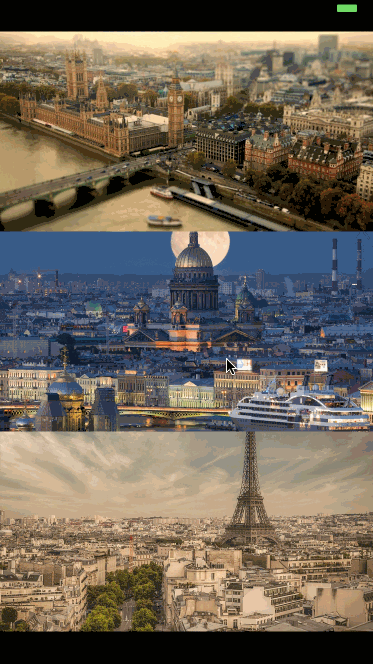
Demo
Usage
import ImageView from 'react-native-image-view';

const images = [
    {
        source: {
            uri: 'https://cdn.pixabay.com/photo/2017/08/17/10/47/paris-2650808_960_720.jpg',
        },
        title: 'Paris',
        width: 806,
        height: 720,
    },
];

<ImageView
    images={images}
    imageIndex={0}
    isVisible={this.state.isImageViewVisible}
    renderFooter={(currentImage) => (<View><Text>My footer</Text></View>)}
/>
See example for better understanding
Props
| Prop name | Description | Type | Default value | Platform |
|---|---|---|---|---|
animationType |
Type of animation modal presented with | "none", "fade", "slide" | "none" | |
backgroundColor |
Background color of the modal in HEX (#0099CC) | string | null | |
controls |
Config of available controls (see below) | Object | {close: true} | |
glideAlways |
Emulates ScrollView glide animation if built-in was not triggered | boolean | false | Android |
glideAlwaysDelay |
Defines delay in milliseconds for glideAlways | number | 75 | Android |
images |
Array of images to display, see below image item description | array | [] | |
imageIndex |
Current index of image to display | number | 0 | |
isVisible |
Is modal shown or not | boolean | false | |
isTapZoomEnabled |
Zoom image when double tapped | boolean | true | |
isPinchZoomEnabled |
Zoom image with pinch gesture | boolean | true | |
isSwipeCloseEnabled |
Close modal with swipe up or down | boolean | true | |
onClose |
Function called on modal closed | function | none | |
onImageChange |
Function called when image is changed | function | none | |
renderFooter |
Function returns a footer element | function | none |
Image item:
{
  source: any, // Image Component source object
  width: ?number, // Width of full screen image (optional but recommended)
  height: ?number, // Height of full screen image (optional but recommended)
  // any other props you need to render your footer
}
It's recommended to specify width and height to speed up rendering, overwise component needs to fetch images sizes and cache them in images objects passed as props.
controls prop:
type ControlType = React.Component<{onPress: () => void}> | null | boolean,

{
  close: ControlType // Component for close button in up right corner, as onPress prop accepts function to close modal
  next: ControlType, // Component for next image button, as onPress prop accepts function to scroll to next image
  prev: ControlType, // Component for previous image button, as onPress prop accepts function to scroll to previous image
}
To use default components just set {next: true, prev: true}, close is showing by default. To create custom controls check src/controls.
License
Note that the project description data, including the texts, logos, images, and/or trademarks,
for each open source project belongs to its rightful owner.
If you wish to add or remove any projects, please contact us at [email protected].