hectahertz / React Native Material Dialog
Licence: mit
Material design dialogs for React Native 💬
Stars: ✭ 135
Programming Languages
javascript
184084 projects - #8 most used programming language
Projects that are alternatives of or similar to React Native Material Dialog
Aestheticdialogs
📱 An Android Library for 💫fluid, 😍beautiful, 🎨custom Dialogs.
Stars: ✭ 352 (+160.74%)
Mutual labels: material-design, dialog, dialogs
Dialogsheet
An Android library to create fully material designed bottom dialogs similar to the Android Pay app.
Stars: ✭ 236 (+74.81%)
Mutual labels: material, dialog, dialogs
Lovelydialog
This library is a set of simple wrapper classes that are aimed to help you easily create fancy material dialogs.
Stars: ✭ 1,043 (+672.59%)
Mutual labels: material-design, dialog, dialogs
Noty
A simple library for creating animated warnings/dialogs/alerts for Android.
Stars: ✭ 136 (+0.74%)
Mutual labels: material-design, material, dialog
Simpledialogfragments
A collection of easy to use and extendable DialogFragment's for Android
Stars: ✭ 94 (-30.37%)
Mutual labels: material-design, dialog, dialogs
Motion
A library used to create beautiful animations and transitions for iOS.
Stars: ✭ 1,726 (+1178.52%)
Mutual labels: material-design, material
Materialcomponent.banner
Material component for Android: Banner
Stars: ✭ 115 (-14.81%)
Mutual labels: material-design, material
Vuetify Swipeout
👆 A swipe out example built with Vue CLI 3 + Vuetify + Swiper.
Stars: ✭ 117 (-13.33%)
Mutual labels: material-design, material
Smartmaterialspinner
The powerful android spinner library for your application
Stars: ✭ 108 (-20%)
Mutual labels: material-design, material
Brainphaser
Android Quiz App (Spaced Repetition) made with Material Design; features categories, statistics and different question modes
Stars: ✭ 117 (-13.33%)
Mutual labels: material-design, material
Svelte Material Ui
Svelte Material UI Components
Stars: ✭ 2,081 (+1441.48%)
Mutual labels: material-design, material
Materialtextfield
A different beautiful Floating Edit Text
Stars: ✭ 1,504 (+1014.07%)
Mutual labels: material-design, material
Smart Webcomponents
Web Components & Custom Elements for Professional Web Applications
Stars: ✭ 110 (-18.52%)
Mutual labels: material-design, material
Materialabout
It's a material-design about screen to use on your Android apps. A developer profile and application information easy to integrate. 🔖
Stars: ✭ 1,511 (+1019.26%)
Mutual labels: material-design, material
Fullscreendialog
A DialogFragment that implements the Full-screen dialog pattern defined in the Material Design guidelines.
Stars: ✭ 111 (-17.78%)
Mutual labels: material-design, dialog
Angular5 Example Shopping App
Angular 5 Example Shopping App + Angular Material + Responsive
Stars: ✭ 120 (-11.11%)
Mutual labels: material-design, material
Light Push
轻量级推送服务和实时在线监控平台,同时用于开发即时通信系统,基于node的socket.io,支持web、android、ios客户端,支持移动端离线推送,可进行分布式部署
Stars: ✭ 128 (-5.19%)
Mutual labels: material-design, material
Material.avalonia
Material design in AvaloniaUI
Stars: ✭ 126 (-6.67%)
Mutual labels: material-design, material
Jtmaterialspinner
An iOS material design spinner view
Stars: ✭ 127 (-5.93%)
Mutual labels: material-design, material
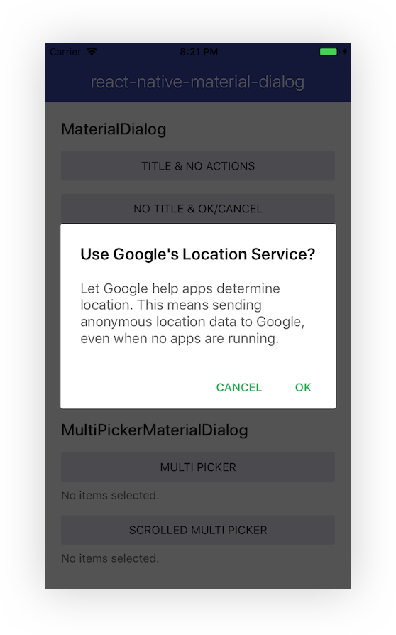
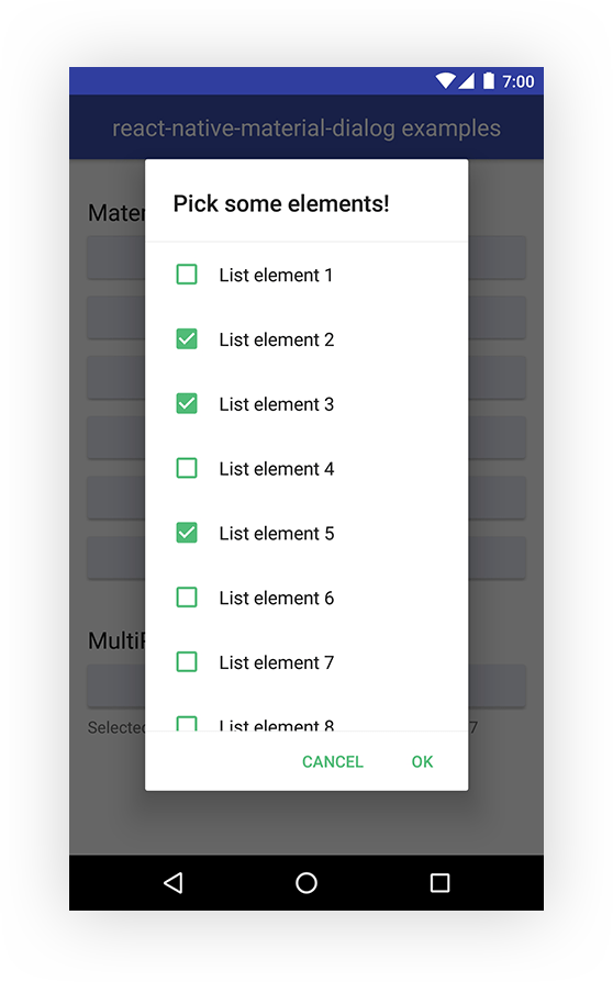
Material design dialog components for React Native. JavaScript-only, for iOS and Android.
Getting started
Step 1
If you're not using Expo, install react-native-vector-icons
Step 2
Install react-native-material-dialog
npm install react-native-material-dialog --save
Example
- Run the example app via Expo or check the code.
Included components
Roadmap
- [ ] Support for stacked action buttons.
- [ ] Dialog that holds a slider.
- [ ] Simple dialog component that accepts a string as content and styles it.
MaterialDialog
Basic and customizable dialog that can hold any component.
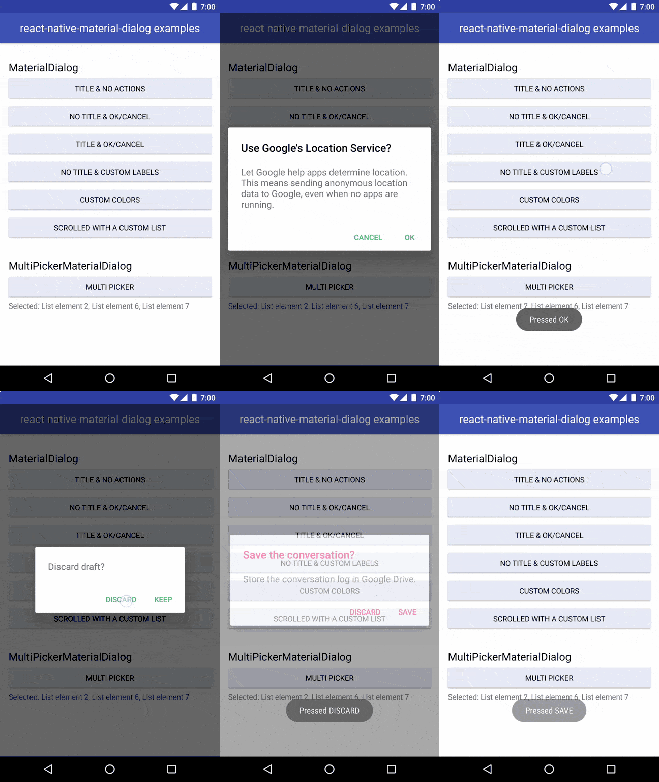
import { MaterialDialog } from 'react-native-material-dialog';

<MaterialDialog
  title="Use Google's Location Service?"
  visible={this.state.visible}
  onOk={() => this.setState({ visible: false })}
  onCancel={() => this.setState({ visible: false })}>
  <Text style={styles.dialogText}>
    Let Google help apps determine location. This means sending anonymous
    location data to Google, even when no apps are running.
  </Text>
</MaterialDialog>;
Props
| Name | Description | Default/Required | Type |
|---|---|---|---|
| visible | shows or hides the dialog | required | bool |
| children | element to be rendered in the content of the dialog | required | element |
| onCancel | callback when the dialog is closed or the cancel action is pressed | required | func |
| onOk | callback when the ok action is pressed | undefined | func |
| cancelLabel | label for the cancel action | 'CANCEL' | string |
| okLabel | label for the ok action | 'OK' | string |
| title | text for the dialog title | undefined | string |
| titleColor | color of the dialog title | 'rgba(0, 0, 0, 0.87)' | string |
| backgroundColor | color of the dialog background | '#FFFFFF' | string |
| colorAccent | color of the action text | '#51BC78' | string |
| scrolled | whether the form is in scrolled mode | false | bool |
| addPadding | automatically add paddings to the content | true | bool |
SinglePickerMaterialDialog
Ready to use dialog that allows to choose only one option from a list.
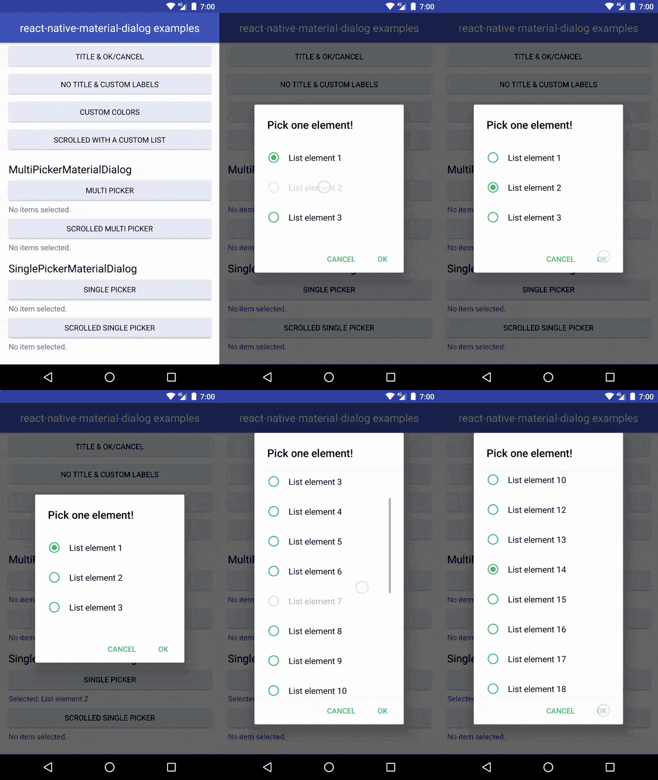
import { SinglePickerMaterialDialog } from 'react-native-material-dialog';

<SinglePickerMaterialDialog
  title={'Pick one element!'}
  items={LIST.map((row, index) => ({ value: index, label: row }))}
  visible={this.state.singlePickerVisible}
  selectedItem={this.state.singlePickerSelectedItem}
  onCancel={() => this.setState({ singlePickerVisible: false })}
  onOk={result => {
    this.setState({ singlePickerVisible: false });
    this.setState({ singlePickerSelectedItem: result.selectedItem });
  }}
/>;
Props
| Name | Description | Default/Required | Type |
|---|---|---|---|
| visible | shows or hides the dialog | required | bool |
| items | list of options to choose from | required | array of objects with a 'label' and 'value' property |
| selectedItem | item that will be selected when opening the dialog | required | object with a 'label' and 'value' property |
| onCancel | callback when the dialog is closed or the cancel action is pressed | required | func |
| onOk | callback when the ok action is pressed | undefined | func |
| cancelLabel | label for the cancel action | 'CANCEL' | string |
| okLabel | label for the ok action | 'OK' | string |
| title | text for the dialog title | undefined | string |
| titleColor | color of the dialog title | 'rgba(0, 0, 0, 0.87)' | string |
| backgroundColor | color of the dialog background | '#FFFFFF' | string |
| colorAccent | color of the action text | '#51BC78' | string |
| scrolled | whether the form is in scrolled mode | false | bool |
MultiPickerMaterialDialog
Ready to use dialog that allows to choose several options from a list.
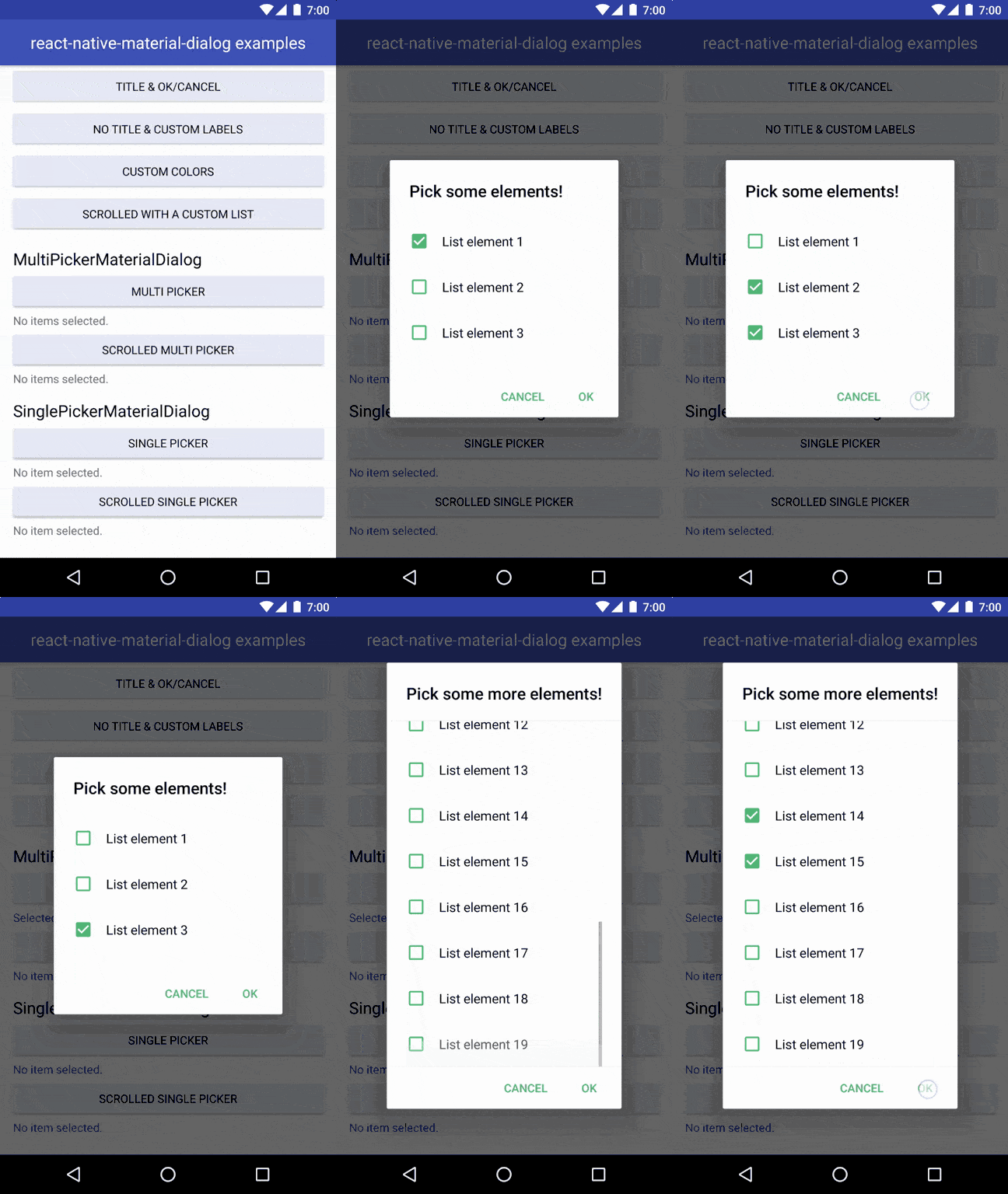
import { MultiPickerMaterialDialog } from 'react-native-material-dialog';

<MultiPickerMaterialDialog
  title={'Pick some elements!'}
  colorAccent={this.props.colorAccent}
  items={LIST.map((row, index) => {
    return { value: index, label: row };
  })}
  visible={this.state.multiPickerVisible}
  selectedItems={this.state.multiPickerSelectedItems}
  onCancel={() => this.setState({ multiPickerVisible: false })}
  onOk={result => {
    this.setState({ multiPickerVisible: false });
    this.setState({ multiPickerSelectedItems: result.selectedItems });
  }}
/>;
Props
| Name | Description | Default/Required | Type |
|---|---|---|---|
| visible | shows or hides the dialog | required | bool |
| items | list of options to choose from | required | array of objects with a 'label' and 'value' property |
| selectedItems | items that will be selected when opening the dialog | required | array of objects with a 'label' and 'value' property |
| onCancel | callback when the dialog is closed or the cancel action is pressed | required | func |
| onOk | callback when the ok action is pressed | undefined | func |
| cancelLabel | label for the cancel action | 'CANCEL' | string |
| okLabel | label for the ok action | 'OK' | string |
| title | text for the dialog title | undefined | string |
| titleColor | color of the dialog title | 'rgba(0, 0, 0, 0.87)' | string |
| backgroundColor | color of the dialog background | '#FFFFFF' | string |
| colorAccent | color of the action text | '#51BC78' | string |
| scrolled | whether the form is in scrolled mode | false | bool |
References
License
Contact
Note that the project description data, including the texts, logos, images, and/or trademarks,
for each open source project belongs to its rightful owner.
If you wish to add or remove any projects, please contact us at [email protected].


