ajsmth / React Native Pager
Programming Languages
Labels
Projects that are alternatives of or similar to React Native Pager
react-native-pager
A fully controllable, high performance pager for React Native
Installation
yarn add @crowdlinker/react-native-pager
If you're using expo, all dependencies are already installed by default. If not, you'll need to install two dependencies along with this library:
yarn add react-native-gesture-handler
yarn add react-native-reanimated
There are additional steps to setting these up:
Example
// lots more examples are available in example/src directory of this repo

import React, { useState } from 'react';
import { View } from 'react-native';
import { Pager, PagerProvider } from '@crowdlinker/react-native-pager';
import { Slide } from './shared-components';

function MyPager() {
  const [activeIndex, onChange] = useState(1);

  return (
    <PagerProvider activeIndex={activeIndex} onChange={onChange}>
      <Pager>
        <Slide />
        <Slide />
        <Slide />
        <Slide />
      </Pager>
    </PagerProvider>
  );
}
API Reference
Pager
import { Pager } from '@crowdlinker/react-native-pager'

Props
--------
children: React.ReactNode[];
activeIndex?: number; - active screen
onChange?: (nextIndex: number) => void; - active screen changed
initialIndex?: number; - initial active screen
springConfig?: Partial<SpringConfig> - configuration for spring transitions on swipe / snap
pageInterpolation?: iPageInterpolation - see below - configuration for individual page transforms
panProps?: Partial<GestureHandlerProperties> - configuration for <PanGestureHandler />
pageSize?: number; - percentage (0 - 1), how far should it page on index change
threshold?: number; - percentage (0 - 1), how far should the user drag before snapping to next / prev
minIndex?: number; - minimum index to swipe to (default 0)
maxIndex?: number; - maximum index to swipe to (default children.length - 1)
adjacentChildOffset?: number; - the number of children adjacent to the activeIndex to render
style?: ViewStyle; - style for pages
containerStyle?: ViewStyle - style for pan handler container
animatedValue?: Animated.Value<number>; - total translation value of the pager
animatedIndex?: Animated.Value<number>; - activeIndex as an animated value e.g intermediate values
type?: 'horizontal' | 'vertical'; - target horizontal swipes or vertical swipes
clamp?: {
  prev?: number; - percentage (0 - 1) - clamp children to the left of the active screen
  next?: number; - percentage (0 - 1) - clamp children to the right of the active screen
};
clampDrag: {
  prev?: number - max drag distance to previous screen,
  next?: number - max drag distance to next screen
}
This interface looks intimidating, but nearly all of these props are optional and customize specific behaviours. They won't be necessary in a lot of use cases.
PagerProvider
import { PagerProvider } from '@crowdlinker/react-native-pager'

Props
--------
children: React.ReactNode;
initialIndex?: number;
activeIndex?: number;
onChange?: (nextIndex: number) => void;
Pagination
import { Pagination } from '@crowdlinker/react-native-pager'

Props
--------
children: React.ReactNode;
pageInterpolation: iPageInterpolation;
style?: ViewStyle;
Slider
import { Slider } from '@crowdlinker/react-native-pager'

Props
--------
numberOfScreens: number;
style: ViewStyle;
Progress
import { Progress } from '@crowdlinker/react-native-pager'

Props
--------
numberOfScreens: number;
style: ViewStyle;
Hooks
There are a number of useful hooks you can use in your screens when you wrap <Pager /> in a <PagerProvider />
  usePager(): [activeIndex, onChange, animatedIndex]
  useFocus(): boolean -> is screen focused
  useOffset(index: number) -> animatedIndex value relative to the given index
  useOnFocus(fn) -> fn() to fire on screen focus
  useIndex() -> the index of the screen
  useAnimatedIndex() -> the animatedIndex value of the pager
  useInterpolation(interpolationConfig) -> interpolated style object
What is animatedIndex?
Animated index represents the animated value of the active index -- it includes possible intermediate values. When panning or transitioning, the activeIndex value moves from 0 -> 1 but the animatedIndex value captures all intermediate values between 0 and 1 during this transition.
Hooks in action
function MySlide(props) {
  const [data, setData] = useState();

  useOnFocus(() => {
    if (!data) {
      myApi.fetchData(props);
    }
  });

  const style = useInterpolation({
    transform: [
      {
        scale: {
          inputRange: [-1, 0, 1],
          outputRange: [0.9, 1, 0.9],
          extrapolate: 'clamp',
        },
      },
      {
        rotate: {
          unit: 'deg',
          inputRange: [-1, 0, 1],
          outputRange: [90, 0, 120],
        },
      },
    ],
  });

  return <Animated.View style={{ flex: 1, ...style }}>...</Animated.View>;
}
Interpolation
One of the core features of this library is the ability to customize style transformations based on a screen's position relative to the focused screen.
Here is an example of an interpolation configuration:
const scaledDown = {
  transform: [
    {
      scaleX: {
        inputRange: [-1, 0, 1],
        outputRange: [0.8, 1, 0.8],
        extrapolate: 'clamp',
      },
    },
  ],
};
The object itself is the same shape as any style prop you would normally pass into a <Animated.View /> component. However, the values of these properties define an interpolation configuration.
The input range refers to the position relative to the focused screen:
inputRange: [-1, 0, 1];
// [-1] targets the screen before the focused screen
// [0] targets the screen that is focused
// [1] targets the screen after the focused screen
The output range reflects the style values that will be applied for each specified inputRange value:
outputRange: [0.8, 1, 0.8];
// [0.8] will be applied to the screen before the focused screen
// [1] will be applied to the screen that is focused
// [0.8] will be applied to the screen after the focused screen
In this case, screens that are on the left and right of the focused screen will be scaled to 80% of their size, and any screen outside of this range will also be given 80% scale.
You can customize the behaviour of all of the screens in a <Pager /> by passing this configuration as the pageInterpolation prop. The interpolations can target all kinds of style properties, such as translations, rotations, and more.
Alternatively, you can customize styles for individual screens by using the useInterpolation() hook. This accepts the same configuration object, and will return the style property that you can apply to your Animated.View
The interpolation configs can be found in the react-native-reanimated docs here.
Examples
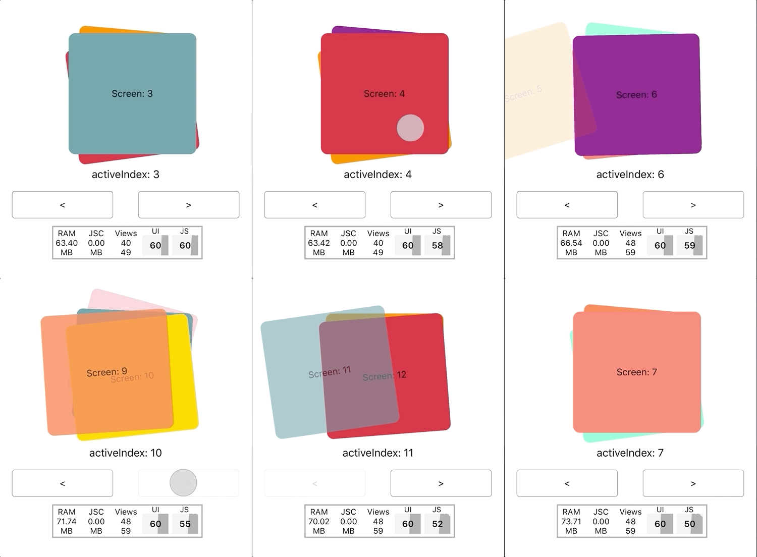
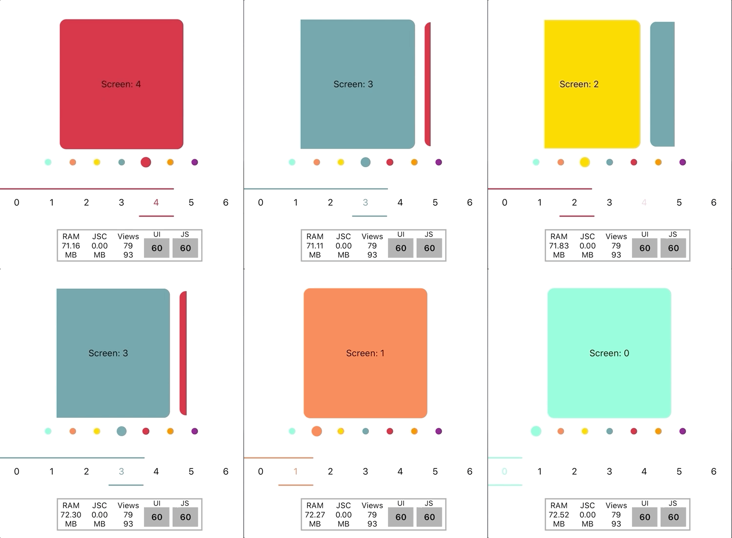
All of the examples in the gifs above (and more) are available in the /example/src directory of this repo. For the most part, these are different configurations of the pageInterpolation prop. There is all kinds of neat stuff you can do with these - if you have a particular configuration you'd like to share, please submit a PR and spread the love!


