React-Tooltip-Controller
This is a feature-rich React component for controlling tooltips. Not only for tooltips, but you can use it for various interaction requirements.
It seamlessly integrates into your markup without breaking it.
Visit the examples page to discover the functionalities.
| Basic Tooltip | Animated Tooltip | Advanced Tooltip |
|---|---|---|
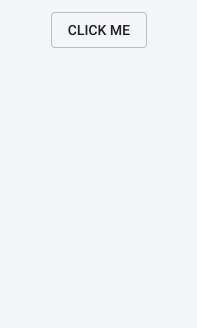 |
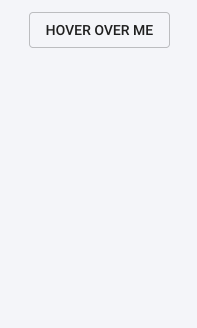 |
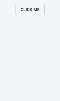 |
Highlights
- Supports
click,hover,hover-holdandhover-interactdetections. - Each tooltip can be animated individually.
- Set whether the tooltip closes when clicked on it.
- Close the tooltip manually by assigning a variable.
- Retrieve the state of the tooltip (whether open or not).
- Set a timeout to automatically close the tooltip.
- Position the tooltip relative to the triggering element.
- Automatically center the tooltip along the X axis for dynamically sized elements.
Installing
npm install react-tooltip-controller
After installing the module, import the following components:
import {ToolTipController, Select} from 'react-tooltip-controller'Basic Usage
<ToolTipController
  detect="click"
  offsetY="center"
  offsetY={20}>

  // Selects the element controlling the tooltip
  <Select>
    <button>Click me</button>
  </Select>

  // Custom tooltip component
  <TooltipComponent/>

</ToolTipController>
Anything, but <Select> component, wrapped by <ToolTipController> is portalled to the bottom of the <body> tag in the DOM.
You can either wrap a component or JSX Markup with <ToolTipController>.
By wrapping the <button> with <Select> component, <TooltipComponent/> is attached to <button> and set to be triggered by a click event.
By default, the tooltip wrapped is positioned relative to the left-bottom of the selected element.
Properties Table
| Props | Description | Possible Values | Default | Data Type |
|---|---|---|---|---|
| id | Assigns an ID number to the tooltip container class to be able to distinguish between multiple tooltips. Required for CSS animations on tooltip | E.g. "1", "2" |
null | String |
| detect | Determines how to trigger the tooltip. Note that timeOut prop should be defined in order to use the "hover-interact” option |
"click","hover","hover-hold","hover-interact” |
"click" |
String |
| closeOnClick | Determines whether the tooltip closes when clicked on it | true, false |
true |
Boolean |
| triggerClose | A Boolean value of true closes the tooltip manually |
Boolean variable | - | Boolean |
| returnState | Returns the state of the tooltip - If it’s open or not | Function | - | Function |
| timeOut | Determines if the tooltip closes automatically after a certain amount of time in milliseconds | positive integers | null | Integer |
| offsetX | Determines the offset along the X axis relative to left bottom of the element | positive/negative integers | 0 | Integer |
| offsetY | Determines the offset along the Y axis relative to left bottom of the element. If set to "center", automatically aligns to middle of the triggering element |
positive/negative integers or "center" |
0 | Integer, String |
| animation | Determines the name of the animation class | - | null | String |
| duration | Determines the duration of the animation in units of milliseconds(ms) or seconds(s) | E.g. "500ms" or "0.5s" |
null | String |
| timing | Determines the timing function of the animation. You can use standard CSS timing functions such as "linear", "ease" or can define a specific Cubic Bezier curve |
E.g. "linear" or "ease" |
null | String |
| properties | Determines the properties to be animated. Can be a string or an array of strings | E.g. "all" or ["opacity", "transform"] |
[ ] | String, Array |
Note: Hover events act as a click event on touch devices.
Examples
Minimal Example
import React, { Component } from 'react'
import {ToolTipController, Select} from 'react-tooltip-controller'

const ToolTip = () =>
  <div className="toolTip">
    Tooltip
  </div>

class Example extends Component {

  render() {
    return (
      <div className="App">

        <ToolTipController
          detect="hover">

          <Select>
            <button>Hello There</button>
          </Select>

          <ToolTip/>

        </ToolTipController>

      </div>

    )
  }
}

export default Example
Animation Example
Stylus File
.react-tooltip-1
  opacity: 0
  transform: translateY(10px)
  &.fadeIn
    opacity: 1
    transform: translateY(0)
JSX file
import React, { Component } from 'react'
import {ToolTipController, Select} from 'react-tooltip-controller'
import './styles/animation.css'

const ToolTip = () =>
  <div className="toolTip">
    Tooltip
  </div>

class Example extends Component {

  render() {
    return (
      <div className="App">

        <ToolTipController
          id="1"
          detect="hover"
          animation="fadeIn"
          duration=".3s"
          timing="ease"
          properties={["opacity", "transform"]}>

          <Select>
            <button>Hello There</button>
          </Select>

          <ToolTip/>

        </ToolTipController>

      </div>

    )
  }
}

export default Example
Note that react-tooltip is a built-in class name and since the id prop is set to "1", it is referred with the specific class name of react-tooltip-1.
Always set the id prop for the animated tooltips in order to prevent any class name conflicts.
Side note: If you don't set the properties prop, all the properties for the tooltip animates. This results in position animations when the browser is resized.
Use of triggerClose prop
import React, { Component } from 'react'
import {ToolTipController, Select} from 'react-tooltip-controller'

const ToolTip = (props) =>
  <div className="toolTip">
    Tooltip
    <button onClick={null}></button>
    <button onClick={props.closeTriggerFunction}></button>
  </div>

class Example extends Component {

  state = {
    trigger: false
  }

  close = () => {
    this.setState({trigger: true})
  }

  render() {
    return (
      <div className="App">

        <ToolTipController
          detect="click"
          closeOnClick={false}
          triggerClose={this.state.trigger}>

          <Select>
            <button>Hello There</button>
          </Select>

          <ToolTip closeTriggerFunction={this.close}/>

        </ToolTipController>

      </div>

    )
  }
}

export default Example
By using the triggerClose prop, the tooltip can be closed manually. To do so, variable passed to triggerClose prop should be set to true.
This example demonstrates how to close the tooltip by setting the state of the triggering variable to true. To prevent the other click events on the tooltip from closing it, closeOnClick is set to false. Note that clicking outside of the tooltip closes it independent of the triggerClose prop.
Use of returnState prop
import React, { Component } from 'react'
import {ToolTipController, Select} from 'react-tooltip-controller'

const ToolTip = (props) =>
  <div className="toolTip">
    Tooltip
  </div>

class Example extends Component {

  state = {
    tooltipState: false
  }

  getTooltipState = (data) => {
    this.setState({tooltipState: data})
  }

  render() {
    return (
      <div className="App">

        <ToolTipController
          select="btn"
          detect="hover"
          returnState={this.getTooltipState}>

          <Select>
            <button>Hello There</button>
          </Select>

          <ToolTip/>

        </ToolTipController>

      </div>

    )
  }
}

export default Example
You can pass a function as a prop through returnState in order to get the state of the tooltip, whether it's open or not.
License
MIT License