kyaroru / Rnparallax
A react native scroll view component with Parallax header :p
Stars: ✭ 474
Programming Languages
javascript
184084 projects - #8 most used programming language
Projects that are alternatives of or similar to Rnparallax
Sticky Parallax Header
A simple React Native library, enabling to create a fully custom header for your iOS and Android apps.
Stars: ✭ 792 (+67.09%)
Mutual labels: parallax, header
React Native Stretchy
🤸♀️A ReactNative scrollable stretchy header component
Stars: ✭ 216 (-54.43%)
Mutual labels: parallax, header
Perspective
Powerful scrolling and motion parallax for iOS
Stars: ✭ 260 (-45.15%)
Mutual labels: parallax
Stickyheaderlistview
打造炫酷列表之 StickyHeaderListView:标题渐变、吸附悬浮、筛选分类、动态头部等
Stars: ✭ 2,820 (+494.94%)
Mutual labels: header
Locomotive Scroll
🛤 Detection of elements in viewport & smooth scrolling with parallax.
Stars: ✭ 4,231 (+792.62%)
Mutual labels: parallax
Immersivedetailsample
A sample application show how to realize immersive parallax effect header like Google Play Store
Stars: ✭ 457 (-3.59%)
Mutual labels: parallax
englishextra.github.io
English Grammar for Russian-Speakers, a PWA website + SPA
Stars: ✭ 19 (-95.99%)
Mutual labels: parallax
Vue Flux
Image slider which comes with 20 cool transitions
Stars: ✭ 359 (-24.26%)
Mutual labels: parallax
Flutter Layouts Exampls
Layout of the flutter example.such as Row,Comlun,listview,Just for learning.
Stars: ✭ 292 (-38.4%)
Mutual labels: header
Viewpagertransition
viewpager with parallax pages, together with vertical sliding (or click) and activity transition
Stars: ✭ 3,017 (+536.5%)
Mutual labels: parallax
Parallax
Easy parallax View for Android simulating Apple TV App Icons
Stars: ✭ 271 (-42.83%)
Mutual labels: parallax
Tilt.js
A tiny 60+fps parallax tilt hover effect for jQuery.
Stars: ✭ 3,442 (+626.16%)
Mutual labels: parallax
Commodity Injection Signatures
Commodity Injection Signatures, Malicious Inputs, XSS, HTTP Header Injection, XXE, RCE, Javascript, XSLT
Stars: ✭ 267 (-43.67%)
Mutual labels: header
React Native Parallax Scroll
Parallax scroll view for react-native
Stars: ✭ 385 (-18.78%)
Mutual labels: parallax
Cute headers
Collection of cross-platform one-file C/C++ libraries with no dependencies, primarily used for games
Stars: ✭ 3,274 (+590.72%)
Mutual labels: header
React Native Collapsing Toolbar
react-native wrapper for android CollapsingToolbarLayout
Stars: ✭ 280 (-40.93%)
Mutual labels: parallax
React Native App Intro
react-native-app-intro is a react native component implementing a parallax effect welcome page using base on react-native-swiper , similar to the one found in Google's app like Sheet, Drive, Docs...
Stars: ✭ 3,169 (+568.57%)
Mutual labels: parallax
RNParallax (react-native-parallax-header)


- A react native scroll view component with Parallax header :p
- Inspired by GitHub - jaysoo/react-native-parallax-scroll-view
- Code is based on React Native ScrollView animated header – App & Flow – Medium and added little customisation :p
Installation
$ npm i react-native-parallax-header --save
Demo
iPhone X or XS (Using alwaysShowTitle={false} & alwaysShowNavBar={false})
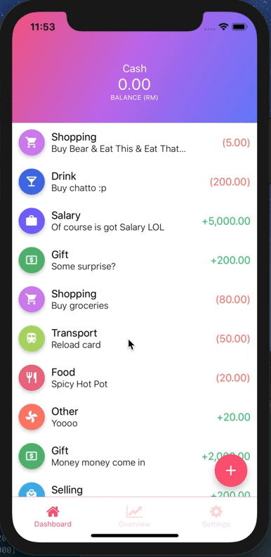
iPhone X or XS
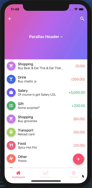
iPhone 8

Example
Refer to TestParallax for working example
import React from 'react';
import {
  StyleSheet,
  View,
  Text,
  StatusBar,
  Dimensions,
  TouchableOpacity,
} from 'react-native';
import ReactNativeParallaxHeader from 'react-native-parallax-header';

const {height: SCREEN_HEIGHT} = Dimensions.get('window');

const IS_IPHONE_X = SCREEN_HEIGHT === 812 || SCREEN_HEIGHT === 896;
const STATUS_BAR_HEIGHT = Platform.OS === 'ios' ? (IS_IPHONE_X ? 44 : 20) : 0;
const HEADER_HEIGHT = Platform.OS === 'ios' ? (IS_IPHONE_X ? 88 : 64) : 64;
const NAV_BAR_HEIGHT = HEADER_HEIGHT - STATUS_BAR_HEIGHT;

const renderNavBar = () => (
  <View style={styles.navContainer}>
    <View style={styles.statusBar} />
    <View style={styles.navBar}>
      <TouchableOpacity style={styles.iconLeft} onPress={() => {}}>
        <Text style={{color: 'white'}}>About</Text>
      </TouchableOpacity>
      <TouchableOpacity style={styles.iconRight} onPress={() => {}}>
        <Text style={{color: 'white'}}>Me</Text>
      </TouchableOpacity>
    </View>
  </View>
);

const renderContent = () => {
  return (
    <View style={styles.body}>
      {Array.from(Array(30).keys()).map((i) => (
        <View
          key={i}
          style={{padding: 15, alignItems: 'center', justifyContent: 'center'}}>
          <Text>Item {i + 1}</Text>
        </View>
      ))}
    </View>
  );
};

const title = () => {
  return (
    <View style={styles.body}>
      <Text style={{color: 'white', fontSize: 25}}>Parallax Header</Text>
    </View>
  );
};

const App = () => {
  return (
    <>
      <StatusBar barStyle="dark-content" />
      <ReactNativeParallaxHeader
        headerMinHeight={HEADER_HEIGHT}
        headerMaxHeight={250}
        extraScrollHeight={20}
        navbarColor="#3498db"
        titleStyle={styles.titleStyle}
        title={title()}
        backgroundImage={require('./bg.png')}
        backgroundImageScale={1.2}
        renderNavBar={renderNavBar}
        renderContent={renderContent}
        containerStyle={styles.container}
        contentContainerStyle={styles.contentContainer}
        innerContainerStyle={styles.container}
        scrollViewProps={{
          onScrollBeginDrag: () => console.log('onScrollBeginDrag'),
          onScrollEndDrag: () => console.log('onScrollEndDrag'),
        }}
      />
    </>
  );
};

const styles = StyleSheet.create({
  container: {
    flex: 1,
  },
  contentContainer: {
    flexGrow: 1,
  },
  navContainer: {
    height: HEADER_HEIGHT,
    marginHorizontal: 10,
  },
  statusBar: {
    height: STATUS_BAR_HEIGHT,
    backgroundColor: 'transparent',
  },
  navBar: {
    height: NAV_BAR_HEIGHT,
    justifyContent: 'space-between',
    alignItems: 'center',
    flexDirection: 'row',
    backgroundColor: 'transparent',
  },
  titleStyle: {
    color: 'white',
    fontWeight: 'bold',
    fontSize: 18,
  },
});

export default App;
API Usage
| Property | Type | Required | Description | Default |
|---|---|---|---|---|
renderNavBar |
func |
No | This renders the nav bar component | Empty <View />
|
renderContent |
func |
YES | This renders the scroll view content | - |
headerMaxHeight |
number |
No | This is the header maximum height | Default to 170
|
headerMinHeight |
number |
No | This is the header minimum height | Default to common ios & android navbar height (have support for iPhone X too :p) |
backgroundImage |
image source |
No | This renders the background image of the header (if specified, background color will not take effect) | Default to null
|
backgroundImageScale |
number |
No | This is the image scale - either enlarge or shrink (after scrolling to bottom & exceed the headerMaxHeight) | Default is 1.5
|
backgroundColor |
string |
No | This is the color of the parallax background (before scrolling up), will not be used if backgroundImage is specified
|
Default color is #303F9F
|
extraScrollHeight |
number |
No | This is the extra scroll height (after scrolling to bottom & exceed the headerMaxHeight) | Default is 30
|
navbarColor |
string |
No | This is the background color of the navbar (after scroll up) | Default color is #3498db
|
statusBarColor |
string |
No | This is the status bar color (for android) navBarColor will be used if no statusBarColor is passed in | Default to null
|
title |
any |
No | This is the title to be display in the header, can be string or component | Default to null
|
titleStyle |
style |
No | This is the title style to override default font size/color | Default to color: ‘white’text and fontSize: 16
|
headerTitleStyle |
style |
No | This is the header title animated view style to override default <Animated.View> style |
Default to null
|
scrollEventThrottle |
number |
No | This is the scroll event throttle | Default is 16
|
contentContainerStyle |
style |
No | This is the contentContainerStyle style to override default <ScrollView> contentContainerStyle style |
Default to null |
containerStyle |
style |
No | This is the style to override default outermost <View> style |
Default to null |
scrollViewStyle |
style |
No | This is the scrollview style to override default <ScrollView> style |
Default to null |
innerContainerStyle |
style |
No | This is the inner content style to override default <View> style inside <ScrollView> component |
Default to null |
alwaysShowTitle |
bool |
No | This is to determine whether show or hide the title after scroll | Default to true
|
alwaysShowNavBar |
bool |
No | This is to determine whether show or hide the navBar before scroll | Default to true
|
scrollViewProps |
object |
No | This is to override default scroll view properties | Default to {}
|
Note that the project description data, including the texts, logos, images, and/or trademarks,
for each open source project belongs to its rightful owner.
If you wish to add or remove any projects, please contact us at [email protected].