alesgenova / Split Me
Programming Languages
Labels
Projects that are alternatives of or similar to Split Me

SplitMe - Universal Splitter
SplitMe is a universal splitter built with Stencil. It can be embedded in projects using any framework or even plain HTML.
See a Live Demo.
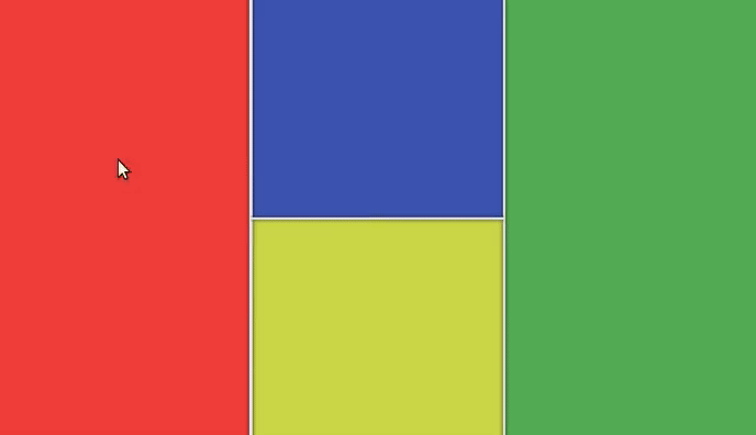
Table of Contents
Setup
Option 1 (HTML)
Add the SplitMe script tag to your index.html:
<script src="https://unpkg.com/split-me/dist/split-me.js"></script>
Option 2 (React / Angular / Vue)
Add SplitMe to your project:
npm install --save split-me
Import SplitMe in your index.js:
import { defineCustomElements as defineSplitMe } from 'split-me/loader';

defineSplitMe(window);
Basic Usage
Use the split-me tag anywhere you like. Set the number of slots in the splitter through the n attribute. Set the order the inner elements through the slot attribute:
<split-me n="2">
  <div slot="0" class="fill red"></div>
  <div slot="1" class="fill green"></div>
</split-me>

<style>
  .fill {
    height: 100%;
    width: 100%;
  }
</style>
Splitters can be arbitrarily nested into each other to achieve any layout.
<split-me n="3" sizes="0.3, 0.3, 0.4" min-sizes="0.2, 0.0, 0.0">
  <div slot="0" class="fill red"></div>
  <div slot="1" class="fill green"></div>
  <split-me slot="2" n="2" d="vertical" fixed>
    <div slot="0" class="fill blue"></div>
    <div slot="1" class="fill magenta"></div>
  </split-me>
</split-me>
Advanced Usage
Properties
| Property | Attribute | Description | Type |
|---|---|---|---|
d |
d |
The direction of the splitter. | "horizontal" | "vertical" |
fixed |
fixed |
Prevent the splitter from being resized. | boolean |
maxSizes |
max-sizes |
The maximum sizes of the slots. Same format as sizes
|
number[] | string |
minSizes |
min-sizes |
The minimum sizes of the slots. Same format as sizes
|
number[] | string |
n |
n |
The number of slots in the splitter. | number |
sizes |
sizes |
The initial sizes of the slots. Acceptable formats are: sizes="0.33, 0.67" or sizes="50%, 25%, 25%"
|
number[] | string |
throttle |
throttle |
The minimum time (in ms) between resize events while dragging. | number |
Events
| Event | Detail | Description |
|---|---|---|
slotResized |
IResizeEvent | Emitted every time dragging causes the slots to resize |
interface IResizeEvent {
  sizes: number[]; // [0.25, 0.75]
  divider: number; // internal divider index
  originalEvent: MouseEvent | TouchEvent; // event that triggered resize
}
Saving State
function handle(event) {
  // extrapolate details
  const { sizes, divider, originalEvent } = event.detail;
  const sourceElement = event.target;

  console.log(sourceElement, originalEvent);
  console.dir({ divider, sizes });

  // store state
  localStorage.setItem('split-sizes', sizes);
}

const el = document.querySelector('split-me');

// loads sizes, but only if they have not been set yet.
el.sizes = el.sizes || localStorage.getItem('split-sizes');

// listen on changes
el.addEventListener('slotResized', handle);
Styling
SplitMe exposes a few CSS variables that can be overridden in order to adjust the styling of the dividers (gutters) to your liking.
This is the list of variables and their default values:
:host {
  --divider-length: 100%; /* Length of the divider along the principal axis */
  --divider-thickness: 0.15rem; /* Thickness of the divider */
  --divider-color: #eeeeee; /* Background color of the divider */
  --divider-shadow: 0 0 0.3rem black; /* Shadow of the divider */
  --divider-image-h: none; /* Background image of the divider when d="horizontal" */
  --divider-image-v: none; /* Background image of the divider when d="vertical" */
  --divider-background-repeat: no-repeat; /* Repeat rule of the background image */
  --divider-background-position: center; /* Position of the background image */
  --phantom-divider-thickness: 2rem; /* Thickness of the phantom divider used to grab mouse events */
}
Any of these variables can be overridden when using SplitMe in your app.
For example, to make the dividers thicker and change their color to yellow:
<split-me n="2">
  <div slot="0" class="fill red"></div>
  <div slot="1" class="fill green"></div>
</split-me>

<style>
  :root split-me {
    --divider-thickness: 0.75rem;
    --divider-color: yellow;
  }
</style>
TODO
Prevent resizingSpecify initial sizesSpecify minimum and maximum sizesCustomizable splitter style