vpusher / The Grid
Projects that are alternatives of or similar to The Grid
<the-grid>
A digital frontier...
Grid layout custom element based on ES2015 and Polymer 2.0.
Features:
- Draggable tiles
- Resizable tiles
- Overlappable tiles
- Collision detection
- Auto growing grid size
- Constraints on tile size
- Mobile support
Example:
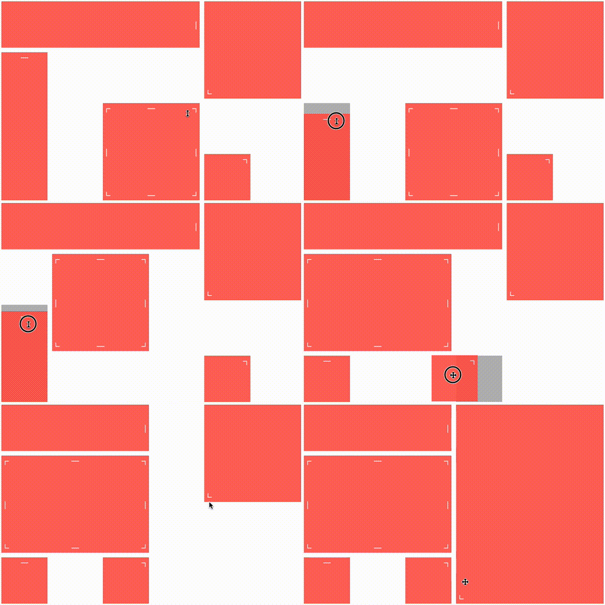
<the-grid draggable resizable animated col-count="6" row-count="4" cell-margin="10">
    <div class="tile" col="0" row="0" height="1" width="4">
        <span resize="right">│</span>
    </div>
    <div class="tile" col="0" row="1" height="3" width="1">
        <span resize="top">─</span>
    </div>

    <div class="tile" col="4" row="3" height="1" width="1">
        <span resize="top-right">┐</span>
    </div>

    <div class="tile" col="4" row="0" height="2" width="2">
        <span resize="bottom-left">└</span>
    </div>
    <div class="tile" col="2" row="2" height="2" width="2">
        <span resize="left">│</span>
        <span resize="right">│</span>
        <span resize="top">─</span>
        <span resize="bottom">─</span>
        <span resize="top-right">┐</span>
        <span resize="top-left">┌</span>
        <span resize="bottom-right">┘</span>
        <span resize="bottom-left">└</span>
    </div>
    <div placeholder></div>
</the-grid>
Installation
First, make sure you have Bower and the Polymer CLI installed.
Then,
bower install
polymer serve -o
Usage
The grid's container
Add a <the-grid> element to your page:
<the-grid></the-grid>
This will show an empty static grid with the default disposition layout with no move or resize capabilities.
You can add the draggable or resizable attribute (or both) to enable respectively tile's drag'n'drop or tile's resizing.
<the-grid draggable></the-grid>
This will show an empty grid with the default disposition layout and also the ability to move tiles by drag'n'drop.
Layout can be modified using the following attributes:
- cell-height: height of the vertical unit in pixels
- cell-width: width of the horizontal unit in pixels
- cell-margin: inner space between tiles, both horizontally and vertically.
- col-count: grid width as an amount of columns.
- row-count: grid height as an amount of columns.
The number of columns
col-countand number of rowsrow-countare by default fixed, and represents the grid size. Nevertheless, you can allow the grid to auto increase its size with respectivelycol-autogrowandrow-autogrowboolean attributes. This behavior occurs when a tile is resized or moved while being on the edge of the grid.
Also, you can allow tiles to overlap each other using overlappable attribute:
<the-grid overlappable></the-grid>
The grid's children (akka tiles).
Each direct child of <the-grid> will be considered as a grid tile that can be moved or resized depending on the grid properties.
Grid's children can be of any types: <div>, <p>, <span>, <tile>, ... or even your own custom element: <grid-tile>.
<the-grid>
    <div col="2" row="1" height="1" width="3" ></div>
    <paper-card col="0" row="0" height="2" width="2" ></paper-card>
</the-grid>
Each child needs 4 attributes which define its position and size within the grid:
- col: the column index of the top-left corner of the tile (starts from 0).
- row: the row index of the top-left corner of the tile (starts from 0).
- width: the column spanning of the tile as an amount of columns (~colspan).
- height: the row spanning of the tile as an amount of rows (~rowspan).
The grid's placeholder
If you need some placeholder while dragging or resizing a tile for preview purpose,
simply add a child to <the-grid> with the placeholder attribute.
<the-grid>
    <div placeholder style="color: grey"></div>
</the-grid>
This will enable a grey placeholder in the grid only visible while dragging and resizing tiles.
The tile's grippers (akka resizers).
If the grid has the resizable attribute, tiles can be resized by grabbing elements called grippers or resizers.
Those elements can be of any types, they just need to have a resize attribute so the grid can find them.
<the-grid>
    <div col="2" row="0" height="1" width="1" >
        <span resize="right">│</span>
    </div>
</the-grid>
Here, a tile is added to the grid. It has a nested right gripper so it can be used to resize the tile by the right edge.
Resize grippers can take the following values:
- top: resize the tile by the top edge.
- bottom: resize the tile by the bottom edge.
- left: resize the tile by the left edge.
- right: resize the tile by the right edge.
- top-left: resize the tile by the top and left edges at the same time.
- top-right: resize the tile by the top and right edges at the same time.
- bottom-left: resize the tile by the bottom and left edges at the same time.
- bottom-right: resize the tile by the bottom and right edges at the same time.
Several grippers can be used for the same tile. They can be nested wherever in the tile element.
Contributing
- Fork it!
- Create your feature branch:
git checkout -b my-new-feature - Commit your changes:
git commit -am 'Add some feature' - Push to the branch:
git push origin my-new-feature - Submit a pull request :D
History
- 1.4.0: Now handles children added on the fly + Serialization helper.
- 1.3.0: Ability to add constraints on tile size as min/max width and height.
- 1.2.0: Introduce autogrow feature and custom events.
- 1.1.0: Introduce overlappable feature.
- 1.0.3: Ability to generate grid's children with templates.
- 1.0.2: Fixes shadow dom wrapping.
- 1.0.1: Enhanced mobile support.
- 1.0.0: Initial release.
License
MIT license


