All Projects → zhiiiyang → tidytuesday

zhiiiyang / tidytuesday

Licence: other
📊 🖌️ Data visualization collection

Programming Languages

r
7636 projects

Projects that are alternatives of or similar to tidytuesday

Ggpage
Creates Page Layout Visualizations in R 📄📄📄
Stars: ✭ 306 (+337.14%)
Mutual labels:  dataviz, rstats, datavisualization
Tidytuesday
📊 My contributions to the #TidyTuesday challenge
Stars: ✭ 410 (+485.71%)
Mutual labels:  dataviz, rstats
Rstudio TableContest 2020
📺 Table showing an "Overview and Series Trends of the Best TV Shows on IMDb" – My Contribution to the Rstudio Table Contest 2020
Stars: ✭ 16 (-77.14%)
Mutual labels:  dataviz, datavisualization
DataViz-Teaching
📈 Visualizations for DataViz Teaching
Stars: ✭ 29 (-58.57%)
Mutual labels:  dataviz, rstats
Vegalite
R ggplot2 "bindings" for Vega-Lite
Stars: ✭ 157 (+124.29%)
Mutual labels:  rstats, datavisualization
leaflet heatmap
简单的可视化湖州通话数据 假设数据量很大,没法用浏览器直接绘制热力图,把绘制热力图这一步骤放到线下计算分析。使用Apache Spark并行计算数据之后,再使用Apache Spark绘制热力图,然后用leafletjs加载OpenStreetMap图层和热力图图层,以达到良好的交互效果。现在使用Apache Spark实现绘制,可能是Apache Spark不擅长这方面的计算或者是我没有设计好算法,并行计算的速度比不上单机计算。Apache Spark绘制热力图和计算代码在这 https://github.com/yuanzhaokang/ParallelizeHeatmap.git .
Stars: ✭ 13 (-81.43%)
Mutual labels:  dataviz, datavisualization
Blogr
Scripts + data to recreate analyses published on http://benjaminlmoore.wordpress.com and http://blm.io
Stars: ✭ 23 (-67.14%)
Mutual labels:  dataviz, rstats
aws-mlu-explain
Visual, Interactive Articles About Machine Learning: https://mlu-explain.github.io/
Stars: ✭ 46 (-34.29%)
Mutual labels:  dataviz, datavisualization
Dex
Dex : The Data Explorer -- A data visualization tool written in Java/Groovy/JavaFX capable of powerful ETL and publishing web visualizations.
Stars: ✭ 1,238 (+1668.57%)
Mutual labels:  dataviz, datavisualization
Easychart
A visual editor for the world's best web charting tool: Highcharts.
Stars: ✭ 45 (-35.71%)
Mutual labels:  dataviz, datavisualization
Hrbrthemes
🔏 Opinionated, typographic-centric ggplot2 themes and theme components
Stars: ✭ 899 (+1184.29%)
Mutual labels:  rstats, datavisualization
Votemapswitzerland
A Swiss version of the famous visualization «Land doesn't vote, people do.»
Stars: ✭ 150 (+114.29%)
Mutual labels:  dataviz, rstats
Waffle
🍁 Make waffle (square pie) charts in R
Stars: ✭ 614 (+777.14%)
Mutual labels:  rstats, datavisualization
Go Admin
A golang framework helps gopher to build a data visualization and admin panel in ten minutes
Stars: ✭ 5,580 (+7871.43%)
Mutual labels:  dataviz, datavisualization
Ggplot Courses
👨‍🏫 ggplot2 Teaching Material
Stars: ✭ 40 (-42.86%)
Mutual labels:  dataviz, rstats
Morph
Morph is a free and open-source tool for creating designs, animations or interactive visualizations from data.
Stars: ✭ 107 (+52.86%)
Mutual labels:  dataviz, datavisualization
FlowViz
A Power BI template that provides easy to understand, actionable flow metrics and predictive analytics for your agile teams using Azure DevOps, Azure DevOps Server and/or TFS.
Stars: ✭ 150 (+114.29%)
Mutual labels:  dataviz, datavisualization
CENTIPEDE.tutorial
🐛 How to use CENTIPEDE to determine if a transcription factor is bound.
Stars: ✭ 23 (-67.14%)
Mutual labels:  rstats
meetup-presentations buenosaires
R-Ladies Buenos Aires recursos
Stars: ✭ 23 (-67.14%)
Mutual labels:  rstats
Interactive-Data-Visualization-with-Python
Present your data as an effective and compelling story
Stars: ✭ 71 (+1.43%)
Mutual labels:  datavisualization

Zhi  Data Visualization Gallery 

Twitter 💬   |   LinkedIn 👔   |   GitHub :octocat:   |   Website 🔗

Table of Contents (click to expand)

How to make an interactive treemap using treemap and d3treeR

Data: introduction of #TidyTuesday media franchise data here

Code: click here

Note: to interact with the treemaps, please go to the post

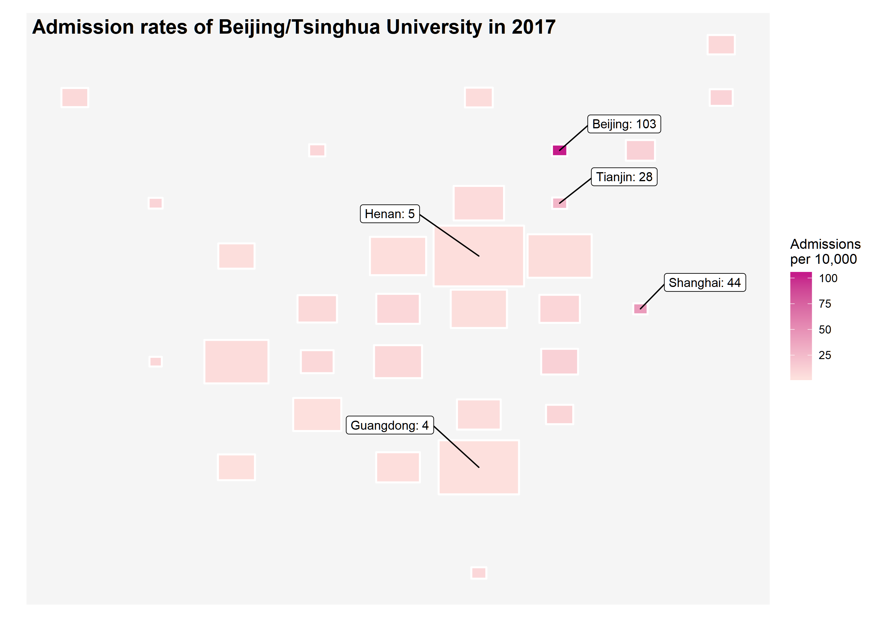
How to make an geofacet waffle chart using geofacet

Data: introduction of #TidyTuesday school diversity data here

Code: click here

Note: go to andriy-gazin/geowaffle to see the original post

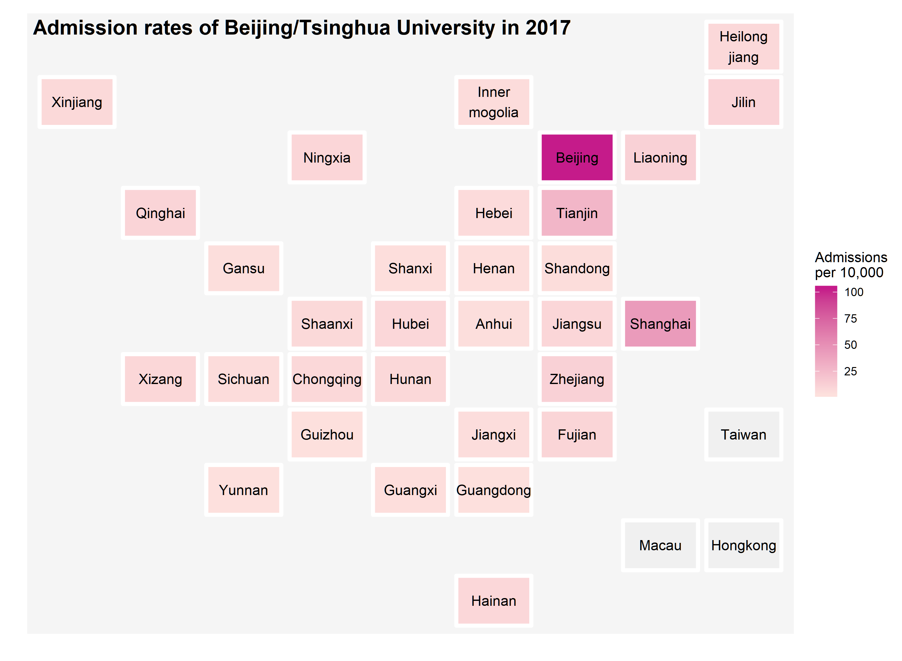
How to make a map using geofacet

How to make an animated picture using gganimate

Code: click here

How to make a heatmap of your Twitter activity using ggplot2

Code: click here

How to make a radar/spider plot of your tweet frequency using ggplot2

Code: click here

How to make a heatmap using ggplot2 and reticulate

Code: click here
Note: this work was inspired by the post on Reddit.

How to make a Sankey diagram and a Word Cloud using networkD3 and wordcloud2

Code: click here

Note that the project description data, including the texts, logos, images, and/or trademarks, for each open source project belongs to its rightful owner. If you wish to add or remove any projects, please contact us at [email protected].