TipDialog
- Please use 3.0.0 or above version, because earlier versions have serious performance issues
- if example no working, please google questions about Flutter upgrade AndroidX, AndroidX Migration - Flutterblock
- if run your app, it shows
Error: Cannot run with sound null safety, please upgrade version to 4.0.0 Reference
A Flutter Tip Dialog
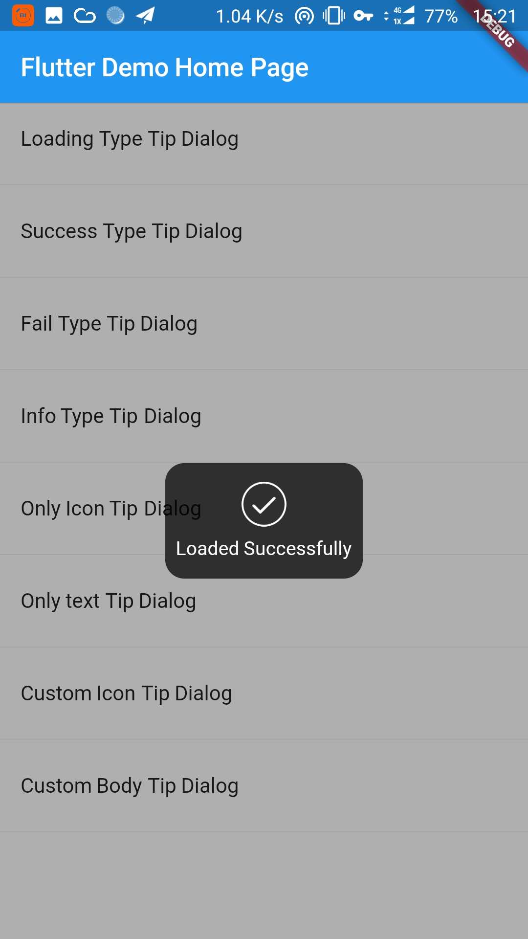
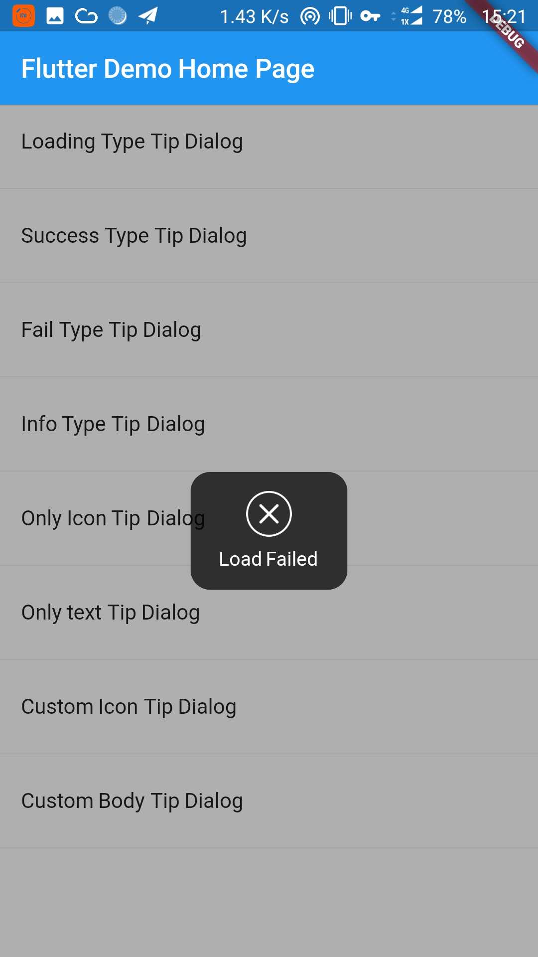
| Loading Type Dialog | Success Tye Dialog | Fail Type Dialog |
|---|---|---|
 |
 |
 |
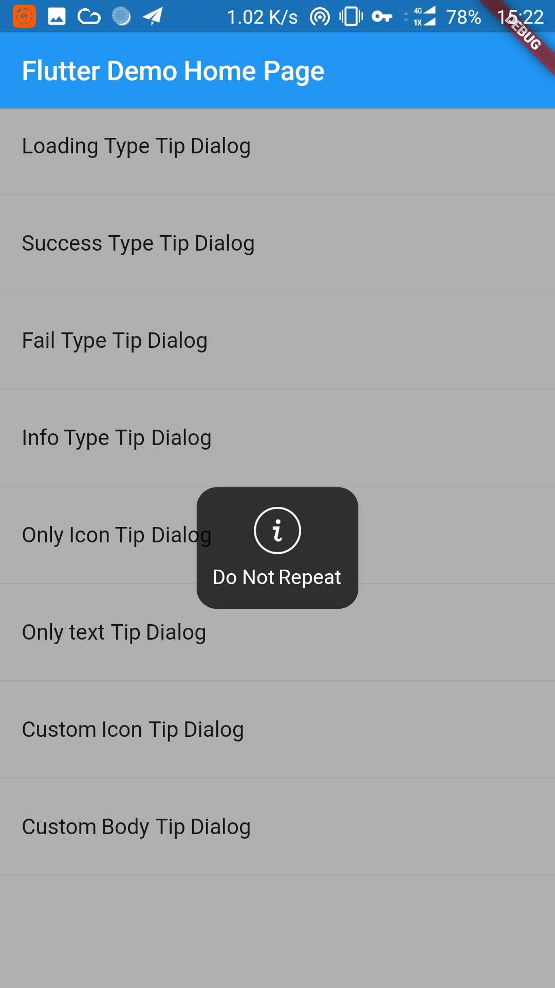
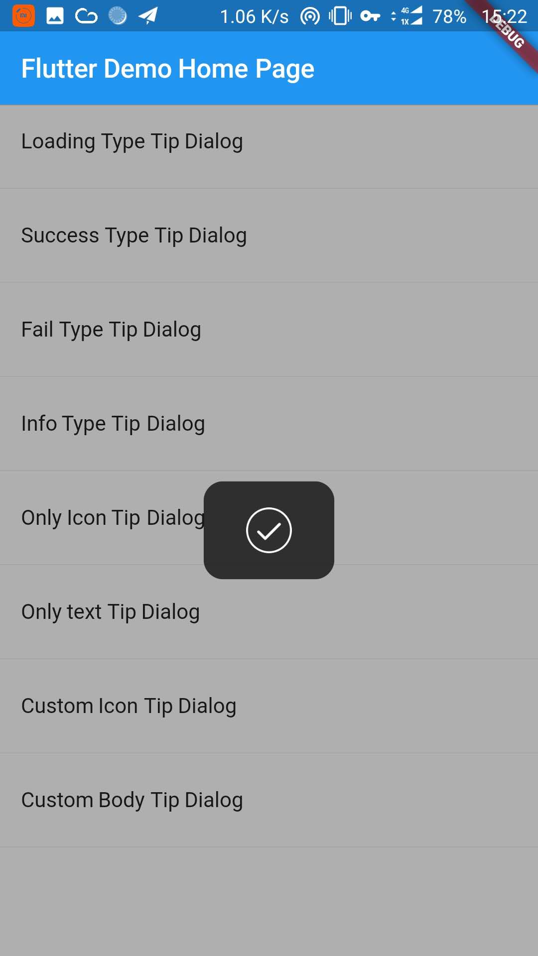
| Info Type Dialog | Only Icon Dialog | Onl Text Dialog |
|---|---|---|
 |
 |
 |
| Custom Icon Dialog | Custom Body Dialog |
|---|---|
 |
 |
1. Depend on it
Add this to your package's pubspec.yaml file:
dependencies:
  tip_dialog: ^4.0.0
2. Install it
You can install packages from the command line: with Flutter:
$ flutter packages get
3. Import it
Now in your Dart code, you can use:
import 'package:tip_dialog/tip_dialog.dart';4. Use
Available attributes
/// [TipDialogContainer]
@required this.child,
/// automatically disappear time
this.duration: const Duration(seconds: 3),
/// mask layer alpha
this.maskAlpha: 0.3
// outside touchable, default false
// if true and onOutsideTouch not set, when use TipDialogHelper.loading(), you can touch mask layer to dismiss
// if true and onOutsideTouch set, when touching the mask layer, onOutsideTouch will be called.
this.outsideTouchable: false
// outside touch callback {@link OutsideTouchCallback}
this.onOutsideTouch
Global Use
/// Use [TipDialogContainer] globally
/// This widget can be globally supported
void main() => runApp(new MyApp());
class MyApp extends StatelessWidget {
@override
Widget build(BuildContext context) {
return new MaterialApp(
title: 'TipDialog Demo',
theme: new ThemeData(),
home: Stack(
children: <Widget>[
MyHomePage(title: 'TipDialog Demo Home Page'),
// add [TipDialogContainer] widget here
TipDialogContainer(duration: const Duration(seconds: 2))
],
),
);
}
}
/// use TipDialogHelper to show or dismiss tip
Widget build(BuildContext context) {
return new Scaffold(
appBar: new AppBar(
title: new Text(widget.title),
elevation: 0.5,
),
body: new ListView(children: <Widget>[
_buildItem("Loading Type Tip Dialog", () async {
TipDialogHelper.loading("Loading");
await new Future.delayed(new Duration(seconds: 5));
TipDialogHelper.dismiss();
}),
new Divider(),
_buildItem("Success Type Tip Dialog", () async {
TipDialogHelper.success("Loaded Successfully");
}),
new Divider(),
_buildItem("Only text Tip Dialog", () async {
TipDialogHelper.show(new TipDialog(
type: TipDialogType.NOTHING,
tip: "Do Not Repeat",
));
}),
new Divider(),
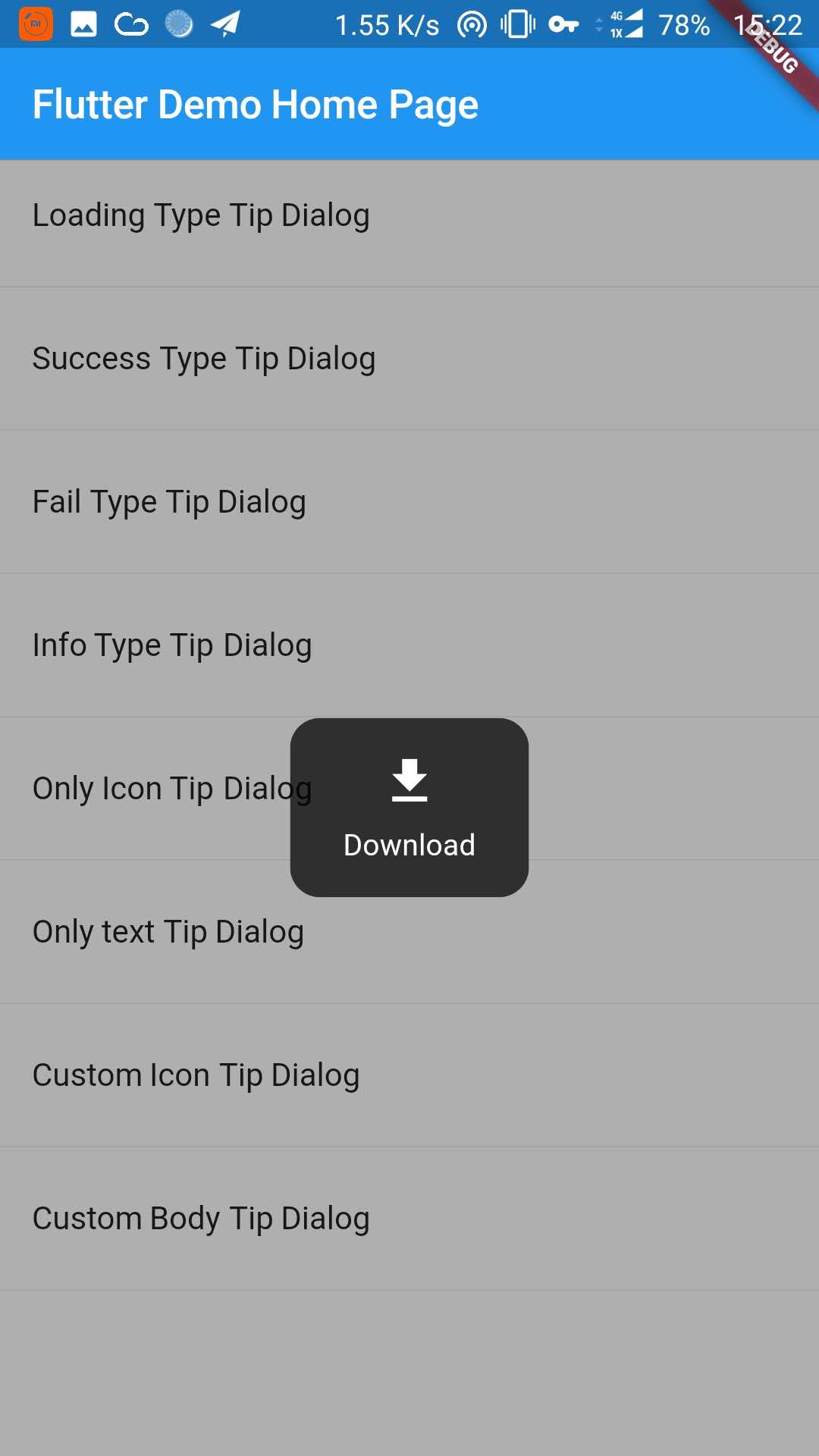
_buildItem("Custom Icon Tip Dialog", () async {
TipDialogHelper.show(new TipDialog.customIcon(
icon: new Icon(
Icons.file_download,
color: Colors.white,
size: 30.0,
textDirection: TextDirection.ltr,
),
tip: "Download",
));
}),
new Divider(),
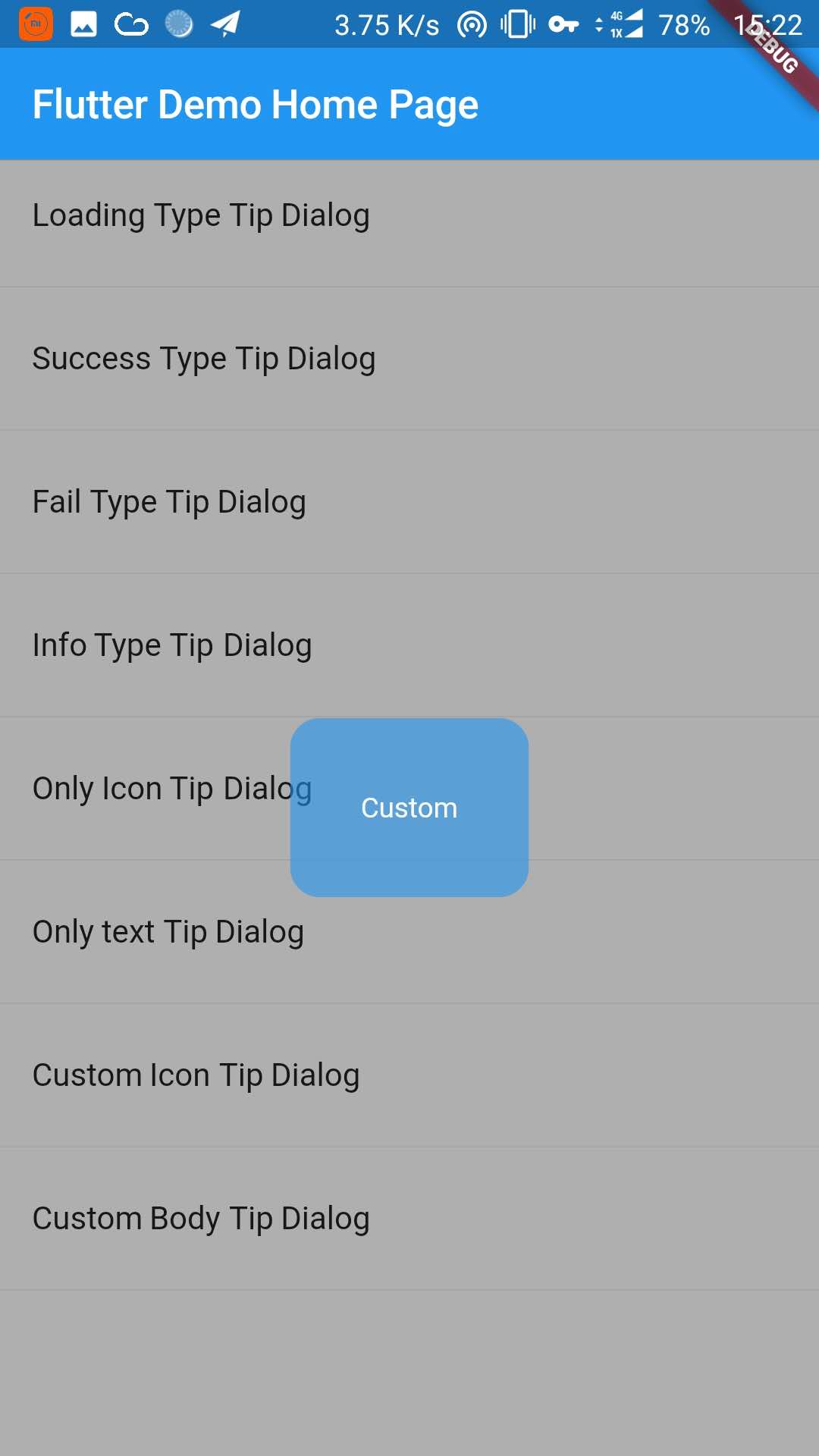
_buildItem("Custom Body Tip Dialog", () async {
TipDialogHelper.show(new TipDialog.builder(
bodyBuilder: (context) {
return new Container(
width: 120.0,
height: 90.0,
alignment: Alignment.center,
child: new Text(
"Custom",
style: new TextStyle(color: Colors.white),
/// if TipDialogContainer are outside of MaterialApp,
/// here is a must to set
textDirection: TextDirection.ltr,
),
);
},
color: Colors.blue.withAlpha(150),
));
}),
new Divider(),
]));
}Use a custom widget when using [TipDialogContainer] globally, there may be appear some unexpected errors. such as Text or Icon, will appear similar to the following error.
No Directionality widget found.
Just set TextDirection just fine. See the custom Widget in the example for details.
5. Default Dialog Type
enum TipDialogType { NOTHING, LOADING, SUCCESS, FAIL, INFO }

NOTHING: no icon
LOADING: have a loading icon
SUCCESS: have a success icon
FAIL: have a fail icon
INFO: have a info icon
CUSTOM: custom tip dialog type, just a sign, do nothing
6. TipDialogHelper Method
/// tipDialog: Need to display the widget
///
/// isAutoDismiss: decide whether to disappear automatically, default is true
/// if true, the dialog will not automatically disappear
/// otherwise, the dialog will automatically disappear after the [Duration] set by [TipDialogContainer]
void show(Widget tipDialog, {bool isAutoDismiss: true});

/// dismiss dialog
void dismiss();

/// show info dialog
void info(String tip);
/// show fail dialog
void fail(String errMsg);
/// show success dialog
void success(String success);
/// show loading dialog
void loading(String loadingTip);
See the example directory for more details.
7. Change log
[4.0.0]
- migrating to null safety
[3.1.0]
- add outside touchable features
[3.0.0]
- fix performance issues
- easier way to call
[2.1.0]
- add TipDialogHelper and deprecated TipDialogConnector
[2.0.1]
- fix dismiss bug
- upgrade android build gradle to 5.1.1
[2.0.0]
- set default auto dismiss duration as 2 seconds
- delete [TipDialogContainer] Partial parameters -- show -- outSideTouchable -- defaultTip -- defaultType
- change show method parameter isLoading to isAutoDismiss
- force display mask layer
[1.1.2] - (MODIFY)
- fix infinite call dismiss bug
- fixed an issue where setting the isLoading value is invalid
[1.1.1] - (MODIFY)
- fix bugs that occur when using globally
[1.1.0] - (FUNCTION CHANGE)
- add tip dialog global support
[1.0.1] - (MODIFY).
- fix loading view version bug.
- set default loading duration
[1.0.0] - first release.
- add release.