arunkumar9t2 / Transition X
Projects that are alternatives of or similar to Transition X
Transition X

Kotlin DSL for choreographing Android Transitions


TransitionManager makes it easy to animate simple changes to layout without needing to explicitly calculate and specify from and to like Animator or Animation expects. When you call TransitionManager.beginDelayedTransition(layout, transition) before updating a layout, the framework automatically does a diff on before and after states and animates the difference.
Transition X is intended to simplify construction of these Transition instances to take full advantage of the framework and provide a clear, concise, type safe and extensible DSL using Kotlin language features.
I highly recommend reading the introduction blog post on my blog.
Download
- Add repository to your project level
build.gradlefile.
allprojects {
    repositories {
        jcenter()
    }
}
- Add library dependency to module level
build.gradlefile.
dependencies{
    implementation 'in.arunkumarsampath:transition-x:1.1.0'
}
Introduction
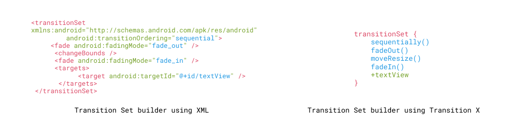
As shown above, instead of creating XML files and later inflating them using TransitionInflator, it is possible to create Transition instances directly using tranistionSet{} block provided by the DSL.
With Transition X, the construction and usage can be greatly simplified with a prepareTransition extension added to ViewGroup.
For example:
constraintLayout.prepareTransition {
  fadeOut {
      startDelay = 100
  }
  moveResize {
    pathMotion = ArcMotion()
  }
  fadeIn()
  +textView // Add textView as target using '+' operator
  exclude<RecyclerView>() // Exclude all recyclerViews
  ease {
    standardEasing // Applies FastOutSlowInInterpolator
  }
}
// Performing layout changes here will be animated just like
// calling TransitionManager.beginDelayedTransition()
All blocks are type-safe and has IDE auto complete support thanks to Kotlin.
Getting Started
Writing your first transition
TransitionSet's can be built programmatically like shown below.
val transition = TransitionSet().apply {
  addTransition(ChangeBounds().apply {
    startDelay = 100
    setPathMotion(ArcMotion())
  })
}
The Transition X equivalent would be:
val transition = transitionSet {
  moveResize {
    startDelay = 100
    pathMotion = ArcMotion()
  }
}
Some of the transition names are opinionated to better express their intent and promote clear code. Here ChangeBounds transition usually animates a View's height, width, or location on screen hence the name moveResize to better convey what it does.
Working with custom transitions
In case you have a custom transition class and want to use with the DSL, it is easy to do so.
- If your transition has a
public no argconstructor then the transition can be added usingcustomTransition<Type: Transition>{}method, transition-x takes care of instantiating the transition. Below example shows usage ofChangeCardColorwhich animates aCardView'scardBackgroundproperty.
constraintLayout.prepareTransition {
  customTransition<ChangeCardColor> {
    +colorChangeCardView
  }
}
- If your transition does not have
public no argconstructor then, you can instantiate the transition yourself and then usecustomTransition(transition) {}instead to add the transition and configure it.
Accessing custom properties
In addition to the common properties like startDelay, interpolator, etc, if your transition has custom properties then customProperties {} block can be used.
constraintLayout.prepareTransition {
  customTransition<ChangeCardColor> {
    +colorChangeCardView
    customProperties {
      myProperty = "hi"
    }
  }
}
Adding, removing and excluding targets
The DSL provides simplified syntax to deal with targets by talking to Transition's add/exclude/remove API.
- Use
+operator oradd()to add targets of typeString (Transition Name)orVieworResource Id.
transitionSet {
  +"TransitionName"
  +userIconView
  add(userIconView)
}
- Use
-operator orremove()to remove targets of typeString (Transition Name)orVieworResource Id.
transitionSet {
  -"TransitionName"
  -userIconView
  remove(userIconView)
}
-
excludeandexcludeChildrenmethods are provided for excluding targets which can be useful in advanced transitions. It can be used onViews,Resource IdsorType
transitionSet {
  exclude<RecyclerView>()
  exclude(R.id.accentBackground)
  excludeChildren(constraintLayout)
}
Interpolators
-
Interpolators can be directly added using
interpolatorproperty.
transitionSet {
  moveResize()
  slide()
  interpolator = FastOutLinearInInterpolator()
}
-
Easing - DSL provides a dedicated
easeblock to add interpolators recommended by material design spec.-
standardEasing- Recommended for views that move within visible area of the layout. UsesFastOutSlowInInterpolator -
decelerateEasing- Recommended for views that appear/enter outside visible bounds of the layout. UsesLinearOutSlowInInterpolator -
accelerateEasing- Recommended for Views that exit visible bounds of the layout. UsesFastOutLinearInInterpolator
-
transitionSet {
  moveResize()
  ease {
    decelerateEasing
  }
}
Nesting transitions
Often, for fined grained transitions it it necessary to add different transition sets for different targets. It is simple to nest multiple transition sets just by using transitionSet {} recursively.
transitionSet {
  auto {
    +"View 1"
  }
  transitionSet {
    moveResize()
    slide()
    +"View 2"
  }
  transitionSet {
    sequentially()
    fadeOut()
    moveResize()
    fadeIn()
  }
}
Adding listeners to transitions
Transition-X makes it easy to react to Transition lifecycle by providing lifecycle methods like onEnd, onStart which internally uses Transition.addListener.
Example:
rootCoordinatorLayout.prepareTransition {
    onStart {
        // Transition Started!
    }
    moveResize {
        +image1
    }
    onEnd {
        // Transition Ended!
    }
}
Additional transitions
The library packages additional transitions not present in the support library and the plan is to add more commonly used transitions to provide a full package. Currently the following transitions are packaged:
-
ChangeText: Animates changes to aTextView.textproperty. -
ChangeColor: Animates changes toView.backgroundif it is aColorDrawableor changes toTextView.textColorif the target is aTextView.
Samples
| Sample | DSL | Demo |
|---|---|---|
| Snackbar animation | Snackbar is anchored below FAB. moveResize is used on on FAB since its position changes. Slide is used on Snackbar since it's visibility changes.
constraintLayout.prepareTransition {
  moveResize {
    +fab
  }
  slide {
    +snackbarMessage
  }
  ease {
    decelerateEasing
  }
}
snackbarMessage.toggleGone()
|
 |
| Cascade animation | It is possible to write normal logical code in the prepareTransition block. Here we add moveResize using loops and by adding a start delay based on position, we can emulate a cascade transition.
constraintLayout.prepareTransition {
  texts.forEachIndexed { position, view ->
    moveResize {
	  +view
	  startDelay = ((position + 1) * 150).toLong()
	}
 }
 moveResize { +fab }
 ease {
    decelerateEasing
 }
}
// Layout changes
(if (defaultState) constraint1 else constraint2)
.applyTo(constraintLayout)
|
 |
| Custom Transition | In the following example, ChangeCardColor is a custom transition that animates cardBackgroundColor property of MaterialCardView .
constraintLayout.prepareTransition {
  customTransition<ChangeCardColor> {
     +cardView
  }
  changeColor {
     +textView
  }
  duration = 1000
}
// Layout changes
cardView.setCardBackgroundColor(color)
textView.setTextColor(calcForegroundWhiteOrBlack(color))
|
 |
| Arc motion | Here the imageView's gravity is changed from START | CENTER_VERTICAL to TOP | CENTER_HORIZONTAL. By using a pathMotion it is possible to control the motion of the animation to follow material guidelines' arc motion.
frameLayout.prepareTransition {
  moveResize {
    pathMotion = ArcMotion()
    +userIconView
  }
}
|
 |
| Advanced choreography | By using techniques above and coupling it with further customization via lifecycle listeners such as onEnd or onPause it is possible to have finer control over the entire transition process. In the example below, notice how different views are configured with different parameters for transition type, interpolation and ordering.
constraintLayout.prepareTransition {
auto {
ease {
standardEasing
}
exclude(metamorphosisDesc2)
}
transitionSet {
fade()
slide()
ease {
accelerateEasing
}
+metamorphosisDesc2
}
changeImage { add(*imageViews) }
onEnd {
constraintLayout.prepareTransition {
moveResize()
changeText {
+collapseButton
changeTextBehavior
|
 |
| Shared element transition | Transition instances created by the DSL can be directly used with activity.window.sharedElementEnterTransition or fragment.sharedElementEnterTransition.
fragment.sharedElementEnterTransition = transitionSet {
  transitionSet {
    changeImage()
    moveResize()
    changeClipBounds()
    scaleRotate()
    ease {
      standardEasing
     }
     duration = 375
     +cartItem.cartImageTransitionName()
  }
  transitionSet {
    ease {
      standardEasing
    }
    moveResize()
    scaleRotate()
    add(cartItem.name, cartItem.price)
    duration = 375
   }
}
|
Demo - WIP. |
| Animated Bottom Navigation | Bottom navigation animation implmentend using custom choreography instead of relying on AutoTransition. The implementation uses ConstraintLayout to define the layouts and then simply show/hides the labels and adds tint to the icons. TransitionManager does the rest.
|
 |
Tasks
- [x] Initial release of Kotlin DSL
- [x] Provide samples for Shared Element Transitions
- [x] Package common transition within the library module
- [ ] Add wiki with best practices and gotchas.
Contributions
Contributions are welcome! I would greatly appreciate creating an issue to discuss major changes before submitting a PR directly. How you can help:
- Improving test coverage.
- Finding the DSL not sufficient for your case? Create an issue so we can discuss.
- Adding more animation samples to the sample app.
License
Copyright 2019, Arunkumar.

Licensed under the Apache License, Version 2.0 (the "License");
you may not use this file except in compliance with the License.
You may obtain a copy of the License at

   http://www.apache.org/licenses/LICENSE-2.0

Unless required by applicable law or agreed to in writing, software
distributed under the License is distributed on an "AS IS" BASIS,
WITHOUT WARRANTIES OR CONDITIONS OF ANY KIND, either express or implied.
See the License for the specific language governing permissions and
limitations under the License.