krystalcampioni / Vue Hotel Datepicker
Licence: mit
Vue date range picker component
Stars: ✭ 665
Projects that are alternatives of or similar to Vue Hotel Datepicker
Zebra datepicker
A super-lightweight, highly configurable, cross-browser date / time picker jQuery plugin
Stars: ✭ 367 (-44.81%)
Mutual labels: calendar, datepicker
Vue Virtual Scroller
⚡️ Blazing fast scrolling for any amount of data
Stars: ✭ 6,326 (+851.28%)
Mutual labels: vuejs-components, vuejs2
React Infinite Calendar
✨ Infinite scrolling date-picker built with React, with localization, range selection, themes, keyboard support, and more.
Stars: ✭ 3,828 (+475.64%)
Mutual labels: calendar, datepicker
Primedatepicker
PrimeDatePicker is a tool that provides picking a single day, multiple days, and a range of days.
Stars: ✭ 292 (-56.09%)
Mutual labels: calendar, datepicker
Angular Moment Picker
Angular Moment Picker is an AngularJS directive for date and time picker using Moment.js.
Stars: ✭ 536 (-19.4%)
Mutual labels: calendar, datepicker
Vue Functional Calendar
Vue.js Functional Calendar | Component/Package
Stars: ✭ 314 (-52.78%)
Mutual labels: calendar, datepicker
Vue Swatches
🎨 Help the user picking beautiful colors!
Stars: ✭ 456 (-31.43%)
Mutual labels: vuejs-components, vuejs2
react-native-infinite-calendar
WIP: React native port of react-infinite-calendar
Stars: ✭ 43 (-93.53%)
Mutual labels: calendar, datepicker
Vuelayers
Web map Vue components with the power of OpenLayers
Stars: ✭ 532 (-20%)
Mutual labels: vuejs-components, vuejs2
Vue Input Tag
🔖 Vue.js 2.0 Input Tag Component
Stars: ✭ 507 (-23.76%)
Mutual labels: vuejs-components, vuejs2
vue-notification-bell
Vue.js notification bell component.
Stars: ✭ 64 (-90.38%)
Mutual labels: vuejs2, vuejs-components
React Modern Calendar Datepicker
A modern, beautiful, customizable date picker for React
Stars: ✭ 555 (-16.54%)
Mutual labels: calendar, datepicker
Calendar
A calendar picker component, based on jQuery.
Stars: ✭ 49 (-92.63%)
Mutual labels: calendar, datepicker
Rkcalendar
SwiftUI Simple Calendar / Date Picker for iOS
Stars: ✭ 349 (-47.52%)
Mutual labels: calendar, datepicker
ionic4-datepicker
Ionic 4 Datepicker component
Stars: ✭ 78 (-88.27%)
Mutual labels: calendar, datepicker
Calendarview
An Easy to Use Calendar for iOS (Swift 5.0)
Stars: ✭ 429 (-35.49%)
Mutual labels: calendar, datepicker
nepali date picker
Material Style Date Picker with Bikram Sambat(Nepali) Calendar Support. Supports both Android and ios.
Stars: ✭ 30 (-95.49%)
Mutual labels: calendar, datepicker
vuejs3-datepicker
vue 3 datepicker. supports disabling, highlighting of dates and programmatic access of date.
Stars: ✭ 23 (-96.54%)
Mutual labels: calendar, datepicker
Ion2 Calendar
📅 A date picker components for ionic2 /ionic3 / ionic4
Stars: ✭ 537 (-19.25%)
Mutual labels: calendar, datepicker


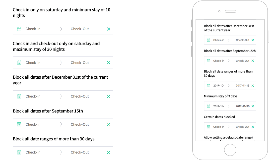
A responsive date range picker for Vue.js that displays the number of nights selected and allow several useful options like custom check-in/check-out rules, localisation support and more.
Demo
https://krystalcampioni.github.io/vue-hotel-datepicker/
Installation
NPM
npm install vue-hotel-datepicker
PNPM
pnpm install vue-hotel-datepicker
YARN
yarn add vue-hotel-datepicker
import HotelDatePicker from 'vue-hotel-datepicker'
import 'vue-hotel-datepicker/dist/vueHotelDatepicker.css';

export default {
  components: {
    HotelDatePicker,
  },
}
<HotelDatePicker />
Props/Options
| Name | Type | Default | Description |
|---|---|---|---|
| alwaysVisible | Boolean |
false |
If true shows display calendar in the page without an input. |
| bookings | Array |
[] |
If you want to show bookings. |
| closeDatepickerOnClickOutside | Boolean |
true |
Closes the date picker when the user clicks outside the date picker. |
| disableCheckoutOnCheckin | Boolean |
false |
If set to true, disable checkout on the same date has checkin. |
| disabledDates | Array |
[] |
An array of strings in this format: YYYY-MM-DD. All the dates passed to the list will be disabled. |
| disabledDaysOfWeek | Array |
[] |
DEPRECATED: An array of strings in this format: ['Monday', 'Tuesday', 'Wednesday', 'Thursday', 'Friday', 'Saturday', 'Sunday']. All the days passed to the list will be disabled. It depends on the translated names. |
| disabledWeekDays | Object |
{} |
An object with the following properties: sunday, monday, tuesday, wednesday, thursday, friday, saturday, the value indicates if that day is disabled (true) or enabled (false). |
| displayClearButton | Boolean |
true |
If set to true, displays a clear button on the right side of the input if there are dates set. |
| enableCheckout | Boolean |
false |
If true, allows the checkout on a disabled date. |
| endDate | [Date, String, Number] |
Infinity |
The end view date. All the dates after this date will be disabled. |
| endingDateValue | Date |
null |
The initial value of the end date. |
| firstDayOfWeek | Number |
0 |
The first day of the week. Where Sun = 0, Mon = 1, ... Sat = 6. You need to set the right order in i18n.day-names too. |
| format | String |
'YYYY-MM-DD' |
The date format string. |
| gridStyle | Boolean |
true |
If false hides the grid around the days. |
| halfDay | Boolean |
true |
Allows to have half a day, if you have check in at noon and checkout before noon |
| hoveringTooltip | [Boolean, Function] |
true |
Shows a tooltip with the number of nights when hovering a date. |
| i18n | Object |
see below | Holds the traslation of the date picker. |
| lastDateAvailable | [Number, Date] |
Infinity |
Allows to stop calendar pagination after the month of that date |
| maxNights | Number |
null |
Maximum nights required to select a range of dates. 0 or null for no limit. |
| minNights | Number |
1 |
Minimum nights required to select a range of dates. |
| periodDates | Array |
[] |
If you want to have specific startAt and endAt period with different duration or price or type of period. See below for more information |
| positionRight | Boolean |
false |
If true shows the calendar on the right of the input. |
| priceSymbol | String |
'' |
The price symbol added before the price when showPrice is true and a price has been set in one of the periodDates array items (period). |
| showPrice | Boolean |
false |
If set to true, displays a price contains on your periodDates. |
| showSingleMonth | Boolean |
false |
If set to true, display one month only |
| showYear | Boolean |
true |
Shows the year next to the month. |
| singleDaySelection | Boolean |
false |
When true only one day can be selected instead of a range. |
| startDate | [Date, String] |
new Date() |
The start view date. All the dates before this date will be disabled. |
| startingDateValue | Date |
null |
The initial value of the start date. |
| tooltipMessage | String |
null |
If provided, it will override the default tooltip "X nights" with the text provided. You can use HTML in the string. |
| value | Boolean |
false |
The v-model prop, controls the visibility of the date picker. |
| yearBeforeMonth | Boolean |
false |
Show the year before the month, only when showYear is true. |
i18n Defaults:
i18n: {
  "night": "Night",
  "nights": "Nights",
  "week": "week",
  "weeks": "weeks",
  "day-names": ["Sun", "Mon", "Tue", "Wed", "Thur", "Fri", "Sat"],
  "check-in": "Check-in",
  "check-out": "Check-out",
  "month-names": [
      "January",
      "February",
      "March",
      "April",
      "May",
      "June",
      "July",
      "August",
      "September",
      "October",
      "November",
      "December",
  ],
  "tooltip": {
      "halfDayCheckIn": "Available CheckIn",
      "halfDayCheckOut": "Available CheckOut",
      "saturdayToSaturday": "Only Saturday to Saturday",
      "sundayToSunday": "Only Sunday to Sunday",
      "minimumRequiredPeriod": "%{minNightInPeriod} %{night} minimum.",
  },
}
periodDates
- Type:
Array - Default:
[]If you want to have specific startAt and endAt period with different duration or price or type of period-
| Key | Type | Description |
|---|---|---|
| endAt | String | YYYY-MM-DD |
| startAt | String | YYYY-MM-DD |
| minimumDuration | Number | Minimum stay (Type: weekly => per_week | Type: nightly => per night) |
| periodType | String | nightly, weekly_by_saturday, weekly_by_sunday |
| price | Float | Price displayed on each day for this period |
Example:
periodDates: [
  {
    startAt: "2020-06-09",
    endAt: "2020-07-26",
    minimumDuration: 4,
    periodType: "nightly"
  },
  {
    startAt: "2020-07-26",
    endAt: "2020-09-30",
    minimumDuration: 1,
    periodType: "weekly_by_saturday"
  },
  {
    startAt: "2020-09-30",
    endAt: "2020-11-30",
    minimumDuration: 2,
    periodType: "weekly_by_sunday",
    price: 4000.0
  }
],
MinimumDuration with a periodType weekly-~ equals to a week
bookings
If you want to show bookings
- Type:
Array - Default:
[]
| Key | Type | Description |
|---|---|---|
checkInDate |
String |
'YYYY-MM-DD' |
checkOutDate |
String |
'YYYY-MM-DD' |
style |
Object |
Style, (see the example) |
Example:
bookings: [
  {
    event: true,
    checkInDate: "2020-08-26",
    checkOutDate: "2020-08-29",
    style: {
      backgroundColor: "#399694"
    }
  },
  {
    event: false,
    checkInDate: "2020-07-01",
    checkOutDate: "2020-07-08",
    style: {
      backgroundColor: "#9DC1C9"
    }
  }
],
Methods
⚠️ In order to open/close the datepicker from an external element, such as a button make sure to set closeDatepickerOnClickOutside to false
| Name | Description |
|---|---|
hideDatepicker |
Hides the datepicker |
showDatepicker |
Shows the datepicker |
toggleDatepicker |
Toggles (shows or hides) the datepicker |
Events
| Name | Params enum | Description |
|---|---|---|
booking-clicked |
MouseEvent, Date, Object
|
Emitted every time a booking is clicked. The first param is the mouse javascript event, the second is the clicked Date and the third is the clicked booking. |
check-in-changed |
Emitted every time a new check in date is selected with the new date as payload. | |
check-out-changed |
Emitted every time a new check out date is selected with the new date as payload. | |
clear-selection |
Emitted every time you clicked on clear Date button. | |
day-clicked |
Date, String, Date|Number|String
|
Emitted every time when day is clicked. The params are clicked: date, format and next disabled date. |
handle-checkin-checkout-half-day |
Object |
Emitted on [beforeMount, clear-selection, checkout]. Param: Object of checkin-checkout date. |
next-month-rendered |
Emitted every time the next month is rendered. | |
period-selected |
Event, Date, Date
|
Emitted every time when a checkOut is clicked. Params: Mouse Event, checkIn, checkOut |
booking-clicked examples
{
  checkInDate: "YYYY-MM-DD",
  checkOutDate: "YYYY-MM-DD",
  style: {
    backgroundColor: "#399694",
  }
}
Credits
This component was originally built as a Vue wrapper component for the Hotel Datepicker by @benitolopez. Version 2.0.0 was completely rewritten with Vue, removing the original library, removing some features and introducing others.
Note that the project description data, including the texts, logos, images, and/or trademarks,
for each open source project belongs to its rightful owner.
If you wish to add or remove any projects, please contact us at [email protected].