vue-sfc-cli
vue-sfc-cli is a powerful tool for developing vue single-file component.
It makes writing docs and demo easily, integrated with an automated github workflow, and is always ready to publish to npm with best practices.
Table Of Contents
Links
Notice
Requirement
Node.js 8.x
Prettier and husky
The component template has built-in prettier and husky setup that can format code when you commit.
However, you need to execute commands as following, otherwise the commit hook will not take effect:
npx vue-sfc-cli

# git init must run before yarn
git init

yarn
Stylelint
The component template has built-in stylelint, which perfectly supports less/sass, but not stylus(it cannot have comment)
Windows
It is not recommended to generate components under Windows, cause .sh files may lost execution permissions.
Tutorial
Quick Start
npx vue-sfc-cli

# Next there will be a bunch of tips, please be sure to fill out
# Recommend kebab-case style, lowercase letters, multiple words separated by - (dash), such as my-component

# After filling the prompt
cd my-component

# Use git to initialize, so you can use the commit hook
git init

# Install dependency
yarn

# Develop component
yarn dev

# Build
yarn build

# Ready to publish!
# Or use `npm publish`
yarn publish
Options
-u, --upgrade
According to the template files in the templates directory, new files will be generated and override the files with same name in current component directory. The default override files is defined in update-files.js. This option often used to upgrade the configuration of old components using the latest version of vue-sfc-cli:
This option can also help any node.js project to set up configuration of AUTO npm publishment via travis ci
# cd my-component
npx vue-sfc-cli -u
--files
If you want to update additional files, you can pass this option, multiple files use , to separate
npx vue-sfc-cli -u --files .babelrc.js,.eslintrc.js
--test
Generate a component template for testing, commonly used in CI.
npx vue-sfc-cli --test
-o, --output
Generate a component template in the specific output dir.
npx vue-sfc-cli --output ./outDir
--name, --owner
These two arguments are usually used together to generate component without prompt.
npx vue-sfc-cli --name log-viewer --owner FEMessage
Writing Example
The docs directory hosts your component's examples. You just write markdown files, and they will turn into demo. It is also recommended to name the markdown files in kebab-case style.
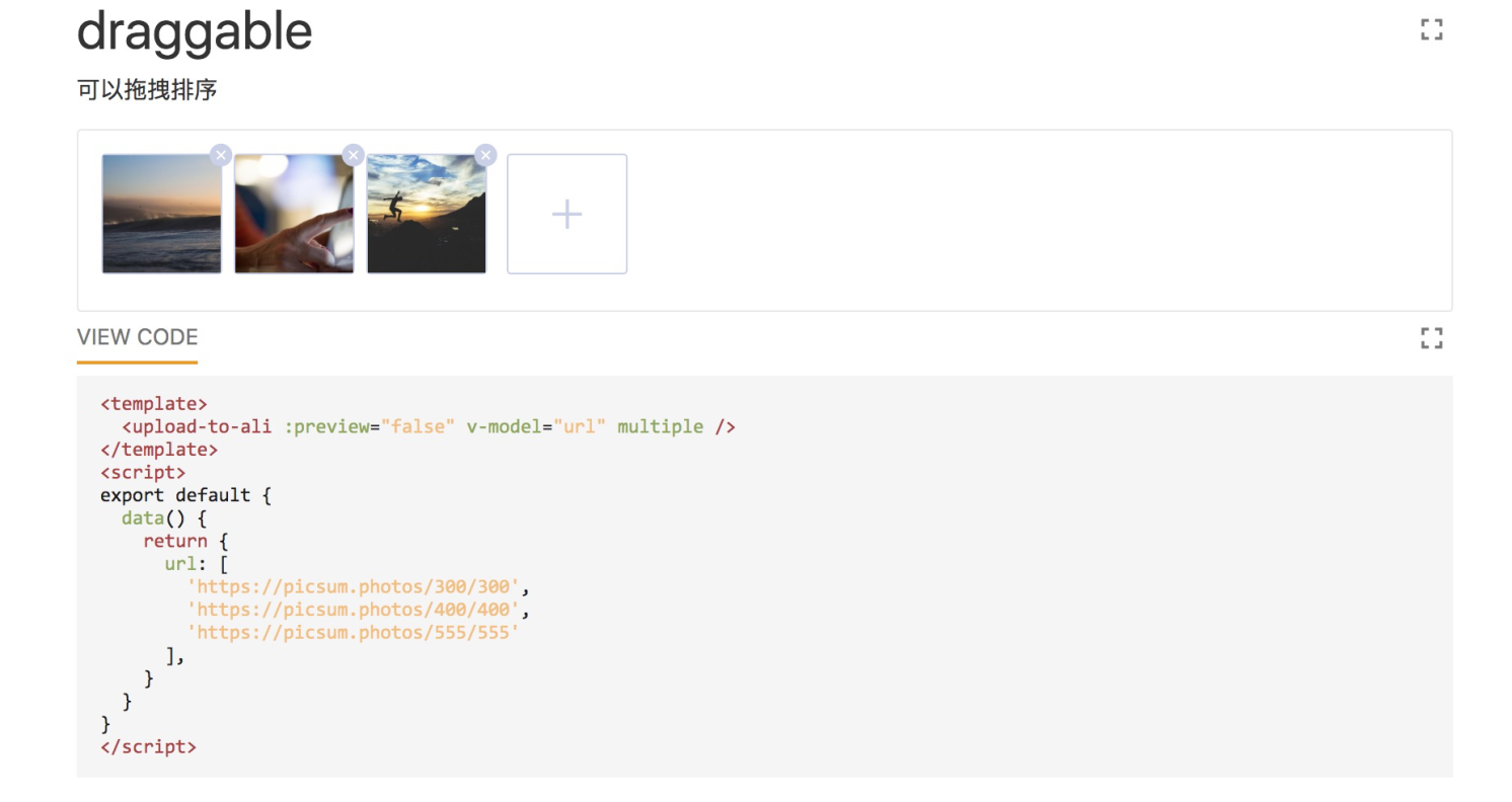
Take the docs/draggable.md file of upload-to-ali, the upload component as an example.
draggable example
```vue
<template>
<upload-to-ali :preview="false" v-model="url" multiple />
</template>
<script>
export default {
data() {
return {
url: [
'https://picsum.photos/300/300',
'https://picsum.photos/400/400',
'https://picsum.photos/555/555'
],
}
}
}
</script>
```
yarn dev can turn this markdown file into live demo, which will show you what the component looks like and it's actual code. You can also modify the code and the demo can hot reload.
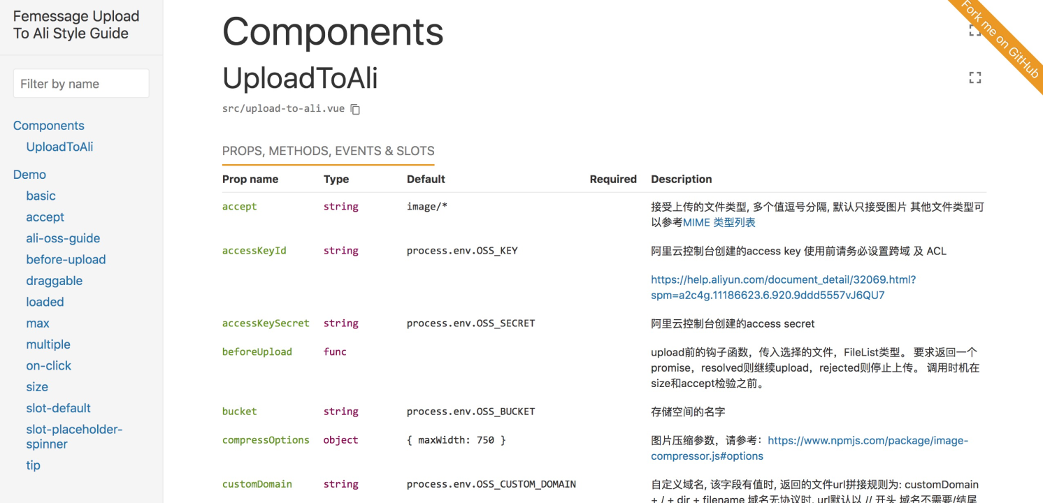
API Documentation
You can simply write comments in vue file to generate API documentation.
Props
Use multiple lines of comments in props
props: {
    /**
     * is upload multiple files
     */
    multiple: {
      type: Boolean,
      default: false
    },
}
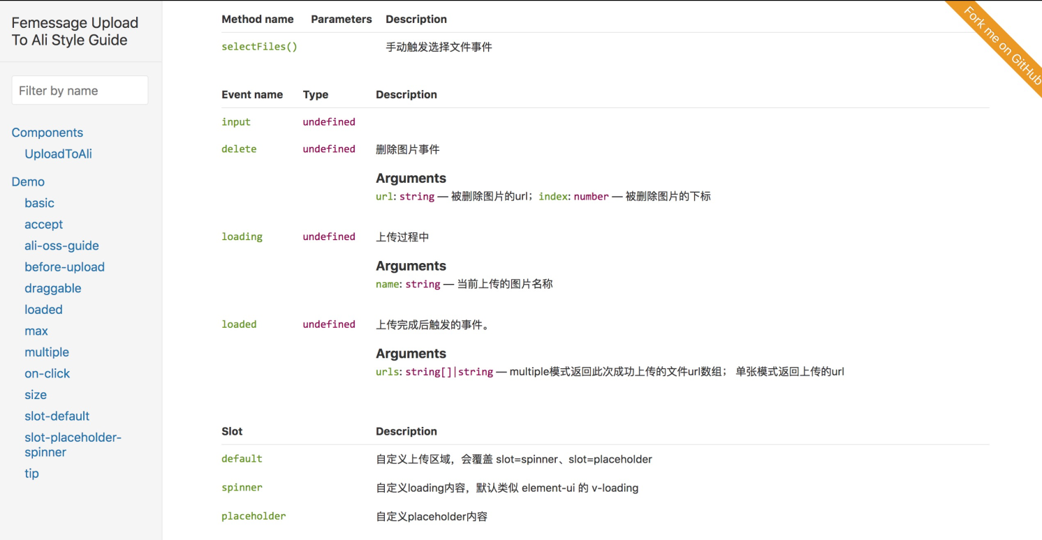
Slot
On the slot line, use the comment at the beginning of @ slot
<!--@slot custom loading content -->
<slot name="spinner">
  <div class="upload-loading">
    <svg class="circular" viewBox="25 25 50 50">
      <circle class="path" cx="50" cy="50" r="20" fill="none"></circle>
    </svg>
  </div>
</slot>
Event
Use multi-line comments above the emit event
/**
 * @property {string} name - file name
 */
this.$emit('loading', name)
Methods
Above the method to be show in API doc, use multi-line comments and add @public
/**
 * trigger select files
 * @public
 */
selectFiles() {
  this.$refs.uploadInput.click()
},
preview like this
Working with third-party library
To Element-UI As an example
yarn add element-ui
Add a file: styleguide/element.js
import Vue from 'vue'
import Element from 'element-ui'
import 'element-ui/lib/theme-chalk/index.css'
 Vue.use(Element)
Modify configuration files: styleguide.config.js
module.exports = {
  // ...
  require: [
    './styleguide/element.js'
  ]
}
if you need bundle in element components, you may refer the following code
// rollup.config.js
import vue from 'rollup-plugin-vue'
import babel from '@rollup/plugin-babel'
import commonjs from '@rollup/plugin-commonjs'
import {terser} from 'rollup-plugin-terser'
import {nodeResolve} from '@rollup/plugin-node-resolve'
import json from '@rollup/plugin-json'
import css from 'rollup-plugin-css-only'
import copy from 'rollup-plugin-copy'
import minimist from 'minimist'

const argv = minimist(process.argv.slice(2))

const config = {
  input: 'src/index.js',
  output: {
    name: 'MyComponent',
    exports: 'named'
  },
  external: ['vue', 'vuex', 'axios', 'js-cookie', 'vue-clamp'],
  plugins: [
    json(),
    nodeResolve({extensions: ['.js', '.jsx', '.es6', '.es', '.mjs', '.vue']}),
    commonjs(),
    css({
      output: 'index.css',
    }),
    vue({
      css: false,
      compileTemplate: true,
      style: {
        postcssPlugins: [require('autoprefixer')]
      }
    }),
    babel({
      babelHelpers: 'runtime',
      extensions: ['.js', '.jsx', '.es6', '.es', '.mjs', '.vue'],
      exclude: 'node_modules/**'
    }),
    copy({
      targets: [
        {
          src: 'node_modules/element-ui/lib/theme-chalk/fonts/**/*',
          dest: 'dist/dist/fonts'
        }
      ]
    })
  ]
}

// Only minify browser (iife) version
if (argv.format === 'iife') {
  config.plugins.push(terser())
}

export default config
Environment variable
If you need to use environment variables, it is recommended to use dotenv
yarn add dotenv --dev
// styleguide.config.js
const webpack = require('webpack')
const dotenv = require('dotenv')

module.exports = {
  webpackConfig: {
    // ...
    plugins: [
      new webpack.DefinePlugin({
        'process.env': JSON.stringify(dotenv.config().parsed)
      })
    ]
  }
}
Contributors
Thanks goes to these wonderful people (emoji key):
 levy |
 EVILLT |
 Donald Shen |
 ColMugX |
This project follows the all-contributors specification. Contributions of any kind welcome!