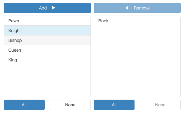
Angular Dual-Listbox
The angular-dual-listbox is an Angular 14 component that provides two lists controls side-by-side that allows items in one list to be selected and moved* to the other list via drag-and-drop and/or a button-based interface. The component supports multiple select options from the list, programatic setting of list sources, and layout with direction and button formatting.
A working demo shows the dual listbox in action.
* Technically, the dual-list component does not move items from one array to another. Rather it makes a copy from the source array of the item and adds it to the destination array, or removes it from the destination array. Thus, the source array is a master list of all available item and the destintion array is a list of items that have been selected from the master list. Therefore, in order for an item to be in the destination array it must also exist in the source array.
How to use?
$ npm i angular-dual-listbox --save
Integration
The angular-dual-listbox should work as-is with webpack/angular-cli. Just add the AngularDualListBoxModule:
import { AngularDualListBoxModule } from 'angular-dual-listbox';

@NgModule({
    imports: [ AngularDualListBoxModule ],
    ...
})
export class AppModule {}
See also the basic-dual-list-demo for a sample project using this module. Note that the default component uses Bootstrap 3 for styling and so the bootstrap.css would need to be included in the project for it to be styled correctly. That said, the styles can be overriden with your own style sheet or fully customized by extending the DualListComponent and providing a new template. For more details, see the section on Extending below.
Usage
Basic usage is:
<dual-list [source]="source" [(destination)]="confirmed"></dual-list>The following parameters are available for the dual-list:
- key - The unique identifier field of each object in the
sourceanddestinationarrays, default is_id. (Note: with a source of an array of strings, each string is its own id.) - display - The field of each object for displaying the object each the
lists, default is
_name. Or, a function that returns a string that can be used for displaying an object. (Note: with a source of an array of strings, each string is its own display.) - height - The height of the lists, default is
100px. - format - A format object, default is
{ add: 'Add', remove: 'Remove', all: 'All', none: 'None', direction: 'left-to-right', draggable: true, locale: undefined } - filter - A boolean whether or not to display a filter for the lists, default is
false. - sort - A boolean whether or not to keep the lists sorted, default is
false. - compare - A compare function to be used for sorting the lists. Note if
sort is not set and compare is set, then sort will be set
true. - source - The source array of objects or strings for the list. (This is the universal, master list of all possible objects.)
- destination The destination array of objects or strings selected from the source. Note, the
destinationarray can have prexisting elements. - (destinationChange) - An event triggered when the destination array changes.
- disabled - The dual-list is disabled, default is
false.
For more usage examples, see the demo-app.component.ts.
Format
The format object allows for the text for the add, remove, all, and none buttons to be set. It also can be used to set the layout direction with the source being on the left-hand side as the default, toggling drag-and-drop, and explicitly setting the locale for the filter string comparision. The default locale is undefined and will use host environment's current locale. An example format object:
export class MyComponent {
    ...
    format = { add: 'Tilføje', remove: 'Fjerne', all: 'Alle', none: 'Intet',
        direction: DualListComponent.LTR, draggable: true, locale: 'da' };
    ...
}
Then used in an html template:
<dual-list [source]="source" [(destination)]="confirmed" [format]="format"></dual-list>Extending
The html template packaged with this component is based on Bootstap 3; however it can be overridden for customization. Here is an example:
import { Component } from '@angular/core';
import { DualListComponent } from 'angular-dual-listbox';

@Component({
    selector: 'custom-dual-list',
    templateUrl: './custom-dual-list.component.html',
    styleUrls: [ './custom-dual-list.component.scss' ]
})
export class CustomDualListComponent extends DualListComponent {
}
See dual-list.component.html
and dual-list.component.css
for template and style guidance.
There is also an Angular-CLI seed project, custom-dual-listbox, available with an example of a customized view and extended functionality.
License
MIT
Author
- David Czeck @czeckd