Notus Angular 


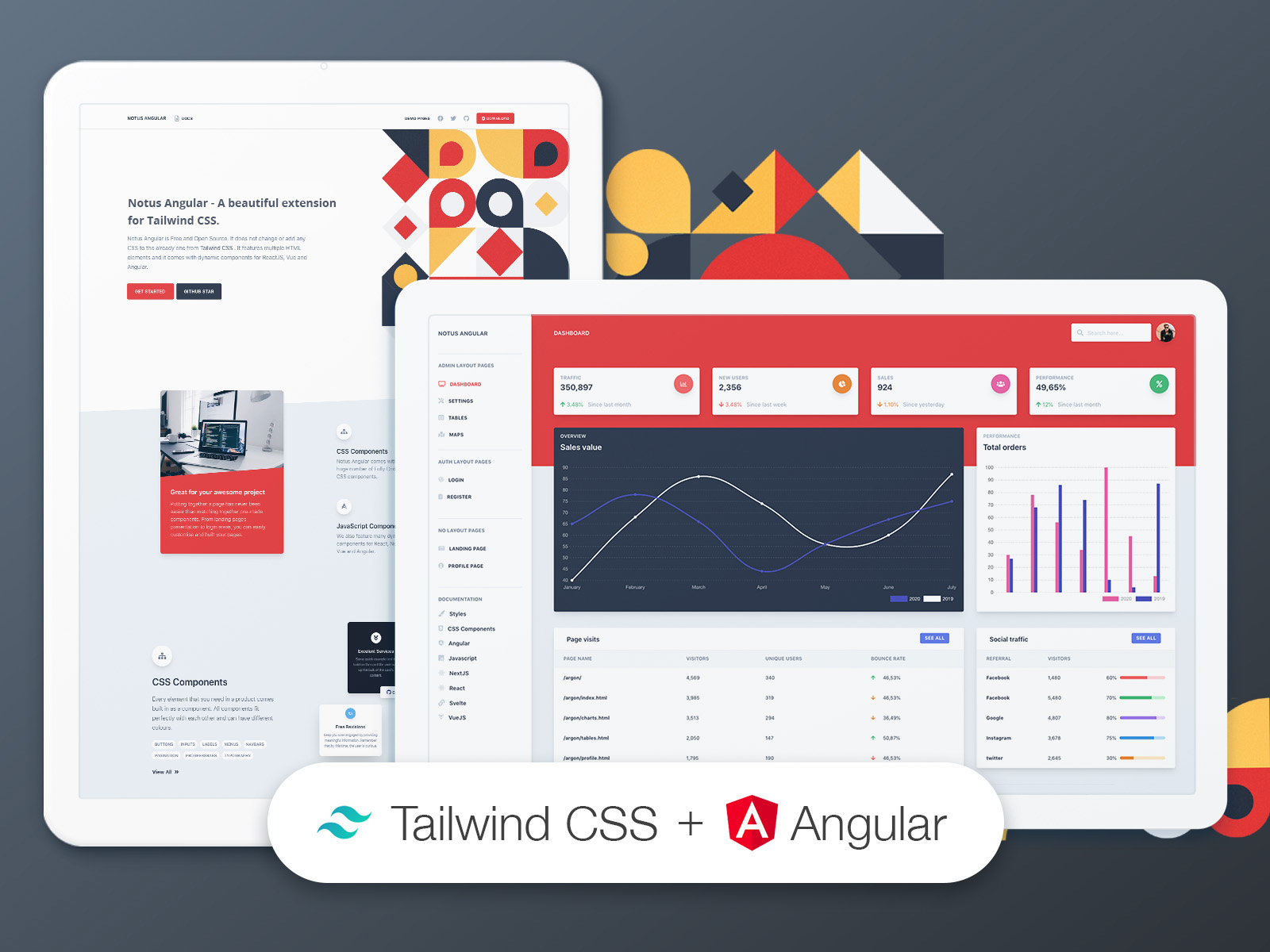
A beautiful UI Kit and Admin for Tailwind CSS and Angular.
Start your development with a Free Tailwind CSS and Angular UI Kit and Admin. Let Notus Angular amaze you with its cool features and build tools and get your project to a whole new level.
Notus Angular is Free and Open Source. It features multiple HTML and Angular elements and it comes with dynamic components for Angular.
It is based on Tailwind Starter Kit by Creative Tim, and it is build with both presentation pages, and pages for an admin dashboard.
Speed up your web development with a beautiful product made by Creative Tim . If you like bright and fresh colors, you will love this Free Tailwind CSS Template! It features a huge number of components that can help you create amazing websites.
Get Started
- Install NodeJS LTS version from NodeJs Official Page
- Download the product on this page
- Unzip the downloaded file to a folder in your computer
- Open Terminal
- Go to your file project (where you’ve unzipped the product)
- (If you are on a linux based terminal) Simply run
npm run install:clean - (If not) Run in terminal
npm install - (If not) Run in terminal
npm run build:tailwind(each time you add a new class, a class that does not exist insrc/assets/styles/tailwind.css, you will need to run this command) - (If not) Run in terminal
npm start - Navigate to https://localhost:4200
- Check more about Tailwind CSS
Pages
If you want to get inspiration or just show something directly to your clients, you can jump start your development with our pre-built example pages. You will be able to quickly set up the basic structure for your web project.
Here are all the page from the project:
- Presentation
- Admin Samples
- Authentication Samples
- Presentation Samples
Fully Coded Components
Notus Angular is built with over frontend 120 components, giving you the freedom of choosing and combining. All components can take variations in colors, that you can easily modify using Tailwindcss classes (NOTE: each time you add a new class, a class that does not exist in src/assets/styles/tailwind.css, you will need to compile again tailwind).
You will save a lot of time going from prototyping to full-functional code, because all elements are implemented. This Free Tailwind CSS Template is coming with prebuilt examples, so the development process is seamless, switching from our pages to the real website is very easy to be done.
Every element has multiple states for colors, styles, hover, focus, that you can easily access and use.
CSS Components
Notus Angular comes with 120 Fully Coded CSS elements, such as Alerts, Buttons, Inputs and many more.
Please check all of them here.
Angular Components
We also feature the following 18 dynamic components:
- Alerts
- Popper for Menus
- Menus
- Modals
- Navbars
- Popper for popover content
- Tabs
- Popper for tooltips content
Table of Contents
- Versions
- Documentation
- Quick Start
- Files and folders
- Browser Support
- Reporting Issues
- Licensing
- Useful Links
- Resources
Versions


| Angular | JavaScript / HTML | NextJS | React | Svelte | VueJS |
|---|---|---|---|---|---|
 |
 |
 |
 |
 |
 |
Documentation
The documentation for the Notus Angular is hosted at our website.
Quick start
Files and Folder
This is the project structure that you will get upon the download:
notus-angular
.
├── CHANGELOG.md
├── ISSUE_TEMPLATE.md
├── LICENSE.md
├── README.md
├── angular.json
├── browserslist
├── e2e
│   ├── protractor.conf.js
│   ├── src
│   │   ├── app.e2e-spec.ts
│   │   └── app.po.ts
│   └── tsconfig.json
├── karma.conf.js
├── package.json
├── src
│   ├── app
│   │   ├── app-routing.module.ts
│   │   ├── app.component.html
│   │   ├── app.component.ts
│   │   ├── app.module.ts
│   │   ├── components
│   │   │   ├── cards
│   │   │   │   ├── card-bar-chart
│   │   │   │   │   ├── card-bar-chart.component.html
│   │   │   │   │   └── card-bar-chart.component.ts
│   │   │   │   ├── card-line-chart
│   │   │   │   │   ├── card-line-chart.component.html
│   │   │   │   │   └── card-line-chart.component.ts
│   │   │   │   ├── card-page-visits
│   │   │   │   │   ├── card-page-visits.component.html
│   │   │   │   │   └── card-page-visits.component.ts
│   │   │   │   ├── card-profile
│   │   │   │   │   ├── card-profile.component.html
│   │   │   │   │   └── card-profile.component.ts
│   │   │   │   ├── card-settings
│   │   │   │   │   ├── card-settings.component.html
│   │   │   │   │   └── card-settings.component.ts
│   │   │   │   ├── card-social-traffic
│   │   │   │   │   ├── card-social-traffic.component.html
│   │   │   │   │   └── card-social-traffic.component.ts
│   │   │   │   ├── card-stats
│   │   │   │   │   ├── card-stats.component.html
│   │   │   │   │   └── card-stats.component.ts
│   │   │   │   └── card-table
│   │   │   │       ├── card-table.component.html
│   │   │   │       └── card-table.component.ts
│   │   │   ├── dropdowns
│   │   │   │   ├── index-dropdown
│   │   │   │   │   ├── index-dropdown.component.html
│   │   │   │   │   └── index-dropdown.component.ts
│   │   │   │   ├── notification-dropdown
│   │   │   │   │   ├── notification-dropdown.component.html
│   │   │   │   │   └── notification-dropdown.component.ts
│   │   │   │   ├── pages-dropdown
│   │   │   │   │   ├── pages-dropdown.component.html
│   │   │   │   │   └── pages-dropdown.component.ts
│   │   │   │   ├── table-dropdown
│   │   │   │   │   ├── table-dropdown.component.html
│   │   │   │   │   └── table-dropdown.component.ts
│   │   │   │   └── user-dropdown
│   │   │   │       ├── user-dropdown.component.html
│   │   │   │       └── user-dropdown.component.ts
│   │   │   ├── footers
│   │   │   │   ├── footer
│   │   │   │   │   ├── footer.component.html
│   │   │   │   │   └── footer.component.ts
│   │   │   │   ├── footer-admin
│   │   │   │   │   ├── footer-admin.component.html
│   │   │   │   │   └── footer-admin.component.ts
│   │   │   │   └── footer-small
│   │   │   │       ├── footer-small.component.html
│   │   │   │       └── footer-small.component.ts
│   │   │   ├── headers
│   │   │   │   └── header-stats
│   │   │   │       ├── header-stats.component.html
│   │   │   │       └── header-stats.component.ts
│   │   │   ├── maps
│   │   │   │   └── map-example
│   │   │   │       ├── map-example.component.html
│   │   │   │       └── map-example.component.ts
│   │   │   ├── navbars
│   │   │   │   ├── admin-navbar
│   │   │   │   │   ├── admin-navbar.component.html
│   │   │   │   │   └── admin-navbar.component.ts
│   │   │   │   ├── auth-navbar
│   │   │   │   │   ├── auth-navbar.component.html
│   │   │   │   │   └── auth-navbar.component.ts
│   │   │   │   └── index-navbar
│   │   │   │       ├── index-navbar.component.html
│   │   │   │       └── index-navbar.component.ts
│   │   │   └── sidebar
│   │   │       ├── sidebar.component.html
│   │   │       └── sidebar.component.ts
│   │   ├── layouts
│   │   │   ├── admin
│   │   │   │   ├── admin.component.html
│   │   │   │   └── admin.component.ts
│   │   │   └── auth
│   │   │       ├── auth.component.html
│   │   │       └── auth.component.ts
│   │   └── views
│   │       ├── admin
│   │       │   ├── dashboard
│   │       │   │   ├── dashboard.component.html
│   │       │   │   └── dashboard.component.ts
│   │       │   ├── maps
│   │       │   │   ├── maps.component.html
│   │       │   │   └── maps.component.ts
│   │       │   ├── settings
│   │       │   │   ├── settings.component.html
│   │       │   │   └── settings.component.ts
│   │       │   └── tables
│   │       │       ├── tables.component.html
│   │       │       └── tables.component.ts
│   │       ├── auth
│   │       │   ├── login
│   │       │   │   ├── login.component.html
│   │       │   │   └── login.component.ts
│   │       │   └── register
│   │       │       ├── register.component.html
│   │       │       └── register.component.ts
│   │       ├── index
│   │       │   ├── index.component.html
│   │       │   └── index.component.ts
│   │       ├── landing
│   │       │   ├── landing.component.html
│   │       │   └── landing.component.ts
│   │       └── profile
│   │           ├── profile.component.html
│   │           └── profile.component.ts
│   ├── assets
│   │   ├── img
│   │   │   ├── github.svg
│   │   │   └── google.svg
│   │   └── styles
│   │       ├── index.css
│   │       └── tailwind.css
│   ├── environments
│   │   ├── environment.prod.ts
│   │   └── environment.ts
│   ├── favicon.ico
│   ├── index.html
│   ├── main.ts
│   ├── polyfills.ts
│   ├── styles.css
│   └── test.ts
├── tailwind.config.js
├── tsconfig.app.json
├── tsconfig.json
├── tsconfig.spec.json
└── tslint.json
Browser Support
At present, we officially aim to support the last two versions of the following browsers:
| Chrome | Firefox | Edge | Safari | Opera |
|---|---|---|---|---|
 |
 |
 |
 |
 |
Reporting Issues
We use GitHub Issues as the official bug tracker for the Notus Angular. Here are some advices for our users that want to report an issue:
- Make sure that you are using the latest version of the Notus Angular. Check the CHANGELOG from your dashboard on our website.
- Providing us reproducible steps for the issue will shorten the time it takes for it to be fixed.
- Some issues may be browser specific, so specifying in what browser you encountered the issue might help.
Licensing
-
Copyright 2021 Creative Tim
-
Licensed under MIT
Useful Links
- Tutorials
- Affiliate Program (earn money)
- Blog Creative Tim
- Free Products from Creative Tim
- Premium Products from Creative Tim
- React Products from Creative Tim
- Angular Products from Creative Tim
- VueJS Products from Creative Tim
- More products from Creative Tim
- Check our Bundles here
- Check our awesome builder here
- Check Tailwind Starter Kit, the project behind this product here
Social Media
Twitter: https://twitter.com/CreativeTim
Facebook: https://www.facebook.com/CreativeTim
Dribbble: https://dribbble.com/creativetim
Instagram: https://www.instagram.com/creativetimofficial/
Resources
- Demo: https://demos.creative-tim.com/notus-angular/?ref=na-readme
- Download Page: https://www.creative-tim.com/product/notus-angular
- Documentation: https://www.creative-tim.com/learning-lab/tailwind/angular/overview/notus?ref=na-readme
- License Agreement: https://www.creative-tim.com/license?ref=na-readme
- Support: https://www.creative-tim.com/contact-us?ref=na-readme
- Issues: Github Issues Page