All Projects β†’ mikemajesty β†’ Chocobo-Date-Range-Picker

mikemajesty / Chocobo-Date-Range-Picker

Licence: MIT license
πŸ—“οΈ Component - The Date Range Picker easier to use in AngularJS.

Programming Languages

javascript
184084 projects - #8 most used programming language
HTML
75241 projects
CSS
56736 projects

Projects that are alternatives of or similar to Chocobo-Date-Range-Picker

Lightpick
(deprecated) Check out the new date picker Litepicker
Stars: ✭ 204 (+786.96%)
Mutual labels:  date, range, picker, daterange
vue-daterangepicker-component
Date range picker for Vue 1.x, based on bootstrap-daterangepicker
Stars: ✭ 22 (-4.35%)
Mutual labels:  date, picker, daterange, daterangepicker
Vuetify Daterange Picker
The missing date range picker for Vuetify JS you have been looking for.
Stars: ✭ 192 (+734.78%)
Mutual labels:  date, range, picker, daterange
react-native-date-ranges
idea from react-native-dates >
Stars: ✭ 68 (+195.65%)
Mutual labels:  date, range, daterange, daterangepicker
jquery-datepicker
A full-featured datepicker jquery plugin
Stars: ✭ 35 (+52.17%)
Mutual labels:  range, picker, rangedate
Litepicker
Date range picker - lightweight, no dependencies
Stars: ✭ 442 (+1821.74%)
Mutual labels:  picker, daterange, daterangepicker
Persianrangedatepicker
Persian range date picker for android.
Stars: ✭ 48 (+108.7%)
Mutual labels:  date, range, picker
Ngx Daterangepicker Material
Pure Angular 2+ date range picker with material design theme, a demo here:
Stars: ✭ 169 (+634.78%)
Mutual labels:  picker, daterange, daterangepicker
Ion2 Calendar
πŸ“… A date picker components for ionic2 /ionic3 / ionic4
Stars: ✭ 537 (+2234.78%)
Mutual labels:  range, daterange, daterangepicker
react-daterange-picker
A react date range picker to using @material-ui. Live Demo: https://flippingbitss.github.io/react-daterange-picker/
Stars: ✭ 85 (+269.57%)
Mutual labels:  date, picker, daterange
Vue Ctk Date Time Picker
VueJS component to select dates & time, including a range mode
Stars: ✭ 707 (+2973.91%)
Mutual labels:  date, range, picker
Singledateandtimepicker
You can now select a date and a time with only one widget !
Stars: ✭ 921 (+3904.35%)
Mutual labels:  date, range, picker
Period
PHP's time range API
Stars: ✭ 616 (+2578.26%)
Mutual labels:  date, range, daterange
Calendarview
A highly customizable calendar library for Android, powered by RecyclerView.
Stars: ✭ 2,862 (+12343.48%)
Mutual labels:  date, daterange, daterangepicker
Flatpickr
lightweight, powerful javascript datetimepicker with no dependencies
Stars: ✭ 14,575 (+63269.57%)
Mutual labels:  date, daterange, daterangepicker
TimeRangePicker
A customizable, easy-to-use, and functional circular time range picker library for Android. Use this library to mimic Apple's iOS or Samsung's bedtime picker.
Stars: ✭ 266 (+1056.52%)
Mutual labels:  range, picker
Xfce4 Genmon Scripts
🐭 XFCE panel generic monitor scripts
Stars: ✭ 69 (+200%)
Mutual labels:  date, tooltip
React Datetimerange Picker
A datetime range picker for your React app.
Stars: ✭ 82 (+256.52%)
Mutual labels:  date, daterange
Datepicker
A Date Picker with Calendar for iPhone and iPad Apps.
Stars: ✭ 103 (+347.83%)
Mutual labels:  date, picker
Rc Datetime Picker
React component for datetime picker by Moment.js
Stars: ✭ 85 (+269.57%)
Mutual labels:  date, picker

Chocobo Date Range Picker - The Date Range Picker easier to use in angular
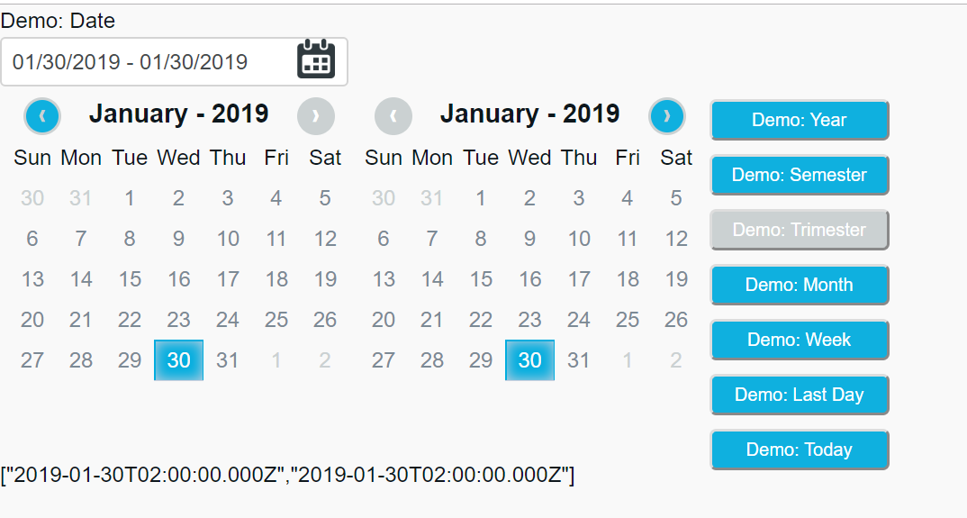
chocobo.png

Try it yourself.

click here

How to install

bower install chocoborangepicker

How to use

Import to your project the chocobo-range-picker.min.js and chocobo-range-picker.min.css files in bower_components folder
 <link href="/bower_components/chocoborangepicker/dist/css/chocobo-range-picker.min.css" rel="stylesheet">
 <script type="text/javascript" src="/bower_components/chocoborangepicker/dist/js/chocobo-range-picker.min.js"></script>

Then refer to your module

 angular.module('yourModule', ['chocoboRangePicker']);
In your controller use the code below
  // Here is your property that you want to be populated with date range.
  $scope.demo = { searchDate: null };  

  $scope.options = {
    txtDateInit: 'Demo: Date',
    buttons: {
      btnYear: { txt: 'Demo: Year', tooltip: "Choose Year" },
      btnSemester: { txt: 'Demo: Semester', tooltip: "Choose Semester" },
      btnTrimester: { txt: 'Demo: Trimester', tooltip: "Choose Trimester" },
      btnMonth: { txt: 'Demo: Month', tooltip: "Choose Month" },
      btnWeek: { txt: 'Demo: Week', tooltip: "Choose Week" },
      btnToday: { txt: 'Demo: Today', tooltip: "Choose Today" },
      btnLastDay: { txt: 'Demo: Last Day', tooltip: "Choose Last Day" }
    },
    inputConfig: {
      showIcon: true,
      iconPath: "http://www.racedepartment.com/images/rd_calext/calendar.png"
    } ,
    minDate: new Date(2017, 1, 3),
    maxDate: new Date(2017, 3, 12)
  };

$scope.options

  • txtDateInit(optional): Label of input text that will show the date interval. If you remove this property it will not shown.;
  • buttons(required): Where you will configure a buttons properties.;
  • buttons: {btnYear}(optional): Where you will configure a each button properties. If you do not use this property the related button will not be displayed;
  • buttons: {btnYear.txt}(optional): Text that will apear in button;
  • buttons: {btnYear.tooltip}(optional): Tooltip that will appear when user mouseover on button.;
  • inputConfig(optional): Without this property the default icon will be displayed;
  • inputConfig: {showIcon}(required): This property indicate if you want show icon. If the property is false, the icon will not be displayed;
  • inputConfig: {iconPath}(optional): This property indicate if you want show icon. This property indicate the path to his own icon;
  • minDate(optional): Indicates the minimun possible date for a user to select;
  • maxDate(optional): Indicates the maximum possible date for a user to select.
In your page use
  <chocobo-range-picker bindRange='false'
                        blockWeekDay='0,6'
                        locale='pt-BR'
                        options='options'
                        ng-model="demo.searchDate">
  </chocobo-range-picker>

chocobo-Range-Picker

  • bindRange(required)

    • true: All date in the range will be assigned to the model;
    • false: The first and last date will be assigned to the model.
  • blockWeekDay(optional)*: Property that represent a weekday to be blocked (0-6), where:

    • "Sunday": 0;
    • "Monday": 1;
    • "Tuesday": 2;
    • "Wednesday": 3;
    • "Thursday": 4;
    • "Friday": 5;
    • "Saturday": 6.

Attention these locales have been tested.

  • Spain: es-ES
  • Brazil: pt-BR
  • United States: en-US
  • Great Britain: en-GB
  • Germany: de-DE

Used versions

  • Angular
    • version: 1.2.32

License

It is available under the MIT license. License


Collaborators

Note that the project description data, including the texts, logos, images, and/or trademarks, for each open source project belongs to its rightful owner. If you wish to add or remove any projects, please contact us at [email protected].